Mixing complementary colors with watercolor for perfect shadows
Summary
TLDRThis video dives into mixing complementary colors and their role in creating natural-looking shadows in watercolor painting. Using a primary palette of yellow, magenta, and cyan, the artist demonstrates how combining complementary colors like yellow and purple, orange and blue, and red and cyan produces muted tones and natural shadows. The video compares shadows created with these mixtures to those made with black, highlighting the more natural results from complementary color mixes. The tutorial concludes with a demonstration of painting a green bell pepper, emphasizing the benefits of using complementary colors for depth and realism.
Takeaways
- 🎨 Complimentary colors are across from each other on the color wheel and can be used to create natural shadows.
- 🟡 The video demonstrates mixing colors using a primary palette of yellow, magenta, and cyan to generate various shades.
- 💧 Adding water to color mixes shows how dilution impacts the lightness of the colors, helping to create different shades and effects.
- 🟣 Mixing yellow and purple, a complementary pair, results in a natural shadow color, creating more depth in a painting.
- 🔵 Orange and blue are another complementary pair, and their mix creates muted tones, including a grayish-black when evenly combined.
- 🔴 Red and cyan complement each other well, especially when using a bit of cyan to deepen the red for more natural shading.
- 🌿 Magenta and green create earthy, muted tones when mixed, helping to achieve natural-looking shadows and variations in color.
- 🌈 The use of complementary colors for shadows leads to more gradual, realistic transitions compared to using black or gray.
- 🫑 An example of a green bell pepper shows how mixing magenta with green for shadows gives a more natural, blended appearance than using black.
- 🎬 The video concludes by encouraging viewers to use complementary colors for more aesthetically pleasing and realistic shadows in their art.
Q & A
What are complementary colors in the context of color theory?
-Complementary colors are pairs of colors that are located opposite each other on the color wheel. When mixed together, they tend to neutralize each other, often creating a gray or muted color.
Which primary colors are used in the yellow-magenta-cyan color theory?
-The primary colors used in the yellow-magenta-cyan color theory are yellow, magenta, and cyan.
How are secondary colors created in the yellow-magenta-cyan color theory?
-In the yellow-magenta-cyan color theory, secondary colors are created by mixing two primary colors in various ratios. For example, yellow and magenta mix to create red, cyan and magenta mix to create purple, and yellow and cyan mix to create green.
Why do artists mix complementary colors to create shadows instead of using black?
-Artists mix complementary colors to create shadows because it produces a more natural and aesthetically pleasing effect. The complementary mix incorporates some of the base color, resulting in a shadow that blends smoothly with the object, whereas black often creates a harsh, unnatural contrast.
What happens when you mix yellow and purple as complementary colors?
-When mixing yellow and purple as complementary colors, the result is a range of muted hues. A tiny bit of purple added to yellow creates a deep yellow, while a tiny bit of yellow added to purple creates a deep purple. A 50/50 mix results in a neutral gray.
What is the significance of adding water to the complementary color mixes in the video?
-Adding water to the complementary color mixes dilutes the colors, allowing the artist to see how the colors lighten and change as they become more transparent. This process is useful for creating subtle gradients and shadows in watercolor paintings.
How does mixing orange and blue as complementary colors affect their hues?
-When orange and blue are mixed as complementary colors, a tiny bit of blue added to orange results in a deep muted orange, while a tiny bit of orange added to blue creates a deep muted blue. A 50/50 mix results in a gray-black hue.
Why does the artist choose to mix complementary colors instead of using black for shadows?
-The artist prefers to mix complementary colors for shadows because it creates a more natural and harmonious effect. Using black often produces a harsh shadow that lacks the subtle color variations seen in real life, making the artwork appear less organic.
What is the difference between using a complementary color mix and black for shadows in watercolor?
-Using a complementary color mix for shadows produces more natural, gradual transitions, with the shadow retaining elements of the base color. In contrast, using black creates a darker, more abrupt shadow that can appear too stark and less integrated into the overall composition.
How is the shadow for the green bell pepper created using complementary colors?
-The shadow for the green bell pepper is created by mixing a bit of magenta into the green to darken and mute the color. This method results in a natural-looking shadow that blends well with the base green color, rather than appearing as a harsh black shadow.
Outlines

このセクションは有料ユーザー限定です。 アクセスするには、アップグレードをお願いします。
今すぐアップグレードMindmap

このセクションは有料ユーザー限定です。 アクセスするには、アップグレードをお願いします。
今すぐアップグレードKeywords

このセクションは有料ユーザー限定です。 アクセスするには、アップグレードをお願いします。
今すぐアップグレードHighlights

このセクションは有料ユーザー限定です。 アクセスするには、アップグレードをお願いします。
今すぐアップグレードTranscripts

このセクションは有料ユーザー限定です。 アクセスするには、アップグレードをお願いします。
今すぐアップグレード関連動画をさらに表示

The ultimate WATERCOLOUR TUTORIAL | For beginners | Drawlikeasir

This UNDERRATED Oil Painting Technique Might Transform Your Colors - Oil Painting Tutorial

Medium of Visual Art

Colour Theory Explained ✅ Colour Wheel Done Right

Watercolour LIGHT & SHADOW - watercolour quick tricks & tips
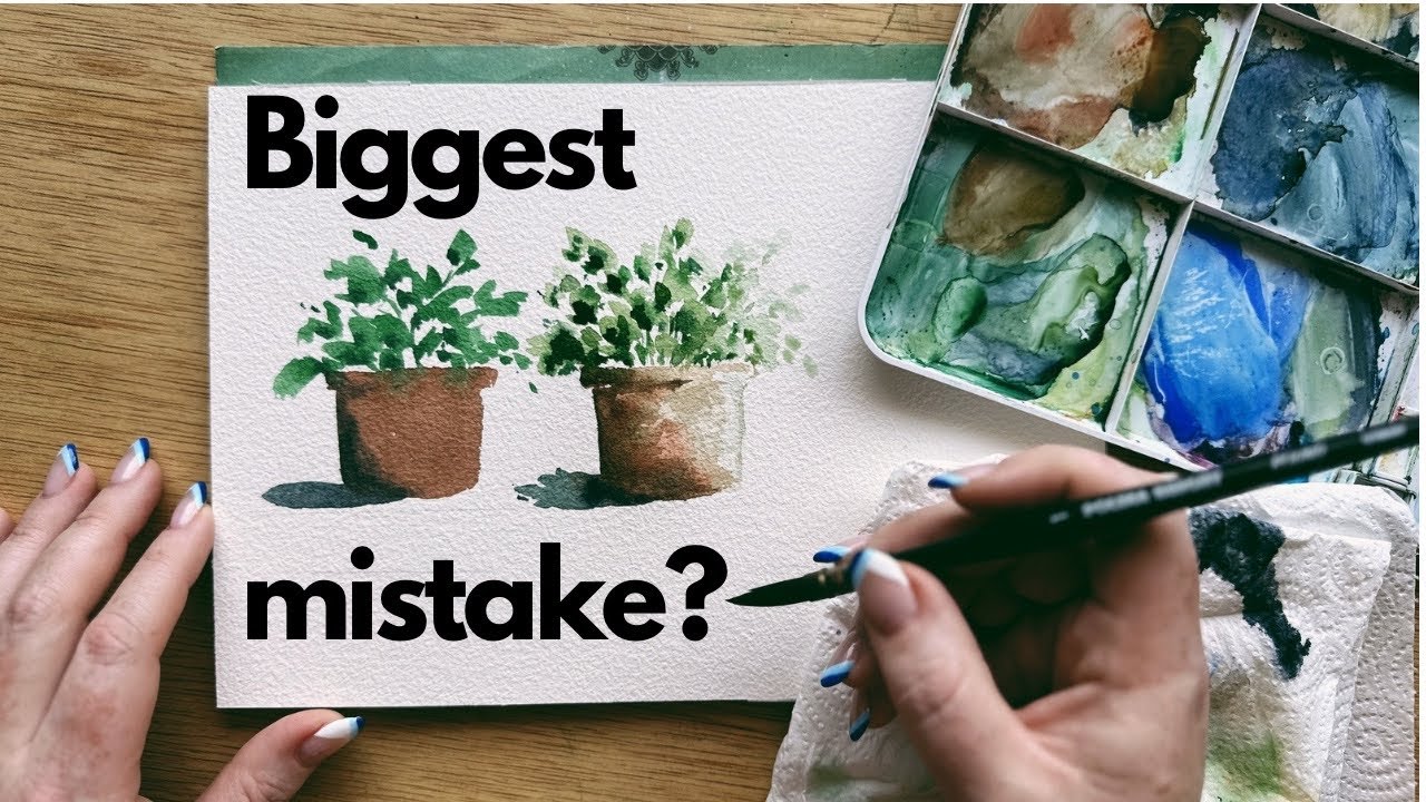
Biggest mistake I see beginner watercolor artists make, and how to fix it
5.0 / 5 (0 votes)
