Histograms and Density Plots for Numeric Variables | Statistics Tutorial | MarinStatsLectures
Summary
TLDRThe video explains the importance of histograms and kernel density plots in visualizing the distribution of numerical data. Using the example of age distribution, it walks through creating bins, calculating frequencies, and representing them visually through histograms. The speaker highlights how changing bin sizes affects the distribution and introduces kernel density plots as a smoother alternative. It also touches on interpreting key distribution features like center, spread, and symmetry, setting the stage for deeper discussions on probability distributions in future videos.
Takeaways
- 📊 Histograms and kernel density plots are used to visualize the distribution of a sample, especially for continuous or numerical variables.
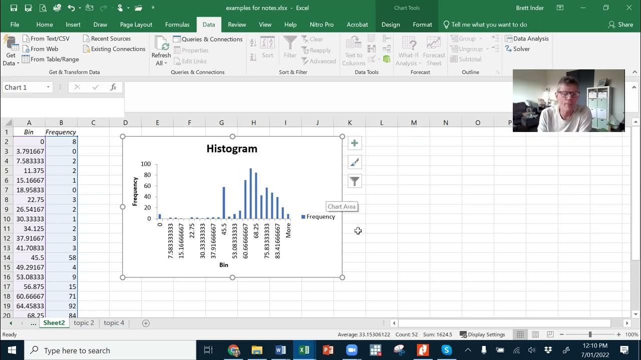
- 🧮 The first step in creating a histogram is to make a frequency table by dividing the data into bins (e.g., 0-10, 10-20, etc.) and counting how many observations fall into each bin.
- 🔢 Bins can vary in size, and different software might choose different bin ranges (e.g., 0-10 vs. 0-15). It’s important to stay consistent in bin selection.
- 📉 Histograms visually represent how data is distributed across bins, with the x-axis showing the variable and the y-axis showing frequency, percentage, or proportion.
- 📏 Bars in a histogram should be of equal width, with no gaps between them when displaying continuous data like age.
- 🔄 Changing bin sizes can alter the shape of the histogram, so the visual appearance of the distribution may change slightly based on how the bins are set.
- 📐 Histograms help identify the center, spread, and shape of a distribution, showing whether it's symmetric or skewed.
- 📦 Another way to summarize the distribution of a numeric variable is through a box plot, which offers a different visual approach.
- 🔀 Kernel density plots smooth out histograms by reducing the impact of bin selection, creating a more continuous estimate of the probability distribution.
- 🎯 Both histograms and kernel density plots are essential for summarizing sample data distributions, and they provide insights into the underlying probability distribution.
Q & A
What are histograms and why are they useful?
-Histograms are graphical representations used to visualize the distribution of numerical, quantitative, or continuous variables by dividing the data into bins. They help us understand the frequency of values within each bin and provide insight into the shape, center, and spread of the data distribution.
How do you create a frequency table for a dataset?
-To create a frequency table, you divide the range of the dataset into bins or categories, such as 0-10, 10-20, etc., and then count how many data points fall into each bin. You can also convert these frequencies into proportions or percentages for a clearer understanding of the distribution.
What is the significance of choosing different bin sizes in histograms?
-Choosing different bin sizes can change the shape of the histogram and affect how the distribution appears. For example, using larger bins can smooth out fluctuations, while smaller bins might show more detail but may also appear more erratic.
What are the key differences between a histogram and a bar chart?
-A histogram is used for continuous data and the bars touch each other, indicating that the data points are related and fall on a continuous scale. In contrast, a bar chart is used for categorical data, and the bars do not touch, indicating that each category is distinct and separate.
What do histograms tell us about the center and spread of a distribution?
-Histograms provide a visual representation of the center of the distribution (which can later be summarized numerically using measures like the mean or median) and show how spread out or clustered the data is. They also indicate the variability and symmetry or skewness of the data.
How does changing bin sizes impact the shape of a histogram?
-Changing the bin sizes can alter the appearance of the histogram. Larger bins may result in a smoother, more generalized shape, while smaller bins can reveal more detail but may introduce more variability and noise in the plot.
What is the kernel density plot and how does it differ from a histogram?
-A kernel density plot is a smooth version of a histogram that estimates the probability distribution of a continuous variable. Instead of relying on fixed bins, it smooths the data to reduce the impact of arbitrary bin selection and provides a continuous estimate of the distribution.
Why is it important to be consistent with handling border values in histograms?
-Consistency with border values (e.g., deciding whether an age of 20 belongs in the 10-20 or 20-30 bin) is important to ensure accurate and reliable representation of the data. A computer software typically has a default setting for handling border values, but you can adjust it for your specific needs.
What insights can we gain from a histogram's shape?
-The shape of a histogram can reveal whether the data is symmetric, skewed (to the left or right), or has multiple peaks. This helps in identifying patterns such as normal distribution or the presence of outliers and anomalies in the data.
What is a box plot and how is it related to histograms?
-A box plot is another way to visualize the distribution of a numeric variable. It summarizes data using the median, quartiles, and potential outliers, and it gives a more compact representation compared to histograms, which show the full distribution with bars. Both histograms and box plots are useful for summarizing numerical data.
Outlines

このセクションは有料ユーザー限定です。 アクセスするには、アップグレードをお願いします。
今すぐアップグレードMindmap

このセクションは有料ユーザー限定です。 アクセスするには、アップグレードをお願いします。
今すぐアップグレードKeywords

このセクションは有料ユーザー限定です。 アクセスするには、アップグレードをお願いします。
今すぐアップグレードHighlights

このセクションは有料ユーザー限定です。 アクセスするには、アップグレードをお願いします。
今すぐアップグレードTranscripts

このセクションは有料ユーザー限定です。 アクセスするには、アップグレードをお願いします。
今すぐアップグレード関連動画をさらに表示

BOX PLOT, HISTOGRAM, DOT PLOT STATISTIKA KELAS 10
Statistika - Penyajian Data Eps.2 l Ruang Belajar #StudyWithDiida

Must know Visualization in Statistics | Descriptive Statistics | Ultimate Guide !! | Part 10
Normality test [Simply Explained]
ETC1000 Topic 2b
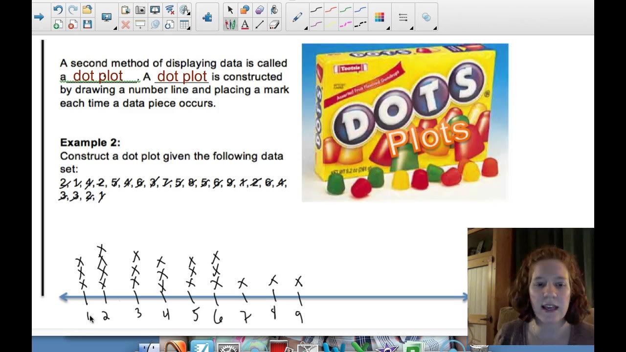
6 - 3 Part 1 Frequency Tables, Dot Plots, HIstograms
5.0 / 5 (0 votes)
