Craig Eliason - Didot and Fashion

ATypI
24 Sept 201818:15

Summary

TLDRThe script discusses the connection between the Didot typeface and fashion magazines like Vogue and Harper's Bazaar. It traces the typeface's origins to 18th-century neoclassicism, highlighting its idealized form that deviates from traditional lettering. The adoption of Didot by fashion magazines in the mid-20th century is linked to the shift towards photography and a more abstract, idealized representation of fashion, reflecting a cultural move towards modernism and the distancing effect of technology on design.

Takeaways

  • 📰 The script discusses the Vogue magazine and its use of the Didot typeface, which is associated with a 'fashion font' style.
  • 🔠 The Didot typeface is linked to neoclassical design, having been used by the Didot family in the late 18th century, and is characterized by its high contrast and geometric forms.
  • 🎨 The script connects the use of Didot in fashion magazines to the broader neoclassical movement, which was interested in the idealized forms of classical antiquity.
  • ✍️ The Didot typeface represents an idealization of writing, with its letterforms being more geometric and less connected to the variability of handwritten letters.
  • 🏛️ Neoclassicism in architecture and art was about returning to the basics and finding pure, ideal forms, which is reflected in the Didot typeface's design.
  • 📸 The adoption of Didot by fashion magazines like Vogue and Harper's Bazaar in the mid-20th century coincided with a shift towards photography and a more objective, visual representation of fashion.
  • 🌐 The change in fashion magazine design in the 1940s, including the use of Didot, reflected a broader cultural shift and the rise of American fashion during and after World War II.
  • 🖋️ The script suggests that the use of Didot in fashion magazines was not just about aesthetics but also about the idealized, authoritative structure it conveyed.
  • 👗 The fashion magazine style, with its use of Didot and photographic covers, creates a sense of distance and objectivity, which aligns with the idealized form of the models and clothing presented.
  • 🎭 The script concludes by suggesting that the Didot typeface, with its origins in neoclassical idealization, is a fitting choice for fashion magazines that aim to present an idealized vision of fashion and beauty.

Q & A

  • What is the significance of the Didot typeface in the fashion industry?

    -The Didot typeface is significant in the fashion industry because it was adopted by major fashion magazines like Vogue and Harper's Bazaar, effectively making it the 'couture typeface'. Its use symbolizes a shift towards an idealized, abstract form that aligns with the fashion industry's focus on stylized presentation.

  • Why did fashion magazines like Vogue and Harper's Bazaar choose the Didot typeface for their nameplates?

    -Vogue and Harper's Bazaar chose the Didot typeface for its neoclassical, idealized character that resonated with the fashion industry's move towards a more abstract and authoritative style. The typeface's high contrast and geometric regularity provided a stark, modern appearance that complemented the evolving visual language of fashion magazines.

  • How does the use of the Didot typeface reflect the historical context of 18th century neoclassicism?

    -The Didot typeface reflects the historical context of 18th century neoclassicism through its departure from traditional letter forms and its embrace of idealized, geometric design. This aligns with the neoclassical movement's broader interest in classical antiquity and its pursuit of noble simplicity and quiet grandeur, as seen in the arts and architecture of the time.

  • What role did the pointed pen and engraving play in the development of the Didot typeface?

    -The pointed pen and engraving played a significant role in the development of the Didot typeface by facilitating high contrast, abrupt modulation, and the independence of stroke width and direction. These characteristics contributed to the modern face type's distinctive appearance, which was a departure from previous typographic styles.

  • How did the introduction of Kodachrome film in 1936 influence the design of fashion magazine covers?

    -The introduction of Kodachrome film in 1936 led to a shift towards the use of color photography on fashion magazine covers, replacing hand-drawn illustrations. This change emphasized a more objective, visual approach, which aligned with the abstract and idealized form of the Didot typeface used for the magazine names.

  • What is the relationship between the fashion magazine cover design and the concept of the 'ideal body' as discussed in the script?

    -The fashion magazine cover design, particularly the use of the Didot typeface and photographic images of models, is related to the concept of the 'ideal body' by presenting a distilled, abstract form that represents an idealized version of reality. This aligns with the fashion industry's goal to showcase clothing in an aspirational, yet universally appealing manner.

  • Why did the fashion magazines shift from using various artistic styles on their covers to a more consistent design language?

    -The shift from various artistic styles to a more consistent design language on fashion magazine covers was driven by the need for a more authoritative and recognizable brand identity. The use of the Didot typeface and standardized cover designs helped establish a clear visual identity that resonated with the industry's move towards a more stylized and idealized presentation.

  • How does the script's discussion of the Didot typeface relate to broader themes of modernism in design?

    -The script's discussion of the Didot typeface relates to broader themes of modernism in design by highlighting the typeface's role in the transition from traditional, hand-crafted styles to a more abstract, geometric approach. This mirrors the modernist movement's emphasis on functionality, simplicity, and the rejection of historical ornamentation in favor of new forms.

  • What is the significance of the 'idealized character' of the Didot typeface in the context of fashion magazine design?

    -The 'idealized character' of the Didot typeface is significant in fashion magazine design because it embodies the aspirational and perfected quality that fashion aims to convey. Its geometric precision and high contrast serve to elevate the presentation of fashion, aligning with the industry's pursuit of an idealized form that transcends individual characteristics.

  • How does the script's analysis of the Didot typeface contribute to our understanding of the evolution of typography and design?

    -The script's analysis of the Didot typeface contributes to our understanding of the evolution of typography and design by illustrating the shift from traditional letter forms to a more abstract, idealized style. It highlights the influence of historical and cultural contexts on design choices and the role of technology in shaping the visual language of fashion magazines.

Outlines

00:00

📚 Vogue's Typography: The Fashion Font

This paragraph discusses the use of a specific lettering style associated with the fashion industry, particularly Vogue and Harper's Bazaar. The style is referred to as the 'fashion font' and is linked to the Didot typeface, which has been used for over 75 years. The speaker argues that this font's idealized character was attractive to fashion journalism in the mid-twentieth century. The historical context of the Didot typeface is explored, including its origins with the Didot family in Paris and its connection to neoclassicism. The paragraph sets the stage for a deeper analysis of how and why this typeface became synonymous with fashion.

05:02

🏛️ Neoclassicism and the Didot Type

The second paragraph delves into the neoclassical movement, highlighting its emphasis on classical antiquity and the pursuit of ideal forms. It contrasts the neoclassical interest in ancient culture, as seen in art and architecture, with the Didot typeface's departure from ancient letter forms. The speaker suggests that while neoclassical art often emulated classical styles, the Didot typeface represented an idealization of writing rather than a direct copy. This idealization is positioned as a key aspect of the neoclassical movement, which sought to capture the essence of classical forms in a more abstract and idealized manner.

10:02

🎨 The Adoption of Didot by Fashion Magazines

Paragraph three examines the historical moment when the Didot typeface was adopted by Vogue and Harper's Bazaar. It discusses how World War II shifted the fashion industry's focus from Europe to the United States, leading to a more self-reliant American fashion scene. The speaker notes that this period saw the rise of New York as a fashion capital and the establishment of New York Fashion Week. The adoption of Didot by these magazines is linked to the need for a consistent and authoritative typeface that could represent the new direction of fashion journalism. The paragraph also touches on the broader changes in magazine design, moving from varied and artistic covers to a more uniform and photographic approach.

15:03

📸 The Evolution of Fashion Magazine Aesthetics

The final paragraph reflects on the evolution of fashion magazine aesthetics, particularly the shift towards photography and abstract representation. It discusses how the use of Didot typeface aligns with the move towards more objective and visually distancing techniques like photography. The speaker suggests that the fashion magazine style has become one of stylized anonymity, where both the model and the typeface are presented in an abstract form that emphasizes form over individuality. This approach creates a sense of idealization and objectivity, which is argued to be a fitting representation of the fashion industry's move towards a more global and commercialized aesthetic.

Mindmap

Keywords

💡Vogue

Vogue is a prominent fashion and lifestyle magazine that has been influential in the fashion industry for decades. In the script, Vogue is mentioned as one of the publications that adopted the Didot typeface for its nameplate, which is a significant aspect of the magazine's branding and visual identity. The use of Didot by Vogue reflects the magazine's commitment to a certain aesthetic and historical connection to the neoclassical ideals of design and typography.

💡Didot

Didot refers to the typeface created by the Didot family, particularly Firmin Didot, a French printer and type designer. The Didot typeface is characterized by its high contrast between thick and thin strokes, and it is associated with the neoclassical design movement. In the script, Didot is highlighted as the typeface that was adopted by Vogue and Harper's Bazaar, signifying a shift towards a more abstract and idealized form of typography that complements the fashion industry's move towards a more stylized and idealized representation of fashion.

💡Neoclassicism

Neoclassicism is an artistic movement that emerged in the mid-18th century, characterized by a renewed interest in the classical art and culture of ancient Greece and Rome. The script discusses how the Didot typeface embodies the neoclassical idealization of forms, moving away from direct emulation of classical models towards a more abstract and idealized representation. This concept is central to understanding the aesthetic choices made by the Didot family and later by fashion magazines in their design and typography.

💡Fashion Font

The term 'fashion font' in the script refers to a specific style of lettering that has become synonymous with the fashion industry. It is exemplified by the Didot typeface and is characterized by its high contrast and geometric forms. The fashion font is used by Vogue and Harper's Bazaar, among others, to signal a connection to the world of fashion and to convey a sense of sophistication and elegance.

💡Type Design

Type design is the craft of designing typefaces and fonts. It involves creating the visual appearance of letters and symbols, considering factors like legibility, aesthetics, and historical context. In the script, type design is discussed in relation to the Didot family's work and how their designs reflect the neoclassical movement's emphasis on idealized forms and geometric principles.

💡Modern Face Type

Modern Face Type refers to a category of typefaces characterized by high contrast between thick and thin strokes, abrupt modulation, and vertical stress. The script mentions that Didot, along with Giambattista Bodoni, is credited with the invention of modern face types. This typeface style was seen as revolutionary and represented a significant development in the history of typography.

💡Engravers

Engravers, such as those mentioned in the script, played a crucial role in the 18th century's typographic landscape. They facilitated the high-contrast and abrupt modulation seen in modern face types, which was an important factor in the development of the Didot typeface. Their work in engraving influenced the appearance and characteristics of typefaces, contributing to the evolution of typography.

💡Idealization

Idealization in the context of the script refers to the process of abstracting and refining forms to represent an ideal version of reality. This concept is central to neoclassicism and is evident in the Didot typeface, which moves away from directly copying classical letter forms to creating an idealized version that embodies the principles of the movement.

💡Fashion Journalism

Fashion journalism encompasses the reporting and commentary on fashion trends, designers, and events. The script discusses the adoption of the Didot typeface by fashion magazines like Vogue and Harper's Bazaar, marking a significant moment in fashion journalism's history. The use of Didot signifies a shift towards a more stylized and idealized representation of fashion, aligning with the industry's broader aesthetic and cultural shifts.

💡Kodakchrome Film

Kodakchrome Film is mentioned in the script as a technological innovation that revolutionized fashion magazine covers by enabling the use of color photography. This development contributed to the shift towards a more visual and less tactile aesthetic in fashion magazines, which is mirrored in the adoption of the abstract and idealized Didot typeface for titles.

Highlights

The magazine's style is recognizable due to its use of a specific lettering style, which is also seen in other fashion magazines like Harper's Bazaar.

The lettering style is referred to as the 'fashion font' and has been used by Vogue and Harper's Bazaar for over 75 years.

The Didot typeface, which the magazine's lettering is derived from, was first used by the Didot family, known for their dominance in fine printing in the late 18th century.

Dido's typeface demonstrates a neoclassical approach to type design, rethinking the relationship between written language and typography.

The typeface is an abstract idealization of pen-written letters, which was a significant draw for fashion journalism in the mid-twentieth century.

Modern face types, like Dido, are characterized by high contrast, abrupt modulation, and regular eye-line proportions.

The pointed pen's use in the 18th century writing introduced modulation similar to modern face types, influencing type design.

Engraving, a prominent medium of the 18th century, facilitated high contrast and abrupt modulation in letter forms.

Neoclassicism in the 18th century was marked by a renewed interest in classical antiquity, influencing various art forms including typography.

The Didot family's work coincided with the neoclassical movement, exemplifying it through their choice of texts and illustrations.

Firmin Didot's types are an example of neoclassical idealization, transforming physical writing into a perfected form.

The adoption of Dido typeface by Vogue and Harper's Bazaar in the 1940s marked a significant shift in fashion magazine design.

World War Two disrupted the European fashion world, leading to a more self-reliant American fashion industry and a shift in design focus.

The introduction of Kodachrome film in 1936 led to a change in fashion magazine covers, favoring photography over hand-drawn images.

The fashion magazine style of the 1940s, with its abstract and authoritative structure, was a response to the changing fashion industry and technology.

The use of Dido typeface in fashion magazines aligns with the idealized and abstract presentation of models and clothing.

The fashion magazine style creates a sense of distance and objectivity, which is reflected in the choice of typeface and photographic style.

Transcripts

play00:04

[Applause]

play00:15

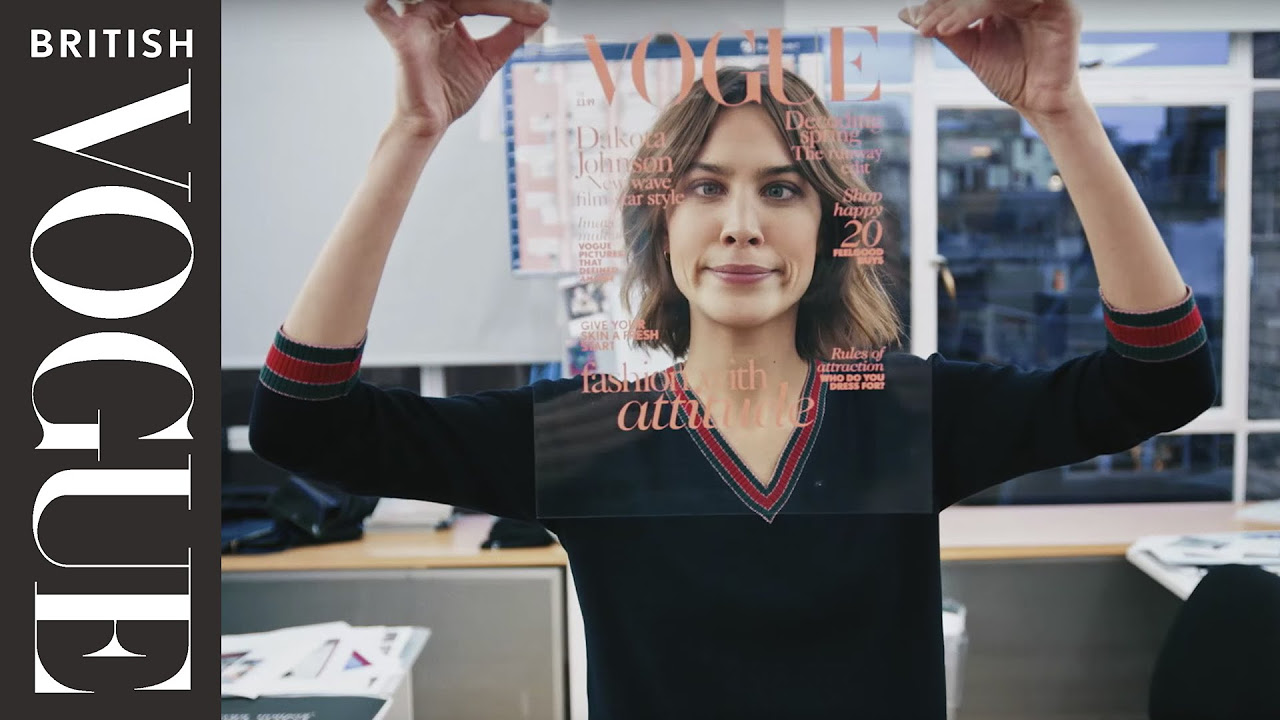
what magazine is this strictly speaking

play00:19

it's unreadable as Beyonce has equipped

play00:21

an entire letter in parts of others but

play00:24

we know it to be vogue that recognition

play00:26

is built on our familiarity generally

play00:28

with the publication and more

play00:30

specifically with the style of the

play00:31

letter parts that we can see the same

play00:35

style of letter is used in the nameplate

play00:36

of another fashion magazine Harper's

play00:38

Bazaar in fact we see letters similar to

play00:41

these and many logos and branding images

play00:43

connected to the world of fashion I

play00:44

noticed the CNN smartphone app went out

play00:47

of its way to signal fashion through a

play00:49

font change we could call this lettering

play00:52

style the fashion font this association

play00:55

is long standing Vogue and Harper's

play00:57

Bazaar have been using these letter

play00:58

forms for over 75 years the magazine

play01:01

name plates derive their letters from

play01:03

the typefaces produced and first used by

play01:05

the D doz the celebrated Paris family

play01:08

who dominated fine printing around the

play01:10

end of the 18th century today I will

play01:13

show that the letter forms of the dido

play01:14

typeface demonstrate a neoclassical

play01:16

rethinking of the relationship of

play01:18

written language to type design they are

play01:21

abstract idealizations of pen written

play01:24

letters it was this idealized character

play01:26

I argue that drew fashion journalism to

play01:29

dido in the mid twentieth century when

play01:31

the art directors of Vogue and Harper's

play01:32

Bazaar effectively made it the auto

play01:35

Couture typeface to understand fully the

play01:38

appeal of this idealized character

play01:40

examining the historical context of both

play01:43

of these moments is necessary my

play01:46

presentation will begin with a brief

play01:48

survey of the common understanding of D

play01:49

DOS place in the history of letter forms

play01:51

then we'll zoom out and consider the

play01:53

context of 18th century neoclassicism in

play01:55

which they first appeared we will see

play01:58

that classical letter forms are

play01:59

puzzlingly absent in these neoclassical

play02:01

types I will make the case that

play02:03

idealization was an indispensable aspect

play02:05

of neoclassicism and considered Eidos

play02:08

fit from that perspective then we'll

play02:10

fast forward to the 20th century to cast

play02:12

light on the historical situation

play02:13

surrounding D doze at adoption by

play02:16

fashion magazines lastly I will argue to

play02:18

these circumstances to called for an

play02:21

idealized form of letter

play02:25

first what is the conventional

play02:27

understanding of Dido in the history of

play02:29

type fairman Dido was the principal type

play02:32

founder of the family and he is widely

play02:34

credited alongside Giambattista bodoni

play02:36

of Parma as the inventor of modern face

play02:39

type as you all know modern face types

play02:42

are characterized by high contrast

play02:44

between stem and hair line width abrupt

play02:46

modulation from thick to thin vertical

play02:49

stress horizontal serifs that are often

play02:52

under akka 'td and regular eyes din

play02:55

proportions modern face types are often

play02:58

hailed as revolutionary but they have

play03:00

also been seen as an expected next step

play03:02

in the history of type design some CD

play03:05

dough and bodoni continuing the

play03:06

direction of the mid 18th century

play03:07

creations of Fournier legion and

play03:09

especially John Baskerville which are

play03:11

consequently labeled transitional going

play03:15

back further the turn of the century

play03:16

whole meadow fois project is also

play03:18

rightly seen as an influential precedent

play03:20

with its upright rationalized forms but

play03:24

looking only for precedents and

play03:25

influences within typography misses the

play03:27

bigger story of 18th century letter form

play03:29

design letters resembling Baskervilles

play03:33

and d dough's appear earlier in writing

play03:34

as evidenced by copy books that provided

play03:37

models for wielding a pen we must

play03:39

consider the dominance of the pointed

play03:41

pen in 18th century writing which

play03:43

largely supplanted the broad nib pen

play03:46

writing with a pressure-sensitive split

play03:48

in the Upen introduces modulation that

play03:50

has similar character to modern face

play03:52

types in the nomenclature of carotenoids

play03:55

eyes theory of the stroke we can see

play03:56

modern face letters as being composed of

play03:58

expansion strokes rather than

play04:00

translation strokes the strokes thicken

play04:03

at will rather than their width being

play04:05

married to the direction of the stroke

play04:08

in addition to the pointed pen the role

play04:11

of the engravers Buuren should be Buuren

play04:13

should be cited it too facilitates high

play04:15

contrast abrupt modulation and the

play04:17

independence of stroke width and stroke

play04:19

direction engraving was an increasingly

play04:22

prominent medium of the 18th century

play04:23

indeed it was the means of reproduction

play04:25

for the pen written models of the day

play04:28

but what can we learn about these letter

play04:30

forms if we look beyond two other letter

play04:32

forms that they resemble

play04:33

how would a broader view of the cultural

play04:35

context illuminate the intentions and

play04:38

receptions of DTOs letters the heyday of

play04:43

the Dido family corresponds precisely

play04:45

with the dominance of neoclassicism in

play04:47

French visual culture as is clear from

play04:50

its name neoclassicism describes the

play04:52

renewed interest in classical antiquity

play04:54

the world of ancient Greece and Rome

play04:56

that was perceived as the high point of

play04:58

civilization and culture an early iconic

play05:02

image of neoclassicism is the oath of

play05:03

the reishi i by french painter jacques

play05:05

derrida vide it depicts a moment of

play05:08

civic duty from ancient Roman legend in

play05:10

a clear and organized style an aesthetic

play05:13

that resembles the relief sculptures of

play05:14

ancient Greece far more than the fluffy

play05:17

Rococo paintings of recent generations

play05:20

the neoclassical movement crossed

play05:22

mediums and countries with prominent

play05:24

adherents including Italian sculpture

play05:26

sculptor Antonio Canova English

play05:29

architect Robert Adam and German

play05:31

theorist JJ VIN Coleman their

play05:34

fascination with ancient culture is

play05:35

evident in this sculpture book in

play05:37

interior design David's first version of

play05:41

the oath appeared in 1784 the very same

play05:44

year that the Dido type cited as the

play05:46

first modern face types were pressed to

play05:48

paper and the D dos productions did not

play05:50

only coincide with his passion for the

play05:52

antique they exemplified it this can

play05:55

most easily be seen in the Dinos

play05:57

proudest achievement the addition Duluth

play06:00

this series of deluxe books were the

play06:02

crowning achievement of printer Pierre

play06:04

Dido printed with types produced by his

play06:06

brother ephemera and with illustrations

play06:09

directed by their compact compatriot

play06:10

dahveed a curator called the editions

play06:13

easily the most significant illustrated

play06:15

set of books in the period setting aside

play06:18

typography for the moment we can quickly

play06:20

see the neoclassical interests in the

play06:22

choice of texts they are from the

play06:24

ancient authors Virgil and Horace and

play06:25

from the more recent genre scene who set

play06:28

his narratives in the ancient world the

play06:31

illustrations in the Louisville editions

play06:33

are likewise firmly neoclassical

play06:35

executed mostly by students of dahveed

play06:38

they include ancient settings and dress

play06:40

toned physiques contrapposto stances and

play06:43

restrained emotion

play06:45

in other words they resemble classical

play06:47

art exemplifying what Benkelman praised

play06:50

as noble simplicity and quiet grandeur

play06:57

given all this overt and implied praise

play06:59

for the ancients conveyed in the

play07:01

productions of the d doze and their

play07:02

neo-classicists colleagues one might

play07:05

find it puzzling to turn to the

play07:06

typography of the Louvre editions and

play07:07

realized that fair man's new letter

play07:09

forms bear no resemblance to ancient

play07:11

letters after all Robert Adam built

play07:15

Roman triumphal arches in the English

play07:17

countryside Benkelman employed art

play07:21

students to learn directly from Greek

play07:23

sculpture the title illustration of one

play07:25

of his books commands us to study our

play07:26

Greek by day and night daavid lined up

play07:31

the followers of Socrates like a

play07:33

Parthenon frieze and Canova as well as

play07:37

dahveed rendered Napoleon as a modern

play07:39

Roman Emperor or mythological God

play07:42

but Dido apparently dismissed ancient

play07:44

letter forms as a model for his types

play07:47

the ancient Roman alphabet most

play07:49

celebrated in the plaque at the base of

play07:50

Trajan's column but used for

play07:52

inscriptions throughout the extent of

play07:54

the ancient empire is different from the

play07:56

modern face in every way we can see in

play07:58

this example the first century Leone

play08:00

tablet it has a lower contrast

play08:04

translation strokes and canted stress

play08:07

set letter for letter against D toes

play08:10

capitals it is clear that fair man had

play08:12

no interest in copying its forms it is

play08:15

striking that the classic Roman capital

play08:17

which has resurfaced so many times in

play08:19

the last 2,000 years that Paul Shah has

play08:21

dubbed it the eternal letter seems to

play08:24

have aroused little interest among the

play08:25

type founders of the neoclassical period

play08:27

the D dough's published neoclassical

play08:30

books with wholly unclassified letters

play08:36

reconciling this requires understanding

play08:37

another side of the neoclassical

play08:39

movement for which a detour into

play08:41

contemporary architectural theory can be

play08:43

useful we can start with Marco Antoine

play08:47

Lussier whose essay on architecture from

play08:49

the 1750s is a seminal text in the

play08:51

Enlightenment architectural thought in

play08:53

it lo GA uncovers what he calls

play08:55

Architects invariable rules

play08:57

by proposing a thought experiment like

play09:00

jean-jacques rousseau loggia encourages

play09:02

his reader to imagine man in a primitive

play09:04

state to establish shelter loggia writes

play09:08

this primitive man must have assembled

play09:10

pieces of wood vertically and connected

play09:12

them at the top with horizontal branches

play09:14

and then built an inclined top to shed

play09:16

the rain this primitive Hut he argues is

play09:20

and should be the basis for all

play09:22

architecture as it was for the

play09:24

development of the Greek column and

play09:25

tablature and Gable the slow GA praises

play09:28

these Greek forms as the natural

play09:30

consequence of considering what is most

play09:32

essential in building the engraved

play09:36

frontispiece published in the second

play09:38

edition of low JS si makes the point

play09:40

clearly the allegorical figure of

play09:42

architecture at the bottom right is

play09:45

redirecting the attention of the little

play09:47

puto away from the more ornamental

play09:49

building pieces on which she reclines

play09:50

and towards the primitive Hut she

play09:54

embodies lo J's command to go back to

play09:56

the basics lo J's encouragement of

play10:00

seeking ideal forms was influential on

play10:02

the neoclassical architects who followed

play10:04

one of the most interesting was Etienne

play10:06

lui bulid who produced a visionary

play10:08

proposal for a Steen attack for Isaac

play10:10

Newton in 1784 again the same year in

play10:13

which Firmin Didot

play10:14

and Jacques lui dahveed made their

play10:16

earliest masterpieces this never built

play10:19

probably unbuildable monument is a

play10:22

colossal spherical space the tiny

play10:25

figures at the bottom of the rendering

play10:26

give a sense of its scale boule

play10:30

envisioned honoring the great scientist

play10:32

with a building of ideal geometric shape

play10:34

if it brings Greeks to mind it's not the

play10:37

architects of the Parthenon so much as

play10:39

Euclid the father of geometry or Plato

play10:41

the theorist of pure forms what boule

play10:44

pursued was not a superficial adoption

play10:46

of antique architectural vocabulary but

play10:49

rather a pure ideal this essentializing

play10:52

and idealizing is another side of

play10:54

neoclassicism so while the illustrations

play10:58

in the D doz books partake of

play11:00

neoclassical emulation of antique works

play11:03

faire man's types exemplify neoclassical

play11:06

idealization of forms in every way in

play11:09

which DTOs typed depart from what would

play11:10

have

play11:10

to be called old-style types they can be

play11:13

seen to be idealized these idealizing

play11:17

departures can be understood by

play11:18

contrasting DTOs typeface to one that

play11:20

adheres more closely to writing such as

play11:22

this Renaissance example from Aldus

play11:24

Manutius d dough's thin unbranded serifs

play11:28

are more like geometric add-ons to the

play11:31

stems than lead in strokes of a writing

play11:33

utensil the high contrast and abrupt

play11:37

modulation are exaggerations of writing

play11:40

a characteristics more than typical

play11:42

artifacts of writing the evening of

play11:46

Capitol widths pushes the design towards

play11:48

mathematical regularity and the upright

play11:52

stress is geometric symmetry that seems

play11:54

to deny the idea that letters are

play11:55

written with one or the other hand most

play11:58

of us are right-handed some of us are

play11:59

left-handed but no one is Center

play12:01

immigrants while the prominent pointed

play12:04

pen

play12:04

doubtless established an appearance of

play12:06

writing that made Dido type sensible I

play12:09

think it makes sense to see those types

play12:11

not as an emulation of writing but

play12:13

rather as an idealization of writing

play12:18

having surveyed the historical context

play12:20

of the invention of Dido types we can

play12:22

now turn our attention to the context of

play12:23

their adoption by fashion journalism

play12:25

this happened nearly simultaneously at

play12:27

the two rival American fashion magazines

play12:29

Conde Nast vogue and William Randolph

play12:32

Hearst Harper's Bazaar at Vogue the

play12:37

consistent Dido nameplate began when

play12:38

Alex Lieberman replaced dr. M F Agra as

play12:41

art director in 1943 it had been used

play12:44

ever since accepting an odd interval in

play12:47

the early 1950s were spaced Franklin

play12:49

Gothic caps briefly supplanted it and

play12:52

settling on Dido Lieberman was playing

play12:55

catch-up with Alexei bradovich who as

play12:57

the seventh celebrated art director of

play12:59

Harper's Bazaar had made the familiar

play13:00

modern face caps appear on the cover a

play13:02

few years earlier the change then came

play13:07

during World War two obviously the war

play13:09

disrupted the European world of fashion

play13:11

an American journalists access to it

play13:14

Paris was occupied and London besieged

play13:16

by Nazi Germany wartime shortages

play13:19

industrial redirections and rationing

play13:22

handicapped the clothing industry

play13:24

the American fashion world became

play13:26

necessarily more self-reliant drawing

play13:28

some attention away from the traditional

play13:30

fashion centers of Europe for example

play13:33

1943 saw the first press week in New

play13:36

York which would eventually evolve into

play13:38

New York Fashion Week this fashion show

play13:40

was the brainchild of Eleanor Lambert an

play13:42

energetic American fashion promoter who

play13:44

also launched an international

play13:45

best-dressed list in the early 1940s

play13:48

honorees on the list were international

play13:51

but the jury was made up of designers

play13:53

and journalists in New York and its

play13:56

notice about the list the New York Times

play13:58

called the city the world's new Design

play14:00

Center

play14:02

the partial shift of the fashion world

play14:04

from Europe to New York was embodied by

play14:06

the design staffs of the leading fashion

play14:08

magazines agha bro de vich and Lieberman

play14:10

were all Eastern Europeans who proved

play14:13

themselves in Paris and other leading

play14:14

cities of Western Europe and then were

play14:16

hired by the American publishers this

play14:20

turning point in fashion journalism is

play14:21

registered on the covers of Vogue and

play14:23

Harper's Bazaar the fact that the dido

play14:26

name plates have been in near constant

play14:27

use on these covers for over

play14:29

three-quarters of a century is even more

play14:31

striking when looking at what designs

play14:33

preceded them before the 1940s vogue

play14:36

displayed in almost riot as a variety on

play14:38

its covers and the same is true for

play14:41

Harper's Bazaar before the 1940s

play14:43

industry illustrators and guest artists

play14:46

were invited to create striking imagery

play14:48

agha and bro de vich well-acquainted

play14:50

with contemporary developments in art

play14:52

and design introduced our deco and

play14:54

surrealist touches the magazine name

play14:57

appeared different with every issue

play14:58

consistent with the artistic mode on the

play15:00

cover but unpredictable from one issue

play15:02

to the next that's the change from

play15:06

quirky hand lettering to the sober Dido

play15:08

nameplate must be seen in concert with

play15:10

the approach to the magazine cover as a

play15:11

whole the lettering changed at the same

play15:14

time that the imagery changed the most

play15:17

important catalyst for this change in

play15:18

approach came in 1936 with the release

play15:21

of Kodachrome film it had been a novelty

play15:24

when vogue first published a color

play15:25

photograph on its cover in 1932 in the

play15:28

1940s nearly every cover of both

play15:31

magazines featured a photograph of a

play15:32

model the tradition of the fashion plate

play15:35

actually centuries old had

play15:37

you served instead of hand drawn images

play15:41

the apparently objective medium of

play15:43

photography would rule covers thence

play15:44

forth what before had had a haptic charm

play15:48

appealing to the sense of touch would

play15:50

from then on have a more purely optic

play15:52

visual effect mediated by the distancing

play15:55

technology of the camera this distancing

play15:58

from the handheld tool runs parallel to

play16:00

the replacement of lettering with the

play16:01

abstract forms of Firmin Didot the 1940s

play16:08

then marked the birth of the fashion

play16:10

magazine style with which we are

play16:11

familiar one online commentator

play16:14

described the style thusly fashion

play16:17

magazines fashion magazine layouts have

play16:19

a particular feel to them we know it

play16:21

well stylized blank a luring in an

play16:24

anonymous way suggestive of sex but

play16:27

devoid of sensuality or personal emotion

play16:29

we are voyeurs whose desires are aroused

play16:31

only to be reach annulled toward the

play16:33

items for sale this description was from

play16:37

last year but already half a century

play16:38

earlier ruled on Bart offered a similar

play16:41

analysis of the model's appearance in

play16:42

fashion journalism

play16:44

he wrote fashion resolves the passage

play16:48

from the abstract body to the real body

play16:49

of its readers by proposing an ideal

play16:51

incarnate body ie that of the model the

play16:55

covergirl this structural paradox

play16:57

defines the covergirl utterly her

play16:59

essential function is not aesthetic it

play17:01

is not a question of delivering a

play17:03

beautiful body subject to the canonic

play17:05

rules of plastic success but a deformed

play17:07

body with a view to achieving a certain

play17:09

formal generality that is a structure it

play17:12

follows that the cover girl's body is no

play17:14

one's body it is a pure form which

play17:16

possesses no attribute we cannot say it

play17:19

is this or that and by a sort of

play17:21

tautology it refers to the garment

play17:23

itself I would extend what Bart says

play17:28

about the cover girl to the title above

play17:30

her as well both photographed model and

play17:32

letter forms are presented in an

play17:34

abstract form that distills how real

play17:37

bodies look and how real bodies making

play17:39

works into a disembodied authoritative

play17:41

structure the cover girls are unreal and

play17:44

their appearances via photography or

play17:47

objectively reproduced rather than

play17:48

artistically rendered

play17:50

what better typestyle to use than one

play17:52

that from it's very beginning strove to

play17:54

transform physical writing into a

play17:56

perfected form and I'll leave you with

play18:00

this a reworked frontispiece for my own

play18:02

argument thank you

play18:04

[Applause]

Rate This

5.0 / 5 (0 votes)

関連タグ
Typeface HistoryFashion MagazinesNeoclassicismDido TypefaceVogueHarper's BazaarTypographyDesign EvolutionCultural InfluenceFashion Journalism
英語で要約が必要ですか?