Design principles: Typography — The Freelancer's Journey (Part 16 of 43)
Summary
TLDRThis script delves into the intricacies of typeface selection and typography, emphasizing the distinction between display and text typefaces. It advocates for limiting typefaces for clarity and pairing them effectively for contrast. The video clarifies the terms 'typeface,' 'font,' and 'font family,' and offers best practices like appropriate line height and column width for readability. It concludes with practical advice on applying these principles, using resources like Adobe Fonts and Google Fonts.
Takeaways
- 🔤 **Typeface Selection Complexity**: Choosing the right typeface is a complex task that requires understanding of design patterns and typography.
- 🎨 **Display vs. Text Typefaces**: Display typefaces are for headings and logos, while text typefaces are for paragraphs, with the former being more decorative and the latter needing high legibility.
- 🔍 **Legibility Experiment**: A decorative typeface may look good in a heading but can be illegible in smaller text sizes, emphasizing the need for appropriate typeface selection based on usage.
- 📏 **Weights Matter**: Thin or ultra-thin fonts can be great for headings but are not suitable for paragraphs due to readability issues.
- 🔄 **Versatility in Typefaces**: Some typefaces are versatile for both display and text uses, but it's generally advised to limit decorative typefaces to headings.
- 👨🎨 **Super Families**: Typeface super families are designed to pair different typefaces that work well together, such as PT Serif and PT Sans.
- 📚 **Terminology Clarity**: 'Typeface' refers to the design of the type, 'font family' to a group of related fonts, and 'font' to the file containing the characters, although these terms are often used interchangeably.
- ⚖️ **Typography Best Practices**: Limit the number of typefaces in a design for clarity, and ensure that different typefaces used are distinct enough from each other.
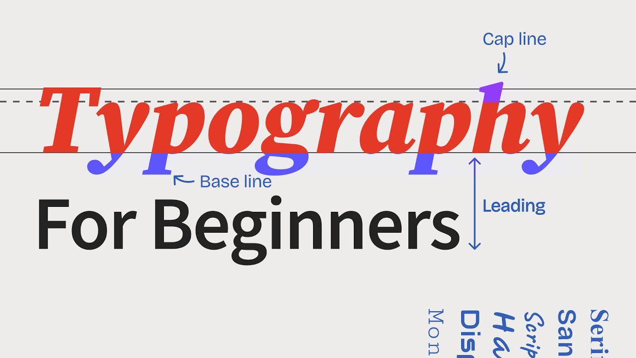
- 📏 **Leading and Line Height**: For better readability, use line heights that are at least 125% of the font size, especially in paragraphs.
- 📐 **Column Width**: Maintain an optimal column width to prevent losing place while reading, with a recommended character limit of 75-100 characters per line.
Q & A
What are the two main groupings of typefaces based on onscreen use?
-The two main groupings of typefaces for onscreen use are display typefaces, which are suitable for headings or logos and make a big statement, and text typefaces, which are designed for readability in large chunks of text at smaller sizes.
Why might a display typeface not be suitable for long paragraphs?
-A display typeface might not be suitable for long paragraphs because they are often more decorative and not designed for easy parsing in large amounts of text, which can make them difficult to read and process.
What is the difference between a typeface and a font family?
-A typeface refers to the design of the type, including the style and shape of the characters, while a font family is a grouping of related fonts that share a common design but may vary in weight, style, or other attributes.
Why is it recommended to limit the number of typefaces used in a design?
-Limiting the number of typefaces in a design helps to avoid overwhelming the viewer's brain, which can get overloaded by constantly switching between too many different fonts, thus improving readability and overall design coherence.
What is a super family in typography?
-A super family in typography refers to a set of different typefaces that are designed to work well together, often including both serif and sans serif versions, and are intended to be used in combination for various text elements in a design.
How does the weight of a typeface affect its legibility in different contexts?
-The weight of a typeface, such as thin or ultra-thin, can affect its legibility. While thin fonts may look great for headings or a few words, they can become tedious and painful to read in paragraphs, suggesting that heavier weights are often more suitable for longer text.
What is the recommended line height for improving readability in paragraphs?
-It is often recommended to use a line height of at least 125 percent of the font size for paragraphs to improve readability, as it provides enough space between lines for the eyes to comfortably move from one line to the next.
Why is column width important in typography and what is the recommended maximum width?
-Column width is important in typography because lines that are too wide can cause readers to lose their place. It is recommended to keep the width to a maximum of seventy-five to a hundred characters per line, including spaces, to maintain legibility.
How does the use of color in typography help differentiate elements on a page?
-The use of color in typography can help differentiate elements on a page, such as headings or code snippets, by providing a visual cue that distinguishes them from the surrounding text, even when the same typeface and weight are used.
What are some resources mentioned for experimenting with fonts and typefaces?
-Adobe Fonts and Google Fonts are mentioned as resources where designers can experiment with different fonts and typefaces to find the right ones for their projects.
Outlines

This section is available to paid users only. Please upgrade to access this part.
Upgrade NowMindmap

This section is available to paid users only. Please upgrade to access this part.
Upgrade NowKeywords

This section is available to paid users only. Please upgrade to access this part.
Upgrade NowHighlights

This section is available to paid users only. Please upgrade to access this part.
Upgrade NowTranscripts

This section is available to paid users only. Please upgrade to access this part.
Upgrade Now5.0 / 5 (0 votes)


