The Truth About Painting Landscapes From Photos
Summary
TLDRIn this instructional video, the artist shares insights on transforming a landscape photo into a painting. They discuss the importance of cropping for composition, emphasizing focal points, and varying shapes for visual interest. The process involves creating a value sketch, simplifying details, and understanding color structures. The artist also explains the application of atmospheric perspective and how to use painting fundamentals to guide decision-making, rather than strictly adhering to the photo. The video concludes with a call to action for viewers to apply these techniques in their own landscape painting endeavors.
Takeaways
- 📸 The video discusses the challenges of painting landscapes from photos, noting that often photos require adjustments to make a good painting.
- 🏞️ The artist shares their process of transforming a photo into a painting, including changes made to the scene for compositional purposes.
- 📐 The importance of cropping a photo to create a dynamic composition is highlighted, focusing on different shapes and sizes for visual interest.
- 🎨 The artist emphasizes the value of simplifying details in the painting to maintain focus on the focal point and avoid distractions.
- 🖌️ A value sketch with three tones is recommended to establish a solid foundation for the painting's composition.
- 🔵 The use of complementary colors is suggested to enhance the painting, such as making the sky more purple to contrast with a yellow building.
- 🌳 The artist advises on simplifying complex areas like trees and foliage to create a sense of depth and distance.
- 🛳️ Understanding the color and value structure of objects, like boats, allows for more creative freedom and accuracy in painting.
- 🌈 Atmospheric perspective is applied by reducing detail and warming colors as objects recede into the distance.
- 🎨 The painting process involves building up value shapes first, focusing on accuracy before adding color and detail.
- 🔗 The artist offers a free color mixing video for those interested in learning more about mixing colors for oil painting.
- 👨🎨 The video concludes with a call to action for viewers to apply the shared techniques to their own landscape painting from photos.
Q & A
Why is a photo often not sufficient by itself to paint from in landscape painting?
-A photo is often not sufficient by itself because it may lack the dynamic elements, compositional balance, and artistic adjustments that can enhance a painting.
What did the artist do to transform the original photo into a more suitable reference for painting?
-The artist cropped the photo to focus on the yellow house as the focal point, adjusted the composition for better balance, and simplified certain areas to enhance the painting's overall structure.
Why did the artist choose to crop the photo in such a way that the yellow house is not in the center?
-The artist wanted the yellow house to be the focal point but not centrally located, to create a more dynamic and interesting composition.
How did the artist use the concept of 'big shapes' to improve the composition of the painting?
-The artist identified and emphasized different big shapes in the scene, such as the boats and trees, to create a sense of variety and depth in the composition.
What is the significance of having different sizes and shapes in the composition according to the artist?
-Having different sizes and shapes adds dynamism to the composition, preventing it from being static and making it more visually interesting.
Can you provide an example of a bad composition as described in the script?
-A bad composition in this context would be one where the house is too close to the center, the boats stop halfway down the middle, and the shapes of the trees and boats are too similar, lacking dynamic differences.
What is the purpose of creating a value sketch with just three values in the artist's process?
-The purpose of a value sketch is to establish an interesting composition with a dark, mid-tone, and light, which forms the foundation of the painting and ensures visual balance.
Why did the artist decide to push complement colors in certain areas of the painting?
-The artist used complement colors to create contrast and visual interest, such as making the sky more purple to complement the yellow building.
What is the benefit of simplifying certain areas in the painting according to the artist's approach?
-Simplifying certain areas helps to reduce distractions from the focal point and also creates a sense of depth by keeping less important areas less detailed.
How does the artist ensure that the boats are constructed with the right color and value structure?
-The artist created a color value formula for the boats based on their observation, which helps in constructing the boats accurately and consistently throughout the painting.
What is atmospheric perspective and how does the artist apply it in the painting?
-Atmospheric perspective is the phenomenon where objects appear cooler and less detailed as they recede into the distance. The artist applied it by reducing detail and making edges softer for boats further away.
Why is it important for the artist to build all the big value shapes up together in the painting process?
-Building all the big value shapes together ensures that the value relationships are correct and consistent across the painting, allowing for accurate comparisons between different areas.
How does the artist use the knowledge of painting fundamentals to guide their decision-making during the painting process?
-The artist relies on their understanding of fundamentals such as value relationships, color theory, and composition to make informed decisions about focal points, contrast, and depth throughout the painting.
Outlines

Cette section est réservée aux utilisateurs payants. Améliorez votre compte pour accéder à cette section.
Améliorer maintenantMindmap

Cette section est réservée aux utilisateurs payants. Améliorez votre compte pour accéder à cette section.
Améliorer maintenantKeywords

Cette section est réservée aux utilisateurs payants. Améliorez votre compte pour accéder à cette section.
Améliorer maintenantHighlights

Cette section est réservée aux utilisateurs payants. Améliorez votre compte pour accéder à cette section.
Améliorer maintenantTranscripts

Cette section est réservée aux utilisateurs payants. Améliorez votre compte pour accéder à cette section.
Améliorer maintenantVoir Plus de Vidéos Connexes
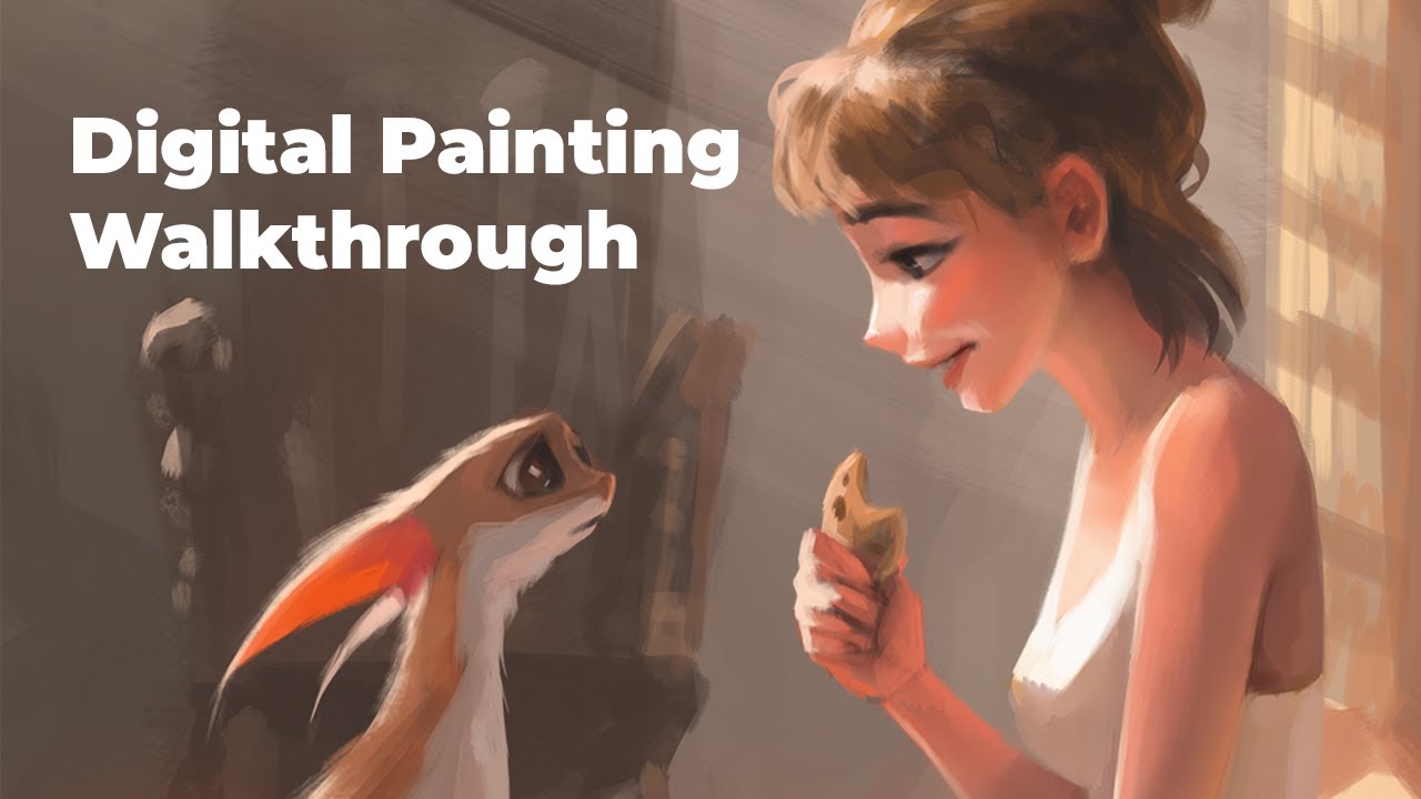
Digital Painting Process Explained
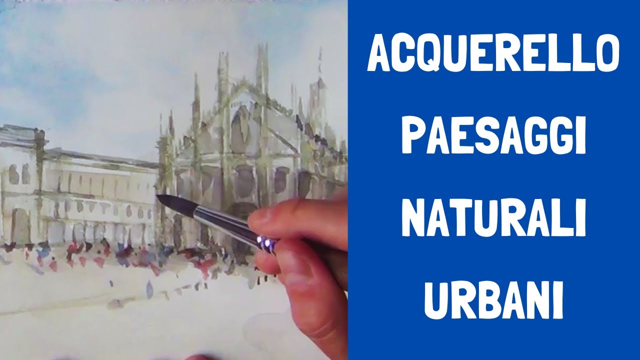
Lezione Intera: Acquarello Facile: Paesaggi Naturali e Urbani - Tecniche Essenziali per Principianti

Berawal dari Hobi Gambar, Bisa jadi Ladang Cuan | Manusia Nusantara tvOne

Questions for artists

Make Money Teaching Paint Parties

Become an advanced painter by learning this one thing
5.0 / 5 (0 votes)
