How to Mix ANY Color - No Talent Method - oil painting instruction
Summary
TLDRThis video guides artists through a structured process for color mixing and value assessment in painting. Starting with a base value (often black), artists are instructed to gradually lighten the color in small steps, ensuring that the value matches the reference photo before judging the color. Through a systematic approach, the video emphasizes using basic color questions to refine hues, highlighting common pitfalls like grayish tones or overuse of orange. It also provides practical advice for working with dark colors like black and adjusting for realistic, natural hues. This method helps artists achieve accurate, dynamic color results in their artwork.
Takeaways
- 😀 Start with the darkest color in your object, typically black, but not always, and gradually lighten it step by step to match the value of the subject in the photograph.
- 😀 Before evaluating the color, ensure that the value of your mixed color matches the value of the photograph, as judging color without matching value leads to inaccurate results.
- 😀 Use a systematic approach: mix a slightly lighter version of the previous color before comparing it to the next step, and repeat this process until you're satisfied with the value.
- 😀 To judge the color, ask six questions: Which color is more yellow, green, blue, purple, red, or orange? This helps to refine the hue you need.
- 😀 Avoid mixing up the color and value check process by constantly switching between the photograph and your palette. Stay focused on getting the value right first.
- 😀 If your mixed color looks too gray, it means it has too much blue. If it's more milky, it's likely too blue as well.
- 😀 When mixing brown tones, remember that brown is essentially a more orange color, so if your color looks too brown, it's too orange.
- 😀 Don’t overcomplicate color descriptions. Stick to basic terms like yellow, green, blue, purple, red, and orange to define hues clearly.
- 😀 When mixing strong colors like orange or blue, avoid mixing too much yellow or blue with black, as this can alter the hue by introducing unintended colors.
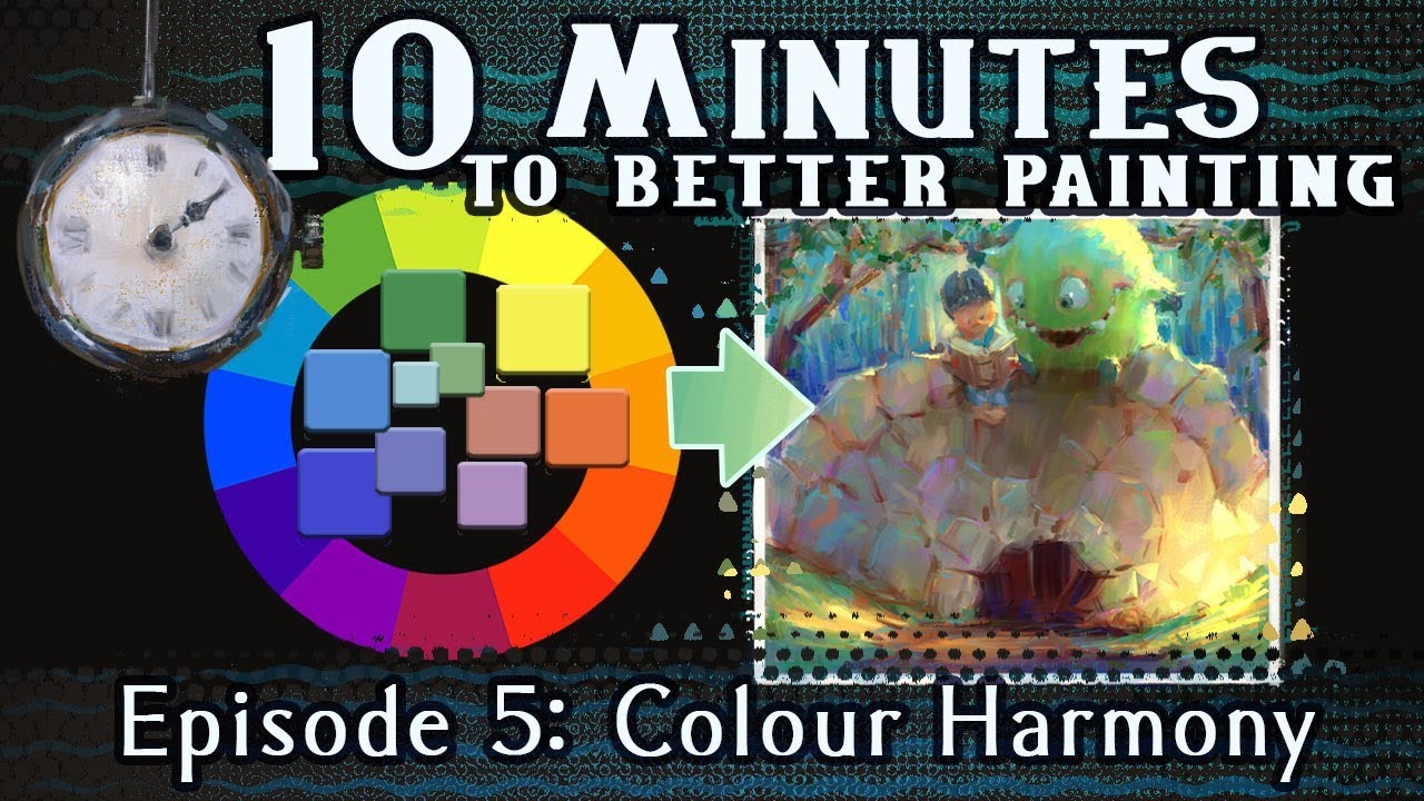
- 😀 If your color is too green, move to the opposite side of the color wheel (red). If it's too blue, use orange; for too yellow, use purple.
- 😀 Always clean your brush thoroughly when switching between color mixes to avoid unintended contamination, especially when transitioning from darker to brighter hues.
Q & A
What is the first step in the color mixing process as described in the video?
-The first step is to choose your color groups based on the object you're painting, such as an apple or a teapot, and start with the darkest color in that object, typically black.
Why is it important to avoid checking the reference photo too early in the workflow?
-It is important to avoid distractions that could break the workflow. You should not check the reference photo until you are satisfied with your color's value because comparing colors prematurely can cause confusion.
What is meant by 'value' when judging color in this process?
-Value refers to the lightness or darkness of the color. It is the first thing to be adjusted, and once you're happy with the value, you can then move on to comparing the color itself.
How can you accurately judge the color after matching the value to the reference photo?
-After placing your color spot on the area where the value matches in the photo, you can judge the color by asking six specific questions: Which one is more yellow, green, blue, purple, red, or orange?
What should you do if you're unsure about your color choice?
-If you're unsure, verbally ask the six color-related questions (e.g., which one is more yellow or more green) in your mind. This helps clarify which direction to adjust your color.
What does it mean if your paint color appears too gray?
-If your paint looks more gray than the reference photo, it means your color is too blue. This is a common mistake when mixing colors.
What is the relationship between brown and orange in this color mixing process?
-In this process, brown is considered the same as orange. If your color appears too brown, it means it is likely too orange.
Why is it important to use only the basic color terms when describing colors?
-Using basic color terms like yellow, green, blue, purple, red, and orange helps avoid confusion and keeps the process simple and clear when comparing and adjusting colors.
How should you handle mixing strong colors like orange or blue?
-For strong colors like orange or blue, it's essential to start with the correct base color. For example, when mixing orange, avoid adding yellow directly to black as it turns green; instead, transition to a base like Burnt Umber. Similarly, for blue, you might need to start with pure blue (e.g., French ultramarine) after using black.
What does it mean if your color appears too 'milky'?
-A 'milky' color indicates that the paint is too blue. Milky colors typically arise when there’s an excess of blue in the mix, making the color appear dull or grayish.
Outlines

Cette section est réservée aux utilisateurs payants. Améliorez votre compte pour accéder à cette section.
Améliorer maintenantMindmap

Cette section est réservée aux utilisateurs payants. Améliorez votre compte pour accéder à cette section.
Améliorer maintenantKeywords

Cette section est réservée aux utilisateurs payants. Améliorez votre compte pour accéder à cette section.
Améliorer maintenantHighlights

Cette section est réservée aux utilisateurs payants. Améliorez votre compte pour accéder à cette section.
Améliorer maintenantTranscripts

Cette section est réservée aux utilisateurs payants. Améliorez votre compte pour accéder à cette section.
Améliorer maintenant5.0 / 5 (0 votes)


