How to design a logo with golden Ratio | Adobe Illustrator Tutorial
Summary
TLDRIn this tutorial, the creator demonstrates how to design a logo using the golden ratio with two methods. The first method involves creating the logo directly in Illustrator using golden circles, while the second uses a sketched concept refined with golden circles. The video provides detailed, step-by-step guidance on constructing shapes, aligning elements, and using the golden ratio for visual harmony. The tutorial concludes by adding gradients and shading to bring the logo to life. Viewers can download the provided files to follow along and create their own golden ratio-based logos.
Takeaways
- 🟢 The golden ratio is a mathematical proportion (1:1.618) used to create aesthetically pleasing designs.
- 🟡 The tutorial explains two methods for designing logos using the golden ratio: one directly in Illustrator with golden circles, and the second based on a sketch.
- 🔵 First, create a golden rectangle by using squares and aligning them, then rotate them to form the grid for golden circles.
- 🔴 The golden circles are extracted by using the ellipse tool, creating perfect circles that align with the squares from the rectangle.
- 🟣 The tutorial demonstrates creating a fish logo by overlapping circles to form the fish's body and tail, but emphasizes that this method isn't ideal.
- 🟠 The recommended method is to sketch a logo concept first, then refine it using golden circles in Illustrator, ensuring geometric precision.
- 🔶 The tutorial uses a turtle logo sketch, showing how to grid it with golden circles, aligning the shell, head, and legs with different circle sizes.
- ⚫ Smart guides and outline views in Illustrator help align the golden circles precisely with the sketch lines.
- 🟡 The shape builder tool is used to remove unnecessary parts of the circles, refining the turtle's outline and merging the shapes.
- 🟢 The tutorial concludes by applying gradient colors and shading techniques to bring the logo to life and make it visually appealing.
Q & A
What is the golden ratio, and why is it important in design?
-The golden ratio, expressed as 1 to 1.618, is a mathematical proportion that has been used throughout history to create visually appealing designs. It helps in achieving a sense of balance and aesthetics in design.
What are the two methods of designing a logo with the golden ratio, as mentioned in the tutorial?
-The two methods are: 1) Designing a logo with golden circles directly in Illustrator, and 2) Designing a logo using golden circles based on a hand-drawn sketch.
How do you create a golden rectangle in Illustrator?
-To create a golden rectangle, you start by drawing a square, duplicating it, and aligning the duplicates. Then, using a series of rotations and additions of smaller squares, you create the full golden rectangle structure.
What are golden circles, and how are they used in logo design?
-Golden circles are circles created using the golden ratio, extracted from the golden rectangle. They are used to guide the proportions and curvature of the logo design.
Why is it important not to resize the golden circles when aligning them with a sketch?
-Resizing the golden circles would disrupt the golden proportions, which are essential for maintaining the visual harmony provided by the golden ratio.
What tools in Illustrator are primarily used in this tutorial for shaping the logo?
-The primary tools mentioned include the Ellipse Tool, Rectangle Tool, Shape Builder Tool, Align window, Smart Guides, and the Pen Tool.
How does the shape builder tool assist in refining the logo design?
-The Shape Builder Tool helps merge and remove unnecessary parts of the shapes, allowing you to create clean and precise outlines for the logo.
What is the role of the sketch in the second method of logo design?
-In the second method, the sketch serves as a guide for the logo design. The sketch's rough geometric shapes are refined using the golden circles for accurate proportions.
How can you add colors to the final logo design?
-Once the logo's outline is completed, colors can be applied using gradients. The tutorial uses the Eyedropper Tool to select gradient colors for different parts of the logo, followed by fine-tuning using the Gradient Tool.
How does the transparency panel enhance the visual quality of the logo?
-The transparency panel allows the designer to change the opacity and blending modes, such as using the Soft Light mode, which enhances the depth and realism of the colors and shadows in the logo.
Outlines

Cette section est réservée aux utilisateurs payants. Améliorez votre compte pour accéder à cette section.
Améliorer maintenantMindmap

Cette section est réservée aux utilisateurs payants. Améliorez votre compte pour accéder à cette section.
Améliorer maintenantKeywords

Cette section est réservée aux utilisateurs payants. Améliorez votre compte pour accéder à cette section.
Améliorer maintenantHighlights

Cette section est réservée aux utilisateurs payants. Améliorez votre compte pour accéder à cette section.
Améliorer maintenantTranscripts

Cette section est réservée aux utilisateurs payants. Améliorez votre compte pour accéder à cette section.
Améliorer maintenantVoir Plus de Vidéos Connexes
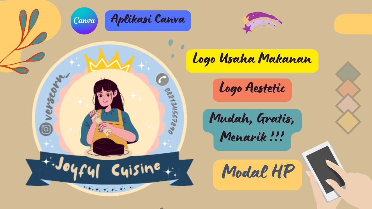
Cara Membuat Logo Usaha Makanan Gratis di Canva || Logo Olshop Aestetic dan Menarik

inkscape tutorial: logo design

Create a Nature Environment using Geometry Nodes | Blender Beginner Tutorial

❌FORGET Shopify! Use this Free AI Website Builder to Create Your Online Store🤑 | Digital Products

Premiere Pro Tutorial: Create Social Proof Ad + Ad Template ✅

Shell Scripting in 20 Minutes - Crash Course | In One Video for Beginners | MPrashant
5.0 / 5 (0 votes)
