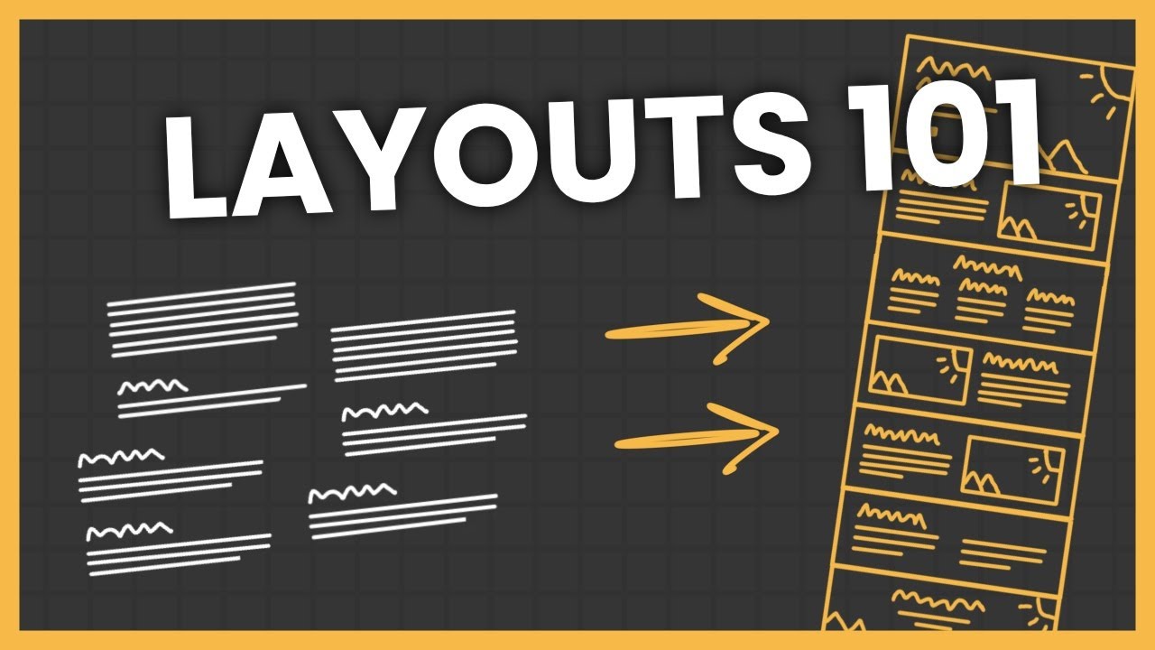
Design Better Than 99% of UI Designers
Summary
TLDRThis video tutorial outlines seven essential guidelines used by top 1% designers to elevate their websites. It covers typography, spacing, grid structures, breaking monotony, color choices, impactful visuals, and attention to detail. By transforming a mediocre site step-by-step, the video demonstrates how to achieve a modern, visually appealing design that stands out, emphasizing the importance of simplicity and minimalism in web design.
Takeaways
- 🔡 Typography is crucial for creating amazing websites, with a focus on the art of text and clean visuals.
- 🔧 Stick to one font for consistency, but if using two, learn from well-designed websites to create a text style guide.
- 📐 Spacing is key in design; use a multiplier based on the relationship between elements to create a visually pleasing layout.
- 📏 Grids help in structuring designs, ensuring visual coherence and alignment of elements.
- 🔄 Breaking the monotony by occasionally breaking grid rules can add interest and surprise to a website's layout.
- 🎨 Colors play a significant role in website aesthetics; use a limited palette with a base, primary, and neutral color for balance.
- 🖌️ Visuals are as important as typography; high-quality images and illustrations can greatly enhance a website's appeal.
- 🌈 Use color with caution, ensuring good contrast and readability, and applying opacities to create hierarchy.
- 📸 Utilize free resources for visuals, such as illustrations and 3D assets, to avoid poor-quality imagery.
- 🏷️ Details make the difference; subtle effects like glows and shadows can elevate the design without overcomplicating it.
- 🛠️ Keep design simple and minimal, avoiding the temptation to over-embellish, to maintain a clean and modern look.
Q & A
What are the seven key guidelines discussed in the video for creating top-tier websites?
-The video does not explicitly list all seven guidelines in the provided transcript, but it covers typography, spacing, grids, breaking monotony, colors, visuals, and details as important aspects of web design.
Why is typography considered essential in web design?
-Typography is essential because it is a fundamental aspect of the visual communication of a website. It can make or break the user experience and is often one of the first elements noticed by visitors.
What is the recommended approach for using multiple fonts on a website?
-The recommended approach is to stick with one font, but if two are necessary, one should find an existing well-designed website using two fonts, inspect the text elements to understand the font properties, and then apply these properties in their own design tool.
How can one determine the appropriate spacing in a web design?
-Appropriate spacing can be determined by considering the relationship between elements. Elements with a closer relationship should have less space between them, and a multiplier can be used to determine the space between elements with a more distant relationship.
What is the significance of using grids in web design?
-Grids provide a visual structure to the design, making it more aesthetically pleasing and organized. They help align elements and create a consistent layout that is easy to navigate.
Why is it important to break the monotony in a web design?
-Breaking the monotony adds interest and surprise to the design, which can enhance user engagement. It helps to create a dynamic and less predictable visual experience.
How should colors be used in web design to ensure they enhance rather than detract from the website?
-Colors should be used carefully with a clear hierarchy and good contrast. A foolproof system is to use three colors: a base color for the background, a primary color for calls to action and details, and a neutral color for text elements.
What role do visuals play in web design, and how can they be improved?
-Visuals are crucial as they can convey the brand's message and aesthetic. They can be improved by using high-quality images, illustrations, and 3D assets that align with the website's overall theme and color scheme.
What are some common pitfalls to avoid when adding details to a web design?
-Common pitfalls include overdoing effects, adding too many elements, and not maintaining a simple and minimal design. It's important to keep the design clean and not let details distract from the overall user experience.
How can the use of opacities in text elements create a hierarchy in web design?
-Using different opacities for text elements can create a visual hierarchy, making it easier for users to distinguish between headings, subheadings, and body text. For example, using 80% opacity for larger text and 70-60% for smaller text can help establish this hierarchy.
What is the importance of maintaining a good reading experience in web design?
-A good reading experience is crucial for user engagement and comprehension. It involves ensuring that text content does not span too wide, which can make reading difficult, and that there is adequate spacing and padding for readability.
How can one use the Framer tool to build custom websites quickly?
-The video suggests that Framer allows for the quick creation of custom websites by applying the discussed design guidelines. It implies that using Framer can streamline the process of web design, though specific steps are not provided in the transcript.
Outlines

Esta sección está disponible solo para usuarios con suscripción. Por favor, mejora tu plan para acceder a esta parte.
Mejorar ahoraMindmap

Esta sección está disponible solo para usuarios con suscripción. Por favor, mejora tu plan para acceder a esta parte.
Mejorar ahoraKeywords

Esta sección está disponible solo para usuarios con suscripción. Por favor, mejora tu plan para acceder a esta parte.
Mejorar ahoraHighlights

Esta sección está disponible solo para usuarios con suscripción. Por favor, mejora tu plan para acceder a esta parte.
Mejorar ahoraTranscripts

Esta sección está disponible solo para usuarios con suscripción. Por favor, mejora tu plan para acceder a esta parte.
Mejorar ahoraVer Más Videos Relacionados
5.0 / 5 (0 votes)


