ETC1000 Topic 1a
Summary
TLDRThis video script delves into the analysis of categorical data in business statistics, focusing on the use of pivot tables in Excel to explore and visualize data. It discusses the importance of understanding different data types, particularly categorical data, and demonstrates how to create frequency distributions and bar charts to identify trends and patterns. The script also introduces the concept of independence, aiming to determine if there's a connection between medical conditions and exercise levels, using percentages to better communicate insights.
Takeaways
- 📊 The script introduces the concept of categorical data, which is non-numerical and is often the original form of data collected before analysis.
- 🔍 The importance of data visualization is emphasized as a tool to make sense of large datasets and to identify patterns and insights.
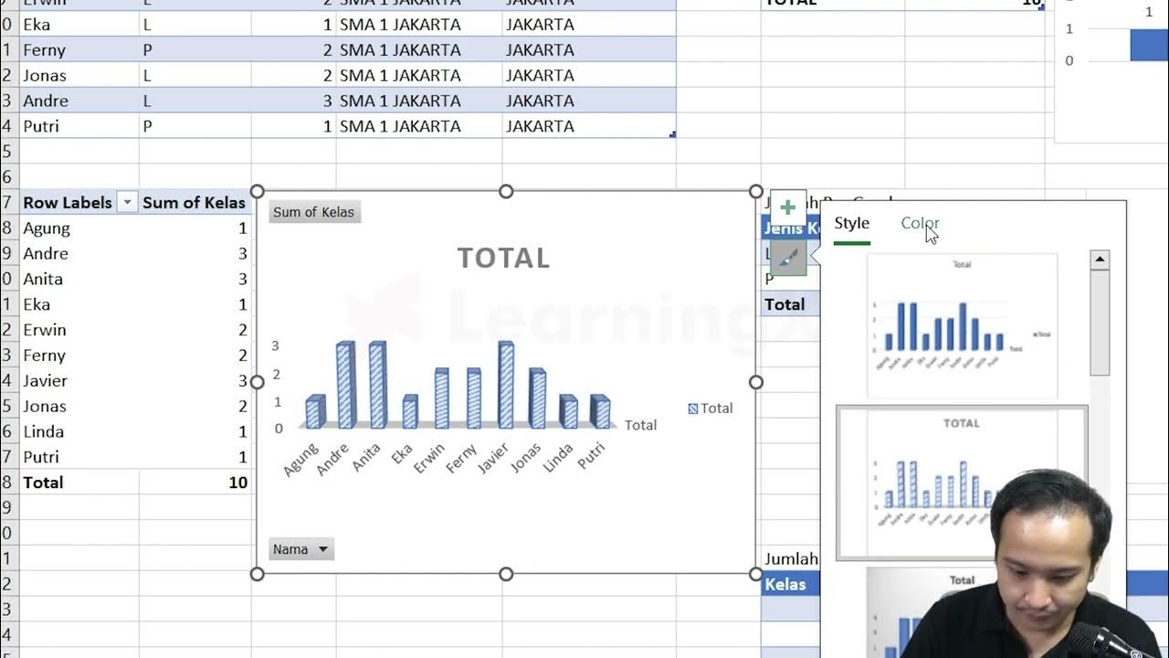
- 📈 The speaker demonstrates the use of pivot tables in Excel as a powerful tool for analyzing and presenting data, particularly for categorical data.
- 📝 The script outlines objectives for the business statistics unit, which include understanding data types, using pivot tables, and grasping the basics of probability distributions.
- 📚 The concept of independence in data is introduced, which is about determining whether events or data points are connected or operate separately.
- 🏥 The example dataset provided in the script pertains to people's primary medical conditions and their exercise habits, aiming to find connections between health and activity levels.
- 📊 The speaker explains how to create a frequency distribution using a pivot table to summarize the most common medical conditions from the dataset.
- 📊 Bar charts and pie charts are used to visually represent the data, with discussions on their effectiveness and appropriateness for different types of data.
- 📈 The script discusses the use of percentages to present data more meaningfully, such as showing the proportion of the population affected by certain conditions.
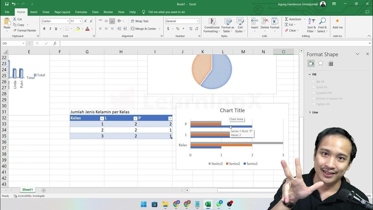
- 🔑 The concept of a contingency table is introduced to explore the relationship between two categorical variables, in this case, medical conditions and exercise levels.
- 🔑 The script highlights the significance of presenting data as percentages of rows or columns depending on the hypothesis being tested, to better understand potential relationships or causations.
Q & A
What is the main focus of the first topic in the business statistics unit?
-The main focus is on categorical data, which is a type of data that is not numerical and requires different methods of analysis and presentation.
Why is it important to understand categorical data?
-It's important because a lot of interesting focal data in the world is not numerical, and understanding categorical data allows us to analyze and present insights from a variety of data forms.
What is a pivot table in Excel, and why is it useful for analyzing data?
-A pivot table is a powerful tool in Excel used for summarizing and analyzing data. It allows users to rearrange and summarize large datasets to identify patterns and trends.
How does the concept of a probability distribution relate to pivot tables?
-The pivot table is an example of a probability distribution as it can show the frequency of different outcomes, which is a fundamental concept in probability distributions.
What is the difference between numerical (quantitative) data and categorical (qualitative) data?
-Numerical data consists of numerical values like counts or measurements, while categorical data consists of labels or categories that cannot be numerically measured.
How does the script use a pivot table to analyze medical conditions and exercise habits from a dataset?
-The script uses a pivot table to create a frequency distribution of medical conditions and exercise habits, allowing for easy visualization and comparison of the data.
What is a bar chart, and how can it be used to visualize data from a pivot table?
-A bar chart is a graphical representation where data values are represented by the length or height of bars. It can be used to visualize data from a pivot table by showing the frequency or percentage of categories side by side.
Why might a pie chart be less effective than a bar chart for visualizing certain data?
-A pie chart might be less effective because it can be difficult to accurately compare the sizes of different slices, especially when the differences are small or the number of categories is large.
What is a contingency table, and how does it differ from a simple pivot table?
-A contingency table is a type of pivot table that includes two dimensions, allowing for the analysis of relationships between two categorical variables, whereas a simple pivot table might only analyze one dimension.
How can analyzing the percentage of row versus percentage of column in a pivot table provide different insights?
-Analyzing the percentage of row can show how a particular category is distributed within different groups, while analyzing the percentage of column can show the proportion of each category within a specific group, which can be useful for understanding potential causal relationships.
What is the significance of comparing the percentage of exercise done by people with different medical conditions?
-Comparing the percentage of exercise done by people with different medical conditions can provide insights into whether exercise might be a contributing factor to the prevalence of these conditions, potentially informing public health strategies.
Outlines

Esta sección está disponible solo para usuarios con suscripción. Por favor, mejora tu plan para acceder a esta parte.
Mejorar ahoraMindmap

Esta sección está disponible solo para usuarios con suscripción. Por favor, mejora tu plan para acceder a esta parte.
Mejorar ahoraKeywords

Esta sección está disponible solo para usuarios con suscripción. Por favor, mejora tu plan para acceder a esta parte.
Mejorar ahoraHighlights

Esta sección está disponible solo para usuarios con suscripción. Por favor, mejora tu plan para acceder a esta parte.
Mejorar ahoraTranscripts

Esta sección está disponible solo para usuarios con suscripción. Por favor, mejora tu plan para acceder a esta parte.
Mejorar ahoraVer Más Videos Relacionados

Master Data Analysis on Excel in Just 10 Minutes
Chapter 5 - Tutorial Analisa Data Part 3 (Pivot Table) | Informatika Booster

Variables and Types of Variables | Statistics Tutorial | MarinStatsLectures

How to Analyze Data with Pivot Tables in Excel
Chapter 5 - Analisa Data melalui Excel | Informatika Booster

Pivot Tables in Excel | Excel Tutorials for Beginners
5.0 / 5 (0 votes)
