Basic Color Theory & Color Harmonies
Summary
TLDRThis video provides an introduction to color theory, focusing on the creation of a color wheel. It explains the primary colors (red, yellow, blue), secondary colors (orange, green, violet), and tertiary colors (like red-orange and yellow-green). The video also discusses color harmonies, including warm vs. cool colors, and the application of monochromatic, analogous, and complementary color schemes. Viewers will learn how to mix colors, adjust their intensity with complementary pairs, and understand color temperature to create visually pleasing combinations.
Takeaways
- 😀 Primary colors (red, yellow, and blue) are the foundation of all other colors and cannot be made by mixing other colors.
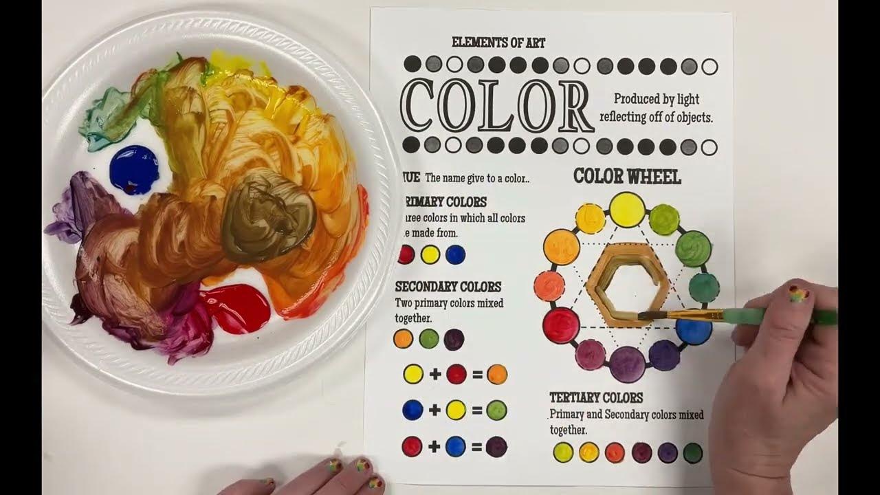
- 😀 Secondary colors (orange, green, and violet) are created by mixing two primary colors.
- 😀 Tertiary colors (red-orange, yellow-orange, etc.) are made by mixing a primary color with an adjacent secondary color.
- 😀 The names of tertiary colors are always in the order: primary first, then secondary (e.g., red-orange, yellow-green).
- 😀 Warm colors (reds, oranges, yellows) are associated with heat and energy, while cool colors (blues, greens, violets) are associated with calm and relaxation.
- 😀 The color wheel can be divided into warm and cool halves, with each half containing six colors.
- 😀 Monochromatic color schemes use variations of a single hue, including tints (lightened with white) and shades (darkened with black).
- 😀 Analogous color schemes consist of colors that are next to each other on the color wheel, creating a harmonious and cohesive palette.
- 😀 Complementary colors are opposites on the color wheel (e.g., red and green, blue and orange), and they create contrast when used together.
- 😀 Mixing complementary colors can neutralize them, creating more muted tones like brown or grey.
- 😀 Understanding color schemes and harmonies helps create visually pleasing and effective designs by grouping colors that work well together.
Q & A
What are primary colors, and why are they called 'primary'?
-Primary colors are red, yellow, and blue. They are called 'primary' because they cannot be created by mixing other colors, making them the foundational colors from which all other colors on the color wheel are derived.
What are secondary colors, and how are they formed?
-Secondary colors are orange, green, and violet. They are formed by mixing two primary colors. For example, mixing red and yellow gives orange, yellow and blue make green, and red and blue combine to create violet.
Why is the color 'violet' used instead of 'purple' in color theory?
-In color theory, the term 'violet' is used because it accurately describes a specific color on the spectrum, as opposed to 'purple,' which is often a less precise term.
What are tertiary colors, and how are they created?
-Tertiary colors, also known as intermediate colors, are created by mixing a primary color with its adjacent secondary color. Examples include red-orange, yellow-orange, yellow-green, and blue-violet. They are always named with the primary color first.
What is the difference between a 'hue', 'tint', and 'shade'?
-A 'hue' is a pure color straight from the color wheel, without any black, white, or grey added. A 'tint' is a hue mixed with white, making it lighter, while a 'shade' is a hue mixed with black, making it darker.
What are warm and cool colors, and how do they relate to the color wheel?
-Warm colors are those associated with heat, like red, orange, and yellow. Cool colors, like blue, green, and violet, are often linked to cold or refreshing sensations. These colors divide the color wheel into two halves, with warm colors on one side and cool colors on the other.
What is a monochromatic color scheme?
-A monochromatic color scheme uses variations of one color, including its tints and shades. This means the base hue is combined with white to make lighter tones and with black to create darker tones, resulting in a harmonious and cohesive color scheme.
What are analogous colors, and how are they used in design?
-Analogous colors are colors that sit next to each other on the color wheel, typically 3-4 colors that are closely related. These colors create a harmonious and visually appealing palette, such as using red, red-orange, and orange together.
What are complementary colors, and why are they important in design?
-Complementary colors are colors that are opposite each other on the color wheel, such as red and green or blue and orange. These pairs create strong contrast and are often used to make certain colors stand out or to neutralize a color when mixed.
How do complementary colors affect the intensity of a color?
-When complementary colors are mixed, they tend to neutralize each other, making the resulting color less intense. For example, adding green to red will make the red appear more muted and less vibrant.
Outlines

Esta sección está disponible solo para usuarios con suscripción. Por favor, mejora tu plan para acceder a esta parte.
Mejorar ahoraMindmap

Esta sección está disponible solo para usuarios con suscripción. Por favor, mejora tu plan para acceder a esta parte.
Mejorar ahoraKeywords

Esta sección está disponible solo para usuarios con suscripción. Por favor, mejora tu plan para acceder a esta parte.
Mejorar ahoraHighlights

Esta sección está disponible solo para usuarios con suscripción. Por favor, mejora tu plan para acceder a esta parte.
Mejorar ahoraTranscripts

Esta sección está disponible solo para usuarios con suscripción. Por favor, mejora tu plan para acceder a esta parte.
Mejorar ahoraVer Más Videos Relacionados

How to Color Wheel with Primary, Secondary and Tertiary colors

How to use Color Theory | Graphic Design Basic

COLOR THEORY BASICS: Use the Color Wheel & Color Harmonies to Choose Colors that Work Well Together

07 | How to use colors in Graphic Design? | Color Theory 101 for Beginner Graphic Designers

PowerPoint Ideas: Color Theory Basics That You Can Use for Better Slides

Theories Of Acid Base Indicators | Ostwald's Theory | Quinonoid Theory | Pharmaceutical Analysis
5.0 / 5 (0 votes)
