10 Rules of Good UI Design to Follow

Elegant Themes
9 Jan 201905:05

Summary

TLDRThis video outlines ten essential rules for effective UI design in web projects. Key points include making everything accessible, maintaining consistency, ensuring clarity, providing feedback, using recognition over recall, considering user interaction, adhering to design standards, establishing an elemental hierarchy, keeping things simple, and ensuring users feel free and in control. These guidelines aim to enhance user experience and accessibility.

Takeaways

  • 🔍 **Accessibility**: Ensure everything the user needs is readily accessible to prevent frustration and increase engagement.
  • 🔄 **Consistency**: Maintain consistent menu placement and design elements across pages to provide a familiar user experience.
  • 📊 **Clarity**: Design interfaces that are clear and straightforward to guide users without causing confusion.
  • 🔔 **Feedback**: Provide immediate feedback for user actions to reassure them that their inputs have been recognized.
  • 👀 **Recognition**: Use intuitive design elements like recognizable icons to help users navigate without needing to recall information.
  • 🤔 **Interaction**: Design the UI to match natural user interactions to avoid confusion and enhance usability.
  • 📏 **Design Standards**: Adhere to common design standards to make the UI intuitive and easy to understand for users.
  • 📈 **Elemental Hierarchy**: Prioritize the most important functions and use white space effectively to guide users naturally.
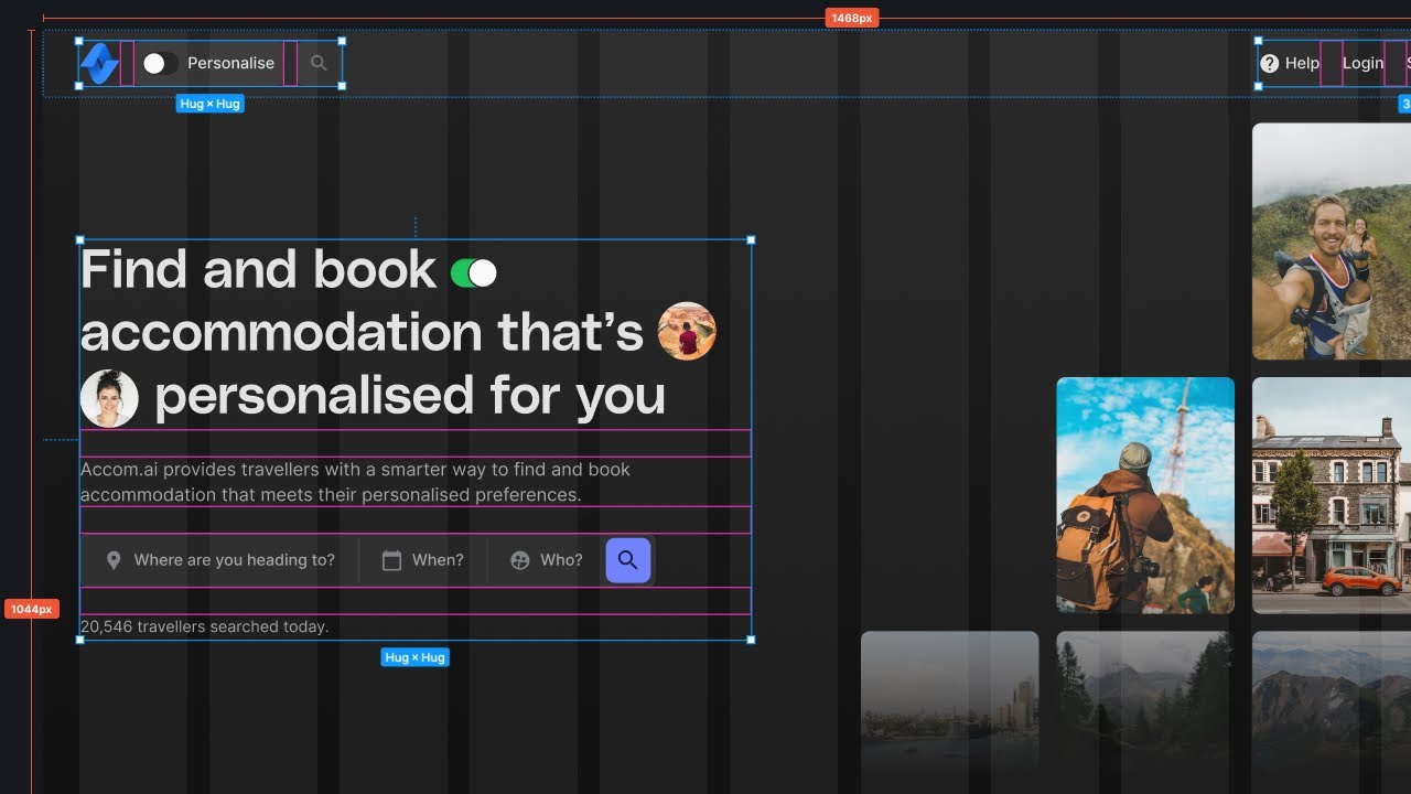
  • 🛠 **Simplicity**: Keep the design simple and focused on essential elements to reduce friction and enhance user experience.
  • 🌐 **User Control**: Design the UI to give users a sense of freedom and control, allowing them to easily reverse actions if needed.

Q & A

  • What is the first rule of good UI design mentioned in the video?

    -The first rule is to make everything the user needs readily accessible. This includes design tools, inventory, spreadsheets, etc., ensuring users can find what they want without leaving the software.

  • How does the video suggest maintaining consistency in UI design?

    -Consistency is maintained by keeping the menu in the same place on every page, not rearranging menu items, and ensuring fonts and designs are consistent from page to page. The UI should also be appropriate for the platform, like different needs for desktop and mobile sites.

  • What does clarity mean in the context of UI design?

    -Clarity in UI design means that users always know what to do and are not confused about the purpose of any site or page. It can be achieved by moving from one step to another on different pages, rather than having a long scrolling page.

  • Why is feedback important in UI design?

    -Feedback is important because it lets users know that their action has been registered. This can be through loading icons, pop-ups indicating success, or other visual cues, which reduce frustration and confusion.

  • What does the video suggest for using recognition in UI design?

    -The video suggests using recognizable icons and intuitive interfaces so that users can recognize elements of the site without having to recall information. This streamlines the interface and makes it more user-friendly.

  • How should UI designers consider user interaction?

    -UI designers should consider how users will interact with the product by choosing one movement and sticking with it. For example, if a button is designed to be pushed, it should function as a button and not leave the user waiting for a response.

  • Why is it important to follow design standards in UI design?

    -Following design standards is important because people are familiar with certain icons and placements, like the hamburger icon for mobile menus or the location of search bars. Deviating from these standards can make the design hard to use.

  • What role does elemental hierarchy play in UI design?

    -Elemental hierarchy is important because it ensures that the most important functions are at the top of their respective pages, guiding users down the page organically. It also involves using white space to prevent clutter and keep the user focused on the page's purpose.

  • Why should UI designers keep things simple?

    -UI designers should keep things simple to make the user experience as frictionless as possible. This means cutting out anything that's not absolutely necessary, like in the example of contact forms where one is much easier to fill out than the other.

  • How can UI design make users feel free and in control?

    -UI design can make users feel free and in control by ensuring that actions needed are located near what they want to act on, and by providing features like cancel buttons or undo functions, which allow users to revert actions and feel that experimentation is okay.

Outlines

00:00

🛠️ 10 Rules of Good UI Design

This paragraph outlines ten key principles for creating user-friendly interfaces in web design projects. It emphasizes making everything accessible, maintaining consistency in layout and design, ensuring clarity, providing feedback, using recognition over recall, considering user interaction, following design standards, establishing elemental hierarchy, keeping things simple, and keeping users in control. Each rule is illustrated with examples, such as using Divi tabs for organization, WordPress admin toolbar for quick access, and clear navigation through checkout processes. The paragraph aims to guide designers in creating interfaces that are intuitive, accessible, and efficient.

05:02

👋 See You Next Time

The second paragraph serves as a brief conclusion to the video, signaling the end of the presentation of the 10 UI design rules. It invites viewers to look forward to the next video, suggesting a series of content where more insights on UI design might be shared.

Mindmap

Keywords

💡Accessibility

Accessibility in UI design refers to ensuring that all users can interact with a website or application, regardless of any disabilities they may have. In the video, it's emphasized that everything the user needs should be readily accessible, such as design tools in web design apps or inventory in video games. An example given is the use of Divi tabs to organize tools, making the software more user-friendly and less likely to cause users to leave due to frustration.

💡Consistency

Consistency in UI design means maintaining uniformity in the layout, menu items, fonts, and design elements across different pages of a website. The video script mentions that having a menu at the top of one page and at the bottom of another can confuse users. Consistency helps users navigate and interact with the site intuitively, as they can anticipate where to find features and information.

💡Clarity

Clarity in UI design is about making sure that the purpose of a site or page is immediately understandable, with no clutter that might confuse users. The video suggests that clarity can be achieved by guiding users from one step to another on different pages, such as a checkout process that moves from a product page to a shopping cart and then to a checkout page, similar to how Amazon structures its process.

💡Feedback

Feedback in UI design is any kind of response or indication that the system provides to the user after an action is taken, such as a button press or file upload. The video script illustrates this with examples like loading icons and pop-ups that confirm successful actions, which are crucial for preventing user frustration and confusion by keeping them informed about what is happening.

💡Recognition

Recognition in UI design is about creating an interface where users can quickly identify and understand elements without needing to recall how to use them from memory. The video mentions using recognizable icons and well-placed messaging as ways to streamline the interface and make it intuitive. This helps in reducing the cognitive load on users and makes the interaction more seamless.

💡Interaction

Interaction in UI design pertains to how users engage with the interface elements, such as buttons, links, and menus. The video script warns against designs that are counterintuitive, like a button that looks clickable but isn't, which can lead to user frustration. It suggests picking one type of movement or interaction and sticking with it for a consistent user experience.

💡Design Standards

Design standards in UI refer to widely accepted practices and symbols that users are familiar with, such as question marks for help or hamburger icons for mobile menus. The video script advises following these standards to ensure that users can easily find and use features without having to learn new systems, as it aligns with their existing knowledge and expectations.

💡Elemental Hierarchy

Elemental hierarchy in UI design is the organization of elements on a page based on their importance, with the most critical functions being most prominent. The video script explains that this hierarchy can guide users down the page naturally. It also mentions the importance of using white space to avoid clutter, which can distract from the page's purpose and impede user progress.

💡Simplicity

Simplicity in UI design is about making the interface as straightforward and easy to use as possible. The video provides an example of two contact forms, one of which is simple and quick to fill out, while the other is more complex and thus more of a headache for the user. Simplifying the UI reduces friction and makes the user experience more pleasant.

💡Control

Control in UI design means giving users the feeling that they are in charge of their actions within the interface. The video script discusses the importance of placing action buttons, like 'Edit', near the object they affect and providing options to cancel or undo actions. This empowers users and makes them feel more comfortable experimenting with the interface.

Highlights

Make everything the user needs readily accessible

Use Divi tabs to organize tools for web design apps

WordPress admin toolbar for quick access to post editor and plugin settings

Include support button and video tutorials for accessibility

Be consistent with menu placement and design elements across pages

Ensure UI is appropriate for the platform (desktop vs mobile)

Clarity means users always know what to do without confusion

Use separate pages for different steps in a process for clarity

Provide feedback for user actions like button presses and file uploads

Use recognizable icons and intuitive interface design

Choose consistent interaction methods to avoid user confusion

Follow design standards for familiar user experience

Establish elemental hierarchy to guide users through the UI

Use white space effectively to avoid clutter and guide user focus

Keep UI simple and minimize non-essential elements

Ensure users feel in control and can easily revert actions

Place action buttons near their related content for context

Add undo and cancel features to give users a sense of freedom

Transcripts

play00:00

in today's video we're gonna go over ten

play00:01

rules of good UI design to follow on

play00:04

every web design project number one make

play00:07

everything the user needs readily

play00:09

accessible whether it's a series of

play00:11

design tools for web design apps the

play00:13

inventory for character in a video game

play00:14

a spreadsheet or anything else if the

play00:17

user can't find what they want they

play00:19

bounce off your software in Divi tabs

play00:21

are used to organize all the tools you

play00:23

need if you use WordPress the admin

play00:25

toolbar gives you the ability to quickly

play00:27

get to the post editor team customize

play00:29

their plugin settings and so on another

play00:31

example is help options and every Divi

play00:34

module we have the support button

play00:35

available everywhere on top of that our

play00:37

hope window pops up with a video

play00:39

tutorial on whatever feature you're

play00:41

working with by including this in module

play00:43

Divi becomes far more accessible and

play00:45

less frustrating number two be

play00:47

consistent don't have the menu on top of

play00:49

one page and at the bottom of another

play00:51

don't rearrange menu items every time it

play00:53

loads make sure that your users know

play00:55

where things are on your site

play00:57

consistency also includes your fonts and

play00:59

designs from page to page additionally

play01:02

you should make sure that your UI is

play01:03

proper for your platform desktop sites

play01:06

have different needs than mobile sites

play01:08

for menus galleries and even product

play01:10

checkout number three be clear clarity

play01:13

means that you want your users to know

play01:14

what to do at all times people are not

play01:17

confused about the purpose of any site

play01:19

or page because there is no clutter one

play01:22

way to achieve clarity is to move from

play01:24

one step to another on different pages

play01:26

instead of having a checkout process

play01:28

scroll down the page have your users

play01:30

navigate from a product page to a

play01:33

shopping cart page to a checkout page

play01:35

etc just like Amazon they will know

play01:37

exactly where they stand in the process

play01:39

eliminating any uncertainty number four

play01:42

give feedback the last thing that users

play01:44

want is to not understand what is going

play01:47

on if they press a button provide an

play01:49

indication that the button was pressed

play01:50

loading icons provide feedback without

play01:53

having to say it if you allow users to

play01:55

upload files give an indication of time

play01:57

remaining providing a pop-up or modal

play01:59

that tells them their action was a

play02:01

success reduces frustration and

play02:03

confusion number five use recognition

play02:06

not recall you want your users to

play02:08

recognize everything about your site

play02:09

when they see it you shouldn't have to

play02:11

think

play02:11

about it and recall the information more

play02:14

than anything you are streamlining your

play02:15

interface so that every part is

play02:17

intuitive and moves from one point to

play02:19

another this can be done by using

play02:21

recognizable icons you may also be able

play02:24

to accomplish this through well-placed

play02:26

messaging that reminds your users what

play02:28

on your site does what number six choose

play02:30

how people interact first you know

play02:33

what's the worst pushing on a pulled

play02:34

door especially when you just pushed on

play02:36

a previous one to get to that one that

play02:39

buildings designer made the user

play02:40

interface inconsistent so you had no

play02:42

clue how to do what you needed to do

play02:44

what about pressing something that looks

play02:46

like a button that isn't but waiting for

play02:49

a response anyway

play02:50

well that's because those designers

play02:52

didn't take into consideration how their

play02:54

users were going to interact with their

play02:56

product so when you're designing your UI

play02:58

pick one movement and stick with it

play03:00

number seven follow design standards

play03:03

people know that question marks indicate

play03:05

help so don't use an exclamation point

play03:07

if you want users to find your mobile

play03:09

menu use the hamburger icon not a grid

play03:12

think about search bars they tend to be

play03:14

in similar places on most sites so if

play03:17

you had put it in a hard-to-find spot

play03:19

users won't know where to look there's

play03:21

nothing wrong with thinking outside of

play03:23

the box but that shouldn't mean the

play03:25

design is hard to use number eight

play03:27

elemental hierarchy matters you want to

play03:30

make sure that the most important

play03:31

functions are at the top of their

play03:32

respective pages this kind of hierarchy

play03:35

can lead the user down the page

play03:36

organically making use of white space is

play03:39

also important as clutter can stall user

play03:41

progress and draw the eye away from the

play03:43

purpose of the page clean lines lots of

play03:46

space and well-defined elements can

play03:48

visually indicate to your users how to

play03:50

move through your UI without any

play03:51

documentation or annotation number nine

play03:54

keep things simple take a look at these

play03:56

two examples both are contact forms to

play03:58

make a request one of these is no

play04:00

problem to fill out while the other is

play04:02

just a bit more of a headache your job

play04:04

is to make things as frictionless for

play04:06

the user as possible and one of the best

play04:08

ways to do that is to cut out anything

play04:10

that's not absolutely necessary number

play04:12

10

play04:13

keep your users free and in control the

play04:15

last thing you want to do with your UI

play04:17

is to make them feel confined or

play04:19

restricted by your design there are two

play04:21

parts to this rule context and

play04:23

permission first whatever acts

play04:24

the user needs to take should be located

play04:27

near what they want to act on if they

play04:29

need to edit a post the Edit button

play04:30

should be near the save published submit

play04:33

preview buttons additionally your UI

play04:35

should always make the user feel as

play04:37

though they can get out of or revert any

play04:39

action they take doing this can be as

play04:41

simple as adding a cancel button to

play04:42

every page of your ecommerce checkout or

play04:45

maybe it's just an undo feature so they

play04:46

feel that experimentation is okay so

play04:49

there you go

play04:50

those were 10 rules of good UI design do

play04:53

you have any rules of good UI design

play04:54

that you always follow let us know in

play04:56

the comments section below if you

play04:58

enjoyed this video be sure to give it a

play04:59

like and subscribe for more content with

play05:02

that said thanks for watching and we'll

play05:03

see you in the next one

Rate This

5.0 / 5 (0 votes)

Etiquetas Relacionadas
UI DesignWeb DesignUser ExperienceAccessibilityConsistencyClarityFeedbackRecognitionInteractionDesign Standards
¿Necesitas un resumen en inglés?