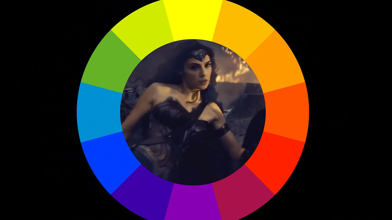
Understanding Color
Summary
TLDRThis video script delves into the art of color usage in art, emphasizing its impact on mood, atmosphere, and storytelling. It outlines three core concepts: the importance of color, understanding saturation and value, and exploring color harmonies. The script educates on how to manipulate colors to guide the viewer's attention, alter scenes' moods, and create compelling color schemes. It also discusses the practical application of six common color harmonies, from monochromatic to double complementary, providing examples and advice on how to avoid common pitfalls. The speaker encourages artists to experiment with colors, learn from practice, and enjoy the creative process.
Takeaways
- 🎨 **Color's Impact**: Colors are crucial in art as they can guide the viewer's attention, set the mood, and enhance storytelling.
- 👀 **Viewer Guidance**: Correct use of color can direct the viewer's eyes to focal points, while incorrect use may cause confusion or discomfort.
- 🖌️ **Saturation and Value**: Saturation (color intensity) and value (color brightness) are key in creating appealing color schemes and should be adjusted for different effects.
- 🌈 **Color Harmony**: Understanding color harmonies helps in creating visually pleasing artwork and can be achieved through various schemes like monochromatic, analogous, and triadic.
- 📈 **Mood Alteration**: Colors can dramatically change the perceived mood of a scene, from joyous and vibrant to sad and desaturated.
- 🌟 **Highlighting Importance**: Bright, saturated colors can be used to highlight important elements or guide the viewer's eye through a composition.
- 🎭 **Storytelling**: Historically, color has been used to signify power or importance, and in modern media, to adjust the narrative's tone.
- 🌌 **Photorealism**: In photorealistic art, color accuracy is vital; a grayscale conversion can reveal how 'real' an image appears.
- 🎭 **Cartoon Usage**: In cartoons, bright and saturated colors are often used to emphasize the unrealistic or surreal nature of the scene.
- 🧩 **Compositional Tool**: Colors can be strategically placed to create a visual path or anchor points within a composition, enhancing its overall impact.
Q & A
What are the three core concepts discussed in the video for understanding color?
-The three core concepts discussed in the video are the importance of color, saturation and value, and color harmonies.
How can color guide the viewer's eyes in an artwork?
-Color can guide the viewer's eyes by highlighting what's important, using color to tell a story, or changing the mood of a scene.
What is the impact of using incorrect colors in a scene?
-Using incorrect colors can make the viewer feel lost, nauseous, or irritated, and it can also make the scene look fake in terms of photorealism.
What is saturation in the context of color theory?
-Saturation is the intensity or purity of a color, and it plays a significant role in creating visually appealing or unappealing color work.
What does value refer to in color theory?
-Value refers to the brightness or darkness of a color, which can be adjusted to create different moods or effects.
How can adjusting saturation and value change the appearance of a color?
-Adjusting saturation and value can create a variety of different shades from a single raw color, affecting the overall look and feel of an artwork.
Why is it important to not overuse highly saturated colors in a scene?
-Overusing highly saturated colors can make an image look fake and provide no resting place for the viewer's eyes, leading to irritation.
How can color be used to tell a story or change the mood in a scene?
-Color can be used to focus attention on a character, signify power, or indicate a change in mood, such as from happiness to sadness.
What are the six popular color harmonies discussed in the video?
-The six color harmonies are monochromatic, analogous, triadic, complementary, split complementary, and double complementary.
What is the monochromatic color harmony and how can it be used?
-Monochromatic harmony involves using only one color, which can be used to focus the viewer on details or create a striking atmospheric effect.
How can color harmonies help in creating a composition?
-Color harmonies can guide the viewer's eyes through a scene, highlight areas of interest, and create a visually pleasing and balanced composition.
Outlines

Esta sección está disponible solo para usuarios con suscripción. Por favor, mejora tu plan para acceder a esta parte.
Mejorar ahoraMindmap

Esta sección está disponible solo para usuarios con suscripción. Por favor, mejora tu plan para acceder a esta parte.
Mejorar ahoraKeywords

Esta sección está disponible solo para usuarios con suscripción. Por favor, mejora tu plan para acceder a esta parte.
Mejorar ahoraHighlights

Esta sección está disponible solo para usuarios con suscripción. Por favor, mejora tu plan para acceder a esta parte.
Mejorar ahoraTranscripts

Esta sección está disponible solo para usuarios con suscripción. Por favor, mejora tu plan para acceder a esta parte.
Mejorar ahoraVer Más Videos Relacionados
5.0 / 5 (0 votes)


