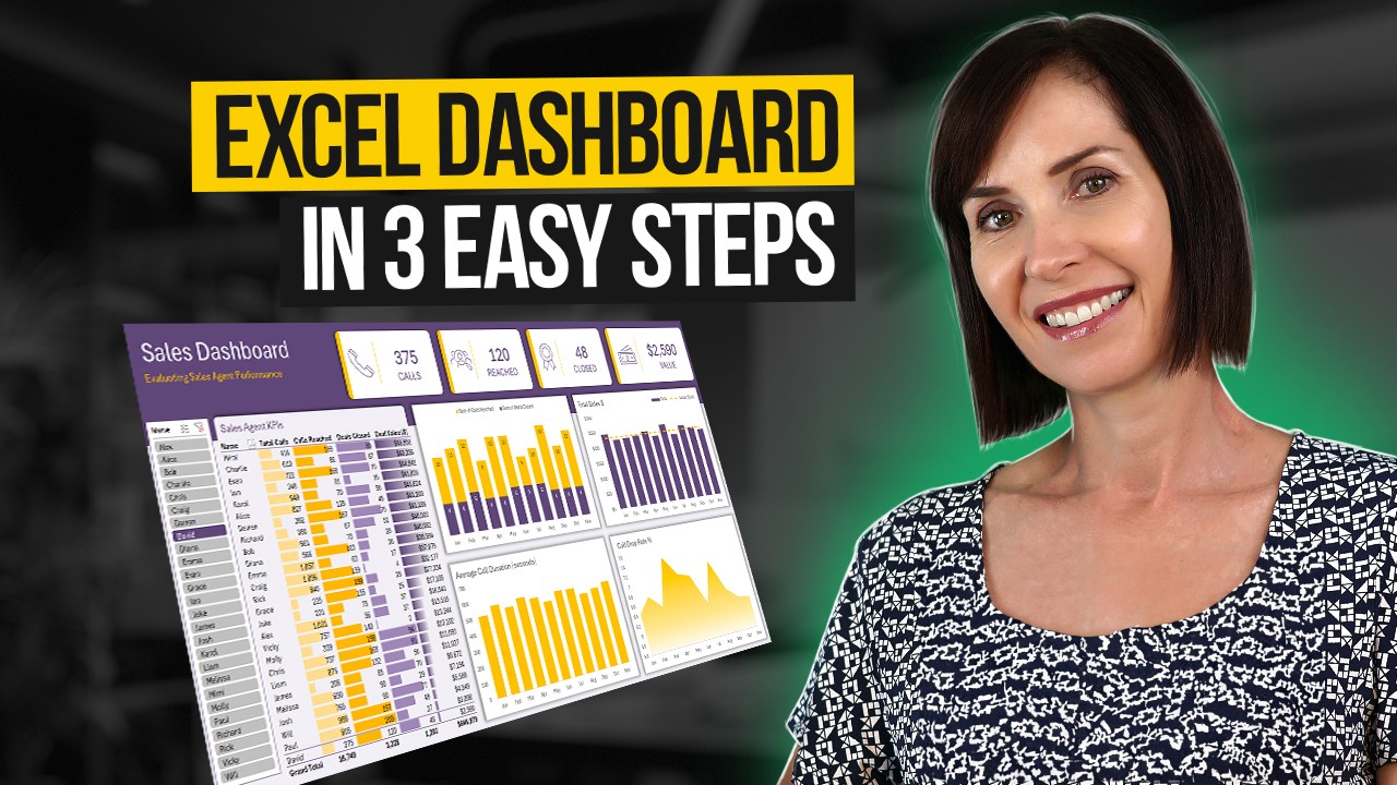
Data Analyst Portfolio Project | Pizza sales Dashboard Using Excel
Summary
TLDRThe video script details a comprehensive guide on creating an Excel dashboard for a sales project. It covers data exploration, transformation, and visualization, focusing on key performance indicators such as total revenue, average order value, and order trends. The presenter demonstrates how to filter, transform data into meaningful insights, and build interactive charts to analyze sales performance over time, by category, and size, ultimately aiming to provide actionable business insights.
Takeaways
- 📊 The script discusses creating an Excel dashboard project for sales data analysis.
- 🔍 It outlines the process of exploring data, identifying unique values, and filtering data within Excel.
- 📈 The dashboard includes key performance indicators (KPIs) such as total revenue, total price, quantity sold, and total orders.
- 📝 The script mentions the importance of data transformation, such as extracting dates and times from strings and converting data formats.
- 📋 It covers the use of Excel functions like TEXT, DATE, and TIME to manipulate and analyze the data effectively.
- 📊 The dashboard features charts that provide insights into daily trends for total revenue and total orders, as well as sales by category and pizza size.
- 📈 The script explains how to calculate the average order value and the contribution of each category to the total revenue.
- 🗓️ Insights are drawn from the data, such as the most popular pizza categories and sizes, and the peak order times and days.
- 🛠️ The dashboard is designed to be interactive, with the ability to filter and view different segments of data to gain deeper insights.
- 🔑 The script emphasizes the power of Excel dashboards for data analysis, providing a clear and actionable overview of sales performance.
- 📚 The final dashboard is a comprehensive tool that combines data visualization with key insights for business decision-making.
Q & A
What is the main topic of the video script?
-The main topic of the video script is about creating an Excel dashboard project, discussing data analysis, transformation, and visualization techniques.
What are the key components discussed for the Excel dashboard?
-The key components discussed include problem statements, key performance indicators (KPIs), chart requirements, and data exploration and transformation techniques.
What kind of data is being analyzed in the script?
-The data being analyzed includes sales data with columns such as present ID, order ID, visa name, quantity, order date, order time, unit price, total price, and category.
How is the data exploration process initiated in the script?
-The data exploration process is initiated by downloading the data and examining the distinct values within the columns to understand the range of data available.
What transformation techniques are mentioned in the script?
-The script mentions using text functions to transform dates and times, extracting parts of dates, and formatting numbers and text to suit the analysis requirements.
What is the significance of filtering in the data exploration process as described in the script?
-Filtering is significant as it allows the analyst to view unique values within the data, understand the distribution of data points, and focus on specific subsets of the data for deeper analysis.
How are calculations performed in the script to derive insights?
-Calculations such as total revenue, total quantity sold, total orders, and average order value are performed using Excel functions and formulas to derive insights from the data.
What types of charts are discussed for visualizing the data in the dashboard?
-The types of charts discussed include bar charts, line charts, and area charts to visualize daily trends for total revenue, total orders, and sales by category and pizza size.
How does the script mention using Excel formulas to categorize data?
-The script mentions using IF formulas to categorize data based on certain conditions, such as categorizing pizza sizes as small, medium, large, extra large, and double extra large based on the values in a column.
What is the purpose of creating a dashboard as described in the script?
-The purpose of creating a dashboard is to provide a comprehensive view of the data, enabling quick insights into key performance indicators, trends, and patterns within the sales data.
How does the script suggest customizing the dashboard for user needs?
-The script suggests customizing the dashboard by adding filters, using conditional formatting, and selecting specific data subsets to focus on, allowing users to tailor the dashboard to their specific analytical needs.
Outlines

Dieser Bereich ist nur für Premium-Benutzer verfügbar. Bitte führen Sie ein Upgrade durch, um auf diesen Abschnitt zuzugreifen.
Upgrade durchführenMindmap

Dieser Bereich ist nur für Premium-Benutzer verfügbar. Bitte führen Sie ein Upgrade durch, um auf diesen Abschnitt zuzugreifen.
Upgrade durchführenKeywords

Dieser Bereich ist nur für Premium-Benutzer verfügbar. Bitte führen Sie ein Upgrade durch, um auf diesen Abschnitt zuzugreifen.
Upgrade durchführenHighlights

Dieser Bereich ist nur für Premium-Benutzer verfügbar. Bitte führen Sie ein Upgrade durch, um auf diesen Abschnitt zuzugreifen.
Upgrade durchführenTranscripts

Dieser Bereich ist nur für Premium-Benutzer verfügbar. Bitte führen Sie ein Upgrade durch, um auf diesen Abschnitt zuzugreifen.
Upgrade durchführenWeitere ähnliche Videos ansehen

Google Sheets - Dashboard Tutorial - Dynamic QUERY Function String - Part 3

Interactive Excel Dashboard Tutorial in 3 Steps (+ FREE Template)

Make Easy Excel Dashboard and Earn Rs 5000 🚀

excel module 5-8 sam capstone project a

Full Project in Excel | Excel Tutorials for Beginners

How to create PERFECT RESUME with zero skills for IT Job Application 🚀 | Resume format for Freshers
5.0 / 5 (0 votes)
