Mengubah data tunggal menjadi data berkelompok dengan MS Excel
Summary
TLDRThe video tutorial explains how to present student data using frequency distribution tables in Microsoft Excel, making it easier to read and analyze. It walks viewers through calculating key statistical values, including total scores, maximum and minimum values, range, average, and class intervals. The instructor demonstrates step-by-step how to create class intervals, determine frequencies using Excel formulas like IF, and organize data for clear visualization. Practical tips for using formulas, locking cell references, and rounding values are included. The tutorial emphasizes accuracy in data handling and provides a comprehensive guide for efficiently transforming raw student scores into organized, interpretable statistical tables.
Takeaways
- 📊 The lesson explains how to present data using a frequency distribution table to make large datasets easier to read and analyze.
- 🧮 The example dataset consists of test scores from 32 students, which are used to demonstrate the process in Microsoft Excel.
- ➕ The total number of data points (Σ or sum) can be calculated in Excel using the SUM formula by selecting all score cells.
- 🔢 The logarithm of the number of data points is calculated to help determine the number of classes for the frequency distribution.
- 📚 The number of classes (k) is calculated using the statistical formula k = 1 + 3.3 log(n), where n is the number of data points.
- 📈 The maximum and minimum values in the dataset are found using the MAX and MIN formulas in Excel.
- 📏 The data range (R) is determined by subtracting the minimum value from the maximum value.
- 📉 The mean (average) score is calculated using the AVERAGE function to understand the central tendency of the data.
- 📐 The class width (interval length) is calculated using the formula R divided by the number of classes (k), and the result is typically rounded.
- 📋 Class intervals are created starting from the minimum value and adding the class width to determine the upper and lower boundaries.
- 🧩 Excel cell references can be locked using the F4 key to prevent them from changing when formulas are dragged across cells.
- 🔍 The IF function is used to check whether each student score falls within a specific class interval.
- 📊 By copying formulas down the column, Excel can automatically check all scores against each class interval.
- ➗ The frequency for each class interval is calculated by summing the results (1s) that indicate scores belonging to that interval.
- ✅ The total of all calculated frequencies should equal the total number of data points (32 students) to ensure the distribution table is correct.
Q & A
What is the main purpose of the script?
-The main purpose of the script is to explain how to create a frequency distribution table in Microsoft Excel. The tutorial covers various statistical concepts such as sum, average, maximum and minimum values, range, and class intervals.
What are the key steps mentioned in the tutorial for creating a frequency distribution table?
-The key steps include calculating the sum of all data values, determining the maximum and minimum values, finding the range, calculating the class intervals, and using Excel functions like SUM, AVERAGE, MIN, and IF to perform calculations.
How is the sum of data values calculated in Excel?
-The sum of the data values is calculated using the SUM function in Excel. The user is instructed to input the formula =SUM(), then select the range of data cells from the first to the last student, and press Enter.
What is the purpose of calculating the 'range' in a frequency distribution?
-The range helps determine the spread of the data by subtracting the minimum value from the maximum value. It is essential for determining the class intervals and the overall distribution of the data.
How are class intervals determined in the frequency distribution table?
-Class intervals are determined by dividing the range by the number of classes. The script uses the formula: range ÷ number of classes. The result is then rounded to find the appropriate length of each class interval.
How do you calculate the interval for each class in the distribution table?
-To calculate the interval for each class, the user begins with the minimum value and adds the class length to create the upper bound for the first class. This process is repeated for subsequent classes, using the upper bound of one class as the lower bound for the next.
What Excel function is used to calculate the 'average' of the data?
-The AVERAGE function in Excel is used to calculate the average. The user inputs the formula =AVERAGE(), selects the data range, and presses Enter to get the result.
What does the IF function do in the context of the frequency distribution?
-The IF function is used to determine if a particular data point falls within a specified class interval. It checks if the value is greater than or equal to the lower bound and less than or equal to the upper bound of a class, and returns a frequency count if the condition is met.
How does the script explain the use of absolute referencing in Excel formulas?
-The script emphasizes the use of absolute referencing (with the dollar sign symbol) in Excel formulas. By pressing F4 after selecting a cell reference, the formula is locked to that specific cell, ensuring it doesn't change when dragged down across other rows.
Why is it important to ensure that all data points fit within the class intervals?
-It is important to ensure that all data points fit within the class intervals to maintain the integrity of the frequency distribution. The sum of the frequencies should equal the total number of data points, and if any values fall outside the defined intervals, the distribution will be inaccurate.
Outlines

Dieser Bereich ist nur für Premium-Benutzer verfügbar. Bitte führen Sie ein Upgrade durch, um auf diesen Abschnitt zuzugreifen.
Upgrade durchführenMindmap

Dieser Bereich ist nur für Premium-Benutzer verfügbar. Bitte führen Sie ein Upgrade durch, um auf diesen Abschnitt zuzugreifen.
Upgrade durchführenKeywords

Dieser Bereich ist nur für Premium-Benutzer verfügbar. Bitte führen Sie ein Upgrade durch, um auf diesen Abschnitt zuzugreifen.
Upgrade durchführenHighlights

Dieser Bereich ist nur für Premium-Benutzer verfügbar. Bitte führen Sie ein Upgrade durch, um auf diesen Abschnitt zuzugreifen.
Upgrade durchführenTranscripts

Dieser Bereich ist nur für Premium-Benutzer verfügbar. Bitte führen Sie ein Upgrade durch, um auf diesen Abschnitt zuzugreifen.
Upgrade durchführenWeitere ähnliche Videos ansehen
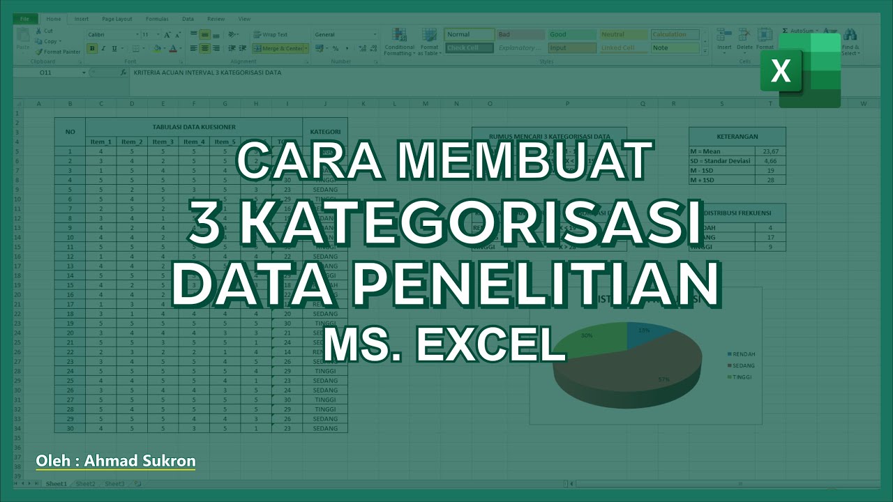
Cara Membuat Kategori data di EXCEL ➡️ Tutorial 3 Kategorisasi Data Penelitian

Penyajian Data (Part-1) ~ Tabel dan Diagram (Materi PJJ Kelas VII / 7 SMP)

pivot tabel, informatika Kl 8 bab 6 Analisis Data kurikulum Merdeka bag 37 hal 149 153
Data - Materi Matematika Kelas 5 Kurikulum Merdeka

CARA PENYAJIAN DATA KELOMPOK - MATEMATIKA SMA

How to analyze data using Epi Info For PC. Easy Peasy Tutorial for Beginners
5.0 / 5 (0 votes)
