Cara Membuat Kategori data di EXCEL ➡️ Tutorial 3 Kategorisasi Data Penelitian
Summary
TLDRThis tutorial demonstrates how to categorize research data using Microsoft Excel. It covers the process of calculating the mean and standard deviation for a set of questionnaire responses, then uses these values to create intervals for three data categories: low, medium, and high. The video shows how to apply formulas like AVERAGE, STDDEV, and IF to categorize each respondent’s score. Additionally, it explains how to calculate the frequency distribution of each category and visualize the results using charts. The tutorial is designed for users wanting to analyze questionnaire data efficiently in Excel.
Takeaways
- 😀 The tutorial demonstrates how to categorize research data in Microsoft Excel based on a Likert scale (1 to 5).
- 😀 The process involves calculating the mean (Min) and standard deviation of survey responses to categorize data into three groups: low, medium, and high.
- 😀 The mean is calculated using the `=AVERAGE(range)` formula in Excel.
- 😀 Standard deviation is calculated using the `=STDEV(range)` formula in Excel.
- 😀 To categorize data, the tutorial defines intervals based on the mean and standard deviation: low (less than Min - 1 * standard deviation), medium (between Min - 1 * standard deviation and Min + 1 * standard deviation), and high (greater than Min + 1 * standard deviation).
- 😀 The `IF` function in Excel is used to assign each respondent's score to the appropriate category.
- 😀 The `COUNTIF` function is used to calculate the frequency distribution for each category (low, medium, and high).
- 😀 A 3D chart is created using the frequency distribution data to visualize the results.
- 😀 The tutorial emphasizes the importance of calculating Min and standard deviation before categorizing the data.
- 😀 The video ends with a brief summary of the steps for categorizing data in Microsoft Excel, followed by a closing greeting.
Q & A
What is the purpose of the tutorial in the transcript?
-The tutorial demonstrates how to categorize research data into three categories (Low, Medium, High) using Microsoft Excel. It includes steps for calculating mean, standard deviation, and assigning scores based on these calculations.
How is the mean (Min) value calculated in Excel?
-The mean (Min) is calculated using the Excel formula `=AVERAGE` applied to the dataset of responses from the questionnaire.
What formula is used to calculate the standard deviation of the dataset?
-The standard deviation is calculated using the Excel formula `=STDEV` applied to the scores from the 30 respondents.
What do the formulas `(Min - 1) * Standard Deviation` and `(Min + 1) * Standard Deviation` represent?
-These formulas are used to determine the boundaries for categorizing the scores into Low, Medium, and High categories. The lower bound is calculated using `(Min - 1) * Standard Deviation`, and the upper bound is calculated using `(Min + 1) * Standard Deviation`.
What does the `IF` function in Excel do in this tutorial?
-The `IF` function is used to assign each respondent's score to one of the three categories: Low, Medium, or High, based on the calculated intervals.
How is the frequency distribution for the three categories calculated?
-The frequency distribution is calculated using the `=COUNTIF` function, which counts the number of respondents falling into each category (Low, Medium, High).
What visual representation is created in the tutorial, and why is it important?
-A chart (either bar or pie chart) is created to visually represent the distribution of respondents across the three categories. This helps in understanding the proportion of respondents in each category.
Why is it important to use the `=AVERAGE` and `=STDEV` functions before categorizing the data?
-The `=AVERAGE` function calculates the mean, which is essential for determining the reference points for the categorization. The `=STDEV` function helps in understanding the spread or variability of the data, which is necessary for setting the boundaries between Low, Medium, and High categories.
How can the boundaries for categorizing scores be adjusted?
-The boundaries can be adjusted by changing the constants in the formulas `(Min - 1) * Standard Deviation` and `(Min + 1) * Standard Deviation`. Altering the multiplier (in this case, `1`) will adjust the range for each category.
What should be done if the Excel sheet needs to be updated with more responses after the categorization is done?
-The formulas should automatically update when new responses are added, but it is important to reapply the `=COUNTIF` and `IF` functions to ensure the new data is categorized and included in the frequency distribution. Additionally, the chart should be refreshed to include the updated data.
Outlines

This section is available to paid users only. Please upgrade to access this part.
Upgrade NowMindmap

This section is available to paid users only. Please upgrade to access this part.
Upgrade NowKeywords

This section is available to paid users only. Please upgrade to access this part.
Upgrade NowHighlights

This section is available to paid users only. Please upgrade to access this part.
Upgrade NowTranscripts

This section is available to paid users only. Please upgrade to access this part.
Upgrade NowBrowse More Related Video

Perkenalan Microsoft Excel

cara object linking and embedding | integrasi office
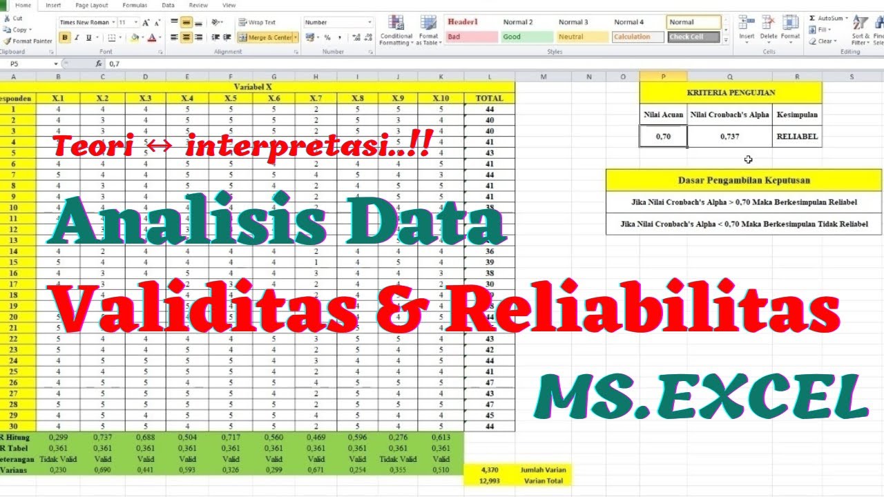
Uji Validitas dan Reliabilitas dengan EXCEL - Uji Validitas Pearson Correlation
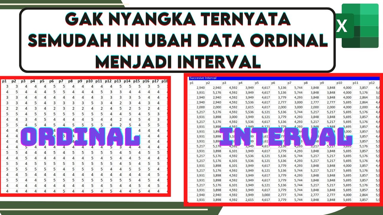
🔴Cara Mengubah Data Ordinal ke Interval Dengan excel | Mengubah data ordinal ke interval dengan MSI
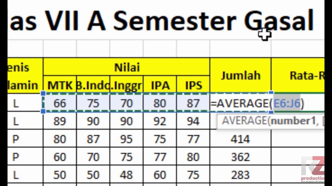
Materi Excel - Cara Menghitung Jumlah Nilai, Rata-Rata, dan Menentukan Nilai Tertinggi Terendah

How to Create a Certificate in Word Connected With Mail Merge
5.0 / 5 (0 votes)