Cumulative Frequency Diagrams - GCSE Higher Maths
Summary
TLDRThis video provides a detailed tutorial on cumulative frequency diagrams, starting with how to complete a cumulative frequency table by adding previous frequencies together. It explains how to plot a cumulative frequency diagram, emphasizing the importance of marking points at the end of each interval. The video then explores how to calculate statistical measures such as median, interquartile range, and percentage of students who meet certain criteria, all based on the cumulative frequency diagram. It also covers how to interpret data and solve related problems, making it a valuable resource for understanding cumulative frequency analysis.
Takeaways
- 😀 Cumulative frequency diagrams start by creating a cumulative frequency table, where each entry includes the sum of the frequencies up to that point.
- 😀 The first entry in the cumulative frequency table is the same as the regular frequency table.
- 😀 To calculate cumulative frequencies, add the current frequency to the previous cumulative total (e.g., 6 + 22 = 28).
- 😀 A cumulative frequency diagram plots cumulative frequencies at the end point of each interval (e.g., plot at 20 for the first interval).
- 😀 When plotting a cumulative frequency diagram, ensure that the horizontal axis represents the intervals (e.g., test marks), and the vertical axis represents cumulative frequencies.
- 😀 You can choose to connect the points on the cumulative frequency diagram using either straight lines or smooth curves.
- 😀 To find the median from a cumulative frequency diagram, locate the point halfway up the total cumulative frequency, then draw a horizontal line to the curve and read off the corresponding value.
- 😀 The interquartile range (IQR) is calculated by finding the lower quartile (1/4th of the total cumulative frequency) and the upper quartile (3/4ths of the total cumulative frequency) and subtracting the lower from the upper quartile.
- 😀 For percentage questions, you can calculate the proportion of data points above or below a certain threshold using the cumulative frequency diagram.
- 😀 The cumulative frequency diagram can also be used to estimate the number of students above or below a specific value (e.g., students who are more than 5 minutes late).
- 😀 Always ensure that the total cumulative frequency is correctly identified (e.g., the highest point on the graph), and use it to find quartiles and medians.
Q & A
What is the purpose of a cumulative frequency table?
-A cumulative frequency table helps to organize and display the cumulative totals of frequencies across intervals, allowing you to track the total count of data points up to the end of each interval.
How do you calculate the cumulative frequency for each interval?
-To calculate cumulative frequency, start with the first frequency and then add the subsequent frequencies progressively. For each interval, the cumulative frequency is the sum of the previous cumulative frequency and the current interval's frequency.
Why do you plot cumulative frequency at the endpoint of each interval?
-Cumulative frequency is plotted at the endpoint of each interval because it represents the total number of data points up to that specific point. It gives a clear representation of how data accumulates as you move through the intervals.
What is the difference between a regular frequency table and a cumulative frequency table?
-A regular frequency table shows the count of data points within each interval, while a cumulative frequency table shows the running total of these frequencies, adding each interval’s frequency to the sum of previous intervals.
How do you plot a cumulative frequency diagram?
-To plot a cumulative frequency diagram, first create axes with the intervals on the horizontal axis and cumulative frequency on the vertical axis. Then, plot points at the end of each interval, corresponding to the cumulative frequency. Finally, connect the points with straight lines or a smooth curve.
What is the median in a cumulative frequency diagram, and how is it calculated?
-The median is the value at the middle of the data set. To calculate it, find the total cumulative frequency, divide by 2, and locate this value on the cumulative frequency axis. Then, draw a horizontal line to the curve, and read the corresponding value on the horizontal axis.
How do you calculate the interquartile range (IQR) from a cumulative frequency diagram?
-To calculate the IQR, first find the lower quartile (Q1) and upper quartile (Q3) by locating 25% and 75% of the total cumulative frequency. Then, subtract Q1 from Q3. The difference is the interquartile range (IQR).
What does it mean if a student is 'more than 5 minutes late' in the context of a cumulative frequency diagram?
-In this case, the problem is asking for the percentage of students whose lateness is more than 5 minutes. To find this, locate 5 minutes on the x-axis, read off the cumulative frequency, and subtract it from the total number of students to get those above 5 minutes late.
How do you find the percentage of students who receive detention based on a cumulative frequency diagram?
-To find the percentage of students receiving detention, locate the threshold time (e.g., 5 minutes) on the x-axis, read the corresponding cumulative frequency, and subtract from the total. Then, calculate the percentage by dividing the number of students receiving detention by the total number of students and multiplying by 100.
What is the purpose of using a straight line or a smooth curve in a cumulative frequency diagram?
-The straight line or smooth curve is used to connect the plotted points on the cumulative frequency diagram. This helps to visualize the cumulative distribution of data and provides a clear and continuous representation of the frequencies as the intervals progress.
Outlines

Dieser Bereich ist nur für Premium-Benutzer verfügbar. Bitte führen Sie ein Upgrade durch, um auf diesen Abschnitt zuzugreifen.
Upgrade durchführenMindmap

Dieser Bereich ist nur für Premium-Benutzer verfügbar. Bitte führen Sie ein Upgrade durch, um auf diesen Abschnitt zuzugreifen.
Upgrade durchführenKeywords

Dieser Bereich ist nur für Premium-Benutzer verfügbar. Bitte führen Sie ein Upgrade durch, um auf diesen Abschnitt zuzugreifen.
Upgrade durchführenHighlights

Dieser Bereich ist nur für Premium-Benutzer verfügbar. Bitte führen Sie ein Upgrade durch, um auf diesen Abschnitt zuzugreifen.
Upgrade durchführenTranscripts

Dieser Bereich ist nur für Premium-Benutzer verfügbar. Bitte führen Sie ein Upgrade durch, um auf diesen Abschnitt zuzugreifen.
Upgrade durchführenWeitere ähnliche Videos ansehen
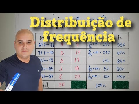
Distribuição de frequência com classes
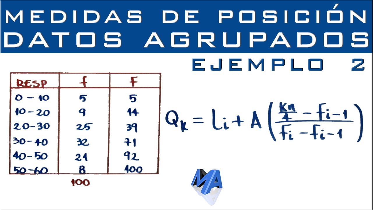
Cuartiles, Deciles y Percentiles | Datos agrupados en intervalos | Ejemplo 2

Membuat Ogive Positif dan Ogive Negarif dari Tabel Distribusi Frekuensi
Statistik : Penyajian Data - Part 4

TABEL DISTRIBUSI FREKUENSI KUMULATIF DAN RELATIF

DISTRIBUIÇÃO DE FREQUÊNCIA ✅ ESTATÍSTICA
5.0 / 5 (0 votes)
