Contoh Soal dan Pembahasan Tren Data, Korelasi dan Interpretasi Data Bivariat Diagram Pencar
Summary
TLDRIn this educational video, the presenter explains how to analyze scatter plots by focusing on trend analysis, correlation, and data interpretation. Using examples, the video covers how to identify linear and nonlinear trends, determine positive or negative correlations, and interpret the relationships between variables. It emphasizes the importance of using tables to simplify the analysis, making it easier for students to understand how variables interact. The video is aimed at 11th-grade students studying the Merdeka Curriculum, providing clear, step-by-step guidance for tackling such problems in mathematics.
Takeaways
- 😀 The video discusses how to analyze data using trends, correlation, and data interpretation for 11th-grade mathematics in the Merdeka curriculum.
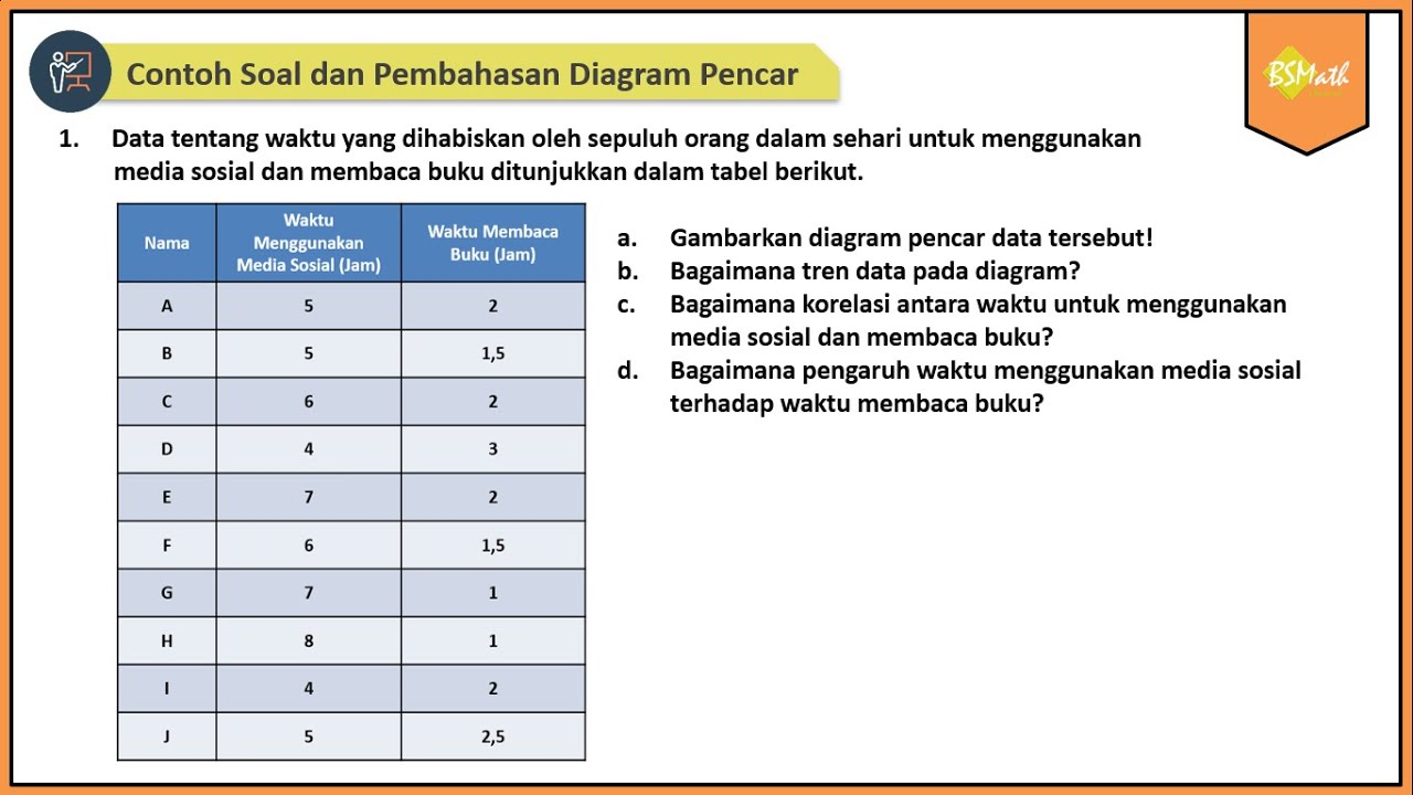
- 😀 The first example involves analyzing a scatter plot of product prices and sales to determine trends, correlation, and the effect of price on sales.
- 😀 To determine the trend, observe the pattern of data points in the scatter plot and decide if it resembles a linear, nonlinear, or irregular pattern.
- 😀 If the data points form a straight line, it indicates a linear trend; if the points curve, it suggests a nonlinear trend.
- 😀 Correlation is determined by the direction of the line: a rising line indicates a positive correlation, while a descending line indicates a negative correlation.
- 😀 Interpretation involves understanding how changes in one variable affect the other. For example, in the first example, higher prices lead to fewer sales.
- 😀 The second example involves analyzing the relationship between shoe size and age. Here, the trend is linear, and the correlation is positive, meaning as age increases, so does shoe size.
- 😀 The third example examines temperature and humidity. This trend is nonlinear with a negative correlation—higher temperatures lead to lower humidity.
- 😀 When analyzing data, it's crucial to create tables summarizing trends, correlation, and interpretation to ensure a clear understanding.
- 😀 The video concludes by emphasizing the importance of analyzing scatter plots by identifying data trends, understanding correlations, and interpreting the effect of one variable on another.
Q & A
What is the main topic of the video?
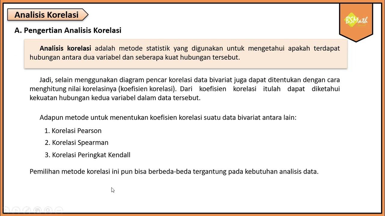
-The video discusses how to determine trends, correlations, and interpret data in scatter plots, specifically for high school mathematics in the Merdeka curriculum.
How can we determine the trend of data in a scatter plot?
-To determine the trend, we observe the pattern of data points. If the points align closely to a straight line, the trend is linear; if they curve, the trend is nonlinear.
What does the term 'correlation' refer to in data analysis?
-Correlation refers to the relationship between two variables, which can be positive (both increase together), negative (one increases while the other decreases), or no correlation (no predictable relationship).
How do we interpret data in terms of correlation?
-Data interpretation depends on the direction of the trend. If the line slopes upward from left to right, the correlation is positive; if it slopes downward, the correlation is negative.
What is the significance of a negative correlation in data interpretation?
-A negative correlation means that as one variable increases, the other decreases. For example, if the price of a product increases, the number of items sold might decrease.
What does it mean when a scatter plot shows a linear trend?
-A linear trend indicates that the data points can be closely approximated by a straight line, showing a consistent relationship between the variables.
Can a scatter plot with a curved pattern be interpreted as nonlinear?
-Yes, a curved pattern suggests a nonlinear trend, where the relationship between variables does not follow a straight line but instead follows a curve.
How does one analyze the correlation of data points in a scatter plot?
-By observing the direction of the line formed by the data points. If the line goes up from left to right, the correlation is positive; if it goes down, the correlation is negative.
What was the interpretation of the relationship between shoe size and age in the second example?
-The interpretation is that as a person's age increases, their shoe size also tends to increase, likely due to growth and changes in body size.
How does the temperature correlate with humidity in the third example?
-The temperature and humidity have a negative correlation, meaning that as the temperature increases, the humidity decreases.
Outlines

Dieser Bereich ist nur für Premium-Benutzer verfügbar. Bitte führen Sie ein Upgrade durch, um auf diesen Abschnitt zuzugreifen.
Upgrade durchführenMindmap

Dieser Bereich ist nur für Premium-Benutzer verfügbar. Bitte führen Sie ein Upgrade durch, um auf diesen Abschnitt zuzugreifen.
Upgrade durchführenKeywords

Dieser Bereich ist nur für Premium-Benutzer verfügbar. Bitte führen Sie ein Upgrade durch, um auf diesen Abschnitt zuzugreifen.
Upgrade durchführenHighlights

Dieser Bereich ist nur für Premium-Benutzer verfügbar. Bitte führen Sie ein Upgrade durch, um auf diesen Abschnitt zuzugreifen.
Upgrade durchführenTranscripts

Dieser Bereich ist nur für Premium-Benutzer verfügbar. Bitte führen Sie ein Upgrade durch, um auf diesen Abschnitt zuzugreifen.
Upgrade durchführenWeitere ähnliche Videos ansehen

STATISTIKA BIVARIAT ( DIAGRAM PENCAR ) - PART 1

Analisis Korelasi#STIE GICI

Belajar Statistika - Makna & Intepretasi Diagram Pencar (Scatter Plot)

Analisis Korelasi - Matematika Wajib SMA Kelas XI Kurikulum Merdeka

Contoh Soal dan Pembahasan Diagram Pencar | Matematika SMA Kelas XI Kurikulum Merdeka

Exploratory Data Analysis (EDA) Using Python | Python Data Analysis | Python Training | Edureka
5.0 / 5 (0 votes)
