The 80% of UI Design - Typography
Summary
TLDRThis video explores the crucial role of typography in UI design, emphasizing how small adjustments in font size, weight, and color can significantly improve user experience. The presenter demonstrates how to create effective hierarchies in design by using spacing, color contrast, and font variations. Key concepts such as grouping elements with proximity, using HSL color values for contrast, and testing designs for readability are covered. The video also delves into light mode design and accessibility, offering practical tips for building intuitive and visually appealing interfaces with minimal font sizes.
Takeaways
- 😀 Typography is crucial in UI design, making up 20% of the design but impacting 80% of the results.
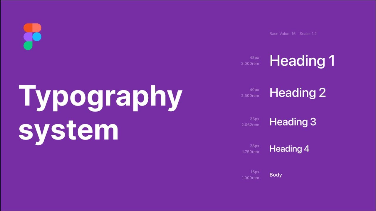
- 😀 Mastering font size, weight, and color allows you to create a clear visual hierarchy and improve user experience.
- 😀 The use of line height is essential for spacing and creating separation between text elements, such as titles and content.
- 😀 Grouping and separating elements with spacing, color, and size can make content more digestible for users.
- 😀 HSL (Hue, Saturation, Lightness) color values are key in UI design, particularly in controlling contrast and lightness to emphasize important elements.
- 😀 Using lighter colors to emphasize important elements (like active tabs) can help direct user focus effectively.
- 😀 Consistency in font size and weight is critical. You don't need many font sizes; a few with varied weights and colors are often enough.
- 😀 For accessibility, it's important to use relative units (like rem) instead of fixed pixel values so users can adjust font sizes as needed.
- 😀 Line height also acts as the margin between text elements, simplifying spacing without needing to manually add gaps or margins.
- 😀 When designing UIs, test the design in various contexts (e.g., at different zoom levels) to ensure readability and proper focus on key elements.
- 😀 Switching between light and dark modes is straightforward by using HSL values, allowing you to keep consistent designs across both modes.
Q & A
Why is typography considered so important in UI design?
-Typography plays a crucial role in UI design because it directly affects readability, hierarchy, and user interaction. Mastering typography can significantly improve the user experience by making interfaces clearer, more functional, and easier to navigate.
What is the primary issue with the left sidebar UI example in the transcript?
-The primary issue with the left sidebar UI is the lack of clear hierarchy, particularly with the selected tab and the buttons at the top. The absence of visual emphasis leads to confusion, leaving users unsure about their current location within the interface.
What does the speaker suggest to improve the title's prominence in the UI?
-To improve the title's prominence, the speaker recommends increasing its size and making it bolder than the surrounding elements. This helps create a visual distinction, making the title stand out and easier for users to focus on.
How does the concept of 'line height' affect the visual hierarchy in UI design?
-Line height affects spacing between lines of text. Proper line height can create a sense of separation between different groups of content, helping to clarify the structure of the UI and ensure that information is visually digestible.
Why is it important to group elements effectively in UI design?
-Grouping elements effectively helps users intuitively understand the relationships between different parts of the interface. Proper grouping and separation make the design more comprehensible and navigable, preventing confusion and improving usability.
What role does color play in creating visual hierarchy in UI design?
-Color, particularly lightness in HSL, is used to emphasize or deemphasize elements in the UI. Elements that are lighter or darker create contrast, drawing attention to key components and making it easier for users to focus on the most important parts of the interface.
How does the use of font weight contribute to UI design?
-Font weight is a simple but powerful way to create emphasis. By adjusting the weight of text, designers can make certain elements stand out, such as titles or buttons, while deemphasizing less critical information, helping to establish a clear hierarchy.
What is the importance of testing UI design changes with real users?
-Testing UI changes with real users ensures that the design is intuitive and functional. User feedback helps identify potential issues with readability, navigation, and overall experience, allowing designers to make informed adjustments.
What are the recommended font sizes for most UI elements, and why?
-The recommended font size for most UI elements is 14-16px. This size is considered optimal for readability, providing clear text without overwhelming users. Adjusting font sizes beyond this range should be done sparingly and only for specific design purposes, such as emphasizing headings or titles.
How does HSL help in creating both dark and light mode UI designs?
-HSL (Hue, Saturation, Lightness) allows for easy adjustments between dark and light modes by simply inverting the lightness value. For dark mode, elements use darker colors, and for light mode, those colors are reversed to lighter shades, maintaining contrast and visual harmony across different themes.
Outlines

Dieser Bereich ist nur für Premium-Benutzer verfügbar. Bitte führen Sie ein Upgrade durch, um auf diesen Abschnitt zuzugreifen.
Upgrade durchführenMindmap

Dieser Bereich ist nur für Premium-Benutzer verfügbar. Bitte führen Sie ein Upgrade durch, um auf diesen Abschnitt zuzugreifen.
Upgrade durchführenKeywords

Dieser Bereich ist nur für Premium-Benutzer verfügbar. Bitte führen Sie ein Upgrade durch, um auf diesen Abschnitt zuzugreifen.
Upgrade durchführenHighlights

Dieser Bereich ist nur für Premium-Benutzer verfügbar. Bitte führen Sie ein Upgrade durch, um auf diesen Abschnitt zuzugreifen.
Upgrade durchführenTranscripts

Dieser Bereich ist nur für Premium-Benutzer verfügbar. Bitte führen Sie ein Upgrade durch, um auf diesen Abschnitt zuzugreifen.
Upgrade durchführenWeitere ähnliche Videos ansehen

UI Design Principles | Everything You Need To Know

1. Understanding Typography | Theory
Typographic Visual Hierarchy in UI Design (4 Examples)

Getting Spacing right between UI Elements when Designing Websites! - Basic Design Principles

Flutter Tutorial for Beginners #6 - Colours & Fonts
Creating typography system in Figma
5.0 / 5 (0 votes)
