Typographic Visual Hierarchy in UI Design (4 Examples)
Summary
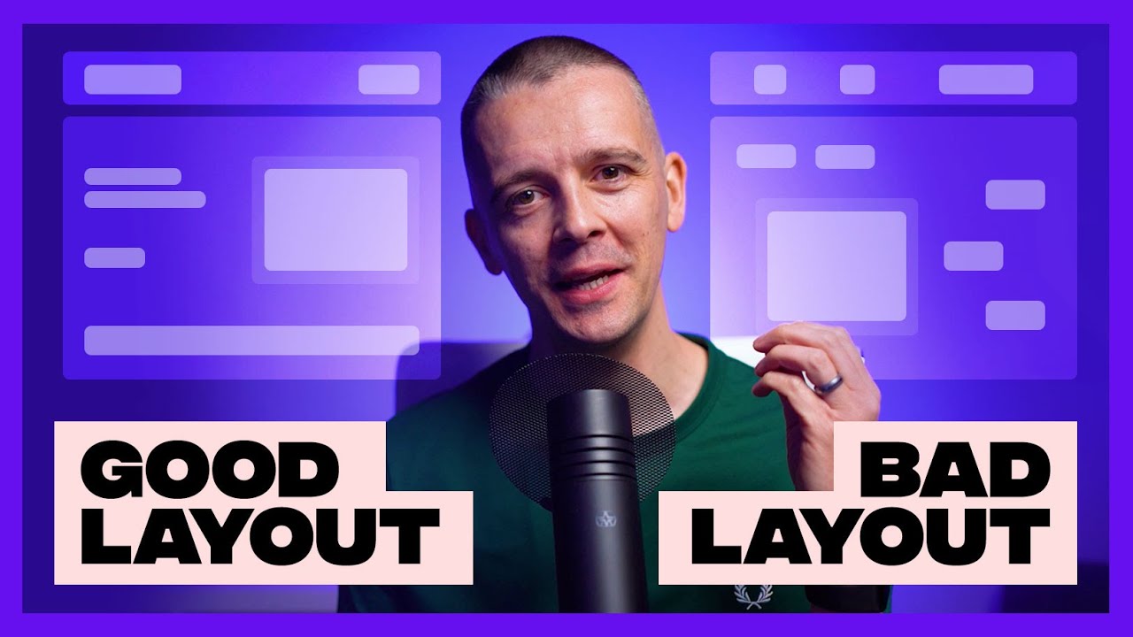
TLDRIn this informative video, Gary Simon explores the principles of typographic visual hierarchy, demonstrating how to effectively guide viewers' attention in design. He emphasizes the importance of differentiating elements through techniques such as varying font weight, size, color, and spacing. Using practical examples from footers, landing pages, and blog layouts, he illustrates how to create clarity and structure in designs. By applying these strategies, designers can enhance user experience and create visually appealing interfaces that communicate effectively. Simon encourages continuous practice of these fundamentals to elevate design quality.
Takeaways
- 😀 Visual hierarchy is crucial in design; without it, designs can appear amateurish.
- 📊 Using different font weights, like bold, can significantly improve clarity in typographic elements.
- 🔍 Font size variations help guide the viewer's attention to the most important information.
- 🎨 Color contrast can enhance separation between different text elements, aiding readability.
- ✍️ Underlining clickable text is an effective way to signal interactivity to users.
- 🔄 Design choices should prioritize user experience, ensuring information is presented clearly.
- 📏 White space is important for separating text elements and improving overall structure.
- 🔗 Experimenting with letter spacing and container backgrounds can create a distinct visual identity.
- ⚖️ Balancing text sizes is vital; if elements are too similar, they can confuse viewers.
- 💡 Accessibility should be considered when selecting color contrasts and font sizes.
Q & A
What is the primary focus of the video?
-The primary focus of the video is on establishing typographic visual hierarchy in design, emphasizing its importance for clarity and structure.
Why is visual hierarchy important in design?
-Visual hierarchy is crucial because it helps guide the viewer's attention, making it easier for them to understand the relationships between different elements and enhancing the overall user experience.
What is one common issue observed in the initial website footer example?
-The initial website footer example lacks differentiation between navigation links and their titles, making it unclear to visitors what each element represents.
How can bold text improve visual hierarchy?
-Bold text enhances visual hierarchy by creating a stronger distinction between different types of information, helping users quickly identify the most important elements.
What techniques can be used to create separation between text elements?
-Techniques to create separation include adjusting font weight (e.g., making text bold), increasing font size, changing colors and backgrounds, and using underlines for clickable links.
What role does color play in establishing visual hierarchy?
-Color plays a significant role by creating contrast between different text elements, which helps viewers distinguish between headings, subheadings, and body text, thereby reinforcing their respective importance.
How should a title be styled to effectively capture attention?
-A title should be larger and potentially bolded to ensure it stands out as the most important element, drawing the viewer's focus first.
What is a recommended approach for subheadings in design?
-Subheadings can be made slightly smaller than the title but still bolded or colored differently to establish a clear hierarchy without competing with the main title.
What strategies were suggested for improving a blog page layout?
-Strategies for improving a blog page include making the title bold and larger, using underlines for links, and adjusting the opacity of less important elements like the date to create a clear hierarchy.
What resources does Gary Simon recommend for further learning?
-Gary Simon recommends exploring Scrimba.com for front-end development and designcourse.com for learning how to design user interfaces.
Outlines

This section is available to paid users only. Please upgrade to access this part.
Upgrade NowMindmap

This section is available to paid users only. Please upgrade to access this part.
Upgrade NowKeywords

This section is available to paid users only. Please upgrade to access this part.
Upgrade NowHighlights

This section is available to paid users only. Please upgrade to access this part.
Upgrade NowTranscripts

This section is available to paid users only. Please upgrade to access this part.
Upgrade Now5.0 / 5 (0 votes)


