Color (Ch 10) I, Visualization Analysis & Design, 2021
Summary
TLDRThis video delves into the complexities of color usage in data visualization, exploring how color can be used to encode information through luminance, saturation, and hue. It discusses how these channels are suited for different types of data—ordered vs. categorical—and highlights the limitations of using too many color bins. The importance of perceptual accuracy is emphasized, particularly in how color choices influence interpretation. The video also covers best practices for creating effective color palettes, including sequential, diverging, and cyclic schemes, and cautions against common mistakes such as overusing rainbow palettes for ordered data.
Takeaways
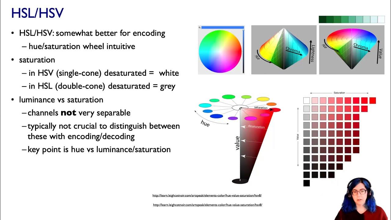
- 😀 Color encoding should be carefully decomposed into three channels: luminance (brightness), saturation (colorfulness), and hue (identity).
- 😀 Luminance and saturation are magnitude channels, suitable for encoding ordered attributes, while hue is used for categorical (identity) attributes.
- 😀 Human perception of color is based on relative comparisons, so contiguous colors are easier to distinguish than non-contiguous ones.
- 😀 A rule of thumb is that only 6 to 12 bins are discriminable in categorical color encoding. More than that can lead to confusion.
- 😀 For non-contiguous regions, color bins should be carefully grouped semantically to improve clarity, as subtle distinctions can be lost when regions are scattered.
- 😀 Ordered data encoding with color should avoid using rainbows, as they are often not perceptually linear and lack intrinsic ordering.
- 😀 The human visual system perceives colors non-linearly, especially within certain regions of the spectrum, making it challenging to use rainbows effectively for ordered data.
- 😀 For sequential data, color maps like Viridis and Magma are effective since they have a monotonic increase in luminance, are perceptually uniform, and are colorblind-safe.
- 😀 Saturated colors are better for small, separated regions in a visual representation, as they are more perceptible. Large regions, on the other hand, require low-saturation colors to avoid visual fatigue.
- 😀 When encoding multiple attributes with color, careful design is needed, particularly for bivariate color maps, as combining two attributes with multiple levels can be difficult for viewers to interpret.
Q & A
What are the three main channels that decompose color in visualization?
-The three main channels are luminance, saturation, and hue. Luminance refers to how bright something is (grayscale), saturation refers to how colorful something is (from gray to fully saturated colors), and hue is the color itself (used to distinguish categorical attributes).
Why is it important to decompose color into separate channels?
-It is important to decompose color because treating color as a single monolithic attribute can lead to confusion. Each channel has distinct perceptual properties that are suited for different kinds of data encoding, such as ordered or categorical attributes.
What are the limitations of using color to encode categorical attributes?
-The main limitation is that human perception can only distinguish a limited number of color bins, typically between 6 and 12. When colors are spread out across small or scattered regions, distinguishing between them becomes difficult. It is essential to avoid trying to encode too many categories with color alone.
What should you do when encoding categorical data with color?
-When encoding categorical data with color, it is advisable to reduce the number of categories or bins, possibly by combining similar categories. Additionally, consider using other visual channels, such as position or size, to support the color encoding.
What is the potential problem with using rainbow color maps for ordered data?
-Rainbow color maps are problematic for ordered data because they lack perceptual linearity. People may not consistently interpret the colors in the same order, and the spectrum is non-linear, making it harder to perceive gradual transitions in data.
What is a more effective alternative to rainbow color maps for ordered data?
-A more effective alternative is to use sequential or diverging color maps that increase in luminance (brightness) in a monotonic way. These color maps, such as Viridis or Magma, are designed to be perceptually uniform and are colorblind-safe.
Why do small regions in a visualization require highly saturated colors?
-Small regions need highly saturated colors to be visible and distinguishable. The human eye has difficulty perceiving subtle color differences in small, isolated regions, so high saturation enhances their visibility.
What should be kept in mind when using transparency in color encoding?
-Transparency should be used cautiously because it is not separable from luminance and saturation. Combining transparency with color can lead to confusion, making it difficult to differentiate between transparency and variations in color intensity.
What are bivariate color maps, and why are they challenging to interpret?
-Bivariate color maps encode two different attributes, typically using variations in both hue and saturation or other channels. When both attributes have multiple levels, these maps become challenging to interpret, as humans struggle to distinguish subtle variations in both dimensions simultaneously.
How should color palettes be designed for single attributes in visualization?
-For single attributes, color palettes should be chosen based on the nature of the data. Categorical data often uses saturated, highly distinguishable colors, while ordered data uses sequential (for continuous data) or diverging (for data with a meaningful midpoint) color palettes. It's crucial to ensure perceptual uniformity and consider colorblind accessibility.
Outlines

Dieser Bereich ist nur für Premium-Benutzer verfügbar. Bitte führen Sie ein Upgrade durch, um auf diesen Abschnitt zuzugreifen.
Upgrade durchführenMindmap

Dieser Bereich ist nur für Premium-Benutzer verfügbar. Bitte führen Sie ein Upgrade durch, um auf diesen Abschnitt zuzugreifen.
Upgrade durchführenKeywords

Dieser Bereich ist nur für Premium-Benutzer verfügbar. Bitte führen Sie ein Upgrade durch, um auf diesen Abschnitt zuzugreifen.
Upgrade durchführenHighlights

Dieser Bereich ist nur für Premium-Benutzer verfügbar. Bitte führen Sie ein Upgrade durch, um auf diesen Abschnitt zuzugreifen.
Upgrade durchführenTranscripts

Dieser Bereich ist nur für Premium-Benutzer verfügbar. Bitte führen Sie ein Upgrade durch, um auf diesen Abschnitt zuzugreifen.
Upgrade durchführenWeitere ähnliche Videos ansehen

Color (Ch 10) II, Visualization Analysis & Design, 2021
Color (Ch 10) III, Visualization Analysis & Design, 2021

Bingung Color Theory? Tonton video ini.

El MISTERIO del COLOR en el CINE y VIDEOCLIPS ft. @GemaVadillo

Pentingnya Warna Dalam Fotografi
COLOR THEORY BASICS: Use the Color Wheel & Color Harmonies to Choose Colors that Work Well Together
5.0 / 5 (0 votes)
