Cara Membuat dan Membaca PENYAJIAN DATA - DIAGRAM BATANG, TABEL dan PIKTOGRAM
Summary
TLDRIn this video, Kak Tata explains how to present data effectively using various methods. First, she introduces the concept of data collection and how to organize it, such as creating tables with item names and quantities. She then covers how to represent data visually through bar charts, frequency tables, and pictograms. Using examples like classroom objects and agricultural data, she demonstrates how to convert raw data into clear, visual formats that are easy to understand. This educational content aims to help viewers master data presentation techniques for better analysis and communication.
Takeaways
- 😀 Data presentation can be done using various methods like bar charts, pictograms, and frequency tables.
- 😀 To represent data clearly, it's important to have accurate data in the first place, such as the number of items in a room.
- 😀 A table is an easy way to organize data, showing the name of the item and its quantity.
- 😀 A bar chart (diagram batang) uses rectangular bars to represent data, where the height of the bar corresponds to the value being measured.
- 😀 The temperature data of students can be represented in a bar chart to show the variation over the days of the week.
- 😀 For creating a bar chart, first draw the axis for days of the week on the x-axis and the temperature values on the y-axis.
- 😀 A frequency table lists the items or categories alongside the number of occurrences or frequency of each item.
- 😀 A frequency table is useful for organizing data like blood types in a group of students.
- 😀 A pictogram uses images or symbols to represent data values, making it visually engaging and easier to understand.
- 😀 An example of a pictogram is showing the number of strawberries harvested each year, with each image representing a set number of items.
- 😀 It’s important to ensure clarity when switching between different data representation methods, like converting tabular data into bar charts or pictograms.
Q & A
What is the main topic discussed in this video?
-The main topic of the video is how to collect and present data, specifically through methods such as bar charts, pictograms, and frequency tables.
What are the examples of data mentioned in the video?
-The examples of data provided include classroom items like figura (5), blackboards (2), and fans (4).
How can data be organized in a clear way according to the video?
-Data can be organized in a clear way by presenting it in a table, which includes the name of the item and its corresponding quantity.
What is a bar chart and how is it used to present data?
-A bar chart is a visual representation where bars (rectangles) represent data values. It is used to display the quantities of different items, with the height of each bar showing the amount for each category.
What was the example of data used for the bar chart in the video?
-The example used was the temperature data of students for each day of the week (Monday to Friday), with the temperatures being presented in a bar chart.
How is temperature data represented in a bar chart?
-The temperature data is represented by plotting the days of the week on the horizontal axis and the temperature values on the vertical axis. Each day has a corresponding bar indicating the temperature on that day.
What is a frequency table and how is it used?
-A frequency table is a type of data table where each category is listed along with the frequency (number of occurrences) of that category. In the video, an example of a frequency table is provided with blood types (O, A, B, AB) and the number of students with each blood type.
Can you give an example of a frequency table from the video?
-Yes, the frequency table example provided in the video shows the number of students with each blood type: O, A, B, and AB, displaying the counts for each group.
What is a pictogram and how is it different from other data presentation methods?
-A pictogram is a visual representation of data using pictures or symbols. Each symbol represents a specific quantity. It differs from other methods because it uses images rather than just bars or numbers, making it easier for some people to understand.
What example is given in the video for presenting data using a pictogram?
-The video uses an example of strawberry harvest data from the years 2017 to 2020, where each symbol of a strawberry represents a specific number of strawberries harvested.
Outlines

هذا القسم متوفر فقط للمشتركين. يرجى الترقية للوصول إلى هذه الميزة.
قم بالترقية الآنMindmap

هذا القسم متوفر فقط للمشتركين. يرجى الترقية للوصول إلى هذه الميزة.
قم بالترقية الآنKeywords

هذا القسم متوفر فقط للمشتركين. يرجى الترقية للوصول إلى هذه الميزة.
قم بالترقية الآنHighlights

هذا القسم متوفر فقط للمشتركين. يرجى الترقية للوصول إلى هذه الميزة.
قم بالترقية الآنTranscripts

هذا القسم متوفر فقط للمشتركين. يرجى الترقية للوصول إلى هذه الميزة.
قم بالترقية الآنتصفح المزيد من مقاطع الفيديو ذات الصلة
Penyajian Data Kelas 7 - Menyajikan Data Dalam Tabel dan Diagram | Jenis Diagram | Statistika

1 PENYAJIAN DATA - STATISTIKA - KELAS 7 SMP
Data - Materi Matematika Kelas 5 Kurikulum Merdeka
Penyajian Data (Part-1) ~ Tabel dan Diagram (Materi PJJ Kelas VII / 7 SMP)
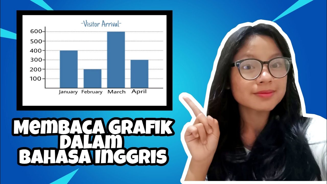
Membaca Grafik Dalam Bahasa Inggris || Eni Kesuma

Fisika SMA - Impuls & Momentum (1) - Pengenalan Impuls dan Momentum, Rumus Impuls dan Momentum (I)
5.0 / 5 (0 votes)
