Illustrator Tutorial: Create a Vector Logo from a Rough Sketch
Summary
TLDRThis tutorial walks through turning a hand-drawn sketch into a clean vector logo using Adobe Illustrator. Starting with importing the sketch, the video demonstrates reducing opacity, locking the layer, and using tools like the pen, circle, and ellipse to outline and refine curves. The instructor emphasizes minimizing anchor points for smooth paths and introduces techniques for tapering strokes to create depth. Additionally, the tutorial covers expanding paths, removing unnecessary anchor points, and rounding corners to enhance the design, ultimately transforming a rough sketch into a professional vector graphic.
Takeaways
- 🖼️ Start by importing a thumbnail sketch into Adobe Illustrator using the 'Place' command.
- 🔧 Lower the opacity of the sketch to around 30% for easy tracing, and lock the layer to prevent interference.
- ⚫ Use a black stroke to outline the shape, starting with a 40-point stroke for the circle.
- ✏️ When drawing with the pen tool, minimize the number of anchor points for smoother curves and easier adjustments.
- 🔄 Use the ellipse tool to define circular curves, and the scissors tool to cut away unwanted sections.
- ✂️ Convert strokes to fills using the 'Object > Expand' command and simplify anchor points with the delete anchor point tool.
- 📐 Adjust the thickness of curves to emphasize shadows and highlights, particularly in areas like the wave lip.
- 🌊 Thin out highlights and keep thicker areas in shadowed parts for a more dynamic look.
- 🛠️ The width tool can be used to adjust thickness, but it may add many extra points, making editing harder.
- 🔲 Use the direct selection tool to round corners and refine the design for smoother, polished results.
Q & A
What is the purpose of importing a sketch into Adobe Illustrator?
-The purpose of importing a sketch into Adobe Illustrator is to turn a rough hand-drawn sketch into a clean vector logo graphic.
What is the first step after importing the sketch into Illustrator?
-The first step after importing the sketch is to reduce the opacity to around 30%, so it remains visible but doesn't interfere while drawing over it.
Why is it recommended to use the least number of points with the Pen tool?
-Using the least number of points makes it easier to achieve smooth curves and simplifies the editing process, as fewer points result in more control over the shapes.
How can you use the Ellipse tool to enhance the design?
-You can use the Ellipse tool to create perfect circular curves, which can then be cut using the Scissors tool to achieve cleaner, smoother shapes in the design.
What does the 'Object > Expand' function do in Illustrator?
-The 'Object > Expand' function converts strokes into fills, allowing the user to manipulate the shapes more easily and prepare the logo for further refinement.
How does deleting anchor points help improve the design?
-Deleting unnecessary anchor points simplifies the path structure, making it easier to create smooth curves without distorting the design.
Why is tapering important in this design, and how is it achieved?
-Tapering adds visual interest by creating a dynamic shift between thick and thin areas in the design. It can be achieved using the Direct Selection tool to adjust paths or by manually manipulating the width of strokes.
What is the limitation of using the Width tool, and why might it be avoided?
-The Width tool adds many extra anchor points, which can make the design more difficult to edit. While it can achieve thick-to-thin effects, removing the additional points can be time-consuming.
What does rounding out corners do for the design?
-Rounding out corners softens sharp edges and enhances the flow of the design, especially in thick-to-thin areas, making the logo look more polished and visually appealing.
Why is it important to unite paths before rounding out corners?
-Uniting the paths ensures that the entire design becomes a single compound path, allowing for consistent corner rounding across the logo without breaking the integrity of the shape.
Outlines

هذا القسم متوفر فقط للمشتركين. يرجى الترقية للوصول إلى هذه الميزة.
قم بالترقية الآنMindmap

هذا القسم متوفر فقط للمشتركين. يرجى الترقية للوصول إلى هذه الميزة.
قم بالترقية الآنKeywords

هذا القسم متوفر فقط للمشتركين. يرجى الترقية للوصول إلى هذه الميزة.
قم بالترقية الآنHighlights

هذا القسم متوفر فقط للمشتركين. يرجى الترقية للوصول إلى هذه الميزة.
قم بالترقية الآنTranscripts

هذا القسم متوفر فقط للمشتركين. يرجى الترقية للوصول إلى هذه الميزة.
قم بالترقية الآنتصفح المزيد من مقاطع الفيديو ذات الصلة
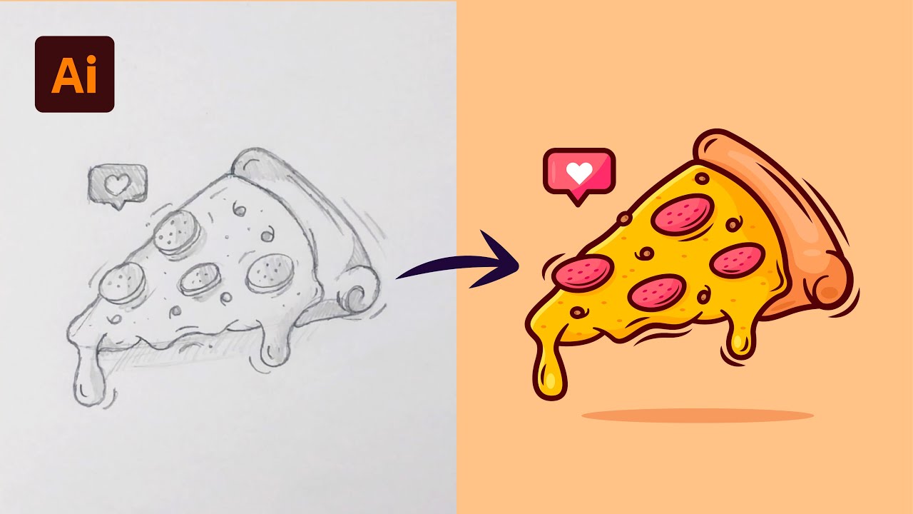
Adobe Illustrator Tutorial: Create a Vector Pizza from Sketch (HD)

Trying out Illustrator's NEW Generative Shape Fill | Adobe Creative Cloud
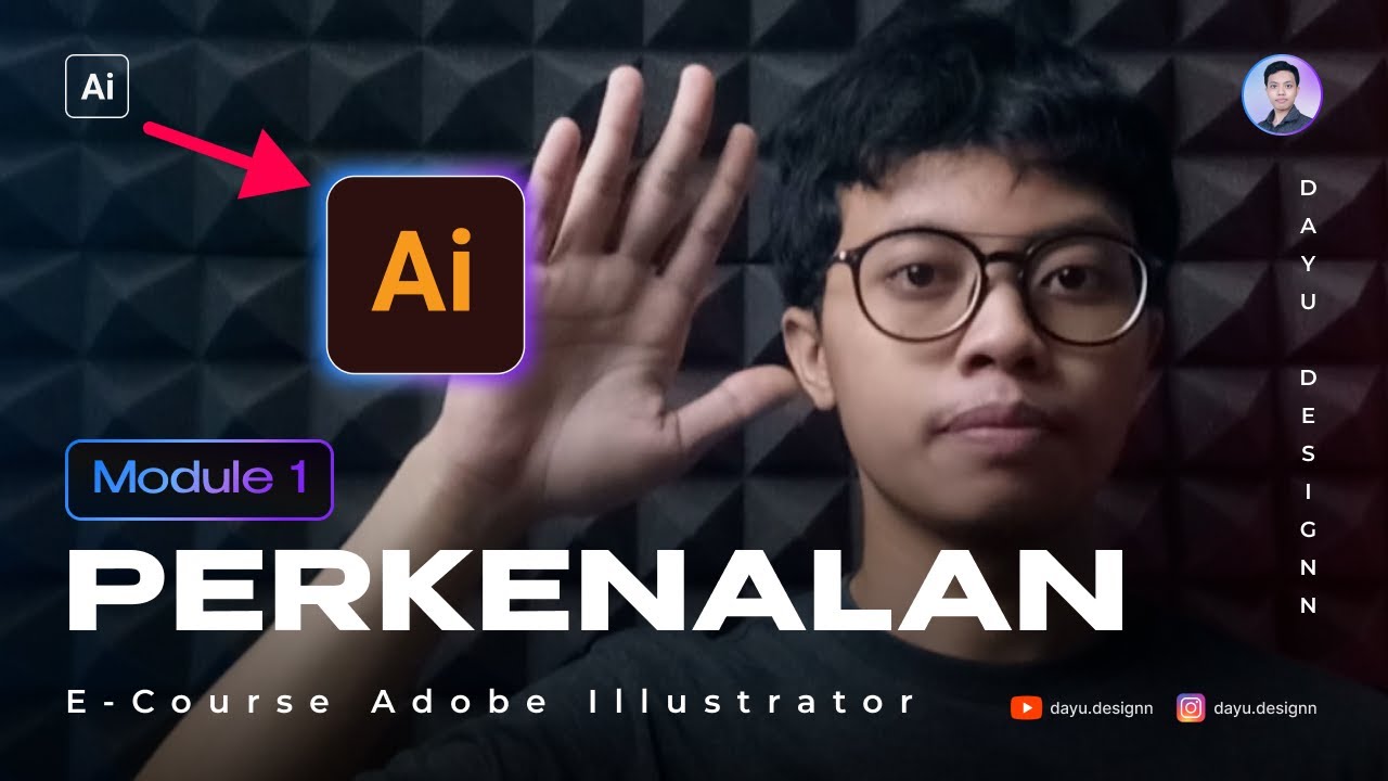
[MODULE 1] Video Awal Pembelajaran Adobe illustrator Dari Pemula - Intermediate by Dayu.Designn
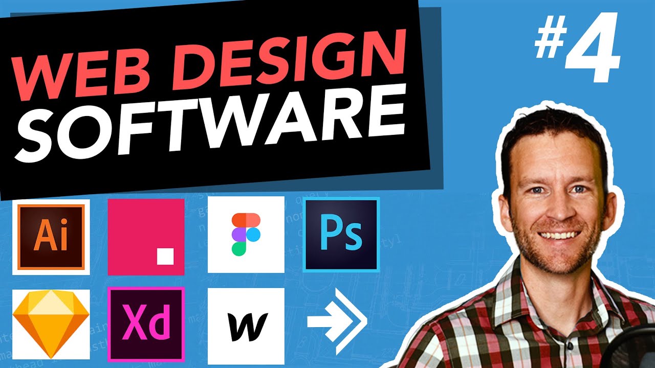
Web Design Software (2019) #4

How to create poster design in adobe illustrator
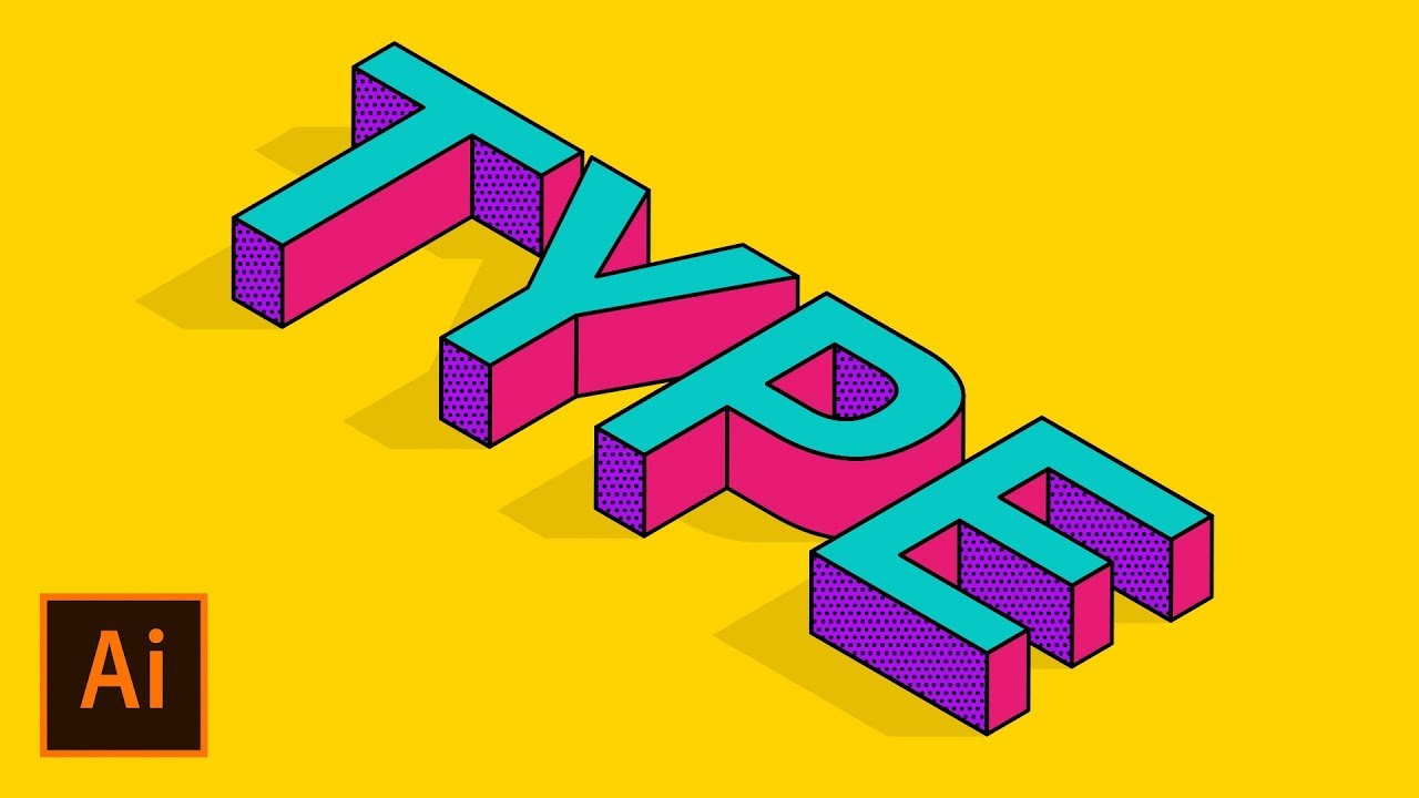
How to Create an Isometric Text Effect in Adobe Illustrator
5.0 / 5 (0 votes)
