Must know Visualization in Statistics | Descriptive Statistics | Ultimate Guide !! | Part 10
Summary
TLDRThe script discusses the significance of graphical representation in descriptive statistics, emphasizing its ability to visually convey data distribution, spread, and central tendency. It covers three main plots used in statistics: histograms, box plots, and scatter plots, along with bar and line charts. The explanation delves into how histograms display data distribution through bins, box plots represent the IQR range, and scatter plots illustrate the relationship between two variables. The script also touches on identifying outliers and the types of skewness in histograms, as well as the concept of modes in relation to histogram types.
Takeaways
- 📊 Graphical representation is crucial in descriptive statistics as it allows for visual data analysis, showing distribution, dispersion, and trends.
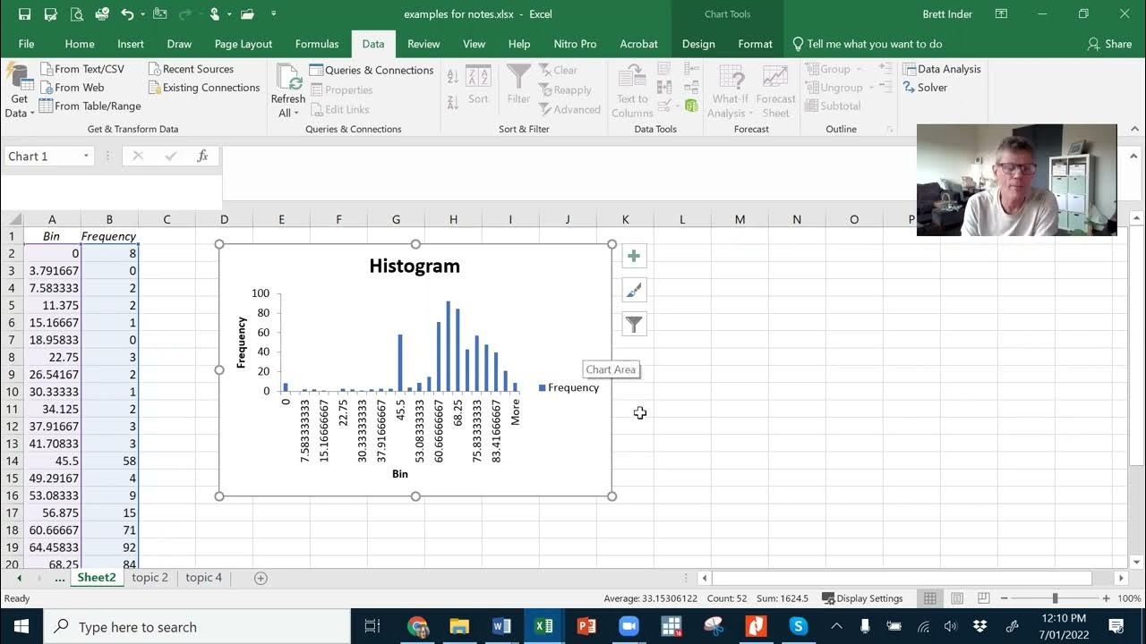
- 📈 Histograms are a primary tool in graphical representation, displaying the distribution of data through bins, which can be adjusted to show different distributions.
- 📉 Box plots are useful for showing the spread of data, identifying outliers, and providing a quick summary of key statistics like median, quartiles, and range.
- 🔍 Scatter plots are essential for visualizing relationships between two variables, helping to identify patterns, trends, and correlations.
- 📊 Histograms can reveal the shape of data distribution, such as whether it's skewed left or right, and can identify outliers and the central tendency of the data.
- 📊 Types of histograms include symmetric, right-skewed, and left-skewed, each indicating different characteristics of the data distribution.
- 📊 Based on the number of modes, histograms can be classified into unimodal, bimodal, and multimodal, each revealing different aspects of the data set.
- 📊 Box plots not only show the IQR range but also help in identifying outliers by calculating values beyond 1.5 times the IQR from the quartiles.
- 📊 Scatter plots are enhanced by adding a regression line, which can indicate the strength and direction of the relationship between variables.
- 🚫 Outliers can significantly affect data analysis processes, and understanding how to identify and handle them is crucial for accurate statistical analysis.
Q & A
What is the importance of graphical representation in descriptive statistics?
-Graphical representation is crucial in descriptive statistics as it allows for visual interpretation of data, making it easier to understand the spread, dispersion, distribution, frequency, and central tendency of the data.
What are the three main types of plots used in graphical representation for statistics?
-The three main types of plots used in graphical representation for statistics are histograms, box plots, and scatter plots.
How does a histogram help in understanding the distribution of data?
-A histogram divides data into intervals (bins) and shows the frequency of data points within these intervals. It helps visualize the distribution, spread, and shape of the data.
What do the bins in a histogram represent?
-Bins in a histogram represent the intervals into which the data is divided. They indicate the range of values within the data set.
What is the difference between a bar chart and a histogram?
-A bar chart represents categorical data, showing the count or quantity of data within categories, while a histogram displays the distribution of continuous data by dividing it into bins.
How can you identify outliers using a histogram?
-Outliers in a histogram are represented by bars that are significantly separated from the rest of the data. They indicate values that are unusually high or low compared to the rest of the data.
What is the significance of the shape of a histogram?
-The shape of a histogram can indicate the type of distribution the data follows, such as normal, right-skewed, or left-skewed distributions.
What are the three types of skewed histograms?
-The three types of skewed histograms are symmetric, right-skewed, and left-skewed. Symmetric histograms have a balanced distribution around the center, while right-skewed histograms have a longer tail on the right side, and left-skewed histograms have a longer tail on the left side.
How can you determine the center of a distribution using a histogram?
-The center of a distribution in a histogram can be determined by looking at the mean, median, and mode. These values are typically located around the center of the distribution.
What is a box plot and what does it represent?
-A box plot is a graphical representation that displays the interquartile range (IQR) of a data set. It shows the median, first quartile (Q1), and third quartile (Q3), as well as any outliers beyond the IQR.
How are the upper and lower whiskers of a box plot calculated?
-The upper whisker is calculated by subtracting 1.5 times the IQR from the third quartile (Q3), and the lower whisker is calculated by subtracting 1.5 times the IQR from the first quartile (Q1).
What is the purpose of a scatter plot in statistical analysis?
-A scatter plot is used to visualize the relationship between two variables. It helps identify patterns, trends, and the direction of the relationship, such as positive, negative, or no correlation.
Outlines
📊 Understanding Graphical Representation in Statistics
The paragraph discusses the importance of graphical representation in descriptive statistics. It highlights how graphical representation allows for visual analysis of data distribution, spread, and central tendency. The speaker introduces three main plots used in statistics: histograms, box plots, and scatter plots, along with bar charts and line charts. Histograms are explained as a way to display the distribution of data through bins, with the x-axis showing intervals and the y-axis showing frequency. The concept of dividing continuous data into intervals and bins is explained, and the idea of frequency within these bins is discussed. The paragraph also touches on how histograms can help identify outliers and the types of skewness in data distribution, such as symmetric, right-skewed, and left-skewed distributions.
📈 Histograms and Data Distribution
This section delves deeper into histograms, explaining how they can represent different types of data distributions, including normal and skewed distributions. The speaker clarifies what a normal distribution is and how it appears symmetrically around the center. The paragraph also discusses the concept of median, mode, and mean in the context of a symmetric histogram. It then contrasts this with right-skewed and left-skewed histograms, explaining how the mean is always larger than the median in a right-skewed distribution and vice versa for left-skewed distributions. The speaker also introduces the idea of dividing histograms based on the number of modes, categorizing them into unimodal, bimodal, and multimodal histograms.
📉 Box Plots and Their Significance
The paragraph explains box plots, which are used to show the IQR range of data. It describes how the box plot is constructed with a box representing the Q3 and Q1 values, and the length of the box (Q3 - Q1) representing the IQR. The concept of whiskers, which extend from the box to the lowest and highest values within 1.5 times the IQR, is introduced. Any data point beyond the whiskers is considered an outlier. The speaker also mentions that box plots can be referred to as 'whisker plots' and are useful for identifying outliers and understanding the spread of data. Additionally, box plots can be called 'five summary statistics' as they provide minimum and maximum values, in addition to the median, Q1, and Q3.
🔍 Scatter Plots for Identifying Relationships
This section focuses on scatter plots, which are used to visualize the relationship between two variables. The speaker explains how scatter plots can help identify patterns, trends, and correlations. The concept of positive, negative, and no correlation is introduced, with examples of how to interpret the direction and strength of relationships between variables. The paragraph also discusses how to enhance scatter plots with regression lines to better understand trends. Additionally, the speaker touches on the identification of outliers in scatter plots and how they can affect the analysis process.
Mindmap
Keywords
💡Graphical Representation
💡Histogram
💡Box Plot
💡Scatter Plot
💡Distribution
💡Skewness
💡Outliers
💡Central Tendency
💡Quartiles
💡Mode
💡Regression Line
Highlights
Graphical representation is crucial in descriptive statistics as it allows visual analysis of data distribution, spread, and central tendency.
Three main plots used in graphical representation are histogram, box plot, and scatter plot.
Histograms display the distribution of data through different bins.
Bins in histograms represent intervals on the x-axis and their frequency on the y-axis.
Histograms help in identifying the shape of data distribution, such as normal or skewed.
Outliers can be identified through the distribution shown in histograms.
Box plots represent the interquartile range and help in understanding data spread and identifying outliers.
Scatter plots are used to visualize relationships between two variables.
The direction and strength of relationships between variables can be identified through scatter plots.
Histograms can be divided based on the presence of skewness: symmetric, right-skewed, and left-skewed.
Symmetric histograms indicate a normal distribution of data.
Right-skewed histograms show a longer tail on the right side, indicating the presence of outliers on the right.
Left-skewed histograms show a longer tail on the left side, indicating the presence of outliers on the left.
Box plots can also be referred to as whisker plots due to the presence of the upper and lower whiskers.
Five summary statistics can be derived from box plots: minimum, first quartile, median, third quartile, and maximum.
Scatter plots help in identifying patterns, trends, and the nature of relationships between variables.
Regression lines can be added to scatter plots to enhance the understanding of relationships.
Outliers in scatter plots can significantly affect data analysis.
Transcripts
[संगीत]
सो ग्राफिकल रिप्रेजेंटेशन ग्राफिकल
रिप्रेजेंटेशन इज वेरी इंपॉर्टेंट इन
डिस्क्रिप्टिव स्टेटिस्टिक्स क्योंकि इसके
थ्रू आप विजुअली देख सकते हो कि डेटा का
स्प्रेड क्या है डिस्पर्स क्या है डाटा का
क्या डिस्ट्रीब्यूशन है क्या फ्रीक्वेंसी
है डाटा की या फिर सेंट्रल टेंडेंसी कहां
पे आती है डटा की तो यह सारी चीजें आप
प्लॉट करके देख सकते हो अब ग्राफिकल
रिप्रेजेंटेशन में तीन मेन प्लॉट आते हैं
स्टेटिस्टिक्स में जो कि है
हिस्टोग्राम
बॉक्स
प्लॉट और स्कैटर प्लॉट्स
इसके अलावा आपको बार चार्ट भी मिल जाते
लाइन चार्ट मिल जाते पाई चार्ट मिल जाते
है बट य स्टेटस्ट कल पॉइंट ऑफ व्यू से
डिस्ट्रीब्यूशन दिखाने के लिए सेंटेंस
दिखाने के लिए या फिर रिलेशन दिखाने के
लिए यह सारे प्लॉट यूज में आते हैं सबसे
पहले हम स्टार्ट करेंगे हिस्टोग्राम से सो
हिस्टोग्राम इट
डिस्पले डिस्ट्रीब्यूशन ऑफ द
डटा सो हिस्टोग्राम जब आप प्लॉट करते हो
तो आपको डिफरेंट बिनस दिख जाते हैं
हिस्टोग्राम अगर आपने नहीं देखा हो तो इस
टाइप का हिस्टोग्राम होता है सो दिस इ द
एक्स एक्सिस दिस इ द वा एक्सिस और यहां पर
आपको डिफरेंट बिनस मिल जाते हैं इनको
हिस्टोग्राम के लैंग्वेज में बिनस कहते
हैं और यही जब दूर दूर होते हैं तो यह
बर्स हो जाते हैं बार चार्ट में सो दिस
इज़ टू रिप्रेजेंट द कंटीन्यूअस डाटा जैसे
कि अगर हमें डाटा मिला है कुछ डटा हमारे
पास है जिसमें जो डाटा है वह ज़ीरो से वन
के बीच में है वन से टू के बीच में है 3 4
5 एंड 6 सो हिस्टोग्राम क्या करता है
हिस्टोग्राम डाटा को डिवाइड करता है
इंटरवल्स में बिंस में यहां पे आप x
एक्सिस पे देख सकते हो इंटरवल्स को और y
एक्सिस पे शो करता है फ्रीक्वेंसी सो यहां
पे आपको y एक्सिस पे मिल जाता है
फ्रीक्वेंसी
सो फॉर एग्जांपल यहां पे आपका डाटा आ जाता
है 10 20 30 एंड 40 सो ये क्या रिप्रेजेंट
कर रहा है 0 से वन के बीच में जितना डाटा
है वो है 20 वन से टू के बीच में जितना
डेटा है वो है 30 तो ये क्या है काउंट है
ये फ्रीक्वेंसी है जो कि हमने पिछले
वीडियो में देखा था डिटेल में फ्रीक्वेंसी
क्या होती है तो अगर आपके डेटा सेट में
जैसे इस तरीके की वैल्यू हैं
ओके सो सपोज इसी तरीके से आपके डाटा में
वैल्यूज हैं जो जीरो से बड़े हैं और वन से
छोटे हैं ठीक है तो उनका काउंट जो है वो
है 20 सो यहां पे बिन बना है रो से वन के
बीच में 20 उसी तरीके से वन से टू वन से
टू के बीच में जितने आपके कंटीन्यूअस डाटा
है वो है 30 काउंट पे टू से थ्री के बीच
में जितने डाटा है उसकी फ्रीक्वेंसी है 40
इसी तरीके से आगे इंटरवल्स की भी तो
फ्रीक्वेंसी और डाटा वैल्यूज के इंटरवल को
मिला के ही आपका ये हिस्टोग्राम बनता है
यहां पे आपको बिन मिल जाते हैं 1 2 3 4 5
एंड सिक्स तो यहां पे सिक्स बिन है अब बिन
के काउंट कुछ चेंज भी कर सकते हो जब आप
प्लॉट करते हो हिस्टोग्राम जब हम ये पाइथन
इंप्लीमेंटेशन में देखेंगे तो हम देखेंगे
किस तरीके से हम हिस्टोग्राम का जब बन के
काउंट चेंज करते हैं तो अपीयरेंस भी इसकी
चेंज हो जाती है मेन जो डेंसिटी ग्राफ
रहेगा वो इसी तरीके का रहेगा आप यहां पे
स्मॉल बिंस में भी इसको डिवाइड कर सकते हो
फॉर एग्जांपल मैंने रो से वन की इंटरवल
लिया है तो मैं 0 से 0.5 और 0.5 से वन का
भी इंटरवल ले सकती हूं ठीक है तो वहां पे
बिन का जो काउंट होगा वो इंक्रीज हो जाएगा
हिस्टोग्राम की हेल्प से आप डाटा का शेप
देख सकते हो सेंट्रल टेंडेंसी देख सकते हो
और स्प्रेड देख सकते हो सो सपोज कीजिए
आपके पास इस डाटा में अचानक से कोई वैल्यू
आ जाती है अराउंड 50 ओके सो 50 टू 60 आपकी
कोई वैल्यू आ जाती है तो यहां पे आपको जो
डाटा है अब वो यहां पे इस तरीके का
डिस्ट्रीब्यूशन आपको देखने को मिल जाएगा
यह क्या होता है आउटलायर होता है सो
हिस्टोग्राम इज आल्सो यूजफुल फॉर
आइडेंटिफिकेशन अभी हम देखते हैं कितने
टाइप से स्क्यूनेस के बेसिस पर
हिस्टोग्राम को डिवाइड किया गया है ठीक है
तो यहां पर भी यह जो डाटा आपको मिल रहा है
जो डिस्ट्रीब्यूशन मिल रहा है ये एक
स्क्यूड डिस्ट्रीब्यूशन है क्योंकि यहां
पे एक आउटलायर तो जब भी आपके डाटा में
आउटलायर प्रेजेंट होगा तो जो आपको
डिस्ट्रीब्यूशन मिलेगा वो स्क्यू
डिस्ट्रीब्यूशन मिलता है सो टाइप्स ऑफ
स्क्यूड हिस्टोग्राम स्क्यूनेस के बेसिस
पे हिस्टोग्राम को डिवाइड किया गया है
थ्री टाइप्स में सबसे पहले है
सिमेट्री सेकंड इज
राइट
स्क्यूड एंड थर्ड इज लेफ्ट स्क्यूड
हिस्टोग्राम जो सिमेटिक हिस्टोग्राम है वो
आपको नॉर्मल डिस्ट्रीब्यूशन डाटा में मिल
जाता है ठीक है तो जब हम प्रोबेबिलिटी
शुरू करेंगे उसमें हम देखेंगे नॉर्मल
डिस्ट्रीब्यूशन क्या होते हैं सो चलिए इन
तीनों हिस्टोग्राम को देखते हैं किय किस
टाइप से विजुअली दिखते हैं और इनमें
क्या-क्या प्रॉपर्टीज होती है सो दिस इज द
िक हिस्टोग्राम दिस इज द राइट स्क्यूड
हिस्टोग्राम एंड दिस इज द लेफ्ट स्क्यूड
हिस्टोग्राम तो जब भी आप डाटा को
रिप्रेजेंट करोगे हिस्टोग्राम के फॉर्म
में तो आपको जो डिस्ट्रीब्यूशन मिलेगा वो
इन्हीं तीनों टाइप का मिल सकता है ठीक है
या तो आपको नॉर्मल डिस्ट्रीब्यूशन मिलेगा
या तो आपको स्क्यू डिस्ट्रीब्यूशन मिलेगा
जो कि राइट में होगा या तो फिर लेफ्ट में
होगा सो यहां पे नॉर्मल डिस्ट्रीब्यूशन का
क्या मतलब है कि जो डाटा है वो नॉर्मली
डिस्ट्रीब्यूटर है अगर इसका हम डेंसिटी
प्लॉट बनाएं तो वो कुछ इस टाइप का होगा सो
नाम से ही क्लियर है सिमेटिक हिस्टोग्राम
इसका मतलब जो डिस्ट्रीब्यूशन है वो
सिमेट्री
अराउंड द सेंटर अगर हम य लाइन खीच दे और
यहां पर देखें लेफ्ट का जो डिस्ट्रीब्यूशन
है और राइट का डिस्ट्रीब्यूशन ये दोनों
इक्वली सेम है ओके सो दिस इ द सिमेटिक
हिस्टोग्राम अब यहां पर अगर हम मीन मीडियन
मोड की बात
करें
सो मीन
मीडियन
मोड यह सारे क्या होते
हैं सेंटर ऑफ द डिस्ट्रीब्यूशन
सो मीन मीडियन मोड आपको सेंटर में आपको इस
यहां पर आपको मीन भी मिल जाता है मीडियन
भी मिल जाएगा और मोड भी मिल जाता है ठीक
है तो यहां पे मीन मीडियन मोड आपका सेंटर
ऑफ द डिस्ट्रीब्यूशन में प्रेजेंट होता है
मतलब इन तीनों वैल्यू में बहुत ज्यादा
डिफरेंस नहीं होता ये अराउंड अप्रॉक्स सेम
वैल्यू होते हैं फॉर नॉर्मल
डिस्ट्रीब्यूशन सो डाटा जो है वो दोनों
साइड प इवनली डिस्ट्रीब्यूटर है और यहां
पर आपको एक बेल शेप का कर्व मिलता है ठीक
है तो जब भी आपको इस टाइप का बेल शेप का
कर्व मिले डिस्ट्रीब्यूशन के लिए तो वो हो
जाता है नॉर्मल डिस्ट्रीब्यूशन और
हिस्टोग्राम जो बनेगा वो हो जाता है
सिमेटिक हिस्टोग्राम सो राइट स्क्यूड
हिस्टोग्राम की बात की जाए तो यहां पे आप
देख सकते हो कि टेल जो गया है वो राइट
साइड में गया है इसका मतलब आउटलायर जो
प्रेजेंट है वो राइट साइड ऑफ द
हिस्टोग्राम के प्रेजेंट है यहां पे आपको
जो जितना वैल्यूज मिल रहा है ये क्या है
आउटलायर
ओके तो जितना आपका मेन डाटा होता है है वो
होता है आपका लेफ्ट साइड में तो यहां पे
आपका ओवरऑल मेन डाटा है और यहां पे आपके
आउट लायर्स आ जाते हैं इसलिए इसे कहते हैं
राइट स्क्यूड हिस्टोग्राम ओके सो अगर हम
इस डिस्ट्रीब्यूशन के मीन की बात करें तो
आपको यहां पे मीन अराउंड 2.05 मिल जाता है
जो कि आपको यहां पे मिलेगा ओके सो दिस इज
द मीन 2.05 और मीडियन की बात करें हम तो
मीडियन आपको यहां प मिल जाता है 1.7 के
अराउंड जो कि आपका यहां पे होगा
ओके सो दिस इज द
मीडियन एंड दिस इज द
मीन तो राइट स्क्यूड हिस्टोग्राम के केस
में आपका मीन होता है हमेशा वो मीडियन से
बड़ा ही होता है ओके सो दिस इज द केस फॉर
द राइट स्क्यूड हिस्टोग्राम राइट स्क्यूड
हिस्टोग्राम को आप पॉजिटिव स्क्यूड भी कह
सकते हैं पॉजिटिव
स्क्यूड हिस्टोग्राम ओके सो नेक्स्ट है
लेफ्ट स्क्यूड हिस्टोग्राम राइट स्क्यूड
हिस्टोग्राम का जस्ट अपोजिट होता है लेफ्ट
स्क्यूड हिस्टोग्राम यहां पे आपको जो टेल
मिल जाता
है यहां पे आपको जो टेल मिल जाता है वो
आपको लेफ्ट साइड में मिल जाता है इसका
मतलब आउटलायर जो प्रेजेंट है वो आपको
लेफ्ट में मिलते हैं यहां पे जितने भी आउट
लायर्स होते हैं वो होते हैं लेफ्ट साइड
में और जो डाटा कंसंट्रेटेड होता है वो
होता है आपका राइट साइड में ओके सो मोस्ट
ऑफ द डेटा इज प्रेजेंट ऑन द राइट साइड इस
केस की बात की जाए तो यहां पे आपको
मीन मीडियन से छोटा मिल जाता है ओके सो
यहां पे जस्ट अपोजिट होता है इसका यहां पे
राइट स्क्यूड में मीन बड़ा था मीडियन से
उसी तरीके से लेफ्ट स्क्यूड में क्या होता
है मीडियन बड़ा होता है मीन से तो ये तो
रहा टाइप्स ऑफ स्क्यूड हिस्टोग्राम
नेक्स्ट हम देखेंगे टाइप्स ऑफ हिस्टोग्राम
बेस्ड ऑन द नंबर ऑफ मोड्स सो नंबर ऑफ
मोड्स के बेसिस पे हिस्टोग्राम तीन टाइप
से डिवाइडेड है फर्स्ट यूनि
मॉडल सेकंड बाय मॉडल
एंड थर्ड इ मल्टीमॉडल
हिस्टोग्राम सो अगर मैं यहां पर एक
डेंसिटी प्लॉट
बनाऊ तो आप देख सकते हो इसका जो पीक है वो
एक सिंगल पीक है ओके यहां पर आपको सिर्फ
एक ही पीक मिलता है बाय मॉडल केस में आप
देख सकते हो अगर हम यहां पर डेंसिटी प्लॉट
बनाते
हैं तो हमें यहां पर दो पीक मिल जाते हैं
ठीक है इसलिए इसको कहा जाता है है बाय
मॉडल मल्टी मॉडल केस में आपको कोई पीक
एसेस दिखता नहीं यहां पे आपको बहुत सारे
पीक्स मिल जाते हैं ओके तो अगर हम यहां पे
एक ऐसी डेंसिटी प्लॉट बनाए तो आप देख सकते
हो यहां पे बहुत सारी पीक वैल्यूज है राइट
तो एज सच हम कह नहीं सकते कि यहां पे
सिंगल पीक वैल्यू है ओके तो ये है
मल्टीमॉडल तो ये सिंपल हिस्टोग्राम है
यूनि मॉडल बाय मॉडल एंड मल्टीमॉडल सो
बॉक्स प्लॉट इस टाइप के जो प्लॉट्स होते
हैं जो चार्ट्स होते हैं उन्हें बॉक्स
प्लॉट कहते हैं यहां पे आपको एक बॉक्स मिल
जाता है जो कि आई क्यूआर रेंज को
रिप्रेजेंट करता है यहां पर आप देख सकते
हो q3 वैल्यू है और q1 वैल्यू है ठीक है
सो जो बॉक्स होता
है वो होता है आ क आ जो कि होता है q3 -
q1 सो अगर हम इसकी लेंथ देखें तो आपको आई
क आर मिल जाता है ओके सो बॉक्स प्लॉट इज
यूजफुल टू
शो द स्प्रेड ऑफ द
डेटा द स्प्रेड ऑफ डाटा एंड आईडेंटिफाइंग
आउटलायर
आइडेंटिफिकेशन
की
लाइन ठीक है अब अपर विस्कर होता है और
यहां पर आपको एक लोअर विस्कर मिल जाता है
तो विस्कर की वजह से य बॉक्स प्लॉट को आप
विस्कर प्लॉट भी कह सकते हो
विस्कर
प्लॉट सो यहां पर आपको यह अपर विस्कर मिल
जाता है यह लोअर विस्कर मिल जाता है अब
इसकी जो हाइट होती है वो कैसे कैलकुलेट
होती है तो अपर विक कैलकुलेट होती है इस
तरीके से q - 1.5 इनटू इंटर क्वार्टा रेंज
उसी तरीके से जो लोअर विस्कर की हाइट होती
है वो q1 - 1.5 इनू इंटर क्वार्इ रेंज
होती
है ओके सो इसके बियोंड जो भी वैल्यूज आती
है जो भी अपर विस्कर और लोअर विस्कर के
बियोंड जो भी वैल्यूज आती है वो एज अ
आउटलायर ट्रीट होती है ओके स डाटा में जब
हम अपर विस्कर और लोअर विस्कर कैलकुलेट कर
लेते हैं तो उसके अलावा जितनी वैल्यूज
बचती है वो होती है आउटलायर तो तो बॉक्स
प्लॉट बहुत ही अच्छा वे है आउट लायर्स को
आईडेंटिफाई करने का कि कोई भी डटा में
कितने आउट लायर्स प्रेजेंट है तो यहां पे
आपका % ऑफ द डाटा जो होता है वो आपका
बॉक्स में लाई करता है ठीक है सो बॉक्स
प्लॉट को आप फाइव
समरी स्टेटिस्टिक्स भी कह सकते हो क्योंकि
यहां पे आपको फाइव स्टेटिस्टिक्स
और उसके अलावा आपको मिनिमम एंड मैक्सिमम
वैल्यू मिल जाती है बॉक्स प्लॉट से सो
दैट्ची अस वेरिएबल है और आपको उनके बीच का
रिलेशनशिप देखना है कि एक वेरिएबल के चेंज
होने प सेकंड वेरिएबल चेंज होता है या
नहीं और किस तरीके से चेंज होता है तो इस
टाइप के जो रिलेशनशिप होते हैं इस टाइप के
जो इंफॉर्मेशन होती है वो कौन प्रोवाइड
करता है स्कैटर प्लॉट प्रोवाइड करता है
विजुअली सो स्कैटर प्लॉट कुछ इस तरीके का
होता
है यहां पर आपको पॉइंट्स मिल जाते हैं जो
कि स्कैटर्ड होते हैं ऑल ओवर द एक्स एंड
वा एक्सिस यहां पर आपको वेरिएबल वन मिल
जाता है और वा एक्सिस प आप वेरिएबल टू को
प्लॉट करते हैं तो जो सिंगल पॉइंट होता है
वो क्या होता है एक जॉइंट डिस्ट्रीब्यूशन
होता है वेरिएबल वन और वेरिएबल टू का सपोज
मेरा जो वेरिएबल वन है वो है 10 और
वेरिएबल टू है वो है 20 तो अगर मैं यहां
पे सपोज यहां प मैंने 10 लिया है और यहां
प मैंने 20 लिया है तो जो वेरिएबल वन और
वेरिएबल टू का उस टाइम का जॉइंट
डिस्ट्रीब्यूशन होगा वो कुछ यहां पे होगा
ओके सो इसी तरीके से स्कैटर प्लॉट को
प्लॉट किया जाता है वेरिएबल वन और वेरिएबल
टू को देखते हुए सो स्कैटर प्लॉट हेल्प्स
इन आइडेंटिफिकेशन
पैटर्न
ट्रेंड्स एंड को
रिलेशन ठीक है यहां पे रिलेशन का मतलब है
को रिलेशन बिटवीन द वेरिएबल सो इट इज
आल्सो यूजफुल फॉर
आइडेंटिफिकेशन
एंड डायरेक्शन ऑफ
द
रिलेशन अब यहां पे स्ट्रेंथ और डायरेक्शन
से क्या मतलब है डायरेक्शन मतलब पॉजिटिव
को रिलेशन है नेगेटिव को रिलेशन है या फिर
कोई को रिलेशन नहीं है ठीक है तो ये हम
स्कैटर प्लॉट से देख सकते हैं को रिलेशन
को आगे हम और डिटेल में देखेंगे किस तरीके
से कैलकुलेट करते हैं क्या फार्मूला होता
है क्या डिफरेंस होता है कोवेरिएट से अभी
के लिए हम कैसे को रिलेशन पॉजिटिव नेगेटिव
और नो को रिलेशन को स्कैटर प्लॉट के थ्रू
प्लॉट करते हैं देखते हैं यह समझते हैं सो
रिलेशनशिप कैन
बी पॉजिटिव नेगेटिव एंड नो
रिलेशन ओके पॉजिटिव को रिलेशन नेगेटिव को
रिलेशन एंड थर्ड वन इज नो को रिलेशन अब
यहां पे कैसे पता चलेगा कि ये पॉजिटिव को
रिलेशन है जब भी आप स्कैटर प्लॉट को प्लॉट
कर करते हो किसी डेटा के लिए और डटा आपका
इस वे में है इंक्रीजिंग ऑर्डर में है ठीक
है पॉजिटिवली इंक्रीज हो रहा है फर्स्ट
वेरिएबल सेकंड वेरिएबल तो वहां पे हो जाता
है पॉजिटिव कोरिले अगर कोई वेरिएबल
डिक्रीज हो रहा है विद द इंक्रीजिंग ऑफ द
फर्स्ट वेरिएबल तब आपका वहां पे नेगेटिव
कोरिले हो जाता है और यहां पे ना कोई
वैल्यू इंक्रीज हो रही है ना कोई वैल्यू
डिक्रीज हो रही है ठीक है यहां पे आपको
कोई ट्रेंड नहीं देखने को मिल रहा कोई
पैटर्न देखने को नहीं मिल रहा है तो यहां
पे नो को रिलेशन होता है सो पॉजिटिव
कोरिले के केस में क्या होता है सो सपोज
वेरिएबल वन आपने x एक्सिस पे शो किया है
और वेरिएबल टू आपका है y एक्सिस पे तो
वेरिएबल वन अगर इंक्रीज हो रहा है तो
वेरिएबल टू भी इंक्रीज होगा नेगेटिव को
रिलेशन क्या मतलब है अगर वेरिएबल वन
इंक्रीज हो रहा है तो वेरिएबल टू डिक्रीज
होगा ओके और नो को रिलेशन में वेरिएबल वन
का इफेक्ट वेरिएबल टू पे कुछ भी नहीं
पड़ता ठीक है तो यहां पे इफेक्ट देखने को
मिल रहा है कि वेरिएबल वन अगर इंक्रीज हो
रहा है तो वेरिएबल टू भी इंक्रीज हो रहा
है वेरिएबल वन इंक्रीज हो रहा है तो
वेरिएबल टू डिक्रीज हो रहा है और लास्ट
में वेरिएबल वन और वेरिएबल टू कोई भी
रिलेशन शो नहीं कर रहे कि वेरिएबल वन अगर
इंक्रीज हो रहा है तो वेरिएबल टू डिक्रीज
हो रहा है ठीक है सो स्कैटर प्लॉट को और
एनहांस किया जा सकता है रिग्रेशन लाइन अगर
हम फिट कर दें यहां पे तो दिस इज द
रिग्रेशन लाइन ठीक है और यहां पे इस तरीके
से तो यहां पे ये अपवर्ड ट्रेंड देखने को
मिल जाता है और यहां पे आपको डाउन वर्ड
ट्रेंड देखने को मिल जाता है सो दिस इज द
पॉजिटिव नेगेटिव एंड नो को रिलेशन अब यहां
पे आप देख सकते हो स्कैटर प्लॉट विथ आउट
लायर्स अब कभी-कभी क्या होता है कि आपके
डेटा सेट में कुछ आउट लायर्स प्रेजेंट
होते हैं तो यहां पे अगर आप स्कैटर प्लॉट
प्लॉट करोगे उनका तो आपको आउट लायर्स कुछ
इस टाइप से देखने को मिल जाएंगे जो कि
नॉर्मल ट्रेंड से बहुत ही ज्यादा डिफरेंट
होंगे ठीक है तब वहां पे आप आइडेंटिफिकेशन
है वेरिएबल वन की वेरिएबल टू की यहां प
इंक्रीज हो रही है तो यहां पे हो जाता है
पॉजिटिव रिलेशन सो नेक्स्ट हम देखेंगे
आउटलायर और वो किस तरीके से अफेक्ट करता
है डेटा एनालिसिस प्रोसेस
को
تصفح المزيد من مقاطع الفيديو ذات الصلة
Which is the best chart: Selecting among 14 types of charts Part II
Bar Charts, Pie Charts, Histograms, Stemplots, Timeplots (1.2)
ETC1000 Topic 2b
Types Of Plot By Purpose - Introduction
03 Descriptive Statistics and z Scores in SPSS – SPSS for Beginners
Histograms and Density Plots for Numeric Variables | Statistics Tutorial | MarinStatsLectures
5.0 / 5 (0 votes)