Statistika Deskriptif (Bag 1): Cara Membuat dan Membaca OGIVE
Summary
TLDRThis educational video script focuses on teaching statistics, specifically the construction of Ogives, which are graphs representing cumulative frequency data. The tutorial covers how to create both positive and negative Ogives from a given data set, using examples of apple distribution and class frequency. It explains the step-by-step process of plotting points, drawing lines, and interpreting the graphs to understand data distribution. The script also includes practical examples of converting Ogives into frequency distribution tables and vice versa, aiming to aid students in their statistical studies.
Takeaways
- 📊 The video discusses the creation of an Ogive graph, a type of cumulative frequency graph used to represent data.
- 🍎 The example used in the video involves data about apples, including frequency and cumulative frequency.
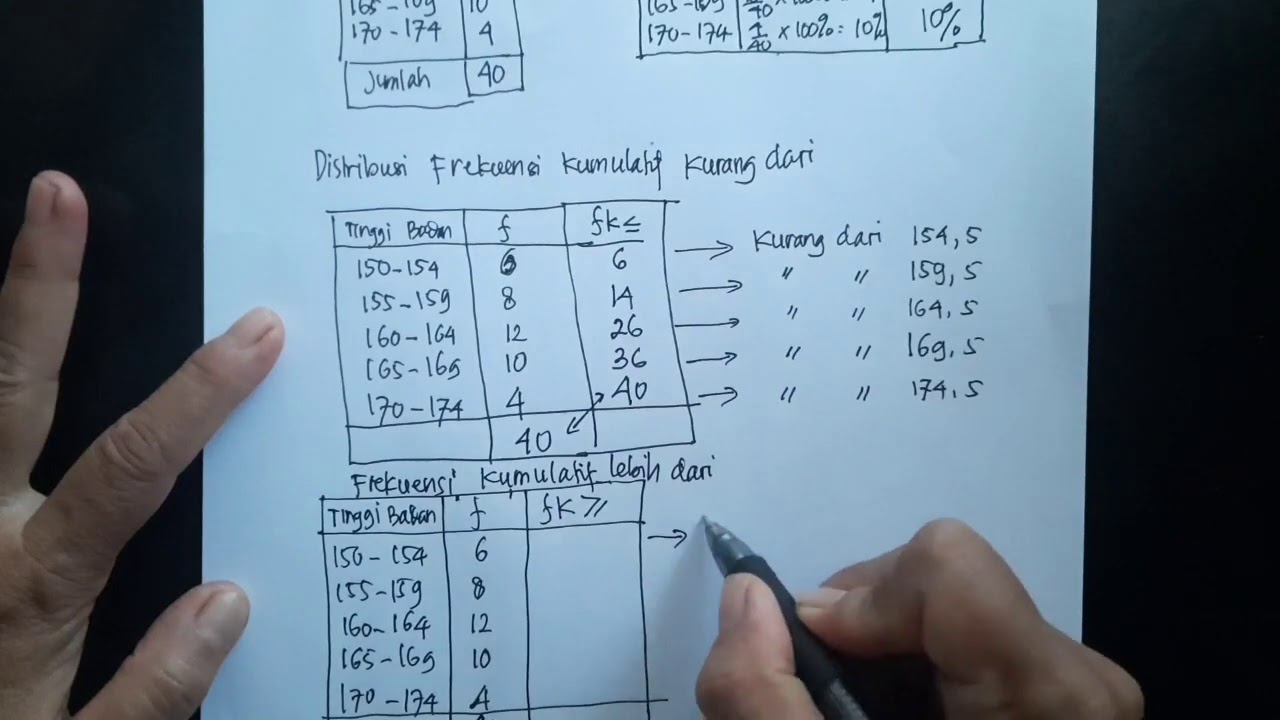
- 📈 The video explains how to calculate cumulative frequencies, which are essential for plotting the Ogive graph.
- 📋 Two types of Ogive graphs are introduced: positive and negative, each representing data differently.
- 📝 The process of plotting the Ogive graph involves creating a horizontal axis for data and a vertical axis for frequency.
- 📉 The video provides a step-by-step guide on how to plot points and connect them with straight lines to form the Ogive graph.
- 🏫 The video is educational, aimed at students in the 12th grade studying mathematics, specifically statistics.
- 🔢 The script includes a practical example of calculating frequencies and cumulative frequencies for different classes or groups.
- 📊 The video explains how to interpret the Ogive graph, including identifying the maximum frequency and the class with the highest data points.
- 🔄 The video also covers how to convert an Ogive graph back into a frequency distribution table.
- ✅ The video concludes with a verification of statements related to the data represented in the Ogive graph, emphasizing the importance of careful data interpretation.
Q & A
What is the main topic discussed in the video?
-The main topic discussed in the video is the creation and understanding of Ogives, specifically focusing on cumulative frequency graphs in the context of statistics.
What are the two types of Ogives mentioned in the script?
-The two types of Ogives mentioned are positive Ogives and negative Ogives.
What is the significance of positive and negative Ogives in the context of the video?
-Positive Ogives are used to show data that increases from left to right, while negative Ogives are used to show data that decreases from left to right, reflecting the cumulative frequency of data points.
How are the cumulative frequencies calculated in the video?
-Cumulative frequencies are calculated by adding the frequency of the current class to the sum of the frequencies of all previous classes.
What is the purpose of drawing a horizontal axis in the Ogive graph?
-The horizontal axis in the Ogive graph represents the data classes, and it is used to plot the cumulative frequencies for each class.
What does the vertical axis represent in the Ogive graph?
-The vertical axis in the Ogive graph represents the cumulative frequencies, showing the accumulation of data points up to each class.
How does the video script guide the creation of a positive Ogive?
-The script guides the creation of a positive Ogive by first calculating the cumulative frequencies, then plotting these on a graph with a horizontal axis for classes and a vertical axis for frequencies, and finally connecting the points with straight lines.
What is the method to create a negative Ogive as described in the script?
-To create a negative Ogive, the script suggests calculating the cumulative frequencies from the bottom up, plotting these on the graph, and then connecting the points with straight lines to form the negative Ogive.
What is the application of Ogives in the context of the video?
-In the video, Ogives are applied to analyze student performance data, such as determining the number of students who need remedial education based on their scores.
How does the video script use Ogives to interpret student data for educational purposes?
-The script uses Ogives to interpret student data by identifying the number of students who fall below certain score thresholds, which helps in deciding which students need to follow remedial or enrichment programs.
What is the conclusion about the number of students needing remedial education based on the Ogive analysis in the script?
-Based on the Ogive analysis, the script concludes that there are 19 students needing remedial education out of a total of 40 students, indicating that more students do not need remedial education.
Outlines

هذا القسم متوفر فقط للمشتركين. يرجى الترقية للوصول إلى هذه الميزة.
قم بالترقية الآنMindmap

هذا القسم متوفر فقط للمشتركين. يرجى الترقية للوصول إلى هذه الميزة.
قم بالترقية الآنKeywords

هذا القسم متوفر فقط للمشتركين. يرجى الترقية للوصول إلى هذه الميزة.
قم بالترقية الآنHighlights

هذا القسم متوفر فقط للمشتركين. يرجى الترقية للوصول إلى هذه الميزة.
قم بالترقية الآنTranscripts

هذا القسم متوفر فقط للمشتركين. يرجى الترقية للوصول إلى هذه الميزة.
قم بالترقية الآنتصفح المزيد من مقاطع الفيديو ذات الصلة

Statistika - Penyajian Data ( Histogram, Poligon & Ogive )

FREKUENSI RELATIF DAN FREKUENSI KUMULATIF, HISTOGRAM, DAN POLIGON

FREQUENCY DISTRIBUTION: Common Terminologies Vid#4 FREE Tutorial | Statistics | EASILY EXPLAINED!

VIDEO ANIMASI MATEMATIKA MATERI PENYAJIAN DATA KELAS 10

Representações Gráficas I | Estatística Básica 03

Statistika 05 | Distribusi Frekuensi dalam Statistika | Frequency Distribution | Belajar Statistika
5.0 / 5 (0 votes)
