PSD - Data Visualization Part.01/02

Devvi Sarwinda
22 Oct 202012:42

Summary

TLDRThis lecture introduces data visualization in the context of data science, emphasizing its importance for interpretation and communication. It outlines the basics of visualization, types of data, and visualization techniques. The focus is on data exploration through visualization, which is crucial for identifying trends and patterns. The lecture also touches on the relationship between visualization and statistics, highlighting how visual representation can enhance data interpretation. It categorizes data into nominal, ordinal, interval, and ratio types, and discusses the suitability of different visualizations for each. The session is part of a data science course at the University of Indonesia, supported by academic development funds.

Takeaways

  • 📊 The lecture introduces data visualization as a critical component in the field of data science, emphasizing its role in providing clear interpretations of data.
  • 🎯 The purpose of the lecture is to explore various forms of data processing, with a focus on the importance of visualizing data for better understanding and analysis.
  • 📈 The lecture outlines two types of visualization: exploratory data visualization, aimed at accurately representing what is depicted, and presentation data visualization, aimed at convincing viewers of the accuracy of the representation.
  • 🔍 A significant focus in academic and educational settings is on exploratory data visualization, which is crucial for initial analysis before building machine learning systems.
  • 📋 The lecture highlights the importance of visualizing data to identify trends, which is more effective than analyzing data in tabular form alone.
  • 📊 The necessity of visualization is underscored by its ability to reveal patterns and assist in making predictions, a critical aspect of data analysis.
  • 🧠 The lecture connects data visualization with artificial intelligence and machine learning, suggesting that visual insights can inform and improve these technologies.
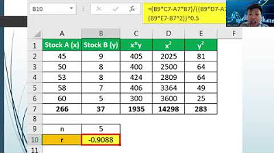
  • 📊 The role of statistics in data visualization is discussed, with an emphasis on using statistical terms like standard deviation and correlation to enhance data interpretation.
  • 📚 The lecture categorizes data into four types: nominal, ordinal, interval, and ratio, each with distinct characteristics and visualization requirements.
  • 📈 The differences between nominal and ordinal data are clarified, with nominal data lacking order and ordinal data having a ranked sequence.
  • 📊 The lecture concludes with a discussion on the types of visualization based on data dimensions, ranging from one-dimensional to three-dimensional, setting the stage for further exploration in subsequent videos.

Q & A

  • What is the main purpose of data visualization in the context of data science?

    -The main purpose of data visualization is to provide a good interpretation of data. When data is visualized effectively, it can be better understood and analyzed.

  • What are the two types of data visualization discussed in the script?

    -The two types of data visualization discussed are 'exploration' and 'presentation'. Exploration focuses on understanding the data, while presentation aims to convince others of the accuracy of the data visualization.

  • Why is data visualization important before conducting machine learning analysis?

    -Data visualization is important before machine learning analysis because it helps to understand the characteristics of the data. It can reveal trends and patterns that are not easily discernible from raw data, which is crucial for building effective machine learning models.

  • How can visualizing data help in identifying trends?

    -Visualizing data can help in identifying trends by representing data in graphical formats such as bar charts, line graphs, or scatter plots. These visual representations make it easier to spot patterns, changes, and correlations within the data.

  • What is the relationship between data visualization and artificial intelligence or machine learning?

    -Data visualization is related to artificial intelligence and machine learning as it provides a way to explore and understand data, which is a fundamental step before applying AI or machine learning techniques. Visual insights can guide the development and tuning of these intelligent systems.

  • What are the four types of data mentioned in the script?

    -The four types of data mentioned are nominal, ordinal, interval, and ratio. These categories help in understanding how data should be visualized and analyzed.

  • How does nominal data differ from ordinal data?

    -Nominal data represents categories without any inherent order, such as gender or types of pets. Ordinal data also represents categories but with a specific order, like ranking or ratings.

  • What are interval and ratio data types, and how do they differ?

    -Interval data types are numeric and have equal intervals between values but no true zero point, such as temperature in Celsius. Ratio data types also have numeric values with equal intervals and a true zero point, indicating a ratio, such as weight or speed.

  • Why is it important to consider the type of data when creating visualizations?

    -Considering the type of data when creating visualizations is important because different data types have different characteristics and require specific types of visualizations to accurately represent the information and insights they contain.

  • What are the different dimensions of data visualization mentioned in the script?

    -The script mentions one-dimensional, two-dimensional, and three-dimensional data visualizations. These dimensions refer to the complexity and depth of the data representation in the visual format.

  • Who produced the module discussed in the script?

    -The module was produced by the Department of Statistics, Faculty of Mathematics and Science, University of Indonesia, with support from the Directorate of Academic Development and Learning Resources (DP ASDP).

Outlines

00:00

📊 Introduction to Data Visualization

This paragraph introduces the topic of data visualization within the context of data science. The speaker emphasizes the importance of visualizing data to provide clear interpretations and insights. The lecture aims to cover the basics of data visualization, types of data, and types of visualizations. It distinguishes between two types of visualizations: data exploration (which focuses on accurately representing the data) and data presentation (which aims to convince the audience of the accuracy of the presented information). The speaker highlights the significance of visualization in identifying trends and patterns, and its utility in performance evaluation within machine learning and intelligent systems.

05:03

🔢 Data Types and Statistical Visualization

The second paragraph delves into the relationship between data visualization and statistics. It mentions the frequent use of statistical terms in visualization, such as standard deviation and correlation. The paragraph explains how visualizing data can lead to better interpretation compared to mere numerical representation. It also touches upon the categorization of data types into nominal, ordinal, interval, and ratio, providing examples for each. The speaker discusses the characteristics of these data types, such as whether they have an inherent order or can be subjected to mathematical operations like division, which is typical for ratio data types.

10:04

📈 Types of Data Visualization

The final paragraph discusses the various types of data visualization, categorized based on dimensions (one-dimensional, two-dimensional, and three-dimensional). It suggests that the choice of visualization technique depends on the nature and dimensions of the data. The speaker indicates that further details about these types of visualizations will be covered in subsequent videos. The paragraph concludes with acknowledgments to the University of Indonesia's Statistics program and the Directorate for Academic Development and Learning Resources for their support in producing the educational module.

Mindmap

Keywords

💡Data Visualization

Data visualization refers to the graphical representation of information and data. It is a key concept in the video as it emphasizes the importance of visualizing data to provide better interpretations and insights. The video suggests that visualizing data can reveal trends and patterns that might not be evident from raw data or tables alone. For instance, the script mentions creating bar charts, line graphs, and scatter plots to visualize data, which helps in identifying trends and making predictions.

💡Data Exploration

Data exploration is the initial phase of data analysis where one investigates the data to discover patterns, relationships, and anomalies. The video highlights that in academic or teaching contexts, the focus is often on data exploration visualization, which is about accurately representing what the data shows. This is crucial before building analysis systems or machine learning models to ensure that the data is well understood.

💡Data Presentation

Data presentation is the process of displaying data in a way that is understandable and convincing to the audience. Unlike data exploration, which is more about understanding the data, data presentation is about convincing others of the validity of the data's representation. The video suggests that visualizing data for presentation is about making sure that what is seen by others is accurately represented, which is essential for effective communication of data findings.

💡Statistical Terms

Statistical terms are specific vocabulary used in the field of statistics to describe data and its properties. The video mentions that many statistical terms are used in data visualization, such as 'standard deviation' and 'correlation.' These terms help in quantifying the data's variability and relationships, which are then visually represented to enhance understanding. For example, the script talks about calculating standard deviation to understand the spread of data, which can be visualized to provide a clearer picture.

💡Data Types

Data types refer to the classification of data based on its characteristics. The video discusses four main types: nominal, ordinal, interval, and ratio. Understanding data types is crucial for choosing the appropriate visualization techniques. For instance, nominal data, which includes categories without order, might be visualized using pie charts, while ordinal data, which has a natural order, could be represented using ordered bar charts.

💡Trend Analysis

Trend analysis involves examining data over time to identify patterns or changes. The video script mentions the importance of visualizing data to observe trends, such as the concentration of a chemical compound increasing or decreasing. Visual representations like line graphs are particularly useful for trend analysis as they can clearly show changes over time.

💡Machine Learning

Machine learning is a subset of artificial intelligence that enables systems to learn from data and improve from experience without being explicitly programmed. The video connects data visualization with machine learning, suggesting that visualizing data can aid in understanding the performance of machine learning models. For example, visualizing the accuracy or error rates of a model can help in tuning the model for better performance.

💡Data Interpretation

Data interpretation is the process of understanding the meaning of data. The video emphasizes that visualizing data can greatly enhance the interpretability of data compared to viewing it in tabular form. By visualizing data, one can more easily identify patterns, outliers, and other insights that might not be apparent from raw numbers. The script gives examples of how visualizing data can help in interpreting the spread and distribution of data points.

💡Data Distribution

Data distribution refers to the way data points are spread across a range of values. Understanding the distribution is crucial for statistical analysis and data visualization. The video script mentions that visualizing data can help in determining if the data follows a normal distribution or another pattern. This is important for statistical tests and for making inferences from the data.

💡Visual Representations

Visual representations are graphical depictions of data used to convey information. The video discusses various types of visual representations such as bar charts, line graphs, and scatter plots. These representations are chosen based on the type of data and the message one wants to convey. For example, the script mentions creating a bar chart to show percentages or a scatter plot to visualize the relationship between two variables.

💡Dimensionality

Dimensionality in data visualization refers to the number of axes or dimensions used to represent data. The video script talks about one-dimensional, two-dimensional, and three-dimensional visualizations. Each dimensionality allows for different types of data representation and analysis. For instance, one-dimensional visualizations might focus on a single variable, while two or three-dimensional visualizations can show relationships between multiple variables.

Highlights

The lecture introduces data visualization as a crucial part of data science.

The purpose of data visualization is to provide good interpretation of data.

Two types of visualization are discussed: exploratory and presentational.

Exploratory visualization focuses on accurately representing what is depicted.

Presentational visualization aims to convince viewers of the accuracy of the depicted data.

The importance of visualization in data analysis is emphasized.

Data visualization is essential for identifying trends and patterns.

The lecture connects visualization with techniques in machine learning.

The necessity of visualization before running machine learning models is highlighted.

Visualization helps in understanding data distribution and patterns.

The role of visualization in performance evaluation within machine learning is discussed.

The relationship between visualization and statistics is explored.

Data types are categorized into nominal, ordinal, interval, and ratio.

Nominal data types are explained as categorical without order.

Ordinal data types are categorical with an inherent order.

Interval and ratio data types are both numeric but differ in their properties.

Examples are given to differentiate between nominal, ordinal, interval, and ratio data types.

The lecture concludes with gratitude to the University of Indonesia and the supporting bodies.

The importance of understanding data types for effective visualization is emphasized.

Transcripts

play00:06

MP3

play00:07

Hai assalamualaikum warahmatullahi

play00:10

wabarakatuh sama datang di perkuliahan

play00:14

pengantar sains data pada topik sesi

play00:19

modul hari ini kita akan membahas

play00:21

mengenai visualisasi data Adapun tujuan

play00:27

dari perkuliahan ini ataupun dari model

play00:29

ini adalah salah satunya di dalam

play00:33

pengantar sains data banyak sekali

play00:36

bentuk-bentuk pengolahan data yang bisa

play00:39

kita lakukan visualisasi nah gunanya

play00:42

visualisasi data ini salah satunya

play00:44

adalah supaya kita bisa memberikan

play00:48

interpretasi dengan baik jika data bisa

play00:52

divisualisasikan dengan baik juga nah

play00:57

untuk visualisasi data

play01:00

Hai ada beberapa hal yang akan dibahas

play01:02

untuk modul kali ini yaitu mengenai

play01:05

salah satunya adalah sebagai berikut nah

play01:10

Adapun outline yang kita akan kita bahas

play01:13

yaitu mengenai yang pertama adalah

play01:15

dasar-dasar dari visualisasi kemudian

play01:20

jenis data dan juga tipe visualisasi Nah

play01:27

ada dua jenis visualisasi yang pertama

play01:30

yaitu mengenai eksploitasi data dari

play01:32

visualisasi

play01:35

Hai kemudian kemudian ada juga mengenai

play01:41

presentasi data Nah untuk visualisasi

play01:45

ekspor Reza Sidharta ini yaitu kita

play01:48

lebih membahas mengenai gambaran apa

play01:51

yang digambarkan itu adalah benar

play01:53

Sedangkan visualisasi dari presentasi

play01:55

data itu adalah meyakinkan bahwa apa

play01:58

yang digambarkan oleh yang dilihat oleh

play02:01

orang-orang itu dia benar Nah biasanya

play02:03

dalam akademik atau sisi pengajaran itu

play02:08

paling banyak fokusnya adalah movie

play02:10

sensasi eksploitasi data atau data

play02:13

exploration visualisasi kemudian yang

play02:17

selanjutnya baru kita akan melanjutkan

play02:20

mengenai visualisasi tentang presentasi

play02:23

dari suatu data nah biasanya untuk

play02:27

visualisasi maaf untuk revitalisasi

play02:30

model data eksplorasi ini biasanya

play02:34

mengaitkan

play02:35

ini app visualisasi yang lebih

play02:38

memulaikan terhadap teknik-teknik Nah

play02:42

jadi seperti apa kita bisa memfitkan

play02:44

dari suatu data tersebut dia lebih cocok

play02:48

kepada model yang mana Nah penting

play02:53

Mengapa kita penting office lisasi data

play02:55

Jadi sebenarnya sebelum kita melakukan

play02:58

atau menjalankan suatu analisis yang

play03:01

kita bangun di dalam bentuk sistem

play03:03

machine-learning tersebut yaitu salah

play03:05

satunya adalah kita bisa mau visualisasi

play03:08

adat yang kita punya nah Biasanya kalau

play03:11

misalnya kita punya data yang contohnya

play03:13

saja saya kita punya data yang modelnya

play03:16

adalah numerik ya Misalnya adalah suatu

play03:19

bentuk tabel nah pagi model datanya Ting

play03:22

sangat banyak Nah mungkin kita misalnya

play03:25

hanya mencari misalnya menentukan

play03:27

tingkat persentase Nah mungkin dengan

play03:29

memfiksasi teh data seperti kita bisa

play03:32

menggambarkan diagram batang kemudi

play03:35

ndak bisa menggambarkan visualisasi

play03:40

bentuk Linenya atau skater Cloud

play03:44

kemudian misalnya kita bisa membuat

play03:45

dalam bentuk grafiknya itu sebaiknya itu

play03:47

lebih baik ketika kita bisa

play03:50

menginterpretasikan kalau Bentuknya itu

play03:52

adalah secara visualisasi dibandingkan

play03:54

kalau misalkan kita membentuknya itu

play03:58

dilihat hanya berdasarkan tabel saja nah

play04:03

jika kita tidak bisa mengidentifikasikan

play04:06

suatu trend atau misalnya mempeng n

play04:08

membuat suatu prediksi nah ini juga

play04:10

biasanya sangat penting dilakukan dengan

play04:12

visualisasi jadi juga sebenarnya Kenapa

play04:15

butuh visualisasi itu salah satunya kita

play04:17

bisa melihat trennya misalnya di dalam

play04:20

berbagai ilmu saya saya misalkan saya

play04:23

contohkan disini misalkan di kimia best

play04:26

alkana Saya pengen lihat ngetren

play04:28

kira-kira suatu senyawa kimia terhadap

play04:32

nilai apa konsentrasinya itu

play04:35

lima makin meningkat atau tidak Nah itu

play04:38

kan sebaiknya dilihat secara visualisasi

play04:40

data dibandingkan kalau kita melihatnya

play04:42

di dalam tabel ya jadi salah satunya itu

play04:45

adalah bisa kita lihat dalam bentuk

play04:47

trend nah kemudian ini secara khusus

play04:51

biasanya penting ketika kita bisa

play04:54

melakukan performance yaitu salah

play04:56

satunya menggunakan metode di dalam

play04:59

mesin learning yaitu tentang aktivitas

play05:02

intelijen nah pada pembahasan Yang

play05:05

pertama mengenai sense data itu salah

play05:07

satu datang sayur situ paling banyak

play05:10

mati berkaitan dengan artificial

play05:12

intelegent pendekatan artificial

play05:15

intelegent ini salah satunya itu bisa

play05:17

kita kaitkan dengan ameto dari

play05:20

artificial intelegent ataupun

play05:22

machine-learning Nah apa kaitanya

play05:27

visualisasi dengan statistik nah

play05:29

biasanya di dalam melakukan visualisasi

play05:31

ini banyak

play05:35

Hai istilah-istilah statistik juga yang

play05:37

kita sering gunakan misalkan kita ingin

play05:40

menghitung nilai nilai standar deviasi

play05:42

korelasi nah ini biasanya di dalam

play05:44

visualisasi data juga akan dilihat

play05:46

al-hasby berikut Nah jadi sebenarnya di

play05:52

dalam ilmu statistik juga memvisualisasi

play05:54

data itu menginterpretasikan data itu

play05:58

lebih baik dibandingkan kalau dibentuk

play06:00

dalam kabel saja Oke misalkan yang kita

play06:03

lihat ya kalau misal kita punya data

play06:05

dalam bentuk tabel Ternyata kau kita

play06:07

visualisasikan bentuknya seperti ini ya

play06:09

kalau kita buat dalam bentuk apa namanya

play06:13

grafik Ya ataupun skater Cloud Nah bisa

play06:16

kita lihat bahwa bentuknya seperti ini

play06:18

nah jadi dari data ini nanti bisa kita

play06:20

interpretasikan akhir-akhir adata ini

play06:23

sempat penyebarannya Seperti apa kalau

play06:25

misalnya dalam statistik Apakah dia bisa

play06:27

mengikuti distribusi Normal atau tidak

play06:30

misalnya ya kemudian nah jenis-jenis

play06:35

namun kini topik sebelumnya tadi modul

play06:38

sebelumnya kita sudah membahas juga

play06:40

mengenai jenis-jenis data nah disini

play06:42

sebenarnya lebih terkait tentang

play06:44

tipe-tipe data salah satunya itu bisa

play06:49

kita bagi dalam empat jadi tipe-tipe

play06:51

data terutama di dalam bidang Ilmu

play06:53

Statistik juga ada empat model data itu

play06:57

tipenya nominal tipenya ordinal tipenya

play07:01

interval dan tipenya rasio Nah untuk

play07:04

yang tipenya nominal biasanya ini a

play07:07

model yang termasuk data kategori dan

play07:10

biasanya tidak terurut Contohnya apa

play07:12

contohnya misalkan hewan peliharaan ada

play07:16

anjing ada kucing ada kelinci ada burung

play07:19

Nah jadi mereka termasuk model data

play07:22

kategori tapi mereka tidak tidak ada

play07:24

rankingnya gitu misalkan apalagi

play07:26

misalkan gender ya jenis kelamin

play07:28

laki-laki perempuan itu kategori tapi

play07:31

kita tidak tidak punya urutan disitu

play07:34

artinya

play07:35

Hai Ah gitu nomor satu perempuan nomor 2

play07:37

enggak ya Jadi tidak ada urutannya Nah

play07:40

kemudian ada tipe data yang jenisnya

play07:42

ordinal Nah untuk tipe data yang

play07:44

jenisnya ordina app Ini ada-ada

play07:49

kategori-kategori contohnya itu adalah

play07:51

nah 12345 misalkan kemudian nilai Amin

play07:59

bbpress Nah itu juga berupa data

play08:02

kategori tapi dia punya urutan jadi itu

play08:05

adalah data ordinal kemudian ada data

play08:08

interval Nah jadi kalau data interval

play08:10

ini adalah jenis data numerik ya jenis

play08:14

data numerik yang nilainya itu bisa

play08:20

dibentuk ke dalam suatu bentuk interval

play08:23

misalkan apa misalkan temperatur yang

play08:25

sangat temperatur kemudian operasinya

play08:28

itu bisa dibuat ke dalam bentuk kecil

play08:30

semua dengan besar pemandangan dan

play08:32

sebagainya kemudian rasio naon

play08:35

yo yo ini ada terdiri atas data numerik

play08:39

kemudian contohnya juga seperti interval

play08:45

ya Tapi biasanya kalau berbicara tentang

play08:48

rasio biasanya kitab membahas tentang

play08:51

proporsi jadi ada-ada operasi pembagian

play08:53

disitu nah kemudian untuk nilai nominal

play09:03

ordinal sendiri jadi letaknya itu

play09:06

sebenarnya kalau letak antara ordinal

play09:09

dan nominal kita ketahui sama-sama

play09:11

mereka itu adalah tipe jenis data

play09:14

kategori tipe jenis data kategorik

play09:17

tetapi ada perbedaannya Yang satu

play09:21

nominal itu tidak memperhatikan urutan

play09:23

sedangkan original itu dia memperhatikan

play09:25

urutan Nah iya jadi kalau misalnya bisa

play09:30

dilihat ya kalau bisa biasa kira-kira

play09:33

gender

play09:35

lu pertama gender gender itu lebih masuk

play09:37

ke mana Yang kedua apa pendapatan

play09:42

tahunan menggunakan tahunan Jadi mungkin

play09:44

yang pertanyaan di sini nanti bisa saya

play09:48

ajukan di forum lain bisa menentukan

play09:51

kira-kira gender kemudian pendapatan

play09:56

tahunan kemudian reaksi orang pada

play10:00

pertanyaan Apakah dia disagree panah

play10:03

Netral apa tidak setuju kemudian Apakah

play10:07

pengen menambahkan lisdin email atau

play10:10

enggak gitu Nah itu kira-kira masuk yang

play10:13

nominal atau ordinal nanti mungkin saya

play10:15

bisa tanyakan di forum diskusi ya nanti

play10:19

bisa kalian jawab dan kalian pikirkan

play10:22

kira-kira Diantara empat contoh Ini yang

play10:24

mana nomina yang mana ordinal nah

play10:29

kemudian Sedangkan untuk interval dan

play10:31

ratio jadi kedua-duanya ini juga

play10:34

sama-sama

play10:35

akan am jenis data yang numerik ya jenis

play10:39

data numerik tapi ada perbedaannya nah

play10:42

kalian tolong nanti coba dipikirkan juga

play10:44

kira-kira Diantara empat contoh ini mana

play10:47

yang termasuk rasio termasuk interval

play10:50

pertama kalau panjang dalam meter yang

play10:53

kedua Kau panjang dalam Fit yang ketiga

play10:55

kalau kecepatan meter per sekon yang

play10:58

keempat itu misalnya skor IQ kira-kira

play11:01

coba mencari nilai kira-kira dia

play11:07

merupakan rasio Jadi kalau tidak kalau

play11:11

dia nilainya interval ya berarti di and

play11:13

check itu ya tidak nah kemudian kita

play11:19

masuk kepada jenis-jenis visualisasi Nah

play11:22

untuk jenis-jenis disorientasi data ini

play11:25

ada beberapa macam yang pertama itu

play11:29

adalah berdasar dari satu dimensi jadi

play11:32

ada yang satu dimensi ada yang 2 dimensi

play11:34

dan 3 dimensi

play11:35

gitu Nah untuk yang satu dimensi ini

play11:37

nanti modelnya berbagai jenis yang

play11:41

biasanya ini fokus kepada jenis dan

play11:43

dimensi dari letak data tersebut nah ini

play11:47

jenis-jenis dari visualisasi data baik

play11:51

untuk di video selanjutnya kita akan

play11:54

membahas mengenai masing-masing jenis

play11:56

dari Hafidz oishi data tersebut mulai

play11:59

dari satu dimensi sampai kepada tiga

play12:01

dimensi saya sebagai mentor untuk modul

play12:11

ini ucapan terima kasih dan saya juga

play12:14

ingin berterima kasih bahwa pada

play12:17

pembuatan modul ini itu diproduksi oleh

play12:20

program studi statistik Fakultas

play12:23

Matematika dan ilmu pengetahuan

play12:25

Universitas Indonesia yang didukung dari

play12:28

bantuan dana Direktorat pengembangan

play12:31

akademik dan sumber daya pembelajaran

play12:33

atau DP ASDP

play12:35

Oh begitu terima kasih dan saya akhiri

play12:39

dengan salamualaikum warahmatullahi

play12:41

wabarakatuh

Rate This

5.0 / 5 (0 votes)

الوسوم ذات الصلة
Data VisualizationData ScienceExploratory AnalysisStatistical ConceptsMachine LearningData TypesGraphical RepresentationTrend AnalysisEducational ContentResearch Methodology
هل تحتاج إلى تلخيص باللغة الإنجليزية؟