Construindo Plots com Matplotlib em Python
Summary
TLDRThis educational video script introduces viewers to creating graphs using Python's Matplotlib library. The instructor demonstrates how to import Matplotlib and its pyplot package, creating simple plots with minimal code. The script emphasizes the ease of graph creation, showcasing customization options like labels, titles, and legends. It introduces the concept of 'grammar of graphics,' highlighting the layers involved in building a graph. The tutorial aims to simplify data visualization, making Python programming for graphs accessible.
Takeaways
- 📊 The script introduces the concept of creating plots or graphs as a visual representation of data using Python.
- 💻 It mentions the use of the Matplotlib library, specifically the pyplot package, for creating and customizing plots within a Jupyter notebook.
- 🔧 The script explains that Matplotlib is not just a plotting library but a comprehensive tool for data visualization in data analysis, machine learning, and more.
- 📈 The speaker demonstrates how to create a simple plot using the `plot` method of the pyplot module, passing two lists of numbers as arguments.
- 🖼️ The script highlights the ability to customize plots with various parameters, such as axis labels, titles, and colors, to enhance data interpretation.
- 🛠️ The concept of 'grammar of graphics' is introduced, which is a set of rules and best practices for creating effective and understandable graphs.
- 🎨 The script showcases how to add layers to a plot, such as data layers, legends, text, and even multiple plots on top of each other.
- 📝 The speaker emphasizes the ease of creating plots with Python, suggesting that with just a few lines of code, one can produce sophisticated visualizations.
- 🌈 Examples are given on how to add labels to axes, titles to plots, and legends to differentiate between data series within the same graph.
- 🔑 The script concludes by encouraging viewers to learn more about the 'grammar of graphics' and to explore the full potential of data visualization tools like Matplotlib.
Q & A
What is the main focus of the video script?
-The main focus of the video script is to introduce the concept of creating graphs or plots using Python, specifically with the Matplotlib library.
Why is Matplotlib a popular choice for data visualization in Python?
-Matplotlib is popular because it is a comprehensive library for creating static, interactive, and animated visualizations in Python, widely used in data analysis, scientific computing, and machine learning.
What is the term used to describe a graphical representation of data in the script?
-The term used to describe a graphical representation of data is 'plot' or 'pote' in Portuguese.
Which specific package within Matplotlib is mentioned for creating and customizing plots?
-The specific package mentioned within Matplotlib for creating and customizing plots is 'pyplot'.
How does the script suggest importing the 'pyplot' package from Matplotlib?
-The script suggests importing 'pyplot' from Matplotlib by using 'from matplotlib import pyplot as plt', where 'plt' is an alias for 'pyplot'.
What is the purpose of the 'plt.show()' function in the context of the script?
-The 'plt.show()' function is used to display the plot that has been created within the script.
What does the script imply about the ease of creating plots in Python over time?
-The script implies that creating plots in Python has become increasingly easier over time, with the evolution of libraries like Matplotlib making the process more straightforward.
What is the term used in the script to describe the area where the graph is drawn?
-The term used to describe the area where the graph is drawn is 'plot area'.
How can the script's content be complemented with additional information?
-The script's content can be complemented by reading the definitions provided in the Tijuca notebook, which are meant to supplement the video's explanations.
What is the concept introduced in the script that compares creating a plot to constructing layers?
-The concept introduced is the 'grammar of graphics', which likens creating a plot to building a set of layers, such as data, legend, text, and multiple plots on top of each other.
How does the script demonstrate customizing a plot with labels and titles?
-The script demonstrates customizing a plot by using methods like 'xlabel', 'ylabel', and 'title' to add labels and titles to the x-axis, y-axis, and the overall plot, respectively.
Outlines

هذا القسم متوفر فقط للمشتركين. يرجى الترقية للوصول إلى هذه الميزة.
قم بالترقية الآنMindmap

هذا القسم متوفر فقط للمشتركين. يرجى الترقية للوصول إلى هذه الميزة.
قم بالترقية الآنKeywords

هذا القسم متوفر فقط للمشتركين. يرجى الترقية للوصول إلى هذه الميزة.
قم بالترقية الآنHighlights

هذا القسم متوفر فقط للمشتركين. يرجى الترقية للوصول إلى هذه الميزة.
قم بالترقية الآنTranscripts

هذا القسم متوفر فقط للمشتركين. يرجى الترقية للوصول إلى هذه الميزة.
قم بالترقية الآنتصفح المزيد من مقاطع الفيديو ذات الصلة

O Que é e Como Criar Gráfico de Barras com Matplotlib em Python?

Data Visualization Tutorial For Beginners | Big Data Analytics Tutorial | Simplilearn

Video Materi Pengenalan Visualisasi Data
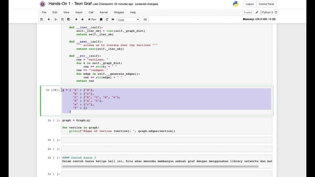
HandsOn Pengenalan Teori Graf

Using Python To Send Telegram Messages To Yourself (In A Few Lines Of Code)
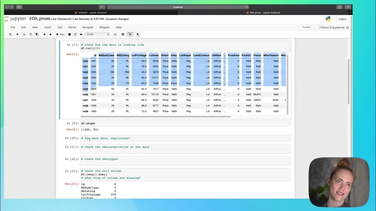
EDA - part 1
5.0 / 5 (0 votes)
