How Typography Elevates Design from Good to Great (Masterclass Part 2/3)
Summary
TLDRIn this masterclass segment, Emmy-winning designer Christo emphasizes the pivotal role of typography in elevating a designer's skill set from good to great. He clarifies the distinction between logo type design and typography, highlighting the latter's focus on manipulating type arrangement for effective communication. Christo advocates that understanding typography, including contrast and space, is fundamental to mastering design in all its forms. He also touches on the importance of expressive typography and its ability to capture attention and convey messages, suggesting that a grasp of this art is crucial for any aspiring designer to achieve greatness.
Takeaways
- 🌟 Typography is a crucial skill for aspiring designers to master in order to elevate their work from good to great.
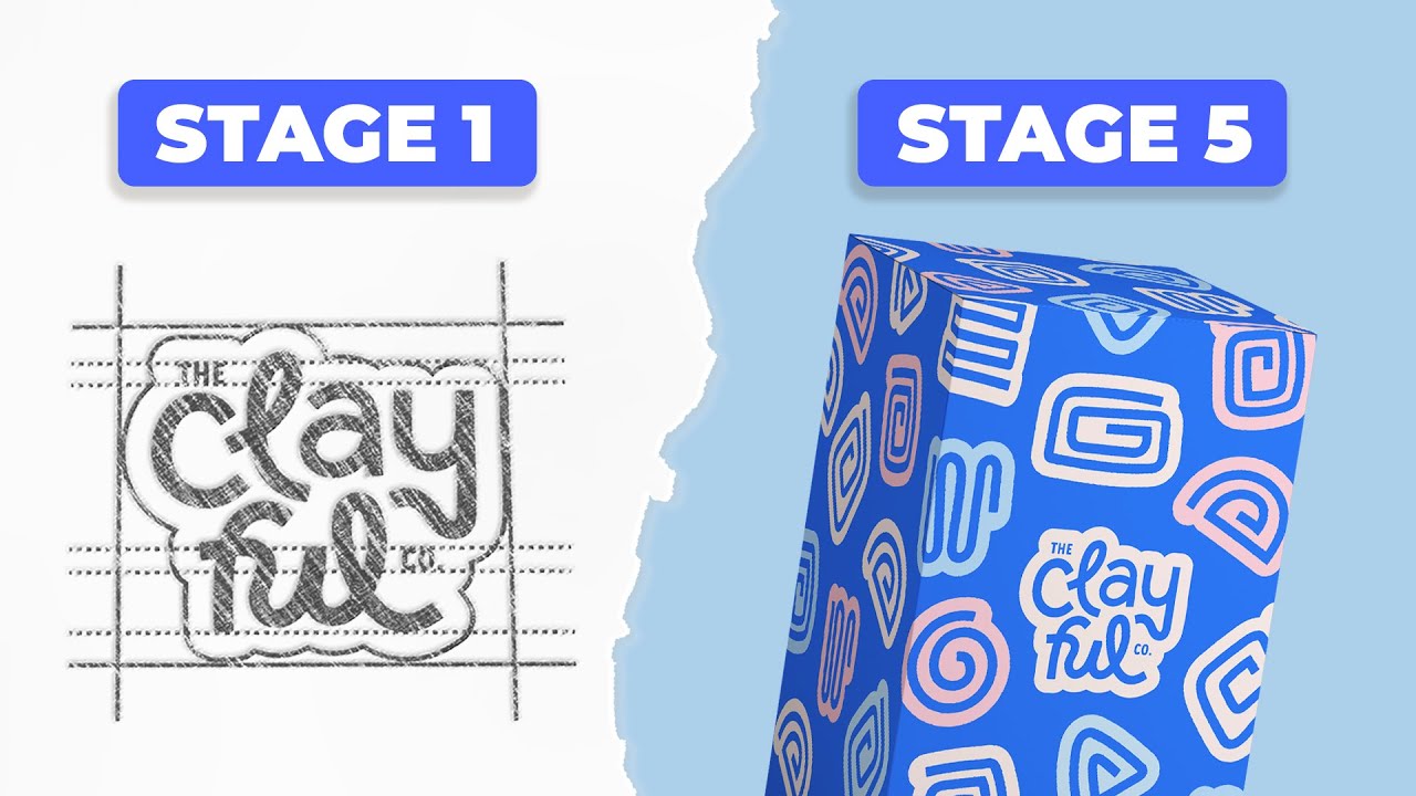
- 🔍 There's a distinction between a logo type designer and a typographer; the former focuses on specific letter combinations for branding, while the latter manipulates type arrangement for communication.
- 📚 A typographer's role involves understanding and utilizing point size, color, weight, and layout to convey ideas effectively.
- 🎨 Expressive typography can be used to capture attention, even if it's not immediately readable; its purpose may be to make the viewer decipher the message.
- 💡 Mastery of typography can lead to a broader understanding of design principles, applicable to various forms of design, including 2D and 3D.
- 🛠️ Rigorous exercises and learning from traditional methods, such as those from the Basel School in Switzerland, can help designers overcome their discomfort with typography.
- 🔄 Understanding contrast in design elements like point size, texture, and weight is key to mastering typography and, by extension, design.
- 🏆 Great typographers often win design competitions, demonstrating their superior understanding of space, color, texture, and contrast.
- 🎭 The work of James Victor showcases how hand-drawn letter forms can become an art form, requiring viewers to work to decipher the message.
- 📖 The intention and goal of a design should dictate the approach to typography, balancing legibility with artistic expression.
- 🎼 Just as music is not just about the notes but also the spaces between them, design is about the balance between structure and freedom.
Q & A
What is the second skill that aspiring designers must master according to the video?
-The second skill that aspiring designers must master is typography, as it is crucial for going from good to great in design.
What is the difference between a logo type designer and a typographer as mentioned in the video?
-A logo type designer focuses on creating a specific expression with a combination of a few letters in a fixed sequence, while a typographer manipulates the arrangement and layout of type to communicate ideas effectively.
What does the video suggest is the 'Kryptonite' for designers?
-The 'Kryptonite' for designers, as mentioned in the video, is typography, which can be a weakness for some and cause them to fall apart in their design work.
What is the purpose of expressive typography according to the video?
-The purpose of expressive typography is not always to be read easily but sometimes to capture attention or make the viewer stop and decipher the message, thus meeting its goal.
What famous quote does the video reference to emphasize the importance of design skills?
-The video references Massimo Vignelli's quote, 'If you can design one thing, you can design everything,' to emphasize the importance of mastering design skills.
What is the significance of learning typography for a designer's overall skill set according to the video?
-Learning typography is significant as it helps a designer understand formal relationships, manipulation of contrast, and arrangement, which can be applied to various facets of design, including 3D design.
What does the video suggest is the relationship between being a great typographer and a great graphic designer?
-The video suggests that one cannot be a great graphic designer without being a great typographer, as typography is a fundamental skill in design.
What is the role of contrast in typography as discussed in the video?
-Contrast in typography, such as in point size, texture, and weight, is essential for creating tension and releasing tension, guiding the reader, and making the design effective.
How does the video describe the work of James Victoria in the context of typography?
-The video describes James Victoria's work as an art form where his hand-drawn letter forms and personal handwriting become beautiful expressions that require the viewer to decipher, adding a layer of interaction.
What is the importance of understanding the intention and goal of a design project according to the video?
-Understanding the intention and goal of a design project is crucial as it helps the designer choose the right approach, balancing between legibility and expressiveness to effectively communicate the message.
What does the video suggest about the use of grids in design?
-The video suggests that while grids are essential tools in design, they should not be overly visible or dominate the design, comparing them to underwear that is meant to be used but not seen.
Outlines
📚 Mastering Typography: The Key to Great Design
In this segment, the video emphasizes the critical role of typography in elevating a designer's skills from good to great. The speaker, Christo, an Emmy award-winning designer, discusses the importance of understanding typography as distinct from logo design. He clarifies that while logo designers focus on specific letter combinations, typographers manipulate type arrangement and layout to convey messages effectively. Christo argues that mastering typography is akin to having a 'Superman' ability in design, with the only 'Kryptonite' being one's discomfort with typography. He suggests that through rigorous exercises and learning from traditional methods, such as those from the Basel School in Switzerland, a designer can overcome this weakness. Typography, according to Christo, is not just about creating visually appealing work but about effectively communicating messages. He also touches on the idea that understanding the formal relationships in typography can translate into success in various design fields, including 3D design. Christo concludes by stating that a great designer must also be a great typographer, as evidenced by award-winning designers who excel in this skill.
🎨 The Art of Legibility and Expressive Typography
The second paragraph delves into the practical applications and artistic expressions of typography. Christo discusses the balance between legible, functional typography and the more artistic, expressive forms that require effort to decipher. He uses the work of James Victoria as an example of the latter, where hand-drawn letter forms become an art form that captures attention and requires the viewer to engage with the design to understand its message. Christo emphasizes the importance of understanding the intention behind a design and choosing the right approach accordingly. He also touches on the idea that while grids and rules are essential, over-reliance can lead to a boring design. The speaker encourages designers to think about the tools and methods they use to convey messages, whether through non-verbal or verbal communication. The segment concludes with a recommendation for viewers to watch a video where Christo applies these principles in real-time, offering a practical demonstration of the importance of typography in design.
Mindmap
Keywords
💡Typography
💡Designer
💡Master Class
💡Kryptonite
💡Contrast
💡Point Size
💡Weight
💡Negative Space
💡Expressive Typography
💡Legibility
💡James Victoria
Highlights
The video discusses the second skill essential for aspiring designers to master, as taught by Emmy award-winning designer, Christo.
Christo emphasizes the importance of typography for designers to transition from good to great.
Designers are compared to Superman or Superwoman, with typography being their only Kryptonite.
Typographers are differentiated from logo type designers, focusing on the arrangement and layout of type rather than creating typefaces.
The purpose of typography is to communicate ideas effectively, not just to capture attention.
Expressive typography can be used to stop viewers in their tracks and make them decipher the message.
Christo shares a famous quote by Massimo Vignelli, highlighting the universality of design skills.
Rigorous exercises from the Basel School in Switzerland can help designers master typography.
Understanding typography translates into mastery of all facets of design, including 3D design.
James Victor's work is highlighted as an example of hand-drawn letter forms elevating to an art form.
The importance of the intention and goal of design in determining the approach to typography.
Most design work involves legible and functional typography, but following all rules can lead to boredom.
Massimo Vignelli's quote about grids being like underwear, meant to be used but not seen, is mentioned.
Christo discusses the importance of understanding the formal relationship when placing elements on a page or screen.
The video concludes with an invitation to watch another video for a real-time application of design principles.
Christo hopes viewers find the video enlightening about the importance of typography in design.
Transcripts
this video is going to dive into the
second skill that you as an aspiring
designer must Master to go from good to
great and we're going to learn it at the
hands of Emmy award-winning designer
Christo in the second part of this
master class series if you missed the
first part go back and watch that now
but for those of you that already
watched it we're going to do a deep dive
on topography and why that's such an
important skill for you to master we're
talking about designers right so you
said how do you go from being an average
designer to a great designer and I'm
going to tell you right now you are like
Superman or Superwoman there's not a lot
that you can't do but you do have one
Kryptonite and if this is your
Kryptonite you're gonna fall apart and
your Kryptonite is typography you know
I'm gonna say it typography
there are some misunderstanding about
what typography is people who design
logo types sometimes refer to themselves
as typographers that's not correct in
typographers are not logo type designers
these are very different skill sets so
logo type designer is concerned about
the individual combination of very
specific number of letters together to
create one expression they're not
worried about if the letters were
reversed or in different order whatever
it is they don't care about that and so
they'll spend a lot of time designing
the perfect alphabet for five or six
letters that's it and in that exact
sequence a typographer in contrast
doesn't design the typeface what they do
is they manipulate the arrangement and
layout of type it's Point size its color
its weight in order for someone to
understand ideas it's arrangement of
letters and words on a screen or on a
page or an app or something like that to
communicate ideas and sometimes the idea
is to just capture your attention and so
some of the traditionalists who don't
understand expressive typography say
like well I can't read that if it's
concept if it's purpose is not for you
to read but it's stopping your tracks to
get you to decipher it then it's met its
goal so typography at least in my
instance has taught me everything about
design and they're so famous Massimo
vignelli quote that says if you can
design one thing you can design
everything and I really believe that so
if typography is your Achilles heel is
your Kryptonite it means that you're
uncomfortable with this there's good
news for you here the good news is if
you go through a series of rigorous
exercises things that we teach and
things have been taught to many
designers many generations before from
the Basel School in Switzerland then you
will learn this thing and it's painful
to learn but once you learn it you can
master design and if they say that
content is King which a lot of people
say well then contrast is Queen learning
about how to manipulate contrast in
point size like big and small in texture
smooth and rough in weight like extra
bold and thin understanding these
relationships a lot of negative space
and deep heavy concentration of type on
a page learning how to use this
translates into every facet of design
not just 2D design with type but also
three-dimensional design once I learned
how to design a poster I could design a
room I could do interior design I could
design furniture and all these things
I've done anything that I can think of
because I understand the formal
relationship that exists when you start
to put things on a page or on the screen
and this to me is a ginormous unlock you
cannot in my opinion be a great designer
if you don't understand typography what
I love about what you just said and my
key takeaway around this is you said the
manipulation of the arrangement of
letters and words for people to
understand the message at the core of
that for me is you are not just making
something pretty you are making
something that effectively communicates
what you're trying to convey what you're
saying is if someone misses that Mark
they're probably just good and not great
am I hearing that right yeah in my
opinion you cannot be a great graphic
designer if you're not a great
topographer too and in fact if you look
through the design annuals in topography
and other International design
competitions you almost always see the
people who win are the best typographers
in the bunch they understand space they
understand color and texture and
contrast in creating tension and
releasing tension they know how to
create primary secondary tertiary reads
and they also know how to do very
beautiful expressive typography as well
we recently had James Victoria on her
show and he does something totally
different which is something that many
of you are going to say well Chris I
watched an episode now you're
contradicting yourself no you my friend
are not paying careful attention enough
right if you think it's a contradiction
James does hand-drawn letter forms and
he takes it to an art form where his
scribbles his brush marks and his
personal handwriting become so beautiful
that they become art itself just the way
that somebody is able to put ink on a
page I kind of draw a parallel to
Chinese calligraphers and if you've seen
them work it's a thing of beauty they're
using ink on a page and they don't have
two shots at this there's no white
there's no building up they just draw
with The Strokes and calligraphers
master calligraphers an artist can
recognize the skill level from one
person to another who's put in 10 20 30
000 hours of practice versus someone who
just starting they can see that so James
primary communication thing isn't about
whether you can read this easily or not
he wants you to work at it to decipher
the meaning or the words that he's drawn
is not illegible but it does require
some work but in that instance you stop
and you try to figure it out and when
you can figure it out a smile happens at
least in your mind now James is not
writing the Declaration of Independence
from the Bill of Rights he's usually
using one or two words or an expression
idea and that's all that's on his
posters and his design and he's
designing this for book covers he's
designed this for posters he's not
designing this for you to read a
manuscript because it would require too
much mental labor you know it's too
intellectually demanding for you to
figure out on any kind of long-term
consistent basis so you have to kind of
weigh what is the intention and the goal
of what it is I'm designing and mix that
with the right approach for the most
part 80 to 90 of what you do is going to
be legible functional typography but if
you follow all the rules it's going to
be really really boring even Massimo
vignelli will talk about this one of the
same quotes is something like grids are
like underwear they're meant to be used
but not seen so so many people like put
grids on everything and it's like yeah I
get it you understand Swiss design
boring you have to learn how to use all
the notes and sometimes the space in
between the notes is the music I'm
borrowing from Massimo again damn that's
a hell of a quote about the unders he's
good at quotes I mean there's a whole
mass of finale Canada that I hope to
learn all of them I love that it's a
conversation and what tools and methods
non-verbally or verbally like I think of
things in communication are you using to
convey the message like with James it's
the whole design is meant to be a mind
game once it clicks you're like oh my
God I'm in the know this is no longer an
inside joke right versus what you're
talking about where you're doing book
covers or manuals or whatnot and there's
like you have to guide the person with
the type and I think that's just
incredible that concludes part two of
this and I hope you find this to be
enlightening in terms of how important
typography is to you as a designer if
you want to upscale I highly recommend
you watch this video right here where
you can actually see me working through
the design problem and see how these
principles apply in real time I hope to
see you sometime soon take care
everybody
foreign
5.0 / 5 (0 votes)