CSS PROJECT 1 OVERVIEW
Summary
TLDRIn this video, the instructor introduces the first project of their HTML and CSS course, guiding viewers through building a complete responsive website. The tutorial covers creating a homepage, about page, and contact page using modern layout techniques like Flexbox and CSS Grid. Viewers will learn to design navigation bars, center content, use images effectively, and implement utility classes. The instructor emphasizes responsive design for mobile devices and shares tips for adding interactive elements, such as tick marks and forms. The video promises a hands-on, engaging experience, encouraging learners to follow along and build a polished, functional website step by step.
Takeaways
- 😀 The video tutorial focuses on building the first website project using HTML and CSS.
- 😀 The creator emphasizes excitement about starting the project and encourages viewers to follow along.
- 😀 The website project will include a homepage, an about page, and a contact page.
- 😀 The project aims to teach practical web design skills like navigation bars, centering elements, and using images.
- 😀 The website design will feature a dark background and text, showcasing basic layout techniques.
- 😀 The tutorial will cover responsiveness, ensuring the website adapts well to mobile screens.
- 😀 Flexbox and Grid will be used for layout management, as covered in the previous HTML and CSS course.
- 😀 The about page will be simple but will demonstrate how to use line breaks and content formatting effectively.
- 😀 The contact page will incorporate a contact form and will utilize image elements.
- 😀 The project will be responsive, meaning it will adjust based on the device (phone, tablet, desktop).
- 😀 Viewers are encouraged to share their excitement and thoughts in the comments, and to stay tuned for future videos on responsive web design.
Q & A
What is the main focus of the video?
-The video focuses on guiding viewers through the process of creating their first HTML and CSS project. The aim is to build a responsive website from scratch, featuring a homepage, about page, and contact page.
What type of content does the website being built in the video include?
-The website includes a homepage, an about page, and a contact page, with elements like navigation bars, text sections, and images. The design also incorporates responsiveness to ensure the site works well on both desktop and mobile devices.
What are some key design elements explained in the video?
-Key design elements discussed include a dark background, centered text sections, image usage, and navigation bars. The speaker also emphasizes the importance of making the site mobile-responsive using modern techniques.
How does the speaker plan to implement responsive design?
-The speaker plans to use techniques like Flexbox and Grid layouts to ensure the website is responsive across different screen sizes, ensuring a consistent experience on both desktop and mobile devices.
Why is Flexbox and Grid being used for the project?
-Flexbox and Grid are chosen because they provide flexible and efficient ways to create responsive and structured layouts, which are essential for creating a well-organized website that adapts to different screen sizes.
What will the tutorial specifically teach about Flexbox and Grid?
-The tutorial will teach viewers how to use Flexbox and Grid for layout management, ensuring they understand how to align and distribute content effectively, creating clean and responsive website designs.
What does the speaker emphasize about the project being mobile-friendly?
-The speaker emphasizes that the website will be fully responsive, meaning it will adapt to mobile devices as well as desktops, providing a seamless experience regardless of screen size.
What kind of skills will viewers gain from this project?
-Viewers will learn the basics of HTML and CSS, how to structure a simple website, how to create responsive layouts, and how to use design elements like navigation bars, images, and text sections. They will also become familiar with Flexbox and Grid layout techniques.
What is the importance of making the website responsive?
-Making the website responsive is crucial because it ensures the website functions well on different devices, such as smartphones and tablets, providing a better user experience by adjusting the layout to fit various screen sizes.
Will viewers be able to apply what they learn in future projects?
-Yes, viewers will gain foundational skills that can be applied to future projects. The principles of HTML, CSS, responsive design, and layout management using Flexbox and Grid are essential building blocks for more advanced web development.
Outlines

此内容仅限付费用户访问。 请升级后访问。
立即升级Mindmap

此内容仅限付费用户访问。 请升级后访问。
立即升级Keywords

此内容仅限付费用户访问。 请升级后访问。
立即升级Highlights

此内容仅限付费用户访问。 请升级后访问。
立即升级Transcripts

此内容仅限付费用户访问。 请升级后访问。
立即升级浏览更多相关视频

Bootstrap 5 Crash Course Tutorial #1 - Intro & Setup
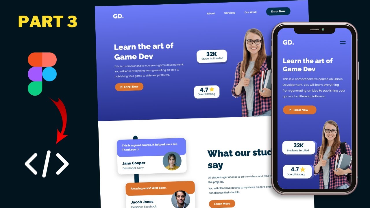
Figma To Real Website | Responsive Homepage | HTML, CSS & JavaScript | Part 3

Video Tutorial 1 Front End - Belajar Dasar Pemrograman Web
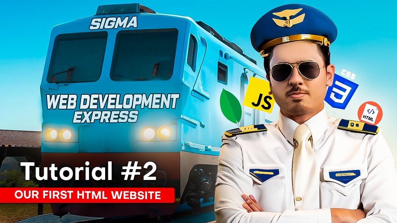
Your First HTML Website | Sigma Web Development Course - Tutorial #2
DESENVOLVENDO MEU PRIMEIRO SITE COM HTML | 4#

Figma To Real Website | Responsive Homepage | HTML, CSS & JavaScript | Part 12
5.0 / 5 (0 votes)
