This UNDERRATED Oil Painting Technique Might Transform Your Colors - Oil Painting Tutorial
Summary
TLDRThis video presents a powerful painting technique that uses complementary colors to desaturate and balance hues without dulling them with black or white. The speaker explains how complementary colors, when mixed, neutralize colors and create complex, vibrant effects. By using strategic color pairs, artists can lighten, darken, and desaturate their palette while preserving vibrancy and depth. The technique is especially useful in portraiture and flesh tones, offering alternatives to traditional methods. The video emphasizes how this approach can add sophistication and vibrancy to artworks, challenging the conventional use of black and white in mixing.
Takeaways
- 😀 Complementary colors are opposites on the color wheel and can help balance and desaturate colors without using black or white.
- 😀 Using complementary colors helps to avoid dull, muddy grays when adjusting colors, providing more vibrant and complex tones.
- 😀 Reducing the saturation of a color doesn't have to involve adding white or black; complementary colors offer a more dynamic alternative.
- 😀 The correct complementary pairs are: red-cyan, yellow-blue, and magenta-green, but it's important to use the right color wheel for these to work.
- 😀 Mixing complementary colors creates neutral gray, and this technique can be used to adjust colors without dulling them.
- 😀 When mixing colors, always consider using complementary pairs for more balanced and harmonious results.
- 😀 Complementary color mixing works not only on the palette but also directly on the canvas to achieve various effects, from subtle corrections to bold contrasts.
- 😀 By using complementary colors in portrait painting, you can balance and harmonize skin tones more naturally, avoiding the use of white or black.
- 😀 Green can be used to balance rose-colored skin tones, while blue can balance yellow-orange tones in the skin, resulting in more natural results.
- 😀 The use of complementary colors in figure painting can prevent skin tones from appearing too dull or lifeless and can make the painting feel more vibrant.
- 😀 Beginners often overlook complementary colors in favor of using black and white, but using complementary pairs can create paintings with more vibrancy and complexity.
Q & A
What is the main problem when trying to desaturate a color in painting?
-The main issue is that when you try to desaturate a color by mixing it with black or white, it can turn dull, dirty, or ash-like, losing the vibrancy and tonal qualities you originally desired.
How can you desaturate colors without losing their vitality?
-You can desaturate colors without losing their vitality by using complementary colors instead of black or white. Mixing complementary colors balances the hue while preserving its vibrancy and tonal qualities.
What is the basic concept of complementary colors in art?
-Complementary colors are pairs of colors that are opposite each other on the color wheel. When mixed, they cancel each other out and create a neutral grey, which can be used to desaturate colors while maintaining their richness.
What is retinal persistence and how does it relate to complementary colors?
-Retinal persistence is the phenomenon where after staring at a color for a period, the complementary color persists in your vision when you look at a neutral background. This concept helps explain why complementary colors create optical effects when used in artwork.
Can you give an example of complementary color pairs?
-Some complementary color pairs are: red and cyan, yellow and blue, and magenta and green. These pairs can be used to desaturate or balance other colors in a painting.
What happens when you mix two complementary colors?
-When you mix two complementary colors, they create a neutral grey because the colors contain the full spectrum of hues missing from each other, balancing out the color mixture.
Why is it beneficial to use complementary colors instead of black and white in a palette?
-Using complementary colors instead of black or white keeps your paintings vibrant and dynamic, adding complexity and richness to the work. Black and white can make colors look flat and lifeless, whereas complementary colors preserve their essence.
What are some examples of complementary pairs on the artist’s palette?
-Some common complementary pairs on the artist’s palette include: cadmium red (or pyrrole red) and cobalt teal or phthalo turquoise, ultramarine blue and yellow ochre, quinacridone magenta and phthalo green (yellow shade).
How can you use complementary colors to adjust flesh tones in a portrait?
-Complementary colors can be used to adjust flesh tones by balancing excessive hues. For example, adding green to neutralize a pink or rose tone, or using blue to tone down yellow-orange undertones, keeping the skin tones natural and harmonious.
How can complementary colors be used on the canvas to create vibrant effects?
-On the canvas, complementary colors can be applied directly to create vibrant effects by blending them into wet paint or keeping them separate for optical mixing. This creates depth and complexity in the painting, as the viewer's eye blends the colors together.
Outlines

此内容仅限付费用户访问。 请升级后访问。
立即升级Mindmap

此内容仅限付费用户访问。 请升级后访问。
立即升级Keywords

此内容仅限付费用户访问。 请升级后访问。
立即升级Highlights

此内容仅限付费用户访问。 请升级后访问。
立即升级Transcripts

此内容仅限付费用户访问。 请升级后访问。
立即升级浏览更多相关视频
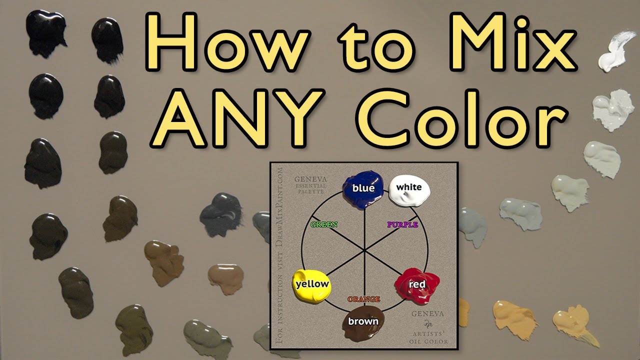
How to Mix ANY Color - No Talent Method - oil painting instruction
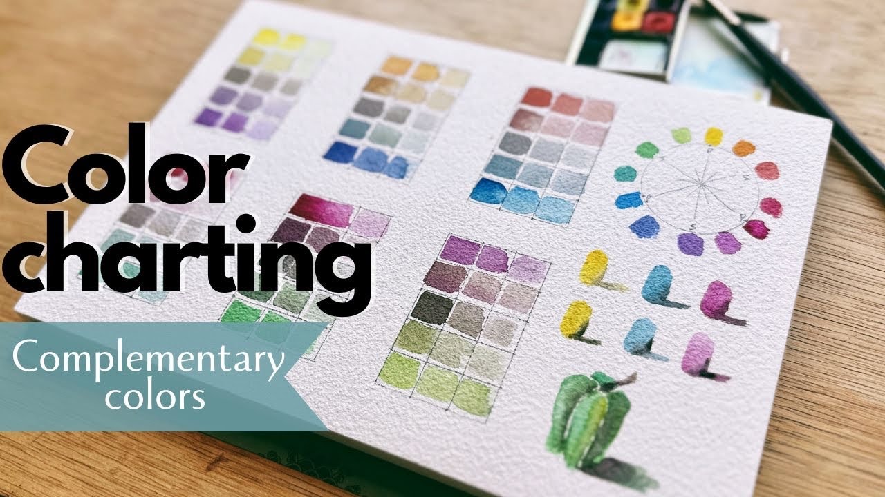
Mixing complementary colors with watercolor for perfect shadows

How to get the right tone in your paintings -PRACTICAL EXERCISE

Exploring Colors: White (How to Paint White) - HC 442

Environment Painting Process

These Lakes Shouldn't Be Three Different Colors
5.0 / 5 (0 votes)
