Color (Ch 10) II, Visualization Analysis & Design, 2021
Summary
TLDRThis video explores the role of color in data visualization, focusing on how different color channels—luminance, saturation, and hue—impact visual clarity, especially for those with color deficiencies. The speaker discusses the challenges faced by colorblind individuals, particularly along the red-green axis, and suggests strategies for creating inclusive visual designs. These include using redundant encoding methods like varying luminance and shapes, as well as choosing accessible color ramps such as blue-orange to ensure readability for all users. The video emphasizes the importance of thoughtful design for accessibility in visual communication.
Takeaways
- 😀 Color can be broken down into three channels: luminance (brightness), saturation (magnitude), and hue (identity).
- 😀 Luminance is critical for detecting edges and fine-grain details, which are essential for effective visualizations.
- 😀 Color blindness (or color deficiency) refers to the reduced ability to perceive certain colors, especially along the red-green axis.
- 😀 8% of men are affected by red-green color blindness, which has two flavors: one related to red and one to green.
- 😀 The visual system processes color into three channels: luminance (black and white), red-green (a*), and yellow-blue (b*).
- 😀 Color-deficient individuals have difficulty distinguishing colors along certain axes, but they still perceive some color differences.
- 😀 Luminance contrast is essential for legible text in visualizations, ensuring accessibility for all viewers.
- 😀 It's important to check how visualizations look for color-deficient individuals using simulators like Coblis to ensure clarity.
- 😀 Redundancy in encoding (e.g., combining hue with luminance or shape) ensures that visualizations are comprehensible to people with color deficiencies.
- 😀 The blue-orange color scheme is a safe choice for color maps as it remains distinguishable for individuals with red-green color blindness.
- 😀 Designers should always think about redundant encoding and ensure accessibility by considering how people with different color deficiencies perceive the data.
Q & A
What are the three main channels of color in visualization design?
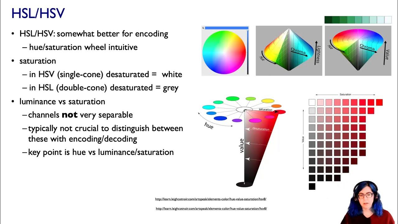
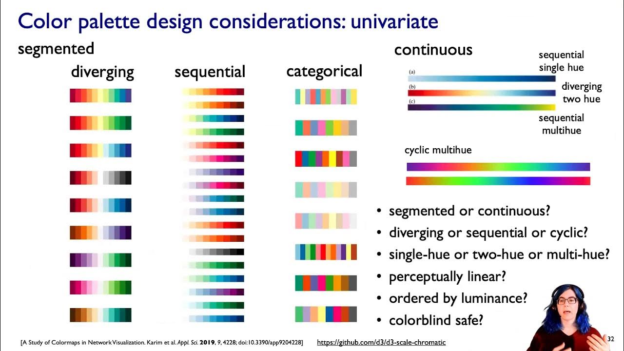
-The three main channels of color in visualization design are luminance, saturation, and hue. Luminance and saturation are used for ordered data, while hue is used for categorical data.
Why is luminance important for detecting edges in visualizations?
-Luminance is crucial for edge detection because the human visual system detects edges primarily through luminance contrast. This allows us to see fine-grained details and distinctions in a visual scene.
How does color deficiency (or color blindness) affect the perception of color?
-Color deficiency, or color blindness, reduces the acuity in perceiving certain color axes, most commonly along the red-green axis. People with color deficiency can still see color, but they experience a limited range compared to those with normal color vision.
What is the difference between luminance and chroma channels?
-Luminance refers to brightness levels, while chroma channels refer to color information. The chroma channels are typically divided into two axes: the red-green (a*) axis and the yellow-blue (b*) axis.
How does the human visual system process color information before reaching the brain?
-The human visual system splits color information into three channels before it reaches the brain. These channels include a luminance channel, which is achromatic (black and white), and two chroma channels (red-green and yellow-blue).
What are the two primary types of red-green color deficiency?
-The two primary types of red-green color deficiency are protanopia (difficulty perceiving red) and deuteranopia (difficulty perceiving green).
How can color deficiency be accommodated in visualization design?
-Color deficiencies can be accommodated by using redundancies in color encoding. For example, combining hue differences with luminance or using varying shapes can help ensure that all users, including those with color deficiencies, can distinguish between elements.
Why is it important to use luminance contrast for labeling in visualizations?
-Luminance contrast is essential for legible text in visualizations because it ensures that the text stands out clearly, even for individuals with color deficiencies who may have trouble distinguishing certain hues.
What is the effect of color deficiency on the perception of a color map?
-Color deficiency reduces the perception of color to just two dimensions (such as luminance and one chroma axis), making it harder to distinguish certain hues. For example, people with red-green color deficiency may have difficulty distinguishing between colors in a diverging color ramp based solely on hue.
What are some safer color choices for colorblind-friendly visualizations?
-Blue and orange are safer color choices for colorblind-friendly visualizations because they are distinguishable for both types of red-green color deficiencies, as well as for individuals with blue-yellow deficiencies.
Outlines

此内容仅限付费用户访问。 请升级后访问。
立即升级Mindmap

此内容仅限付费用户访问。 请升级后访问。
立即升级Keywords

此内容仅限付费用户访问。 请升级后访问。
立即升级Highlights

此内容仅限付费用户访问。 请升级后访问。
立即升级Transcripts

此内容仅限付费用户访问。 请升级后访问。
立即升级浏览更多相关视频
Color (Ch 10) III, Visualization Analysis & Design, 2021
Color (Ch 10) I, Visualization Analysis & Design, 2021

Pentingnya Warna Dalam Fotografi

Bingung Color Theory? Tonton video ini.

Tutorial Color Grading di Premiere Pro ...!

COLOR THEORY BASICS: Use the Color Wheel & Color Harmonies to Choose Colors that Work Well Together
5.0 / 5 (0 votes)
