Understanding Color

Blender Guru
27 Feb 201423:13

Summary

TLDRThis video script delves into the art of color usage in art, emphasizing its impact on mood, atmosphere, and storytelling. It outlines three core concepts: the importance of color, understanding saturation and value, and exploring color harmonies. The script educates on how to manipulate colors to guide the viewer's attention, alter scenes' moods, and create compelling color schemes. It also discusses the practical application of six common color harmonies, from monochromatic to double complementary, providing examples and advice on how to avoid common pitfalls. The speaker encourages artists to experiment with colors, learn from practice, and enjoy the creative process.

Takeaways

  • 🎨 **Color's Impact**: Colors are crucial in art as they can guide the viewer's attention, set the mood, and enhance storytelling.
  • 👀 **Viewer Guidance**: Correct use of color can direct the viewer's eyes to focal points, while incorrect use may cause confusion or discomfort.
  • 🖌️ **Saturation and Value**: Saturation (color intensity) and value (color brightness) are key in creating appealing color schemes and should be adjusted for different effects.
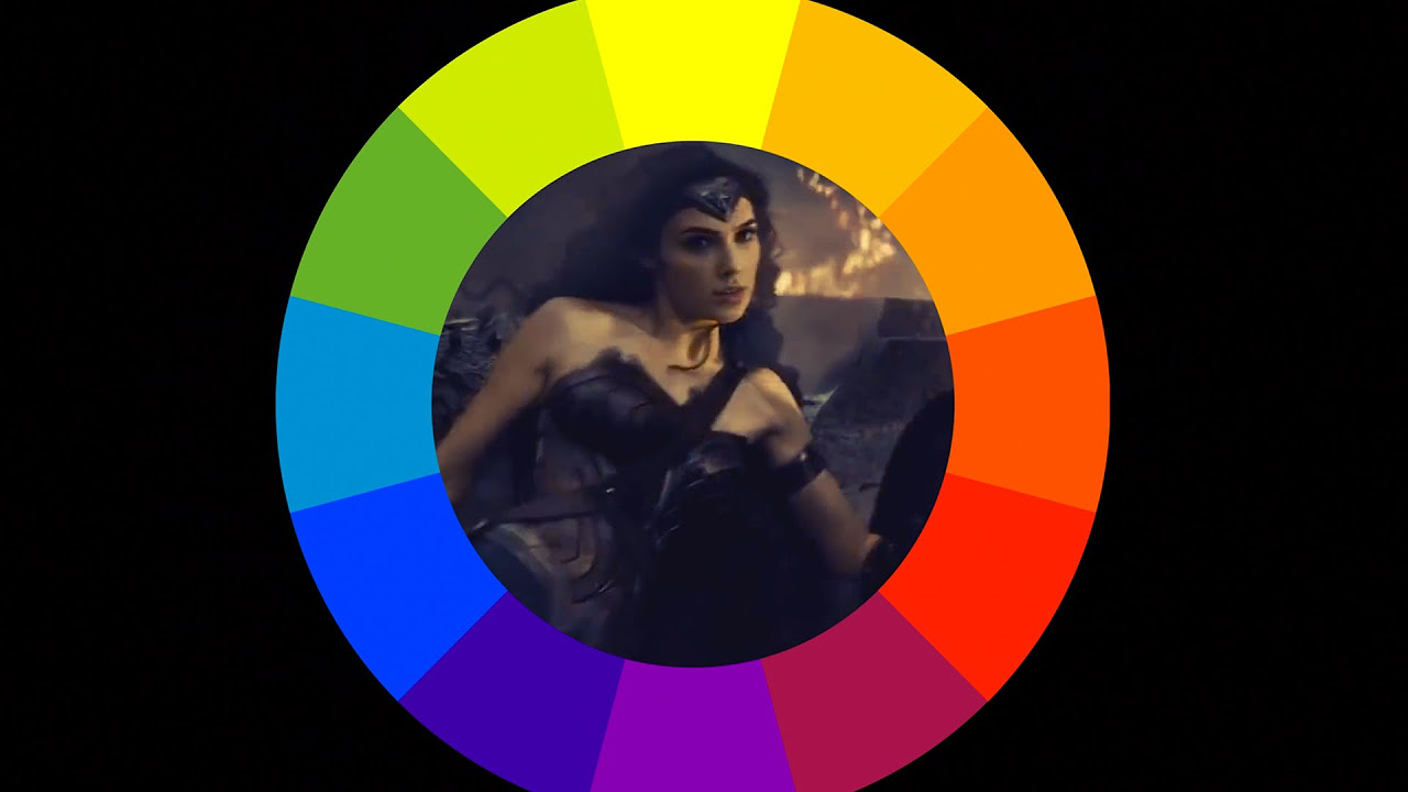
  • 🌈 **Color Harmony**: Understanding color harmonies helps in creating visually pleasing artwork and can be achieved through various schemes like monochromatic, analogous, and triadic.
  • 📈 **Mood Alteration**: Colors can dramatically change the perceived mood of a scene, from joyous and vibrant to sad and desaturated.
  • 🌟 **Highlighting Importance**: Bright, saturated colors can be used to highlight important elements or guide the viewer's eye through a composition.
  • 🎭 **Storytelling**: Historically, color has been used to signify power or importance, and in modern media, to adjust the narrative's tone.
  • 🌌 **Photorealism**: In photorealistic art, color accuracy is vital; a grayscale conversion can reveal how 'real' an image appears.
  • 🎭 **Cartoon Usage**: In cartoons, bright and saturated colors are often used to emphasize the unrealistic or surreal nature of the scene.
  • 🧩 **Compositional Tool**: Colors can be strategically placed to create a visual path or anchor points within a composition, enhancing its overall impact.

Q & A

  • What are the three core concepts discussed in the video for understanding color?

    -The three core concepts discussed in the video are the importance of color, saturation and value, and color harmonies.

  • How can color guide the viewer's eyes in an artwork?

    -Color can guide the viewer's eyes by highlighting what's important, using color to tell a story, or changing the mood of a scene.

  • What is the impact of using incorrect colors in a scene?

    -Using incorrect colors can make the viewer feel lost, nauseous, or irritated, and it can also make the scene look fake in terms of photorealism.

  • What is saturation in the context of color theory?

    -Saturation is the intensity or purity of a color, and it plays a significant role in creating visually appealing or unappealing color work.

  • What does value refer to in color theory?

    -Value refers to the brightness or darkness of a color, which can be adjusted to create different moods or effects.

  • How can adjusting saturation and value change the appearance of a color?

    -Adjusting saturation and value can create a variety of different shades from a single raw color, affecting the overall look and feel of an artwork.

  • Why is it important to not overuse highly saturated colors in a scene?

    -Overusing highly saturated colors can make an image look fake and provide no resting place for the viewer's eyes, leading to irritation.

  • How can color be used to tell a story or change the mood in a scene?

    -Color can be used to focus attention on a character, signify power, or indicate a change in mood, such as from happiness to sadness.

  • What are the six popular color harmonies discussed in the video?

    -The six color harmonies are monochromatic, analogous, triadic, complementary, split complementary, and double complementary.

  • What is the monochromatic color harmony and how can it be used?

    -Monochromatic harmony involves using only one color, which can be used to focus the viewer on details or create a striking atmospheric effect.

  • How can color harmonies help in creating a composition?

    -Color harmonies can guide the viewer's eyes through a scene, highlight areas of interest, and create a visually pleasing and balanced composition.

Outlines

00:00

🎨 Understanding Color in Art

This paragraph introduces the challenges artists face with color usage, emphasizing its impact on mood, atmosphere, and harmony. The video aims to teach effective color application to enhance storytelling and create appealing color schemes. It outlines three core concepts: the importance of color, saturation and value, and color harmonies. The speaker explains how color can direct the viewer's attention, alter a scene's mood, or make a viewer feel lost or irritated if misused. The paragraph also touches on the difficulty of achieving photorealism with color, suggesting that our eyes are exposed to numerous saturations and shades daily, yet we seldom study them, leading to challenges in artistic application.

05:00

🌈 The Role of Saturation and Value

This section delves into the specifics of saturation and value in color theory. Saturation refers to a color's intensity or purity, while value indicates its brightness or darkness. The speaker illustrates how adjusting these properties can drastically change a color's appearance and impact. Using examples, they show how high saturation can be jarring, and how reducing it can create more pleasing tones. Similarly, adjusting value from 100% brightness to 20% can turn a color nearly invisible, illustrating the importance of these adjustments in creating depth and variety in artwork. The paragraph also discusses the overuse of saturation in digital art and how it can lead to a lack of visual rest, advocating for strategic desaturation to enhance composition and storytelling.

10:02

🖼️ Color Harmonies and Schemes

The speaker transitions to discussing color harmonies, which are about colors that work well together, also known as color schemes or complementaries. Six popular color harmonies are introduced: monochromatic (single color), analogous (adjacent colors), triadic (equally distant colors), complementary (opposing colors), split complementary (one color and the two adjacent to its complement), and double complementary (two pairs of complementary colors). Each harmony is explained with examples of how they can be used to create focus, mood, and atmospheric effects in art, with a special emphasis on how they can be applied in various artistic contexts, from traditional painting to digital art and animation.

15:05

🌟 Advanced Color Harmonies in Practice

This paragraph provides detailed examples of how advanced color harmonies, such as split complementary and double complementary, can be effectively used in artwork. It discusses how these schemes can create lively and joyous compositions, and how they can be used to balance and highlight different elements within a scene. The speaker illustrates these concepts with images that show how the careful use of color can lead to striking and pleasing visual results. The importance of not using colors equally and instead focusing on one dominant color with accents of others is also emphasized.

20:05

📚 Conclusion and Encouragement

In the final paragraph, the speaker summarizes the key points of the video, reminding viewers of the importance of understanding and applying color harmonies effectively. They reiterate the importance of saturation and value, and encourage viewers to practice and have fun with color experimentation. The speaker also provides resources for further learning and thanks the artists whose work was featured in the presentation. The video concludes with a reminder to enjoy the learning process and not to stress about mastering color use.

Mindmap

Keywords

💡Color

Color is a fundamental aspect of visual art, including painting and digital media. It is used to create mood, guide the viewer's attention, and tell stories. In the video, the speaker emphasizes the difficulty many artists face in using color effectively, highlighting how it can 'make or break' a scene. The proper use of color can guide the viewer's eyes to important elements, while incorrect use can lead to confusion or discomfort.

💡Saturation

Saturation refers to the intensity or purity of a color. High saturation can make colors appear vibrant and striking, but too much can lead to an unnatural look or visual discomfort. The video explains that saturation is a key factor in creating appealing color schemes, and adjusting it can drastically change the mood or focus of an artwork. For example, reducing saturation can turn a harsh red into a more subdued pink.

💡Value

Value in color theory denotes the lightness or darkness of a color, ranging from bright to dark. The script mentions that adjusting value can transform a color's appearance, such as making a red look more like a muddy brown by lowering its brightness. Value is crucial for creating depth and contrast in a scene, helping to draw attention to certain areas or elements.

💡Color Harmonies

Color harmonies, also known as color schemes, refer to the practice of using colors that work well together. The video discusses various harmonies such as monochromatic, analogous, and complementary. These harmonies are essential for creating visually pleasing and balanced artwork. For instance, analogous colors are those adjacent on the color wheel, creating a peaceful and comfortable mood often found in nature.

💡Monochromatic

A monochromatic color scheme uses different shades of a single color. This approach forces the viewer to focus on the details and values within the artwork, creating a striking atmospheric effect. The video gives examples of monochromatic paintings where the artist uses one color in various values and saturations to create depth and interest.

💡Analogous

Analogous colors are those that are next to each other on the color wheel. This scheme is known for being easy on the eyes and creating a peaceful mood, often mimicking natural color combinations like green trees and blue skies. The video script provides examples of paintings that use analogous colors to create a harmonious and visually comfortable scene.

💡Triadic

Triadic color harmony involves colors that are equally spaced around the color wheel, creating a vibrant and playful effect. It's more challenging to use than other harmonies and is often seen in cartoons or surreal art. The video mentions that triadic schemes can be very striking but should be used carefully to avoid a chaotic look.

💡Complementary

Complementary colors are those that are opposite each other on the color wheel. They are naturally pleasing and create a high-contrast effect. The video script advises using one color predominantly and the other as an accent to avoid equal parts, which can be too intense. Examples from art history and movies illustrate the use of complementary colors to draw attention and create focus.

💡Split Complementary

A split complementary scheme uses one color and the two colors adjacent to its complement. This approach provides more creative freedom than a standard complementary scheme, resulting in a lively and joyous look. The video gives examples of artwork where the split complementary scheme is used to create a vibrant and balanced color palette.

💡Double Complementary

Also known as tetratic, this scheme involves using two pairs of complementary colors. It's best for differentiating between foreground and background elements, creating a complex and rich color scene. The video script illustrates how this scheme can be used to create a balanced and visually interesting composition, with one pair of colors for the foreground and another for the background.

Highlights

Colors are crucial for guiding the viewer's attention and altering the mood or atmosphere of a scene.

Using colors incorrectly can lead to a scene that feels off, lost, or irritating.

Saturation and value are key factors in creating appealing color schemes.

High saturation can make an image look fake and uncomfortable to view.

Desaturating parts of a scene can help guide the viewer's eyes and provide visual rest.

Color can be used to tell a story or highlight the importance of certain elements within a scene.

Colors can significantly impact the mood of a scene, as demonstrated in the movie 'Up'.

Monochromatic color schemes involve using only one color and are great for focusing on details.

Analogous color schemes use colors next to each other on the color wheel and are soothing to the eye.

Triatic color harmony involves using colors equally distant from each other on the wheel and is playful.

Complimentary color schemes use colors opposite each other on the wheel for a naturally pleasing effect.

Split complimentary color schemes offer more creative freedom by using three colors instead of two.

Double complimentary color schemes involve using two pairs of opposite colors for a balanced look.

Practicing with colors is essential to develop an eye for creating effective color schemes.

Resources and tools are available to help artists develop their color skills and understanding.

Artists should enjoy the process of learning about colors and not stress about getting it perfect right away.

Transcripts

play00:00

using colors is probably one of the

play00:01

biggest hurdles that artists face

play00:04

knowing how to use colors effectively to

play00:06

adjust the mood or the atmosphere or to

play00:09

even pick colors that actually go well

play00:11

together it's really hard for a lot of

play00:13

people to uh to make it work so that's

play00:15

what this video is all about

play00:18

understanding color by the end of this

play00:20

video you'll discover how to use colors

play00:22

effectively to alter the story or to

play00:25

create pleasing color schemes so I'm

play00:28

going to break it down into three core

play00:30

Concepts starting with why color is so

play00:32

important then saturation and value and

play00:36

finally color harmonies so starting with

play00:39

the Y colors when used correctly can

play00:42

guide the viewer's eyes to what's

play00:44

important like in this scene your eyes

play00:45

are immediately drawn to this nice green

play00:48

cylinder in the center of the screen uh

play00:51

it could also be used to uh tell the

play00:53

story or completely change the mood of

play00:55

the scene entirely however when used

play01:00

incorrectly like in my terrible scene

play01:02

here from 2007 it can make the viewer

play01:04

feel lost nauseous or even irritated

play01:08

basically colors can make or break your

play01:11

scene very very important to get it

play01:14

nailed down even worse in terms of

play01:17

photorealism color is one of the biggest

play01:19

giveaways that your image is fake if you

play01:22

don't believe me take out your latest

play01:24

work convert it to grayscale and notice

play01:27

how it immediately looks a lot more f

play01:29

photo realistic getting colors right is

play01:33

just hard throughout the day our eyes

play01:35

soak in millions of huge saturations and

play01:38

shades but we rarely ever stop to study

play01:41

them so when it comes time to actually

play01:44

work we have a hard time drawing from

play01:46

our memory what color is used for one

play01:49

could argue that it goes back to our

play01:51

childhood as kid we learned about colors

play01:54

in their most simplified raw formats red

play01:58

blue yellow Etc

play02:00

but when we tried using these raw colors

play02:02

in our art we probably quickly noticed

play02:05

that the results came out really ugly

play02:08

but why is that saturation and value

play02:11

that's why saturation is the intensity

play02:15

or purity of the color and it's one of

play02:17

the biggest culprits when it comes to

play02:19

ugly color work the second is value

play02:22

which refers to the brightness or the

play02:24

darkness of the color so let's have a

play02:27

look at these uh on the left here 100%

play02:29

saturation really hard to look at but

play02:32

tone it down to 20% and it becomes

play02:35

almost a pink fleshy color um again I

play02:38

haven't adjusted the color at all but

play02:40

just changing the saturation gives you

play02:43

very different results let's try it

play02:44

again with value 100% on the left 20% on

play02:48

the right you can almost barely see it

play02:50

so that's adjusting the brightness of

play02:52

the color basically so you can see that

play02:53

it now looks more like a muddy Brown

play02:55

than a red now if you had to tweak both

play02:58

of these the saturated and the value you

play03:01

can see that you can create a whole

play03:03

pleora of different shades um all from

play03:06

just one raw color at the

play03:08

start as is demonstrated in this

play03:11

painting I'm fairly certain that the

play03:13

only color used in this painting is red

play03:16

so just mixing it with white and black

play03:19

you know changing the saturation and the

play03:20

value um able to create an entire image

play03:23

from just one color very interesting now

play03:26

in the CG World saturation is probably

play03:29

one of the biggest offenders a lot of

play03:31

artists choose highly saturated colors

play03:34

because they think it will make the

play03:35

result look much better um but really it

play03:39

couldn't be further from the truth uh

play03:41

highly saturated colors not only look

play03:43

incredibly fake but using saturated

play03:46

colors everywhere gives your eyes

play03:48

nowhere to rest which is really

play03:50

important in an image so um having a

play03:53

look at this you can see staring at it

play03:55

for too long it becomes a little bit

play03:57

irritating so desaturate areas of your

play04:00

scene are very very important but that's

play04:03

not to say that bright saturated colors

play04:05

are all bad um in this example you can

play04:08

see that your eyes are automatically

play04:10

drawn to the red bright mountains in the

play04:13

background there that was deliberate um

play04:17

that can be used as a compositional

play04:18

element so your eyes are following back

play04:20

and forth along the same path as the

play04:23

camels are traveling very cool and in

play04:25

this image it's pretty clear that the

play04:27

artist wanted you to notice those flat

play04:29

flowers it's also called wild poppies

play04:32

which is kind of a giveaway um but the

play04:35

red highly fluorescent uh color of them

play04:38

it almost jumps off the screen at you so

play04:40

really startling and probably the one

play04:42

element that you'll remember this image

play04:44

for and it can also be used for

play04:46

storytelling uh throughout history if

play04:48

you have a look at a lot of paintings

play04:50

Jesus is always wearing red um and

play04:52

that's basically to uh Focus the

play04:54

attention on him and also to make him

play04:56

look powerful and mighty and in terms of

play05:00

cartoons um highly saturated or bright

play05:03

colors can actually work in your favor

play05:05

because it can immediately note to the

play05:08

viewer that they're looking at something

play05:09

which is fake and it really plays to its

play05:12

surreal unrealistic uh

play05:14

qualities brightness and saturation can

play05:16

even adjust your mood if you remember at

play05:19

the start of up the colors were very

play05:21

vibrant there was a lot of oranges there

play05:24

was pinks uh fluorescent grass and

play05:28

really really vibrant colors this was to

play05:30

signify the joyous happy moment in their

play05:33

lives but then it later turned to

play05:36

sadness and the colors immediately Chang

play05:38

to very desaturated tones a lot of Grays

play05:42

a lot of Browns and if you have a look

play05:44

at that image on the right there I mean

play05:46

there's almost really no color at all I

play05:48

mean it's just a little bit of blue kind

play05:50

of some brown in there but nearly all

play05:53

desaturated so that helps you to feel

play05:55

the coldness and the the loneliness that

play05:58

the characters are experiencing um this

play06:00

same effect was used at the start of The

play06:02

Incredibles and as well as the Matrix um

play06:05

color is a really powerful mood changer

play06:08

and it's used a lot in Hollywood as well

play06:10

as video games which is why Call of Duty

play06:12

is completely desaturated almost um it

play06:16

can also be used for composition so

play06:18

having a look at this image your eyes

play06:19

are probably automatically drawn into

play06:21

the background there where there is some

play06:23

dudes wearing some gnarly red pants um

play06:27

so it's really it's guiding your eyes

play06:29

from the foreground to the background

play06:31

just by having something highly

play06:33

saturated so very important um a similar

play06:36

effect can be seen right here if it

play06:38

weren't for that highly saturated parrot

play06:40

there in the foreground it's unlikely

play06:42

that this image would have uh be as

play06:45

successful as it is um the parrot really

play06:48

gives you something to Anchor yourself

play06:49

to so you're then free to explore the

play06:52

rest of the scene so to

play06:53

speak so just to summarize what I've

play06:56

already spoken about saturation and

play06:57

value in a nutshell don't overdo it

play07:00

don't saturate and use high values all

play07:02

throughout your scene it will always

play07:04

come out horrible use saturation and

play07:07

value to guide the viewer to tell a

play07:10

story who is powerful you know what are

play07:12

you drawing attention to you can use it

play07:15

to change the mood use vibrant colors in

play07:17

an animation and desaturated you know

play07:19

when you want to change it to to be sad

play07:22

um or you can just use it to draw

play07:23

attention to something that otherwise

play07:25

wouldn't be getting attention so that's

play07:27

the why saturation and value which leads

play07:29

us to point number three color harmonies

play07:33

sorry for blinding you there so I love

play07:36

this topic color harmonies basically

play07:38

pertains to the fact that some colors

play07:40

look better together than others it's

play07:43

also known as color schemes or

play07:45

complimentary um harmonies you know it

play07:48

has a number of different words um so

play07:49

what I'm going to be talking about is

play07:51

six popular and common color harmonies

play07:54

that work well they're based on concrete

play07:56

ideas and you can start using them in

play07:58

your work straight away

play08:00

so the first one is monochromatic

play08:02

probably the easiest one to start with

play08:05

because it involves only one color

play08:09

entire image uses just one color this is

play08:12

best for single subjects because it

play08:14

forces the viewer to focus on the

play08:16

details of the image the changes in the

play08:18

value the

play08:19

saturation um and it could also be used

play08:21

to create a very um striking atmospheric

play08:24

effect as will uh be demonstrated right

play08:27

now um so you can see here your eyes are

play08:30

drawn to the silhouette of the rocks and

play08:32

the figures and you're focusing on the

play08:34

story as opposed to the colors very cool

play08:37

and this image here aside from that

play08:38

yellow moon at the top there is entirely

play08:41

painted with red giving a very striking

play08:43

atmospheric effect and this next one I

play08:46

absolutely love creepy chilling and it's

play08:49

all using one color yellow very very

play08:53

cool effect and um yeah used very well

play08:56

all right number two is analogous this

play08:59

one is cool cool um it's about colors

play09:01

that are adjacent to each other on the

play09:03

wheel so generally you know about the

play09:06

distance you can see right there the

play09:08

cool thing about this one is that it's

play09:09

easy on the eyes It generally creates a

play09:12

peaceful and comfortable mood mainly

play09:14

because it is seen a lot in nature with

play09:17

you know green trees blue skies things

play09:19

like that the colors are are very

play09:21

related so to give you some examples

play09:24

this image here um at the start it might

play09:26

almost look monochromatic since there's

play09:28

a lot of that uh that purple in the

play09:30

background there but you can see over

play09:32

here if I put my mouse here you can see

play09:34

there is a blue sort of Shaw resting on

play09:36

that that chair there and then of course

play09:38

you've got this striking pink flower

play09:40

there really great use of that color

play09:42

scheme and then here as the example with

play09:45

nature you've got some uh some you know

play09:47

dark green grass here you've got some

play09:50

light green up here in this tree here

play09:52

and then of course the sky um with a

play09:54

nice uh blue there and in this image

play09:57

really awesome example um totally

play10:00

striking um so you got this lovely red

play10:02

dress of course and then the use of

play10:04

purple and pinks throughout the rest of

play10:06

the scene and in this image here um

play10:09

aside from a couple of areas where

play10:10

there's a blue the rest of it is all

play10:13

really using yellow orange and red so if

play10:15

you look in the background there yellow

play10:17

taxis you got some orange signs red car

play10:20

Etc so really nice effect which brings

play10:24

us to number three the triatic color

play10:27

Harmony scheme

play10:29

so this one is probably one of the

play10:31

hardest to pull off um it involves

play10:33

colors which are equally distant to each

play10:35

other on the wheel as I said hardest to

play10:37

pull off um it's really best for

play10:40

cartoons or surreal scenes um because it

play10:43

can really come across as being quite

play10:45

playful um it's probably not the best

play10:48

example to put right after that um but

play10:50

you can see here again Jesus is wearing

play10:52

that striking red and then um using blue

play10:55

and yellow to highlight other elements

play10:57

and it's created a very pleasing looking

play10:59

result and here really great example it

play11:02

doesn't have to be just the primary

play11:04

colors by the way the the triadic can be

play11:06

as I said equally distant to each other

play11:08

on the color wheel so this one is using

play11:10

mainly orange green and blues um and you

play11:14

can see it's it's a really great effect

play11:16

um it it comes across really cheerfully

play11:19

and um yeah just really nice all right

play11:23

number four complimentary this one is

play11:25

probably one I'm sure you've all heard

play11:27

of before um it's basically colors that

play11:30

are opposing each other on the wheel so

play11:33

it's very very popular a lot of artwork

play11:35

not only today but throughout history

play11:37

use complimentary color schemes it's

play11:39

just naturally pleasing to the eye

play11:42

colors that are opposite to each other

play11:43

on the wheel just look better I mean

play11:46

they just look nice next to each other

play11:48

um but something that a lot of people

play11:49

don't mention is that you shouldn't use

play11:51

both colors equally like you shouldn't

play11:53

use 50% green and 50% red you should be

play11:56

using one color predominantly generally

play11:59

the weaker color so in this case if you

play12:00

using green and red uh you'd be using

play12:03

the green the most so you'd be using

play12:05

that for like most of the scene and then

play12:07

using some splashes of red so you know

play12:09

like some really desaturated greens and

play12:11

then some you know saturated areas of uh

play12:13

red have a look at some examples here we

play12:16

go uh very similar to the movie Brave I

play12:18

think um you could see uh a lot of green

play12:22

she's wearing a nice green dress there a

play12:24

lot of green along the grass there and

play12:25

then of course this red Shaw her red

play12:28

hair and the Sun set and everything else

play12:30

there creating a really nice scheme here

play12:32

this one is um a lot harder to notice

play12:35

since it looks almost monochromatic um a

play12:37

lot of yellow throughout everything but

play12:39

if you look way in the background there

play12:41

you can see uh some violet color so um

play12:45

yeah that is a complimentary color

play12:46

scheme and here I love this one it's uh

play12:49

a great example of using cool and warm

play12:52

colors which are naturally complimentary

play12:55

um and uh that can also be used to

play12:57

affect the mood of the uh of the scene

play12:59

as well if you want the a certain part

play13:01

of the of the scene to look sort of cold

play13:04

then uh using blue cool uh Aqua type

play13:07

colors can have that effect and then

play13:09

using warm colors such as red and orange

play13:12

can make it look inviting or Pleasant

play13:14

and this one really popular one that was

play13:16

on CG Society for a long time uh by Tony

play13:19

brat inic sorry if I pronounced your

play13:22

name wrong uh using the uh red and green

play13:25

color scheme uh coming across really

play13:27

really nicely um and uh very powerful

play13:30

looking effect and this one here very

play13:32

obvious red and green seems uh to be a

play13:35

very popular complimentary scheme um and

play13:38

then this example here um as I showed

play13:41

you before we've got Aqua for most of

play13:43

the elements and then in the background

play13:45

there you've got some highlights of some

play13:47

warm orange lights and especially on the

play13:49

screens there but there's virtually

play13:51

almost no other color in the scene which

play13:53

is kind of interesting and then this one

play13:54

here I love this one Drogo from Game of

play13:56

Thrones um it's mostly yellow mostly has

play14:00

this this yellow orangey tin to it and

play14:02

you might be thinking where is the blue

play14:04

well it's here it's from the rim light

play14:07

and I would say without that blue this

play14:09

image would not look as striking or as

play14:11

good as it does that blue even though

play14:14

it's really subtle and it's only a small

play14:15

amount it really does help to balance

play14:18

out the heavy use of this yellow color

play14:22

all right so now let's talk about split

play14:24

compliment split complimentary color

play14:26

schemes are very similar to the one we

play14:28

just talked about

play14:29

using opposites um but basically you

play14:32

take one end of it and then you split it

play14:34

so um doing that allows you U more

play14:36

creative freedom so instead of just

play14:38

being locked to two colors um it allows

play14:41

you to use three colors um generally

play14:44

this type of color scheme feels more

play14:46

lively and joyous so I'll give you an

play14:48

example here um love this painting uh

play14:52

really nice use of some purples there of

play14:54

course all through the flowers and then

play14:56

you've got some yellow FL um flowers

play14:58

here the the green plants of course and

play15:00

then you know yellow in the background

play15:02

so basically just three colors all

play15:04

throughout the whole thing and it's a

play15:05

really striking very pleasing looking

play15:08

result and this one I love this image um

play15:11

we've got some really nice orange trees

play15:14

there um this uh striking uh green um

play15:19

lawn here sorry and then of course the

play15:21

nice cool blue calming sky so the those

play15:23

three colors going together um they work

play15:26

out really well and even though they're

play15:27

really highly saturated

play15:29

um there are elements of uh um low value

play15:32

and desaturation like you can see these

play15:34

trees in the background here um they've

play15:36

been uh desaturated it's really this

play15:38

main foreground um where you've got this

play15:40

orange against this blue which are

play15:43

naturally um complimentary as well um

play15:46

they go really well together and then

play15:47

you've got some dark areas in the grass

play15:50

Etc and then this one here this one's a

play15:52

little bit harder to notice but um you

play15:53

can see obviously you've got some yellow

play15:56

um on the robot itself um and then of

play15:58

course the blue sky and you might be

play16:00

looking where is the orange and it's in

play16:02

the sunset in the background there so

play16:04

very subtle but again it does give you

play16:06

um a little bit more freedom using three

play16:08

colors as opposed to two and this one

play16:11

here I love this one by Carlos um it's

play16:14

uh it's a great use it looks like two

play16:16

colors but really it's uh it's three so

play16:18

we've got this this blue color which is

play16:20

of course going through her hair and the

play16:22

dress but then the plant itself you've

play16:24

got some especially on those uh the

play16:26

stamans if that's how you pronounce it

play16:28

of the the flowers there um they sort of

play16:30

come out as this aqua color almost a

play16:32

greenish sort of color in the background

play16:35

even a little bit of purple there I

play16:36

didn't notice that before um but yeah

play16:38

really nice use of a split complimentary

play16:40

scheme there this one again you might

play16:42

think this is just a complimentary

play16:43

scheme um thinking that it's just blue

play16:46

and uh orange there on the book but if

play16:48

you have a look at her hair you can see

play16:50

that um it's red it's got a nice red

play16:52

tint to it especially um uh on this

play16:54

curtain over here as well there's a

play16:56

little bit of red so um a nice use of

play16:58

three colors there coming out really

play17:00

nicely um and of course this one here

play17:03

really love this image great use of

play17:04

colors especially for a cartoon scene

play17:07

highly saturated um Lively joyous look

play17:10

to it um you've got of course the yellow

play17:12

bananas um the pink flower very vibrant

play17:16

in her hair and then the green trees um

play17:19

and uh this dress here as well um you

play17:21

could argue that there's some blue like

play17:23

there's a little blue uh sky and the Sea

play17:26

um but I would say there's a lot of

play17:27

green in that like it's not it's more of

play17:29

a a greenish Aqua sort of color um and

play17:34

as you could see I mean the results

play17:35

speak for themselves lovely just

play17:38

dazzling looking image um great use of

play17:41

the split complimentary scheme all right

play17:43

finally let's talk about the

play17:45

tetratic or let's just call it the

play17:47

double complimentary that's its other

play17:49

name I prefer to call it double

play17:51

complimentary um so this is basically

play17:53

the complimentary color scheme doubled

play17:56

so um it's just choosing two pairs of

play17:59

opposites really um it doesn't really

play18:01

matter where they are on the wheel um

play18:03

just choose two different pairs um so

play18:06

it's best used for foregrounds and

play18:08

backgrounds like I would wouldn't really

play18:10

recommend using it for like mixing

play18:13

everything in the same sort of area sort

play18:16

of hard to describe I'll show you some

play18:17

examples in a sec um but like for

play18:19

example using the foreground you might

play18:20

want to have you know one pair and then

play18:22

weigh in the background maybe balance

play18:23

another pair um never ever use 25% of

play18:28

each like what I said before about using

play18:29

complimentary colors don't use 50/50

play18:32

same with this if you use 25% of each it

play18:35

would just look horrible just chaos um

play18:39

so you want to uh have you know some

play18:42

like the weak colors use them primarily

play18:44

and then use the splashes of the uh the

play18:46

brighter colors hard to pull off but it

play18:49

can uh produce some pretty pleasing

play18:51

looking results having a look at this

play18:53

one for example um this is an example of

play18:55

the 4 grand background uh the for Grand

play18:58

is using the green and red pairing and

play19:01

then way in the background sort of hard

play19:02

to see but you've got some violets and

play19:05

some yellows coming through there so

play19:07

that's an

play19:08

example and this one here this one you

play19:11

might not think is a double

play19:12

complimentary but you have a look at it

play19:14

more and you'll notice it um you've of

play19:16

course got this uh reddish orange

play19:18

building there so that makes up the red

play19:20

um then you've got the yellow coming

play19:21

through on this light here as well as in

play19:23

these buildings here the blue coming

play19:25

through on the sky which just leaves the

play19:27

green left and and that is in the water

play19:31

very very desaturated really nice use of

play19:33

it but the it's this nice green sort of

play19:36

murkiness and as well as that you've got

play19:38

some splashes of green in the plants

play19:40

here and the vine as well so a really

play19:43

nice use of using four colors together

play19:46

and this one I love it's an excellent

play19:48

use um of course the the the main color

play19:51

for this image which your eyes are most

play19:52

drawn to is the red hat and then

play19:55

opposite to that is this uh jacket or

play19:57

hoodie that he's wearing in which is

play19:59

this green color so looking at this

play20:01

color wheel you can see they're paired

play20:03

the red and the green so where's the

play20:05

other two colors in the background you

play20:07

can see the background mostly blue with

play20:10

some little yellow um bouquet effect

play20:14

lights in the background there um so

play20:16

again that's foreground background just

play20:18

pairing the two foregrounds paired and

play20:20

the background is paired creating a

play20:22

really nice pleasing

play20:23

result um and then finally to leave on

play20:26

this one this one you probably wouldn't

play20:27

think uh is using four colors but again

play20:30

it is there um so there is a lot of blue

play20:34

um but you can see that there's a

play20:35

difference you've got this Aqua greenish

play20:38

bright blue and then you've got this

play20:40

deep sort of murky blue um so those are

play20:43

the two different Blues there and then

play20:45

you've got this nice blonde yellowy hair

play20:47

here and that goes in really well with

play20:49

that deep blue so those are nice

play20:51

complimentary colors and then the skin

play20:53

is this more warmer orangish color and

play20:56

you've got some even some red lips there

play20:58

as well

play20:59

um and uh and that goes balancing um uh

play21:02

the uh this aqua color which is uh in

play21:05

going into her mermaid tail there really

play21:07

nice use of it those nice vibrant funky

play21:09

colors again really plays to The Surreal

play21:12

qualities of a of a cartoon render so

play21:15

that's it to summarize this whole video

play21:19

saturation use it sparingly not over the

play21:22

whole thing use it to highlight the

play21:23

areas of interest and to help tell a

play21:25

story think about the overall image

play21:28

uh values use values of high con high

play21:31

contrast to draw attention to things so

play21:33

that's basically brightness versus uh

play21:35

Darkness um and then talking about the

play21:37

color harmonies these are the six again

play21:40

first monochromatic which is one color

play21:42

two analogous using adjacent colors

play21:45

triatic using equally distant colors

play21:48

three of them um complimentary opposing

play21:51

colors on the wheel split complimentary

play21:54

uh one complimentary end extended and

play21:57

then finally the double compliment just

play21:59

the two pairs of opposing colors so

play22:01

that's pretty much it guys I'd leave on

play22:03

one final note and that is don't stress

play22:07

colors can be really fun um it can be

play22:10

stressful when you're trying to you're

play22:12

experimenting and you're trying to play

play22:13

with it and trying to make something

play22:14

that works um it it sometimes does just

play22:18

take a lot of practice to come up and

play22:19

have a like uh develop an eye for seeing

play22:23

um a combination that will actually work

play22:24

with your scene uh especially with 3D

play22:27

scenes uh where you've got a lot of

play22:28

different shading as well as bounce

play22:30

lighting and stuff like that and that

play22:32

can kind of mess up your scheme

play22:33

sometimes so um just basically have fun

play22:36

with it it can be fun provided you don't

play22:38

stress um and just enjoy the process of

play22:40

learning the colors um and yeah um yeah

play22:44

if you wanted the notes for this

play22:45

presentation as well they're up on

play22:47

blender Guru and as well as that I

play22:49

provided some resources so some sites um

play22:52

where you can read up more on some color

play22:54

schemes as well as some programs will

play22:56

help which will help you develop some

play22:58

color games um and finally special

play23:00

thanks to all of these artists who were

play23:02

um nice enough to let me use it in this

play23:05

presentation big thanks to all of you

play23:07

that's it for me guys I hope you enjoyed

play23:09

this video have fun with colors and I'll

play23:11

see you next time bye

Rate This

5.0 / 5 (0 votes)

相关标签
Color TheoryArt TechniquesMood AdjustmentAtmospheric ArtColor HarmoniesArtistic GuidanceSaturation ValueCreative ProcessVisual StorytellingCG Art
您是否需要英文摘要?