Learn Webflow in 16 Minutes (Crash Course)
Summary
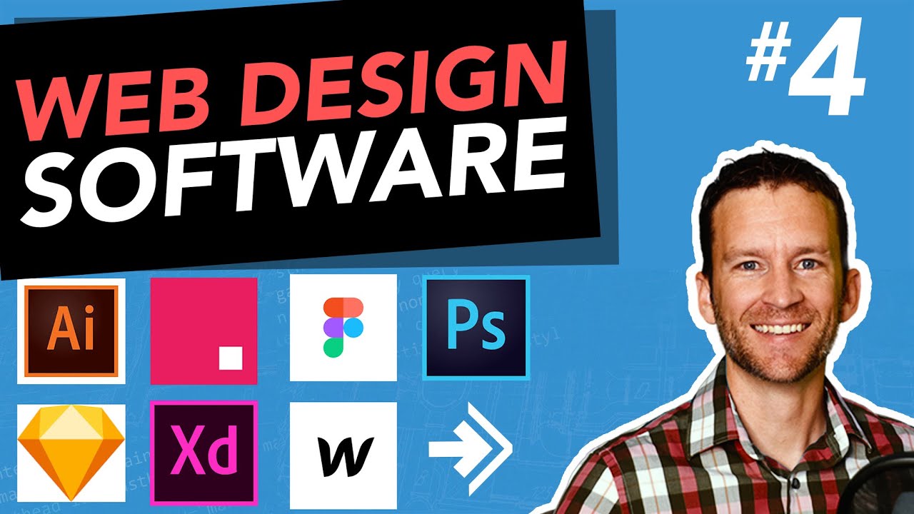
TLDRThis video tutorial offers a quick and insightful introduction to Webflow, a web design tool, in just 16 minutes. The presenter begins by explaining the fundamental 'box model' concept, demonstrating how everything on the web is structured as boxes within boxes. Using the Apple website as an example, the presenter showcases how HTML and CSS work together. The tutorial then shifts to Webflow, starting with basic styling of the main 'body' box, progressing through navigation bar creation, and constructing page sections using div blocks. Techniques like flexbox, container usage, grid system, and CSS styling for text and images are illustrated. The video also touches on more advanced features like responsive design and animations, concluding with an encouragement to explore their full Webflow course for deeper learning.
Takeaways
- 📦 Understanding the Box Model: The foundational concept of web design is the box model, where everything on the web is essentially boxes nested within other boxes.
- 🌐 Webflow Introduction: The video provides a quick start guide to using Webflow, a powerful web design tool.
- 🎨 Styling with CSS: The script explains how to use CSS (Cascading Style Sheets) to style web elements like buttons, specifying their appearance and interaction.
- 🖼️ Inspecting Elements: The video demonstrates using the inspect tool in a browser to view and understand the structure and styling of a web page.
- 🔳 Creating and Styling Div Blocks: The basic building blocks of a webpage in Webflow are div blocks, which can be styled and named for easy reference.
- 🔧 Flexbox Layout: The video introduces the use of Flexbox for layout, which allows for easy alignment and distribution of items within a container.
- 🔘 Setting up Container Width: To ensure content is viewable and doesn't require horizontal scrolling, the script explains setting a maximum width for containers.
- 📝 Typography and Text Styling: The importance of typography is highlighted, with instructions on changing font, size, weight, and text case for headings.
- 🚗 Adding Visual Elements: The process of adding images and other visual elements to a webpage is demonstrated, including aligning and sizing them appropriately.
- 🔽 Creating Grid Layouts: The video shows how to create a three-column grid layout, a common design pattern for structuring content.
- 🎥 Page Load Animations: To enhance user experience, the script covers adding simple animations that trigger upon page load, making the webpage more engaging.
Q & A
What is the box model concept explained in the video?
-The box model concept refers to the idea that everything on the web is structured as boxes within boxes, with elements like buttons, text, and images nested inside each other, forming the layout of a webpage.
Why is it important to understand the box model before using Webflow?
-Understanding the box model is crucial because it helps in grasping how web pages are structured and styled, allowing for better design and layout control when building websites in Webflow.
What is the first step demonstrated in Webflow after explaining the box model?
-The first step demonstrated in Webflow is defining the main box or 'body' of the website, which involves setting a background color and font style to establish a base for the page's design.
How does the presenter use the styling panel in Webflow?
-The presenter uses the styling panel in Webflow to select and modify the appearance of webpage elements, such as changing background colors, fonts, and layout properties.
What is a 'div block' in Webflow, and how is it used in the video?
-A 'div block' in Webflow is a container element used to structure and organize content on the webpage. In the video, div blocks are used to create different sections of the page, like the navigation and content areas.
How does the presenter create a navigation bar in Webflow?
-The presenter creates a navigation bar by adding a div block, naming it 'nav', and then inserting elements like a menu, logo, and search icon within it. The layout is then adjusted using flexbox to distribute the elements evenly.
What is the purpose of using flexbox in the navigation bar's design?
-Flexbox is used in the navigation bar's design to provide a flexible and efficient way to layout, align, and distribute space among items within a container, even when their size is unknown or dynamic.
How does the presenter manage the layout and spacing of elements in Webflow?
-The presenter manages layout and spacing by adjusting margins and paddings to ensure elements are evenly spaced and aligned, and by using layout features like flexbox and grid to control the arrangement of components.
What method does the presenter use to highlight the 'S-Class' in the heading?
-The presenter uses a larger font size and a block display style to highlight 'S-Class' in the heading, making it stand out as a prominent element on the page.
What is the significance of the page load animation demonstrated at the end of the video?
-The page load animation is significant as it enhances the user experience by creating a visually appealing entrance for elements on the webpage, making the site more interactive and engaging for visitors.
Outlines

此内容仅限付费用户访问。 请升级后访问。
立即升级Mindmap

此内容仅限付费用户访问。 请升级后访问。
立即升级Keywords

此内容仅限付费用户访问。 请升级后访问。
立即升级Highlights

此内容仅限付费用户访问。 请升级后访问。
立即升级Transcripts

此内容仅限付费用户访问。 请升级后访问。
立即升级5.0 / 5 (0 votes)


