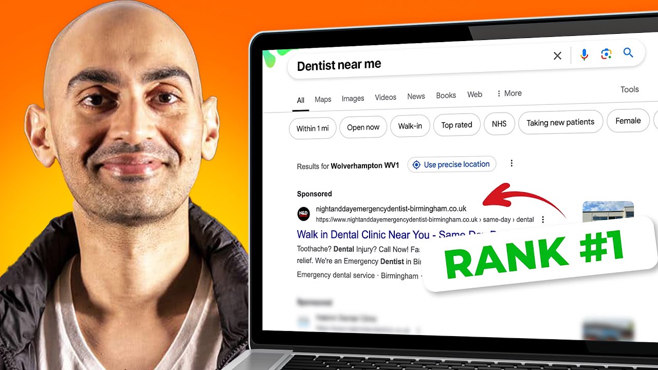
How to Optimize Website Conversions by Improving Your CTA
Summary
TLDRIn this instructional video, Neil Patel shares expert tips for optimizing call to actions (CTAs) on websites to boost conversions. He emphasizes avoiding generic CTA phrases and instead crafting text that aligns with the product's benefits. Patel also advises using images that guide the viewer's attention towards the CTA and incorporating time-sensitive language to create urgency. Lastly, he stresses the importance of strategic CTA placement throughout the website, ensuring they are positioned where they make the most sense and are easily accessible to visitors.
Takeaways
- 🚀 Optimize your call to actions (CTAs) for better conversions.
- 📝 Avoid generic words like 'Buy Now' or 'Try me' in your CTAs.
- ✅ Ensure CTA text is directly related to the benefit of your product or service.
- 👀 Use images that direct attention to your CTA, such as having a person in the image look towards the CTA.
- ⏳ Incorporate time-sensitive words in your CTAs to encourage immediate action.
- 📈 Examples of effective CTAs include 'Grow your traffic today' for marketing services.
- 🌟 Place CTAs strategically throughout your website where it makes sense.
- 🎥 Position a CTA beneath any videos explaining your product or service.
- 🛠️ Add CTAs after describing features and services to prompt user action.
- 🔄 Continually place CTAs beneath benefit descriptions to minimize scrolling for users.
Q & A
What is the main focus of the video script provided?
-The main focus is on how to optimize call to actions (CTAs) on a website to increase conversions and sales.
Why should generic words be avoided in call to actions according to Neil Patel?
-Generic words like 'Buy Now' or 'Try me' are not effective because they don't relate to the specific benefits of the product or service, which is crucial for conversion.
How does the call to action text relate to the consumer's benefit in Neil Patel's example?
-The call to action text should align with the benefit that the consumer is going to get, making them more likely to convert.
What role does the hero image play in drawing attention to the call to action?
-The hero image, especially if it includes a person, should have the person's gaze directed towards the call to action, subconsciously guiding the viewer's attention there.
Why is it important to use time-sensitive words in call to actions?
-Time-sensitive words like 'Try now' or 'Free trial' create a sense of urgency, encouraging immediate action rather than delaying the decision.
How does the placement of call to actions affect the user experience on a website?
-Call to actions should be placed strategically throughout the website where they make sense, not just at the bottom or above the fold, to ensure they are easily accessible and don't require excessive scrolling.
What is the significance of placing a call to action after a video explaining the product or service?
-Placing a call to action after a product or service explanation video allows users to take immediate action based on the information they have just learned.
Why should call to actions be sprinkled throughout the webpage and not just in one place?
-Scattering call to actions throughout the page ensures that users can take action at various points in their journey without having to scroll back up or down repeatedly.
What is the recommended approach for describing the benefits of a product or service in relation to call to actions?
-It is recommended to continually place call to action buttons beneath the description of each benefit, making it clear and convenient for users to take the next step.
How does the script suggest enhancing the effectiveness of call to actions on a website?
-The script suggests enhancing effectiveness by using relevant text, directing the gaze in images towards the CTA, adding time-sensitive words, and placing CTAs in logical locations throughout the website.
What is the overall goal of optimizing call to actions as described in the script?
-The overall goal is to increase the likelihood of website visitors converting into customers by making the call to actions more engaging, relevant, and strategically placed.
Outlines

This section is available to paid users only. Please upgrade to access this part.
Upgrade NowMindmap

This section is available to paid users only. Please upgrade to access this part.
Upgrade NowKeywords

This section is available to paid users only. Please upgrade to access this part.
Upgrade NowHighlights

This section is available to paid users only. Please upgrade to access this part.
Upgrade NowTranscripts

This section is available to paid users only. Please upgrade to access this part.
Upgrade NowBrowse More Related Video

Where Should You Place Your Call to Action Button? Here Are 3 Conversion Rate Optimization Tips

The Power of AI: Discovering Its True Capabilities

CRO Unlocked - Free Conversion Rate Optimization Course by Neil Patel - Increase Website Conversions

My Marketing Plan Process - 6 Steps to Marketing Any Business (Products or Services)

SEO For Beginners: 3 Powerful SEO Tips to Rank #1 on Google - Still Works In 2023.

How To Get B2B Leads & Clients On LinkedIn - Module 1 - Lesson 3 - LinkedIn Unlocked
5.0 / 5 (0 votes)