Intro to Data Visualization with R & ggplot2 | Google Data Analytics Certificate

Google Career Certificates
2 Jul 202150:34

Summary

TLDRThis video script delves into the significance of data visualization in analysis, highlighting ggplot2 as a pivotal tool in R's tidyverse. It guides viewers through creating various plots, customizing aesthetics, and utilizing geoms to represent data effectively. The script also covers facet functions for subset display, annotation techniques for plot clarification, and methods for saving visualizations. The tutorial aims to empower data analysts with ggplot2's capabilities for insightful and accessible data storytelling.

Takeaways

  • πŸ“Š Data visualization is crucial for conveying insights from data analysis, making complex information understandable through compelling visuals.
  • πŸ“ˆ R's ggplot2 package is a popular tool for data visualization, offering powerful and user-friendly features to create various types of plots.
  • 🌟 The ggplot2 package is part of the tidyverse, inspired by 'The Grammar of Graphics', providing a systematic approach to building visuals.
  • πŸ” Aesthetics in ggplot2 determine the visual properties of plot elements, such as size, shape, and color, and are mapped from data variables.
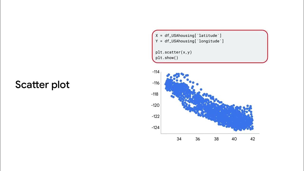
  • πŸ“š Geoms are geometric objects used to represent data in plots, with options like points for scatter plots, bars for bar charts, and lines for line diagrams.
  • πŸ”„ Facets in ggplot2 allow for displaying subsets of data in separate plots, useful for exploring relationships within different groups or categories.
  • πŸ–ŒοΈ Annotations and labels in ggplot2, such as titles, subtitles, captions, and text annotations, enhance the clarity and communication of a plot's purpose.
  • 🧩 The use of color, shape, and size aesthetics can help differentiate data points and highlight key insights, making visuals more accessible and informative.
  • πŸ”– Saving plots in R using ggsave or RStudio's Export option is essential for reproducing and sharing work, facilitating collaboration and feedback.
  • πŸ” ggplot2's flexibility and popularity among data analysts make it a foundational tool for learning more advanced data visualization techniques in R.

Q & A

  • What is the significance of data visualization in data analysis?

    -Data visualization is crucial in data analysis as it helps stakeholders understand the meaning of data through clear and compelling visuals. It brings the story of the data to life and makes it easier to comprehend.

  • What is ggplot2 and why is it popular in R?

    -Ggplot2 is R's most popular visualization package, created by Hadley Wickham. It is favored for its power and user-friendliness, allowing users to create a variety of plots, organize and represent different variables in a dataset, and customize the visuals.

  • What inspired the creation of ggplot2?

    -Ggplot2 was inspired by the 1999 book 'The Grammar of Graphics' by Leland Wilkinson, which is a scholarly study of data visualization by a computer scientist. The name ggplot2 stands for 'grammar of graphics'.

  • What are some other visualization packages available in R?

    -Besides ggplot2, R offers other visualization packages such as Plotly, Lattice, RGL, Dygraphs, Leaflet, Highcharter, Patchwork, gganimate, and ggridges, each serving different visualization needs from simple pie charts to complex interactive graphs and 3D visuals.

  • How does ggplot2 help in combining data manipulation and visualization?

    -Ggplot2 allows users to combine data manipulation and visualization using the pipe operator, making it a versatile tool for data analysis.

  • What are aesthetics in ggplot2 and how are they used?

    -In ggplot2, aesthetics are visual properties of objects in a plot, such as size, shape, or color of data points. They are used to map visual features in a plot to variables in the data, enhancing the visual representation and storytelling of the data.

  • What is a geom in ggplot2 and how does it differ from aes?

    -A geom in ggplot2 refers to the geometric object used to represent data, such as points for scatter plots or bars for bar charts. It differs from aes, which is used to define the mapping between data and plot aesthetics.

  • How can facets be used in ggplot2 to display data?

    -Facets in ggplot2 allow users to display smaller groups or subsets of data by creating separate plots for each variable or category. This can help in focusing on specific trends or relationships within the data.

  • What are some common geom functions in ggplot2?

    -Common geom functions in ggplot2 include geom_point for scatter plots, geom_bar for bar charts, geom_line for line diagrams, geom_smooth for trend lines, and geom_jitter for scatter plots with random noise to avoid over-plotting.

  • How can annotations be added to a plot in ggplot2?

    -Annotations can be added to a plot in ggplot2 using the annotate function. This allows users to include text labels, titles, subtitles, captions, and other notes to explain or comment on the plot, making it easier for stakeholders to understand the data presentation.

  • What are the methods to save plots in ggplot2?

    -Plots in ggplot2 can be saved using the Export option in the Plots tab of RStudio or the ggsave function provided by the ggplot2 package. Users can save plots as image files or PDF files, ensuring they can access and share their work later.

Outlines

00:00

πŸ“Š Introduction to Data Visualization with ggplot2

The script introduces data visualization as a crucial aspect of data analysis, emphasizing its role in conveying data insights to stakeholders. It highlights ggplot2, a popular R package, as a powerful and user-friendly tool for creating various plots. The speaker previews upcoming lessons on coding with ggplot2, customizing visuals, and leveraging its features for effective data storytelling. The paragraph also mentions other visualization packages in R, such as Plotly and Lattice, and touches on the origin of ggplot2, inspired by 'The Grammar of Graphics', a foundational text for data visualization.

05:02

🎨 Mastering ggplot2 Basics: Aesthetics and Geom Functions

This paragraph delves into the fundamentals of ggplot2, focusing on aesthetics and geoms. Aesthetics are visual properties like color, size, and shape that map to data variables, while geoms represent the geometric objects used to visualize data, such as points, bars, or lines. The speaker discusses the pipe operator for combining data manipulation and visualization and mentions the ggplot2 cheatsheet as a reference guide. Core concepts like mapping data to aesthetics, choosing appropriate geoms for data representation, and customizing plot labels are introduced, setting the stage for more advanced topics.

10:03

πŸ” Exploring Data with ggplot2: Creating and Customizing Plots

The script provides a step-by-step guide to creating a ggplot2 plot, starting with the ggplot function and progressing through adding layers with geoms and mapping aesthetics. It explains the importance of the plus sign for layering and the use of the aes function for defining mappings between data and visual properties. The paragraph includes practical tips for writing code in R, such as paying attention to case sensitivity and matching parentheses, and encourages learners to utilize R's help resources and community for troubleshooting.

15:04

πŸ– Enhancing Visuals: Applying Aesthetics to Data Points

This section discusses the use of aesthetics to enhance data visualization, allowing for clearer communication of data insights. It demonstrates how to map variables to aesthetics such as color, shape, and size to differentiate data points, using the Penguins dataset as an example. The speaker shows how to adjust transparency with the alpha aesthetic and how to use R's automatic legends to aid in data interpretation. The paragraph also covers how to change the overall appearance of a plot by setting aesthetics outside of the aes function.

20:05

πŸ“ˆ Understanding Geom Functions: Diverse Data Representations

The script explores the variety of geom functions available in ggplot2 for creating different types of plots. It contrasts the use of geom_point for scatter plots with geom_bar for bar charts and introduces geom_smooth for adding trend lines. The paragraph explains how to combine geoms in a single plot and how to use geom_jitter to address over-plotting issues. The goal is to show the flexibility of ggplot2 in representing data through various geoms and how they can be tailored to specific storytelling needs.

25:08

πŸ“Š Analyzing Trends with Advanced ggplot2 Features

This paragraph examines advanced features of ggplot2 for detailed data analysis, such as using geom_smooth to illustrate trends and facets to display subsets of data. The speaker discusses how to use facet_wrap and facet_grid functions to create multi-panel plots that reveal patterns and trends within data groups. The paragraph provides examples of how facet functions can be applied to the Penguins and Diamonds datasets to uncover insights that may not be apparent in a single plot.

30:13

πŸ–ŒοΈ Customizing Plots with Labels and Annotations

The script focuses on the customization of plots using labels and annotations to enhance data communication. It describes how to add titles, subtitles, and captions to plots for clarity and how to use the annotate function to place text within the plot grid to emphasize specific data points. The paragraph provides a hands-on example using the Penguins dataset and discusses various formatting options for annotations, such as color, font style, size, and angle.

35:15

πŸ’Ύ Saving Your ggplot2 Visualizations

This section outlines the importance of saving ggplot2 plots for future access and collaboration. It demonstrates two methods for saving plots: using the Export option in RStudio and the ggsave function from the ggplot2 package. The speaker provides step-by-step instructions for each method, including choosing file formats, naming files, and accessing saved files. The paragraph reinforces the value of reproducible and shareable work in an analytical role.

40:15

πŸŽ‰ Course Completion and Next Steps

The final paragraph celebrates the completion of the video and encourages further engagement with the course material. It prompts viewers to access the full course experience for job search assistance and to earn an official certificate. It also invites viewers to watch the next video in the series and to subscribe to the channel for more educational content, highlighting the ongoing learning journey in data analytics.

Mindmap

Keywords

πŸ’‘Data visualization

Data visualization refers to the presentation of data in a graphical format to make it easier to understand and analyze. It is a key aspect of data analysis that helps stakeholders grasp complex information quickly. In the video, data visualization is central to explaining how to use R's ggplot2 package to create compelling visuals that highlight key insights from data.

πŸ’‘ggplot2

ggplot2 is a popular data visualization package in R, known for its powerful and user-friendly interface. It is based on the 'Grammar of Graphics' and allows users to build plots by combining different layers and elements. The script emphasizes ggplot2 as the primary tool for creating a variety of plots, showcasing its flexibility and the immediate results it provides.

πŸ’‘Aesthetics

In ggplot2, aesthetics are the visual properties of the data points, such as color, shape, size, and position on the plot. They act as a mapping between visual features and data variables, allowing for the representation of data in a visually meaningful way. The script explains how different aesthetics can be mapped to variables to create more expressive plots.

πŸ’‘Geoms

Geoms in ggplot2 are the geometric objects used to represent the data, such as points, lines, or bars. They determine the type of plot that is created. The script discusses various geoms like geom_point for scatter plots, geom_bar for bar charts, and geom_smooth for adding trend lines to the plots.

πŸ’‘Facets

Facets in ggplot2 are used to display subsets of data in separate plots, either by wrapping or in a grid format. They allow for the exploration of data within different groups or categories. The script illustrates how facet_wrap and facet_grid can be used to create multiple plots based on the variables in the data set, such as differentiating between penguin species or diamond cuts.

πŸ’‘Annotations

Annotations in ggplot2 are textual or graphical notes added to plots to explain, comment on, or highlight certain aspects of the data. They help in guiding the viewer's attention to key points. The script demonstrates how to use labels and the annotate function to add titles, subtitles, captions, and text notes within the plot area.

πŸ’‘Data frames

A data frame is a fundamental data structure in R used to store data in a tabular format with rows and columns. It is the typical format for input data in ggplot2. The script mentions choosing a data frame as the initial step in creating a plot with ggplot2.

πŸ’‘The Grammar of Graphics

The Grammar of Graphics is a concept that inspired ggplot2, referring to a systematic way of constructing graphs using basic building blocks. It provides a set of rules for creating a wide variety of visualizations. The script explains that ggplot2 implements this grammar, allowing users to create diverse plots by combining different elements.

πŸ’‘Customization

Customization in the context of ggplot2 refers to the ability to tailor the appearance of plots to suit specific needs or preferences. This includes changing colors, layouts, dimensions, and adding text elements. The script covers how to customize plots using various functions and aesthetics to create high-quality visuals.

πŸ’‘RStudio Cloud

RStudio Cloud is a cloud-based integrated development environment (IDE) for R programming, which allows users to write and execute R code in a web browser. The script instructs viewers to log in to RStudio Cloud to practice creating plots with ggplot2, emphasizing the interactive learning process.

πŸ’‘Saving plots

The process of saving plots in ggplot2 is essential for preserving work and sharing results. The script describes two methods for saving plots: using the Export option in RStudio and the ggsave function from the ggplot2 package. This allows users to store their visualizations in various formats for future use or presentation.

Highlights

Data visualization is crucial for data analysis, as it allows stakeholders to understand data through clear and compelling visuals.

ggplot2 is R's most popular data visualization package, noted for its power and user-friendliness.

Learning ggplot2 enhances data visualization skills, facilitating the understanding of data changes and their immediate visual representation.

R enables quick transitions between data analysis and visualization, streamlining the workflow of a data analyst.

Various visualization packages exist for R, including Plotly, Lattice, and RGL, each serving different purposes from simple charts to complex visuals.

ggplot2's creation was inspired by 'The Grammar of Graphics', providing a systematic approach to building a wide range of visualizations.

Aesthetics in ggplot2 are visual properties like size, shape, or color, mapping data variables to visual elements in a plot.

Geoms in ggplot2 represent data through geometric objects such as points, bars, or lines, chosen based on the data type and desired representation.

Facets in ggplot2 allow for the display of subsets of data on separate plots, revealing patterns and trends within specific groups.

Labels and annotations in ggplot2 are used to add context, highlight important data, and guide the viewer's attention.

The ggplot2 cheatsheet serves as a comprehensive reference guide for functions and is useful for learning new visualization techniques.

ggplot2's syntax and structure promote the reuse of code for creating various plots, making the visualization process efficient.

Common issues in ggplot2, such as misplaced plus signs or parentheses, can be easily resolved with attention to detail and R's helpful resources.

The use of geom functions like geom_smooth and geom_jitter can enhance scatter plots by showing trends and dealing with over-plotting.

Bar charts can be effectively created and customized in ggplot2 using geom_bar, with options to display counts or proportions.

Faceting with facet_wrap and facet_grid in ggplot2 enables the organization of complex data into more digestible and insightful visuals.

Customizing ggplot2 plots with titles, subtitles, captions, and annotations helps in effectively communicating the story of the data.

Plots created in ggplot2 can be saved using RStudio's Export option or the ggsave function for future access and sharing.

Transcripts

play00:03

SPEAKER: Data visualization is one of the most important parts

play00:07

of data analysis.

play00:08

Powerful visuals show stakeholders

play00:11

what your data means in a clear and compelling way,

play00:14

and highlighting key insights.

play00:17

Visuals help bring the story of your data to life,

play00:20

and make that story easier to understand.

play00:23

You might remember the sneak peek

play00:25

I gave you of R's data visualization powers.

play00:28

I created those visuals with ggplot2,

play00:32

one of the core packages of the tidyverse.

play00:35

Ggplot2 is R's most popular visualization package,

play00:39

and for good reason.

play00:41

It's a powerful and user-friendly data viz tool.

play00:45

Up next, you'll learn how to write and execute

play00:48

all the code we previewed earlier.

play00:50

You'll learn how to use ggplot2 to create a variety of plots,

play00:55

organize and represent different variables in your data set,

play00:59

and customize the look and feel of your visuals.

play01:03

Working with ggplot2 can help you

play01:05

get the most out of your data.

play01:07

Your new data viz skills will also

play01:10

make it easier to learn other parts of R. Going forward,

play01:14

you'll be better able to visualize

play01:16

the results of any change you make to your data.

play01:20

Plus, you get an immediate result for all your hard work,

play01:23

which is one of my favorite parts

play01:25

of creating plots in ggplot2.

play01:28

Just enter some code, run it, and out comes

play01:33

a cool-looking visual that helps you and others understand

play01:36

your data.

play01:38

Visualization is a key part of a data analyst's workflow,

play01:42

and R lets you move back and forth

play01:44

between analysis and visualization

play01:47

quickly and easily.

play01:49

I'm looking forward to showing you what ggplot2 can do.

play01:52

[MUSIC PLAYING]

play01:56

In this video, we'll focus on ggplot2.

play01:59

We'll learn about its main features and functions,

play02:02

and how it can help you visualize your data.

play02:06

First, let's talk about some different visualization

play02:08

packages you can use with R. Base R has its own package,

play02:14

and there are other useful packages you can add.

play02:18

They'll help you do almost anything

play02:19

you want with your data, from making simple pie

play02:22

charts to creating more complex visuals like interactive graphs

play02:27

and maps.

play02:29

General purpose packages like Plotly

play02:32

let you do a wide range of visualization functions.

play02:36

Others, like RGL, focus on specific solutions

play02:40

like 3D visuals.

play02:43

Some of the most popular include ggplot2, Plotly, Lattice, RGL,

play02:50

Dygraphs, Leaflet, Highcharter, Patchwork,

play02:55

gganimate, and ggridges.

play02:58

Personally, ggplot2 is my favorite for data analysis.

play03:02

It's both powerful and flexible.

play03:05

With a little bit of code, you can create

play03:08

all kinds of different plots.

play03:10

You can use ggplot2 on its own or extend its powers

play03:15

with other packages.

play03:16

Plus, it's the most popular visualization package in R.

play03:20

A lot of data analysts prefer to use

play03:23

ggplot2, which is why we're using ggplot2 here.

play03:28

ggplot2 was originally created by the statistician

play03:32

and developer Hadley Wickham in 2005.

play03:36

Wickham's inspiration for creating ggplot2

play03:39

came from the 1999 book "The Grammar of Graphics,"

play03:44

a scholarly study of data visualization by computer

play03:47

scientist Leland Wilkinson.

play03:50

The first two letters of ggplot2 actually

play03:54

stand for grammar of graphics.

play03:57

And in the same way the grammar of a human language

play04:00

gives us rules to build any kind of sentence,

play04:03

the grammar of graphics gives us rules

play04:05

to build any kind of visual.

play04:08

So ggplot2 has some basic building blocks

play04:11

that you can use to create plots.

play04:14

In other words, when you learn the basic steps

play04:17

for creating a plot in ggplot2, you

play04:20

can reuse these steps to create lots

play04:23

of different kinds of plots.

play04:25

Plus, you can add or remove layers of detail to your plot

play04:29

without changing its basic structure or the underlying

play04:33

data.

play04:34

This makes ggplot2 really powerful.

play04:37

In the next video, we'll go over these steps one by one.

play04:41

ggplot2 has lots of other benefits, too.

play04:45

You can create all different types of plots,

play04:48

including scatter plots, bar charts, line diagrams, and tons

play04:54

more.

play04:55

You can change the colors, layout, and dimensions

play04:58

of your plots, and add text elements,

play05:01

like titles, captions, and labels.

play05:05

With just a little bit of code, you

play05:07

can create high-quality visuals.

play05:10

Plus, ggplot2 lets you combine data manipulation

play05:14

and visualization using the pipe operator.

play05:19

ggplot2 also has tons of functions that

play05:22

cover all your data viz needs.

play05:25

To give you an idea, check out the ggplot2 cheatsheet,

play05:29

which is a popular reference guide.

play05:32

You can find out more about the cheatsheet in an upcoming

play05:35

reading.

play05:36

It's not important to learn all these functions right away,

play05:40

or even know what they are.

play05:42

Over time, as you get into more advanced data analysis,

play05:46

you can learn about new functions as you need them.

play05:50

Just know that if you need to find a function for something,

play05:54

ggplot2 probably has it.

play05:58

And like we discussed, even the basic functions of ggplot2

play06:02

let you do so much.

play06:06

We'll focus on some core concepts in ggplot2--

play06:10

aesthetics, geoms, facets, labels and Annotations.

play06:17

These might be new concepts to you.

play06:19

And that's OK.

play06:21

We'll learn about them together.

play06:22

And soon we'll explore each in detail.

play06:26

For now, let's get a quick preview.

play06:29

In ggplot2, an aesthetic is a visual property

play06:33

of an object in your plot.

play06:36

For example, in a scatter plot, aesthetics

play06:39

include things like the size, shape, or color

play06:43

of your data points.

play06:45

Think of an aesthetic as a connection, or mapping,

play06:49

between a visual feature in your plot

play06:51

and a variable in your data.

play06:54

We'll talk more about mapping later on.

play06:56

A geom refers to the geometric object

play07:00

used to represent your data.

play07:02

For example, you can use points to create a scatter plot,

play07:07

bars to create a bar chart, or lines to create a line diagram.

play07:13

You can choose a geom to fit the type of data you have.

play07:17

Points show the relationship between two

play07:19

quantitative variables.

play07:21

Bars show one quantitative variable varies

play07:25

across different categories.

play07:27

Up next, we'll talk about the facet function.

play07:30

Facets let you display smaller groups, or subsets,

play07:34

of your data.

play07:36

With facets, you can create separate plots

play07:39

for all the variables in your data set.

play07:43

Finally, the label and annotate functions

play07:46

let you customize your plot.

play07:49

You can add text, like titles, subtitles, and captions,

play07:53

to communicate the purpose of your plot

play07:55

or highlight important data.

play07:58

That's all for now.

play08:00

Coming up, we'll use code to create our own first plot

play08:03

in ggplot2.

play08:04

[MUSIC PLAYING]

play08:08

You might remember that the Penguins data set contains

play08:12

size measurements for three penguin

play08:14

species that live in the Palmer Archipelago, in Antarctica.

play08:19

The data set includes variables, such as body mass, flipper

play08:23

length, and bill length.

play08:25

Now, we'll learn how to use code to create those visuals.

play08:30

We'll go through the process of creating a plot step by step.

play08:34

We'll also go over some general tips

play08:36

on how to write code in ggplot2, and check out some useful help

play08:40

resources.

play08:42

First, let's log in to RStudio Cloud.

play08:45

As we go along, I encourage you to join in and try out

play08:49

all the code in RStudio.

play08:51

Feel free to pause the video any time you need to.

play08:55

We are assuming you already have the tidyverse packages

play08:58

installed.

play08:59

If you don't, refer to an earlier video,

play09:02

or run install.packages("tidyverse").

play09:07

Let's start by loading the ggplot2 package

play09:10

and the Penguins data set.

play09:20

Let's check out the plot that shows the relationship

play09:22

between body mass and flipper length in the three penguin

play09:26

species.

play09:33

The plot shows a positive relationship

play09:36

between the two variables.

play09:38

In other words, the larger the penguin,

play09:40

the longer the flipper.

play09:43

Now, let's check out the code.

play09:45

The code uses functions from ggplot2

play09:48

to plot the relationship between body mass and flipper length.

play09:52

As a quick refresher, in R, a function

play09:55

is a name, followed by a set of parentheses.

play09:58

Lots of functions require special information

play10:01

to do their jobs.

play10:02

You write this information, called the function's argument,

play10:07

inside the parentheses.

play10:09

The three functions in the code are the ggplot function,

play10:13

the geom point function, and the aes function.

play10:18

Every ggplot2 plot starts with the ggplot function.

play10:23

The argument of the ggplot function

play10:26

tells R what data to use for your plot.

play10:30

So the first thing to do is choose a data frame

play10:33

to work with.

play10:34

You can set up the code like this.

play10:37

Inside the parentheses of the function, write the word data,

play10:41

then an equal sign, then penguins.

play10:45

This code initializes, or starts, the plot.

play10:49

If we stop right now and run the code,

play10:52

the result will be an empty plot.

play10:54

Let's try it.

play11:03

This is just the first step in creating a plot.

play11:07

The next thing you might notice about this code

play11:09

is the plus sign at the end of the first line.

play11:12

You use the plus sign to add layers to your plot.

play11:16

In ggplot2, plots are built through combinations of layers.

play11:21

First, we start with our data.

play11:23

Then, we add a layer to our plot by choosing a geom

play11:27

to represent our data.

play11:29

The function geom_point tells R to use

play11:34

points to represent our data.

play11:37

Keep in mind that the plus sign must

play11:39

be placed at the end of each line to add a layer.

play11:43

Adding a geom function is the second step in creating a plot.

play11:47

As a reminder, a geom is a geometric object

play11:51

used to represent your data.

play11:53

Geoms include points, bars, lines, and more.

play11:58

In R code, the function geom_point

play12:02

tells R to use points, and create a scatter plot.

play12:07

We'll learn more about geoms later on.

play12:10

Next, we need to choose specific variables from our data set,

play12:14

and tell R how we want these variables to look in our plot.

play12:19

In ggplot2, the way a variable looks is called its aesthetic.

play12:25

As a quick reminder, an aesthetic

play12:27

is a visual property of an object in your plot,

play12:31

like its position, color, shape, or size.

play12:35

The mapping=aes part of the code tells R what aesthetics to use

play12:41

for the plot.

play12:42

You use the aes function to define

play12:47

the mapping between your data and your plot.

play12:50

Mapping means matching up a specific variable in your data

play12:54

set with a specific aesthetic.

play12:56

For example, you can map a variable

play12:59

to the x-axis of your plot or you can map a variable

play13:03

to the y-axis of your plot.

play13:06

In a scatter plot, you can also map a variable

play13:09

to the color, size, and shape of your data points.

play13:13

We'll learn more about aesthetics soon.

play13:16

Mapping aesthetics to variables is the third step

play13:20

in creating a plot.

play13:21

In R code, we map the variable flipper length to the x-axis,

play13:26

and the variable body mass to the y-axis.

play13:30

Inside the parentheses of the aes function,

play13:34

we write the name of the aesthetic, then

play13:36

the equals sign, then the name of the variable.

play13:40

We write the code, and R takes care of the rest.

play13:47

Using the penguins data, R creates a scatter plot,

play13:51

puts the variable body mass on the y-axis,

play13:54

and the variable flipper length on the x-axis.

play13:58

Our code follows the common sequence

play14:00

for creating plots in ggplot2.

play14:03

Earlier, we talked about the grammar

play14:05

of graphics, a set of steps for making

play14:08

all kinds of different plots.

play14:11

You can also think of the sequence as the basic grammar

play14:14

for making plots in ggplot2.

play14:17

To create a plot, follow these three steps--

play14:21

start with the ggplot function, and choose

play14:24

a data set to work with.

play14:26

Add a geom_function to display your data.

play14:31

Map the variables you want to plot

play14:34

in the arguments of the aes function.

play14:37

We can also turn our code into a reusable template

play14:40

for creating plots in ggplot2.

play14:44

To make a plot, replace the bracketed sections

play14:47

in the code with a data set, a GEOM_FUNCTION,

play14:51

or a group of AESTHETIC MAPPINGS.

play14:55

We can make all kinds of different plots

play14:57

using this template.

play14:58

For example, instead of plotting the relationship

play15:01

between body mass and flipper length,

play15:03

we could use two different variables in the Penguins data

play15:07

set.

play15:08

Let's try bill length and bill depth.

play15:11

We can put bill length on the x-axis and bill depth

play15:15

on the y-axis.

play15:17

Let's run the code and check out this new scatter plot.

play15:25

As you learn to write code in R, or any other programming

play15:29

language, you'll come across problems.

play15:31

It happens to everyone.

play15:33

I've been working in R for years,

play15:34

and I still write code that has errors.

play15:37

A lot of times, these will be minor errors with easy fixes.

play15:42

It helps if you pay attention to the details.

play15:45

For example, R is case sensitive.

play15:48

If you accidentally capitalize the first letter

play15:51

in a certain function, it might affect your code.

play15:55

Also, make sure every opening parenthesis in your function

play16:00

matches with a closing parenthesis.

play16:03

Notice how this code won't run correctly, but this code does.

play16:17

One common problem when working with ggplot2

play16:20

is remembering to put the plus sign in the right

play16:22

place when adding a layer to your plot.

play16:25

Always put the plus sign at the end of a line of code.

play16:29

It's easy to forget and put it at the beginning of the line.

play16:41

Or you might accidentally use a pipe instead of a plus sign.

play16:55

We all make mistakes.

play16:56

That's part of the learning process.

play16:59

The good news is we have plenty of tries to get it right.

play17:02

There's also plenty of resources to help you out.

play17:06

To learn more about any R function, just run the code

play17:10

question mark, function_name.

play17:14

For example, if you want to learn more

play17:16

about the geom_point function, type in question

play17:21

mark geom_point.

play17:28

As a new learner, you might not understand all the concepts

play17:32

in the Help page.

play17:33

At the bottom of the page, you can

play17:35

find specific examples of code that may show you

play17:39

how to solve your problem.

play17:42

If you still can't find what you're looking for,

play17:45

feel free to reach out to the R community online.

play17:48

As I mentioned earlier, there are

play17:50

tons of great online resources for R. Chances are,

play17:54

someone else has had the same problem.

play17:57

That's it for now.

play17:59

Up next, we'll learn more about aesthetics.

play18:01

[MUSIC PLAYING]

play18:05

In this video, you'll learn how to change

play18:07

the aesthetics of your visuals, which

play18:10

can help you present your data in a more compelling way.

play18:13

With aesthetics, you can highlight key points

play18:16

in your data, and communicate more clearly and effectively

play18:20

with your stakeholders.

play18:21

Earlier, we learned that an aesthetic is a visual property

play18:26

of an object in your plot.

play18:28

For example, in a scatter plot, aesthetics

play18:31

include the size, shape, or color of your data points.

play18:36

You can display a point in different ways

play18:39

by changing its aesthetics, or the way it looks.

play18:43

You can make a point small, triangular, or blue,

play18:47

or a combination of these.

play18:49

Let's go back to our Penguins data

play18:51

set and review the code for our plot

play18:54

that shows the relationship between body mass and flipper

play18:57

length.

play18:58

As a quick refresher, the mapping=aes part of the code

play19:04

tells R what aesthetics to use for the plot.

play19:08

You use the aes function to define

play19:12

the mapping between your data and your plot.

play19:15

Mapping means matching up a specific variable in your data

play19:20

set with a specific aesthetic.

play19:23

For example, you can map a variable

play19:26

to the x-axis of your plot or you can map a variable

play19:30

to the y-axis of your plot.

play19:33

To map an aesthetic to a variable,

play19:35

set the name of the aesthetic equal to the name

play19:38

of the variable inside the parentheses of the aes

play19:42

function.

play19:43

Our code tells R to map flipper length to the x-axis and body

play19:49

mass to the y-axis.

play19:51

Let's log into RStudio Cloud and run the code.

play19:55

As a quick reminder, let's start by loading the ggplot2 package

play19:59

and the Penguins data set.

play20:04

R will automatically place the appropriate label

play20:07

on each axis of our scatter plot.

play20:20

After you map a variable to an aesthetic,

play20:22

R takes care of the rest.

play20:25

You can also map data to other aesthetics,

play20:28

like color, size, and shape.

play20:31

Right now, our plot is in black and white.

play20:34

It clearly shows the positive relationship

play20:36

between the two variables.

play20:39

As the values on the x-axis increase,

play20:42

the values on the y-axis increase.

play20:45

But it's also got some limitations.

play20:47

For example, we can't tell which data points refer to each

play20:51

of the three penguin species.

play20:53

To solve this problem, we can map a new variable

play20:57

to a new aesthetic.

play20:59

Let's add a third variable to our scatter plot

play21:02

by mapping it to a new aesthetic.

play21:05

We'll map the variable Species to the aesthetic Color

play21:09

by adding some code inside the parentheses of the aes

play21:14

function.

play21:15

We'll add a comma after the body mass variable,

play21:19

and type color=species.

play21:23

Our code tells R to assign a different color

play21:26

to each species of penguin.

play21:29

Let's check it out.

play21:32

The Gentoos are the largest of the three penguin species.

play21:36

The legend, just to the right of the plot,

play21:38

shows us that the blue points refer to the Gentoo penguins.

play21:43

Not only does R automatically apply different colors

play21:46

to each data point, it also gives a legend to show us

play21:50

the color coding.

play21:51

That's what I love about R--

play21:53

give it just a little bit of code,

play21:55

and it'll go the extra mile to help you out.

play21:58

We can also use shape to highlight the different penguin

play22:01

species.

play22:02

Let's map the variable species to the aesthetic shape.

play22:07

To do this, we can change the code from color=species

play22:12

to shape=species.

play22:15

Instead of colored points, R assigns different shapes

play22:19

to each species.

play22:21

Now, the legend shows us a circle for the Adelie species,

play22:26

a triangle for the Chinstraps, and a square for the Gentoos.

play22:30

You might notice that our plot is in

play22:33

black and white again because we removed the code for color.

play22:37

Let's put some color back into our plot.

play22:39

If we want, we can map more than one aesthetic

play22:42

to the same variable.

play22:44

Let's map both color and shape to species.

play22:47

We'll add the code color-=species,

play22:51

while keeping the code shape=species.

play22:59

Now our plot shows a different color and a different shape

play23:02

for each species.

play23:05

We can keep going.

play23:06

Let's add size as well, and map three aesthetics to species.

play23:11

If we add size=species, each colored shape will also be

play23:16

a different size.

play23:21

Using more than one aesthetic can also

play23:24

be a way to make your visuals more accessible because it

play23:27

gives your viewers more than one way to make sense of your data.

play23:31

We can also map species to the alpha aesthetic, which controls

play23:36

the transparency of the points.

play23:38

Our first plot showed the relationship

play23:40

between body mass and flipper length in black and white.

play23:44

Then, we mapped the variable species to the aesthetic color

play23:49

to show the difference between each of the three penguin

play23:52

species.

play23:53

If we want to keep our graph in black and white,

play23:56

we can map the alpha aesthetic to species.

play24:00

This will make some points more transparent,

play24:02

or see-through, than others.

play24:05

This gives us another way to represent each penguin species.

play24:09

Let's try it.

play24:10

Alpha is a good option when you've got a dense plot

play24:13

with lots of data points.

play24:22

You can also set the aesthetic apart from a specific variable.

play24:26

Let's say we want to change the color of all the points

play24:30

to purple.

play24:31

Here, we don't want to map color to a specific variable,

play24:34

like species.

play24:36

We just want every point in our scatter plot to be purple.

play24:39

So we need to set our new piece of code outside of the aes

play24:44

function, and use quotation marks for R color value.

play24:50

This is because all the code inside of the aes function

play24:54

tells R how to map aesthetics to variables.

play24:57

For example, mapping the aesthetic color

play25:00

to the variable species.

play25:03

If we want to change the appearance of our overall plot

play25:07

without regard to specific variables,

play25:10

we write code outside of the aes function.

play25:14

Let's write the code and run it.

play25:26

That's all for now.

play25:27

We just learned about the most common aesthetics for points--

play25:31

x, y, color, shape, size, and alpha.

play25:37

We also discovered how aesthetics

play25:39

can change the look of our plot and highlight important data.

play25:43

We've covered a lot so far and learned

play25:46

a bunch of new concepts.

play25:47

It takes time to process new information

play25:50

and learn new skills.

play25:51

So feel free to watch any of these videos

play25:54

again if you need a refresher or want to practice in RStudio.

play25:59

Coming up, we'll learn more about geoms.

play26:01

[MUSIC PLAYING]

play26:06

In this video, we'll learn how to use different geom functions

play26:10

to create different types of plots, such as scatter plots

play26:14

and bar charts.

play26:15

There are lots of different geoms available.

play26:18

You can choose a specific geom based

play26:21

on how you want to represent your data and your goals

play26:24

for communicating it.

play26:26

This lets you tell the story of your data in different ways

play26:29

and communicate effectively to different audiences.

play26:33

Let's start with two visualizations.

play26:36

Both visuals contain the same x variable and the same y

play26:40

variable.

play26:41

Both use the same data, but each plot

play26:45

uses a different visual object to represent the data.

play26:49

One uses points.

play26:50

The other uses a smooth line.

play26:53

In other words, they use different geoms.

play26:57

In ggplot2, a geom is the geometrical object

play27:02

used to represent your data.

play27:04

Geoms include points, bars, lines, and more.

play27:09

The geom_point function uses points to create scatter plots.

play27:14

The geom_bar function uses bars to create bar charts, and so

play27:20

on.

play27:21

To change the geom in our plot, we

play27:24

need to change the geom function in our code.

play27:27

For example, take the plot that shows

play27:30

the relationship between body mass and flipper length.

play27:33

The code uses geom_point to create a scatter plot.

play27:39

Let's log into RStudio Cloud and watch what

play27:42

happens when we change geoms.

play27:44

First, let's load the ggplot2 package and the Penguins data

play27:48

set.

play27:51

Now, we can put geom_smooth in place of geom_point.

play28:05

We still have the same data, but now the data

play28:09

has got a different visual appearance.

play28:11

Instead of points, there's a smooth line that fits the data.

play28:15

The geom_smooth function is useful for showing

play28:20

general trends in our data.

play28:22

The line clearly shows the positive relationship

play28:25

between body mass and flipper length.

play28:28

The larger the penguin, the longer the flipper.

play28:31

We can even use two geoms in the same plot.

play28:35

Let's say we want to show the relationship between the trend

play28:37

line and the data points more clearly.

play28:40

We can combine the code for geom_point

play28:44

and the code for geom_smooth by adding a plus symbol

play28:49

after geom_smooth.

play28:52

Let's write the code and run it.

play29:02

Let's say we want to plot a separate line

play29:04

for each species of penguin.

play29:07

We can add the linetype aesthetic to our code

play29:10

and map it to the variable species.

play29:13

Geom_smooth will draw a different line

play29:17

with a different linetype for each species of penguin.

play29:22

The legend shows how each linetype

play29:25

matches with each species.

play29:28

The plot clearly shows the trend for each species.

play29:32

Finally, let's check out the geom_jitter function.

play29:37

The geom_jitter function creates a scatter plot,

play29:41

and then adds a small amount of random noise

play29:44

to each point in the plot.

play29:46

Jittering helps us deal with over-plotting,

play29:50

which happens when the data points in a plot

play29:52

overlap with each other.

play29:55

Jittering makes the points easier to find.

play29:58

I'll show you what I mean.

play30:00

Let's replace geom_point with geom_jitter.

play30:13

Now that we've seen what ggplot2 can do with scatter plots,

play30:17

let's explore bar charts.

play30:19

We'll use the Diamonds data set that you're already

play30:22

familiar with.

play30:23

This includes data like the quality, clarity, and cut

play30:28

for over 50,000 diamonds.

play30:31

This data set comes with the ggplot2 package,

play30:34

so it's already loaded.

play30:37

To make a bar chart, we use the geom_bar function.

play30:43

Let's write some code that plots a bar chart of the variable cut

play30:47

in the Diamonds data set.

play30:49

Cut refers to a diamond's proportions, symmetry,

play30:53

and polish.

play30:55

Notice that we didn't supply a variable for the y-axis.

play30:59

When you use geom_bar, R automatically

play31:04

counts how many times each x value appears in the data,

play31:08

and then shows the counts on the y-axis.

play31:12

The default for geom_bar is to count rows.

play31:17

But that's only one of the many different applications

play31:20

for bar charts.

play31:22

For example, the x-axis of our plot shows five categories

play31:27

of cut quality--

play31:29

fair, good, very good, premium, and ideal.

play31:35

The y-axis shows the number of diamonds in each category.

play31:39

Over 20,000 diamonds have a value

play31:42

of ideal, which is the most common type of cut.

play31:46

Geom_bar uses several aesthetics that you're already

play31:51

familiar with, such as color, size, and alpha.

play31:55

Let's add the color aesthetic to our plot,

play31:58

and map it to the variable cut.

play32:01

We write the code the same way as we did with scatter plots,

play32:05

and add color=cut after x=cut.

play32:10

Don't forget to put a comma after x=cut to add a new

play32:15

aesthetic.

play32:19

The color aesthetic adds color to the outline of each bar.

play32:24

R also supplies a legend to show the color coding.

play32:29

Let's say we want to highlight the difference between cuts

play32:32

even more clearly to make our plot easier to understand.

play32:36

We can use the fill aesthetic to add color

play32:39

to the inside of each bar.

play32:42

In our code, we put fill=cut in place of color=cut.

play32:52

R automatically chooses the colors and supplies a legend.

play32:57

That looks great.

play32:58

I really enjoy using the fill aesthetic.

play33:02

If we map fill to a new variable,

play33:05

geom_bar will display what's called a stacked bar chart.

play33:11

Let's map fill to clarity instead of cut.

play33:18

Our plot now shows 40 different combinations

play33:21

of cut and clarity.

play33:23

Each combination has its own colored rectangle.

play33:28

The rectangles that have the same cut value

play33:31

are stacked on top of each other in each bar.

play33:35

The plot organizes the complex data.

play33:39

Now we know the difference in volume between cuts,

play33:43

and we can figure out the difference in clarity

play33:45

within each cut.

play33:47

This is just the beginning of what you can do with geoms.

play33:50

ggplot2 has over 30 geom functions

play33:54

that you can use to make plots, and extension packages

play33:58

give you even more.

play34:00

The ggplot2 cheatsheet is a great resource

play34:04

for learning more about geoms.

play34:06

As you move forward and do more advanced data analysis,

play34:11

you'll find plenty of new geoms to work with.

play34:14

Until then, the geoms we just reviewed will keep you busy

play34:19

and let you do a lot with your data.

play34:22

Coming up, we'll learn how to use

play34:25

the facet functions to display our data in different ways.

play34:28

[MUSIC PLAYING]

play34:33

In this video, we'll learn how to use the ggplot2 facet

play34:37

functions to display our data in new ways.

play34:41

Facet functions let you display smaller groups, or subsets,

play34:45

of your data.

play34:46

A facet is a side, or section, of an object,

play34:50

like the sides of a gemstone.

play34:52

Facets show different sides of your data

play34:55

by placing each subset on its own plot.

play34:59

Faceting can help you discover new patterns in your data

play35:02

and focus on relationships between different variables.

play35:06

For example, let's say you're looking at sales

play35:09

data for a clothing company.

play35:11

You might want to break down your data by category

play35:14

to show specific trends--

play35:16

children's clothing versus adult clothing,

play35:20

or spring fashions versus fall fashions.

play35:23

Or if you are running an employee engagement survey,

play35:27

you might want to break down your data by tenure,

play35:29

and compare senior employees to new employees.

play35:33

ggplot2 has two functions for faceting--

play35:36

facet_wrap and facet_grid.

play35:41

Let's explore them both.

play35:42

We'll start with facet_wrap.

play35:45

To facet your plot by a single variable, use facet_wrap.

play35:51

Let's say we wanted to focus on the data

play35:53

for each species of penguin.

play35:56

Take our plot that shows the relationship between body mass

play35:59

and flipper length in each penguin species.

play36:03

The facet_wrap function lets us create a separate plot

play36:08

for each species.

play36:10

To add a new layer to our plot, we'll

play36:13

add a plus symbol to our code.

play36:16

Then, inside the parentheses of the facet_wrap function,

play36:21

type a tilde symbol, followed by the name of the variable.

play36:26

Let's log into RStudio Cloud and check it out.

play36:29

As a reminder, we'll start by loading the ggplot2 package

play36:33

and the Penguins data set.

play36:36

You can find the tilde symbol in the upper-left corner

play36:39

of the keyboard, just below the Escape key.

play37:00

There!

play37:00

The separate plots show the relationship

play37:02

between body mass and flipper length

play37:05

within each species of penguin.

play37:07

Pretty cool, right?

play37:09

Facets help us focus on important parts of our data

play37:13

that we might not notice in a single plot.

play37:15

If your visual is too busy--

play37:17

for example, if it's got too many variables or levels

play37:20

within variables-- faceting can be a good option.

play37:25

Let's try faceting the Diamonds data set.

play37:27

Earlier, we made a bar chart that

play37:29

showed the number of diamonds for each category of cut--

play37:33

fair, good, very good, premium, and ideal.

play37:38

We can use facet_wrap on the cut variable

play37:43

to create a separate plot for each category of cut.

play37:46

Let's check it out.

play37:53

To facet your plot with two variables,

play37:56

use the facet_grid function.

play38:00

Facet_grid will split the plot into facets

play38:03

vertically by the values of the first variable

play38:07

and horizontally by the values of the second variable.

play38:11

For example, we can take our penguins plot and use

play38:15

facet_grid with the two variables sex and species.

play38:21

In the parentheses following the facet_grid function,

play38:25

we write sex, then the tilde symbol, then species.

play38:30

Let's run the code.

play38:36

There are nine separate plots, each

play38:38

based on a combination of the three species of penguin,

play38:42

and three categories of sex.

play38:45

Facet_grid lets you quickly reorganize and display

play38:49

complex data, and makes it easier

play38:51

to spot relationships between different groups.

play38:55

If we want, we can focus our plot

play38:57

on only one of the two variables.

play39:00

For example, we can tell R to remove sex

play39:03

from the vertical dimension of the plot and just show species.

play39:07

Let's check it out.

play39:11

You can easily spot differences in the relationship

play39:14

between flipper length and body mass between the three species.

play39:19

In the same way, we can focus our plot

play39:21

on sex instead of species.

play39:26

Facets let you reorganize your data

play39:29

to show specific relationships between variables,

play39:32

and reveal important patterns and trends

play39:35

in subsets of your data.

play39:37

That's all for now.

play39:38

Next up, we'll learn how to customize our plots

play39:41

using labels and annotations.

play39:43

[MUSIC PLAYING]

play39:48

In everyday language, to annotate

play39:50

means to add notes to a document or diagram

play39:53

to explain or comment upon it.

play39:56

In ggplot2, adding annotations to your plot

play40:00

can help explain the plot's purpose

play40:02

or highlight important data.

play40:05

When you present your data visuals to stakeholders,

play40:08

you may not have much time to meet with them.

play40:12

Labels and annotations will point their attention

play40:15

to key things and help them quickly understand your plot.

play40:19

Let's start with the label function.

play40:21

It's super useful for adding informative labels

play40:24

to a plot, such as titles, subtitles, and captions.

play40:29

For example, we can add a title to our plot that

play40:32

shows the relationship between body mass and flipper length

play40:36

for the three penguin species.

play40:39

A title will clearly indicate the purpose of the plot.

play40:43

Let's go over the code.

play40:44

First, we add a plus sign to add a new layer to our plot.

play40:49

Next, in the parentheses following the label function,

play40:53

we write the word title, then an equals sign, then

play40:57

the specific text we want in our title.

play41:00

Let's log in to RStudio Cloud and check it out.

play41:03

First, let's load the ggplot2 package and the Penguins data

play41:07

set.

play41:11

Remember, put the plus sign at the end of a line of code.

play41:15

It's easy to forget.

play41:38

R automatically displays the title at the top of the plot.

play41:43

We can also add a subtitle to our plot

play41:46

to highlight important information about our data.

play41:49

To do this, we enter the code for a subtitle

play41:52

in the same way as a title.

play41:55

Remember to add a comma after the title argument

play41:58

before you enter your subtitle.

play42:04

R automatically displays the subtitle just below the title.

play42:09

We can add a caption to our plot in the same way.

play42:13

Captions let us show the source of our data.

play42:16

The Palmer Penguins data was collected from 2007 to 2009

play42:22

by Dr. Kristen Gorman, a member of the Palmer Station Long-Term

play42:27

Ecological Research Program.

play42:29

Let's cite Dr. Gorman in our caption.

play42:38

R automatically displays the caption

play42:40

at the bottom right of our plot.

play42:45

Titles, subtitles, and captions are

play42:47

labels that we put outside of the grid of our plot

play42:51

to indicate important information.

play42:54

If we want to put text inside the grid

play42:57

to call out specific data points,

play42:59

we can use the annotate function.

play43:02

For example, let's say we want to highlight the data

play43:06

from the Gentoo penguins.

play43:08

We can use the annotate function to add some text

play43:11

next to the data points that refer to the Gentoos.

play43:15

This text will clearly communicate what the plot shows

play43:18

and reinforce an important part of our data.

play43:22

OK.

play43:23

Let's check out the code.

play43:25

In the parentheses of the annotate function,

play43:27

we've got information on the type of label,

play43:31

the specific location of the label,

play43:33

and the context of the label.

play43:36

In this case, we want to write a text label.

play43:40

We also want to place it near the Gentoo data points.

play43:44

Let's put it at the following coordinates--

play43:47

x-axis equals 220 millimeters, and y-axis equals 3,500 grams.

play43:57

Finally, let's write our text--

play43:59

The Gentoos are the largest.

play44:03

Let's run it.

play44:07

Check it out.

play44:08

R automatically places the text label

play44:11

on the correct coordinates in our plot.

play44:14

We can customize our annotation even more.

play44:17

Let's say we want to change the color of our text.

play44:20

Well, we can add color equals, followed

play44:23

by the name of the color.

play44:25

Let's try purple.

play44:26

We can also change the font style and size of our text.

play44:31

Use fontface and size to write the code.

play44:36

Let's bold our text and make it a little larger.

play44:45

We can even change the angle of our text.

play44:48

For example, we can tilt our text at a 25-degree angle

play44:53

to line it up with our data points.

play44:56

Let's try it.

play44:58

That looks great.

play45:00

By this point, our code is getting pretty long.

play45:03

If you want to use less code, you

play45:05

can store your plot as a variable in R.

play45:08

As a quick reminder, to create a variable in R,

play45:12

you type the variable name, then a less-than sign,

play45:16

followed by a dash.

play45:18

Let's try it with the variable name p.

play45:27

Now, instead of writing all the code again,

play45:30

we can just call p and add an annotation to it-- like this.

play45:42

You get the same result.

play45:44

Some people like to see every step of their code listed out

play45:47

in front of them.

play45:49

So there are advantages to doing it the longer way.

play45:52

It's really up to you.

play45:54

I just want you to know that you've got options.

play45:57

Hopefully, this gives you an idea of some of the ways

play46:00

you can customize your plots.

play46:02

Labels and annotations can be really helpful

play46:06

when it comes to highlighting important parts of your data

play46:09

and communicating key points.

play46:11

That's all for now.

play46:13

Coming up, you'll learn some useful ways

play46:15

to save your plots in ggplot2.

play46:18

[MUSIC PLAYING]

play46:22

In this video, we'll learn how to save our plots.

play46:25

Saving your work so that you can access it later

play46:28

is so important.

play46:30

It lets you continue to work on it

play46:32

yourself or share it with others.

play46:35

Being able to reproduce and share your work

play46:38

is a key part of your future analyst role

play46:41

because it lets you collaborate with teammates.

play46:44

They can double-check your work and offer feedback

play46:47

to help you improve it.

play46:48

So let's save our plots.

play46:50

To do this, you'll use the Export option

play46:53

in the Plots tab of RStudio or the ggsave function provided

play47:00

by the ggplot2 package.

play47:03

First, we'll save our plots using the Export option.

play47:07

Then, we'll use the ggsave function.

play47:11

Let's log into RStudio Cloud.

play47:13

We'll load the ggplot2 package and the Penguins data set.

play47:20

To start, let's write some code and create

play47:22

the plot that shows the relationship between body mass

play47:26

and flipper length in three penguin species.

play47:37

Let's use the Export option in the Plots tab to save our plot.

play47:44

We can save it as an image file or a PDF file.

play47:49

Let's try saving it as an image.

play47:53

There are six different options for image format,

play47:56

including PNG and JPEG.

play48:01

Let's try PNG.

play48:04

Next, we name our file and click Save.

play48:12

Now, if we click on the Files tab,

play48:15

we'll find our file in the list.

play48:20

Let's open it up.

play48:23

Looks great!

play48:25

That covers the Export option for saving a plot.

play48:29

Now, let's check out the ggsave function.

play48:32

ggsave is a useful function for saving a plot.

play48:36

It defaults to saving the last plot

play48:39

that you displayed and uses the size of the current graphics

play48:43

device.

play48:44

Let's try saving our plot as a PNG file using ggsave.

play48:50

ggsave will automatically save the plot

play48:53

that shows the relationship between body mass and flipper

play48:56

length because this is the last plot that we displayed.

play49:00

We have to give the file a name and say what kind of file

play49:04

we want to save it as.

play49:06

Let's write the code.

play49:07

Within the parentheses of the function,

play49:10

we start off with a quotation mark,

play49:12

followed by the name of the file.

play49:15

Let's name it Three Penguin Species.

play49:19

We put a period after the file name, then

play49:23

the type of file we want, then a closing quotation mark.

play49:27

Let's run it.

play49:32

Now, if we click on the Files tab,

play49:35

we'll find our new file in the list.

play49:38

Let's open it up.

play49:40

Again, looks great!

play49:44

That covers the basics of saving plots.

play49:47

After all your hard work creating plots in ggplot2,

play49:51

you definitely want to remember to save them so you can

play49:54

access and share them later on.

play49:57

And that's the end of our work on data visualization.

play50:01

You're off to a great start visualizing data with ggplot2.

play50:06

Plus, the concepts we've covered are a great base

play50:09

for learning even more about data viz in R

play50:12

as you move forward.

play50:14

TONY: Congratulations on finishing this video

play50:16

from the Google Data Analytics Certificate.

play50:18

Access the full experience, including job search help,

play50:21

and start to earn the Official Certificate

play50:24

by clicking the icon or the link in the description.

play50:26

Watch the next video in the course by clicking here.

play50:29

And subscribe to our channel for more from upcoming