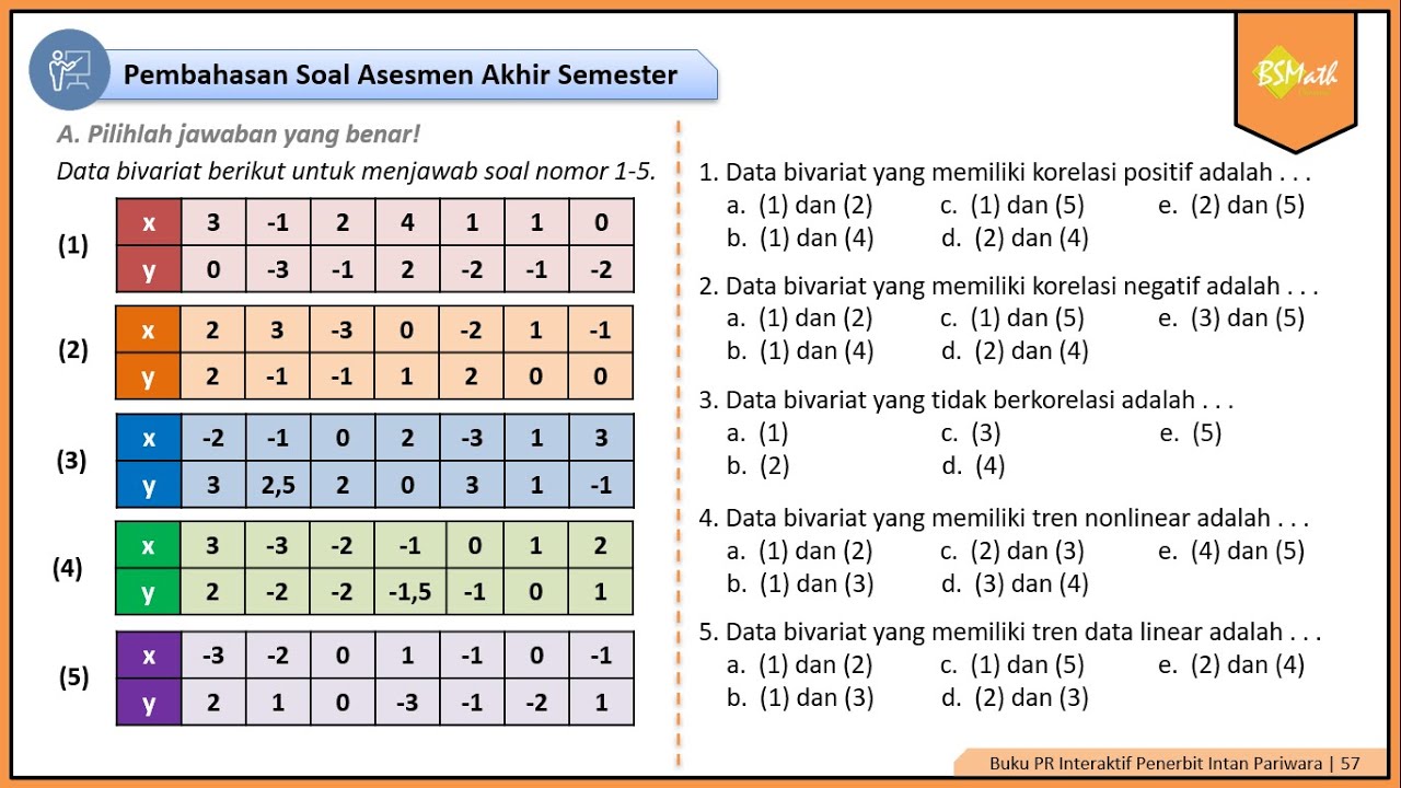
Hubungan Diagram Pencar dan Korelasi Variabel X dan Y
Summary
TLDRIn this lively class session for 11th graders, the teacher dives into bivariate data, focusing on scatter plots and correlation. Using relatable everyday examples, she explains positive correlation (both variables rise together), negative correlation (one rises while the other falls), and no correlation (variables unrelated). Students are guided through practical exercises, such as analyzing speed versus travel time or shopping amounts versus total cost. The lesson emphasizes how visualizing data can reveal hidden patterns in daily life, encouraging students to observe, collect, and interpret data to better understand relationships and predict outcomes in real-world scenarios.
Takeaways
- 📊 Understanding data visually helps reveal patterns that are otherwise hidden in raw numbers.
- 🔍 Scatter plots are a key tool to observe relationships between two variables in a dataset.
- 😊 Positive correlation occurs when both variables increase together, forming an upward-sloping pattern.
- 😟 Negative correlation occurs when one variable increases while the other decreases, forming a downward-sloping pattern.
- ☁️ No correlation or scattered data indicates that the variables do not influence each other and appear randomly on a scatter plot.
- 📝 Everyday examples, like study time versus exam scores or spending versus savings, make understanding correlations easier.
- 🏍️ Faster travel (higher speed) reducing travel time is an example of negative correlation in real life.
- 🛒 Buying more items in a store increases the total price, illustrating positive correlation practically.
- ✂️ Some variables, like shoe size and math ability, have no correlation, demonstrating independent data points.
- 💡 Observing and collecting data from daily life can uncover hidden correlations and help predict outcomes.
- 📚 Visualizing data through scatter plots is essential for interpreting and summarizing statistical information effectively.
- 🎯 Using clear examples and exercises solidifies understanding of different types of correlations.
Q & A
What is the main topic discussed in the video transcript?
-The main topic is bivariate data, specifically scatter diagrams and correlation, including positive, negative, and no correlation.
Why does the teacher emphasize the importance of visualizing data?
-Visualizing data helps reveal patterns that raw numbers alone cannot show, making it easier to understand relationships between variables.
How does a positive correlation appear in a scatter diagram?
-In a positive correlation, the points on a scatter diagram tend to form a line that slopes upwards from left to right, indicating that as one variable increases, the other also increases.
Can you give an everyday example of positive correlation from the transcript?
-Yes, an example is the relationship between study time (variable X) and exam scores (variable Y). The more time students spend studying, the higher their scores tend to be.
What characterizes a negative correlation in a scatter diagram?
-A negative correlation occurs when the points on a scatter diagram slope downward from left to right, meaning that as one variable increases, the other decreases.
Provide an example of negative correlation mentioned in the transcript.
-The transcript gives the example of spending money (variable X) and remaining savings (variable Y). The more money spent, the less savings remain.
What does it mean when there is no correlation between two variables?
-No correlation means the variables do not influence each other at all, and the points on the scatter diagram appear randomly scattered with no clear pattern.
What example illustrates no correlation from the transcript?
-An example is shoe size (variable X) and math ability (variable Y). The size of a student's shoes has no effect on their math performance.
Why is it useful to analyze correlations in daily life, according to the transcript?
-Analyzing correlations helps understand relationships between variables, predict outcomes, and make informed decisions based on observed patterns in everyday life.
What exercise does the teacher give to help students practice identifying correlations?
-The teacher asks students to consider scenarios like riding a motorbike faster to reduce travel time (negative correlation), shopping in a minimarket to increase total cost (positive correlation), and comparing hair length with jumping height (no correlation).
What is the key takeaway from the session on scatter diagrams and correlation?
-The key takeaway is that understanding scatter diagrams and types of correlation—positive, negative, or none—helps students interpret data patterns in both academic and everyday contexts.
How does the transcript suggest students apply these concepts outside the classroom?
-Students are encouraged to observe daily routines, collect data mentally or physically, and identify hidden correlations to predict outcomes or make better decisions.
Outlines

This section is available to paid users only. Please upgrade to access this part.
Upgrade NowMindmap

This section is available to paid users only. Please upgrade to access this part.
Upgrade NowKeywords

This section is available to paid users only. Please upgrade to access this part.
Upgrade NowHighlights

This section is available to paid users only. Please upgrade to access this part.
Upgrade NowTranscripts

This section is available to paid users only. Please upgrade to access this part.
Upgrade NowBrowse More Related Video

STATISTIKA BIVARIAT ( DIAGRAM PENCAR ) - PART 1

Statistika Bivariat: Mengungkap Hubungan Dua Variabel!

Analisis Korelasi#STIE GICI

Menggambar Diagram Pencar Kelas XI Fase F Kurikulum Merdeka
Pembahasan Soal Asesmen Akhir Semester Materi Diagram Pencar Nomor 1-5 | Matematika Wajib Kelas XI

Excel Forecasting Visualization
5.0 / 5 (0 votes)