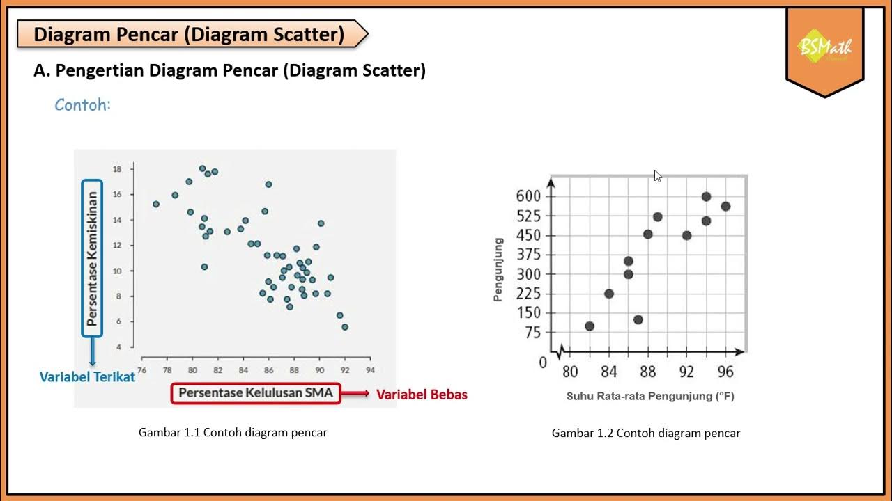
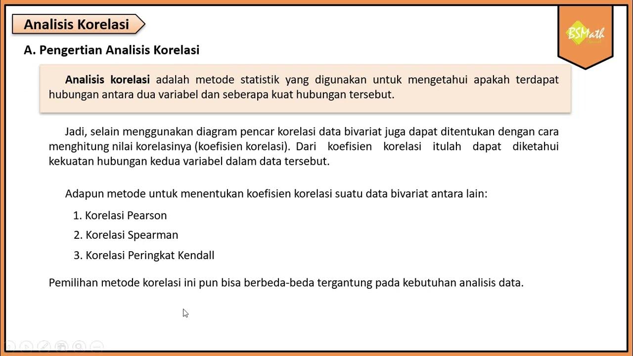
Diagram Pencar
Summary
TLDRThis video explores the power of scatter plots in visualizing and understanding relationships between two variables. Using the relatable example of study hours and exam scores, it explains key concepts such as independent and dependent variables, correlation types (positive, negative, none), and the strength and shape of relationships (linear vs. nonlinear). Viewers learn step-by-step how to transform raw data into meaningful visual insights, detect outliers, and interpret patterns. The video emphasizes the practical importance of scatter plots as a foundation for more advanced analysis and encourages applying these skills to everyday data to uncover hidden stories and insights.
Takeaways
- 😀 A scatter plot is a powerful visual tool that helps understand the relationship between two variables.
- 😀 It uses data points on a graph to reveal patterns and trends, making raw data more meaningful.
- 😀 The X-axis represents the independent variable, while the Y-axis represents the dependent variable.
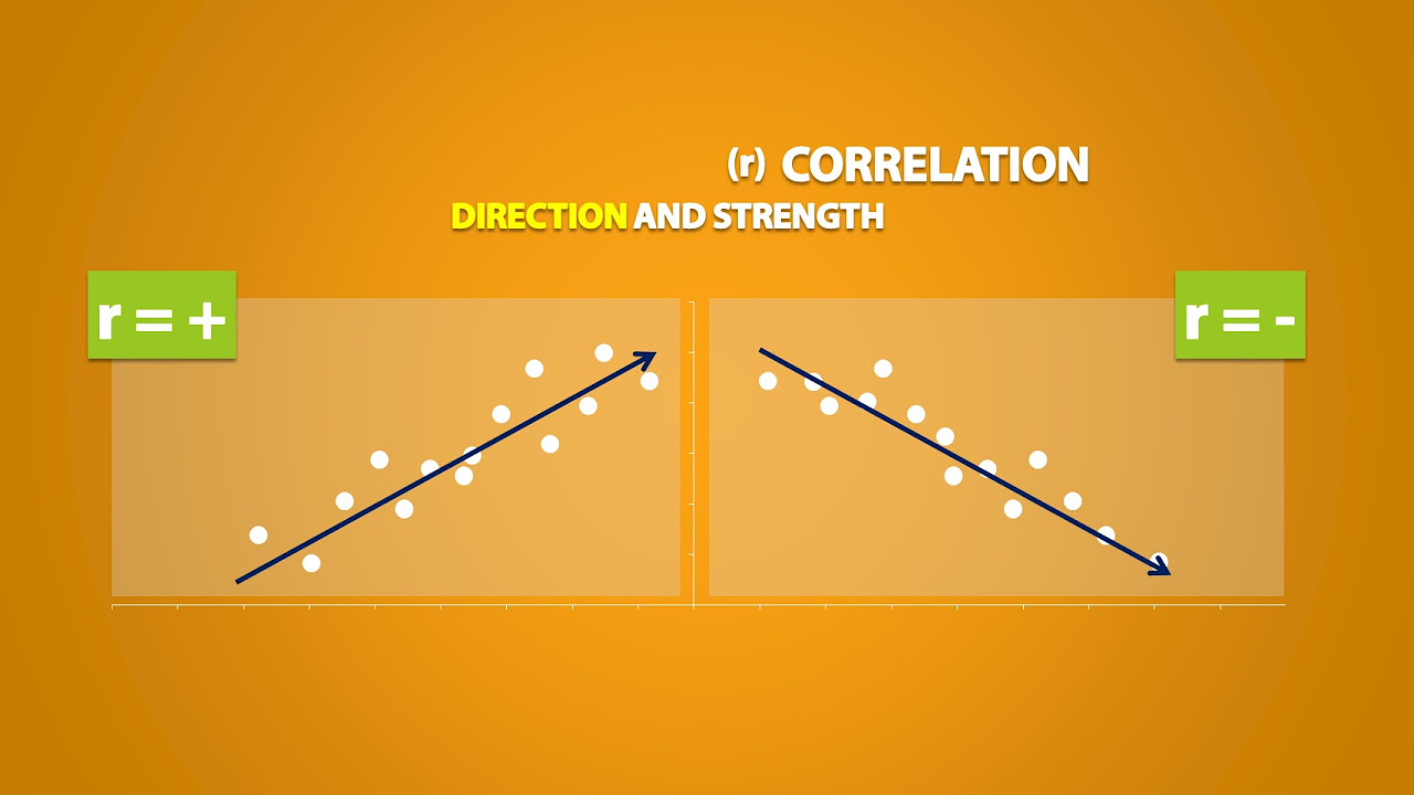
- 😀 Positive correlation means that as one variable increases, the other does too (e.g., more study hours = higher exam scores).
- 😀 Negative correlation means that as one variable increases, the other decreases (e.g., higher speed = less travel time).
- 😀 Sometimes, no correlation is present when data points scatter randomly without any discernible pattern.
- 😀 Scatter plots help to identify the strength and type of the relationship between variables (e.g., linear vs. nonlinear).
- 😀 A linear relationship means data points form a straight line, while a nonlinear relationship means they follow a curved pattern.
- 😀 The closer the data points are to forming a perfect line, the stronger the correlation.
- 😀 Scatter plots are essential for quickly detecting relationships in data, spotting outliers, and serving as a foundation for more complex analyses like linear regression.
- 😀 Visualizing data using scatter plots can lead to deeper insights and uncover hidden patterns in real-life data, such as the relationship between coffee consumption and work productivity.
Q & A
What is the main purpose of a scatter plot?
-The main purpose of a scatter plot is to visually represent the relationship between two variables, helping to identify patterns, trends, and correlations between them.
How can a scatter plot help answer questions like 'Does studying more lead to better exam scores'?
-A scatter plot can show the relationship between study hours and exam scores by plotting each data point (study hours, exam score) on a graph, allowing you to visually analyze if there is a positive or negative correlation between the two variables.
What does 'bivariate data' mean in the context of a scatter plot?
-Bivariate data refers to data that involves two variables, such as study hours (X) and exam scores (Y), that are plotted on a scatter plot to analyze their relationship.
How do you interpret a positive correlation in a scatter plot?
-In a positive correlation, as the value of one variable increases (e.g., study hours), the value of the other variable (e.g., exam scores) also tends to increase, forming an upward trend on the graph.
What does a negative correlation look like in a scatter plot?
-A negative correlation occurs when one variable increases (e.g., speed) and the other decreases (e.g., travel time). On the scatter plot, this results in a downward trend from left to right.
What happens if there is no correlation between two variables in a scatter plot?
-If there is no correlation, the points on the scatter plot will be randomly scattered without forming any visible pattern or trend.
What is the difference between linear and nonlinear relationships in scatter plots?
-In a linear relationship, the data points form a straight line, indicating a constant rate of change between the two variables. In a nonlinear relationship, the data points form a curved pattern, indicating a changing rate of change.
How can the strength of a relationship between variables be assessed in a scatter plot?
-The strength of the relationship can be determined by how closely the data points cluster together. If the points are tightly grouped along a line, the relationship is strong. If they are spread out, the relationship is weak.
What are the four steps to create a scatter plot with real data?
-The four steps are: 1) Identify the independent variable (X) and dependent variable (Y), 2) Set the appropriate scales for the X and Y axes, 3) Plot each data point on the graph, and 4) Observe the pattern and interpret the relationship.
Why is it important to understand relationships in data through scatter plots?
-Understanding relationships through scatter plots is crucial because it allows you to quickly identify patterns, detect outliers, and lay the foundation for more advanced analyses like linear regression.
Outlines

This section is available to paid users only. Please upgrade to access this part.
Upgrade NowMindmap

This section is available to paid users only. Please upgrade to access this part.
Upgrade NowKeywords

This section is available to paid users only. Please upgrade to access this part.
Upgrade NowHighlights

This section is available to paid users only. Please upgrade to access this part.
Upgrade NowTranscripts

This section is available to paid users only. Please upgrade to access this part.
Upgrade NowBrowse More Related Video
Belajar Statistika - Makna & Intepretasi Diagram Pencar (Scatter Plot)
Explanatory and Response Variables, Correlation (2.1)
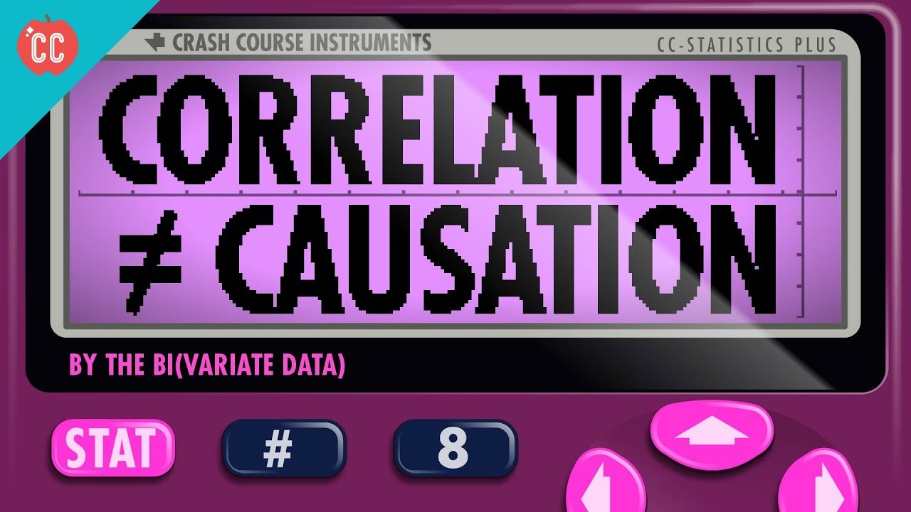
Correlation Doesn't Equal Causation: Crash Course Statistics #8

Analisis Korelasi#STIE GICI
Pengertian Diagram Pencar - Matematika Wajib SMA Kelas XI Kurikulum Merdeka
Analisis Korelasi - Matematika Wajib SMA Kelas XI Kurikulum Merdeka
5.0 / 5 (0 votes)