How To Use Waterfall Charts: 3 Types With Real Examples
Summary
TLDRThis video dives into the three main types of waterfall charts commonly used in consulting: the build-up, movement, and gap waterfall charts. It explains how each chart serves a different purpose—showing contributions to a total, illustrating changes over time, and highlighting discrepancies between actuals and targets. Through real-world examples from firms like BCG and McKinsey, the video illustrates when and how to use each chart effectively. Additionally, it covers key design principles, such as choosing purposeful colors and using chart decorations to enhance clarity, while emphasizing the importance of fitting the right chart to your data.
Takeaways
- 😀 Waterfall charts are a common consulting tool used to visually represent the buildup of data over time or the impact of different factors on a total.
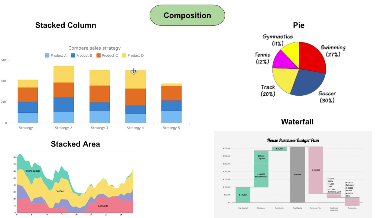
- 😀 The **Build-Up Waterfall Chart** is the most common and displays how different components contribute to a total. It’s useful for stacking data and highlighting relative contributions.
- 😀 **Movement Waterfall Charts** focus on the change from an initial value to a final one, often used for financial data like net income or profit margins, highlighting increases or decreases.
- 😀 **Gap Waterfall Charts** highlight the gap between actual values and targets, making them ideal for illustrating problems or complications in business scenarios.
- 😀 Callouts are important for explaining key insights in a waterfall chart, such as why certain values are larger or smaller than expected.
- 😀 The **Build-Up Waterfall Chart** can be made more powerful by grouping data, adding totals for groups, and using callouts to explain groupings and movements.
- 😀 Using a **Movement Waterfall Chart** in financial presentations allows for a clear depiction of drivers behind changes, such as revenue or cost factors.
- 😀 **Gap Waterfall Charts** work well when explaining problems or discrepancies, particularly in a situation where a target isn't being met. They’re commonly paired with callouts to address gaps.
- 😀 When creating waterfall charts, it’s important to use colors strategically to draw attention to key sections, like positive vs. negative movements.
- 😀 Don’t force a waterfall chart where it doesn’t fit. Select the right type of chart based on the data, rather than trying to make the data fit a waterfall format.
- 😀 Consultants use waterfall charts not only for clarity but also for visual appeal, making data easier to understand while keeping presentations sleek and professional.
Q & A
What is the simplest type of waterfall chart used in consulting?
-The simplest type of waterfall chart is the Build-up Waterfall Chart. It is used to show how various parts contribute to a total, with a clear sequence leading up to the final value.
What is the purpose of callouts in a waterfall chart?
-Callouts in a waterfall chart are used to provide additional context or explanations for certain parts of the chart, such as why a particular segment is larger or smaller than expected.
How does a Build-up Waterfall Chart differ from a stacked column or bar chart?
-While a stacked column or bar chart can show parts contributing to a total, a Build-up Waterfall Chart adds visual interest and clarity by using callouts and avoiding excess white space, making it easier to highlight key points.
What is the main function of a Movement Waterfall Chart?
-A Movement Waterfall Chart is used to show the change from an initial value to a final value, typically displaying financial metrics such as net income, with increases and decreases clearly marked.
What are 'difference arrows' in a Movement Waterfall Chart?
-Difference arrows are visual elements used in a Movement Waterfall Chart to indicate the direction and magnitude of the change between the initial and final values, helping to highlight the overall change.
What is the role of color in creating effective waterfall charts?
-Color should be used purposefully in waterfall charts to highlight important sections and make it easier for viewers to understand the chart. Different colors can differentiate between positive and negative changes or between different groups.
How does a Gap Waterfall Chart function?
-A Gap Waterfall Chart is used to highlight the gap between an actual value and a target. It visually displays the difference and is often used to explain problems or areas where performance falls short of expectations.
What key elements should you consider when creating a Gap Waterfall Chart?
-When creating a Gap Waterfall Chart, it's important to use different colors or border styles for the gap column to make it stand out, and to include callouts that explain why there is a gap or how significant it is.
Why are the three types of waterfall charts useful in consulting presentations?
-The three types—Build-up, Movement, and Gap—allow consultants to effectively display different types of data: building up to a total, showing changes over time, and highlighting gaps between actual and target values. Each chart serves a distinct purpose depending on the data being presented.
What is a key takeaway from the 'three golden rules' of creating waterfall charts?
-The key takeaway is to design waterfall charts thoughtfully: use color with purpose, add chart decorations (like arrows and callouts) to emphasize key points, and avoid forcing a waterfall chart if the data doesn’t naturally fit. Choose the most appropriate chart for the data at hand.
Outlines

This section is available to paid users only. Please upgrade to access this part.
Upgrade NowMindmap

This section is available to paid users only. Please upgrade to access this part.
Upgrade NowKeywords

This section is available to paid users only. Please upgrade to access this part.
Upgrade NowHighlights

This section is available to paid users only. Please upgrade to access this part.
Upgrade NowTranscripts

This section is available to paid users only. Please upgrade to access this part.
Upgrade NowBrowse More Related Video
Every Major Chart Type and When to Use It

How to pick the "perfect" chart for your situation in Power BI?
4 Question Categories to help choose your chart types for Data Visualization

MANAGEMENT CONSULTING PRESENTATION - How consulting firms create slide presentations (Ex-McKinsey)

The 7½ Types of Business Organizational Structures
Research methods graphs
5.0 / 5 (0 votes)