Pertemuan ke 5 Statistika sosial
Summary
TLDRThis educational video explains fundamental concepts in statistics, including measures of central tendency (mean, mode, median) and dispersion (range, interquartile range, variance, and standard deviation). It emphasizes how to calculate and interpret these values, using practical examples and Excel functions for ease of computation. The video also introduces the use of box plots to visualize data distribution and identify outliers, helping viewers understand data trends and irregularities. Through a combination of theoretical explanations and hands-on application, the video offers a comprehensive guide to statistical analysis.
Takeaways
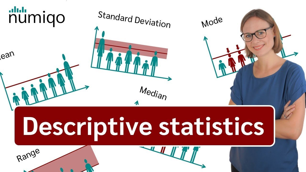
- 😀 The discussion begins with an introduction to central tendency and data dispersion measures, including mode, median, quartiles, and range.
- 😀 Mode refers to the most frequent observation in a dataset, which can be easily identified with examples like the most repeated number in a set.
- 😀 Median is the middle value in an ordered dataset. It divides the data into two equal halves, and its position can be calculated using a formula.
- 😀 Quartiles divide data into four equal parts, helping to understand the distribution of the dataset. Q1, Q2 (median), and Q3 are key points in this process.
- 😀 Boxplots are introduced as a visual tool to represent data spread, using Q1, Q2 (median), and Q3 values. They also help identify outliers and extreme values.
- 😀 Outliers are data points significantly different from others, which can be detected using boxplots by identifying values outside defined thresholds.
- 😀 The concept of calculating the range of data is covered, which is the difference between the highest and lowest values in a dataset.
- 😀 Variance and standard deviation are explained as measures of how spread out data points are around the mean, with formulas for both population and sample data.
- 😀 The importance of distinguishing between population and sample data when calculating measures like the mean, variance, and standard deviation is highlighted.
- 😀 A practical example using Excel demonstrates the process of calculating averages, variance, and standard deviation, emphasizing the use of built-in functions for ease of calculation.
Q & A
What is the focus of the video in terms of data analysis?
-The video focuses on discussing measures of central tendency and data dispersion, such as mean, median, mode, quartiles, and how these are used to analyze datasets, particularly in the context of e-ktp data.
What is the 'mode' in data analysis, and how is it identified?
-The mode refers to the value that appears most frequently in a dataset. In the video, an example is given where the mode of a dataset is identified by finding the most common number, such as '9' in the provided data sample.
How is the median calculated, and what is its significance?
-The median is the middle value of a dataset when the data is ordered. If there is an odd number of data points, the median is the central number. If the dataset has an even number of points, the median is the average of the two middle values. The video illustrates this with an example where the median is 8 in a dataset of seven values.
What are quartiles and how are they used in data analysis?
-Quartiles divide a dataset into four equal parts after sorting it. The first quartile (Q1) is the value below which 25% of the data falls, the second quartile (Q2) is the median, and the third quartile (Q3) is the value below which 75% of the data falls. These quartiles help in understanding the spread of the data.
What is a boxplot, and what information can it provide about data?
-A boxplot is a graphical representation of the distribution of data based on the quartiles. It shows the minimum, first quartile, median, third quartile, and maximum values. It helps identify the spread of the data, and potential outliers. The video explains how to create a boxplot using quartiles and identify outliers.
What is the difference between a regular outlier and an extreme outlier?
-A regular outlier is a data point that falls between the first and second lower bounds or the first and second upper bounds. An extreme outlier falls below the second lower bound or above the second upper bound. The video discusses how to calculate these bounds to identify outliers in a dataset.
How does the video suggest handling outliers when analyzing data?
-The video emphasizes the importance of identifying outliers as they can distort analysis and decision-making. By identifying and considering the impact of outliers, one can avoid skewing results or drawing incorrect conclusions.
What is the significance of understanding the spread of data through range and variance?
-Understanding the spread of data through range and variance allows analysts to grasp how much data points deviate from the central tendency. The range is the difference between the highest and lowest values, while variance measures the average squared deviation from the mean. These help assess data consistency and variability.
How are the formulas for variance and standard deviation different for population data versus sample data?
-For population data, variance is calculated using the formula: Sigma(Xi - μ)² / N. For sample data, the formula adjusts by using N-1 in the denominator (known as Bessel's correction) to account for sample bias, which helps provide a more accurate estimate of the population variance.
What role do symbols like μ and X̄ play in data analysis?
-In data analysis, μ represents the population mean, while X̄ represents the sample mean. These symbols help distinguish between population and sample data and guide the proper application of formulas for calculating measures like mean, variance, and standard deviation.
Outlines

This section is available to paid users only. Please upgrade to access this part.
Upgrade NowMindmap

This section is available to paid users only. Please upgrade to access this part.
Upgrade NowKeywords

This section is available to paid users only. Please upgrade to access this part.
Upgrade NowHighlights

This section is available to paid users only. Please upgrade to access this part.
Upgrade NowTranscripts

This section is available to paid users only. Please upgrade to access this part.
Upgrade NowBrowse More Related Video

Ukuran Dispersi dan Variasi
Descriptive Statistics [Simply explained]
What is Descriptive Statistics? A Beginner's Guide to Descriptive Statistics!

2.5 Medidas descriptivas

Notation and Formulas for Summary Statistics
Descriptive Statistics: FULL Tutorial - Mean, Median, Mode, Variance & SD (With Examples)
5.0 / 5 (0 votes)