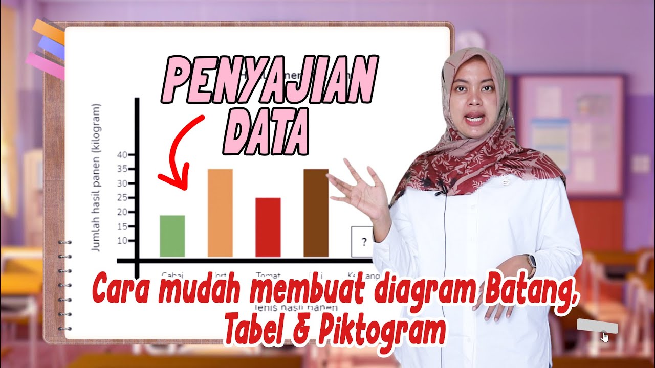
Penyajian Data Dalam Bentuk Gambar (Piktogram) - Matematika Kelas 5 SD
Summary
TLDRThis educational video explains how to present data using picture graphs (pictograms) for fifth-grade mathematics students. The example illustrates how to represent the livestock population in a village with images of animals, such as cows, to visually depict data. The process includes finding the greatest common divisor (GCD) of the animal numbers from different farmers and using it to determine how many pictures represent a certain quantity of animals. The video also demonstrates how to create a pictogram step by step, helping students understand the concept of visual data representation in a simple and engaging way.
Takeaways
- 😀 The video starts with an invitation to subscribe, like, comment, and share the channel to support its growth.
- 😀 The video explains how to present data in the form of pictures or pictograms for 5th-grade mathematics students.
- 😀 Pictograms are used to represent data, such as the population of animals (e.g., chickens, cows, goats) using pictures of those animals.
- 😀 The example in the video focuses on presenting data about the number of cows in four farms in Sukajaya village.
- 😀 The population data for the four farms are: Farm A (60 cows), Farm B (90 cows), Farm C (75 cows), and Farm D (45 cows).
- 😀 To create the pictogram, the first step is to find the greatest common divisor (GCD) of the numbers 60, 90, 75, and 45, which is 15.
- 😀 One picture of a cow represents 15 cows in the pictogram.
- 😀 The number of pictures of cows for each farm is calculated by dividing the number of cows by 15: Farm A (60 ÷ 15 = 4), Farm B (90 ÷ 15 = 6), Farm C (75 ÷ 15 = 5), and Farm D (45 ÷ 15 = 3).
- 😀 A table is created to display the data, with the farm name in the first column and the number of cows in the second column.
- 😀 The final pictogram shows that Farm A has 4 cow pictures, Farm B has 6, Farm C has 5, and Farm D has 3, where each picture represents 15 cows.
Q & A
What is the main purpose of using pictograms in data presentation?
-The main purpose of using pictograms is to visually represent data in a simplified and easily understandable way. Pictograms use images or symbols to represent quantities, making the data more engaging and easier to interpret.
What kind of data is being represented in this tutorial?
-The tutorial represents data related to the populations of cows owned by different farmers in the village of Sukajaya.
What does FPB (Greatest Common Divisor) stand for and how is it used in the tutorial?
-FPB stands for 'Factor Persekutuan Terbesar,' or Greatest Common Divisor (GCD). It is used to determine a common number that can represent each data point in the pictogram. In this case, FPB helps decide how many cows each image should represent.
How is the FPB of 60, 90, 75, and 45 calculated?
-The FPB of 60, 90, 75, and 45 is 15, which is the largest number that divides all of them evenly. This allows one image of a cow to represent 15 cows.
How many images of cows are used to represent the data for each farmer?
-Each farmer's cow population is represented by a different number of images based on their total number of cows divided by the FPB. Peternak A has 4 images, Peternak B has 6 images, Peternak C has 5 images, and Peternak D has 3 images.
What is the significance of using one image to represent 15 cows?
-Using one image to represent 15 cows simplifies the data, making it easier to visualize and compare the livestock populations across different farmers. It ensures that the pictogram is clear and not overloaded with too many images.
What steps should be followed to create the pictogram in this tutorial?
-To create the pictogram, follow these steps: 1) Identify the data to be represented, 2) Find the FPB of the values, 3) Calculate the number of images by dividing each value by the FPB, 4) Draw the pictogram using the corresponding number of images for each data point.
How does the pictogram visually compare the livestock populations of each farmer?
-The pictogram visually compares the livestock populations by showing the number of cow images for each farmer. The more images of cows, the larger the farmer's population. For example, Peternak B has 6 images, indicating a larger population than Peternak D, who has only 3 images.
Why is it important to find the FPB when creating a pictogram?
-Finding the FPB is important because it determines the scale of the pictogram. It ensures that each image represents a reasonable quantity, making the pictogram easy to understand and ensuring that the data is presented proportionally.
What role does the music play in the video?
-The music in the video adds a light and engaging atmosphere, making the tutorial more enjoyable to watch. It serves to maintain the viewer's attention and provide a more pleasant learning experience.
Outlines

This section is available to paid users only. Please upgrade to access this part.
Upgrade NowMindmap

This section is available to paid users only. Please upgrade to access this part.
Upgrade NowKeywords

This section is available to paid users only. Please upgrade to access this part.
Upgrade NowHighlights

This section is available to paid users only. Please upgrade to access this part.
Upgrade NowTranscripts

This section is available to paid users only. Please upgrade to access this part.
Upgrade NowBrowse More Related Video

Penyajian Data (Part-1) ~ Tabel dan Diagram (Materi PJJ Kelas VII / 7 SMP)

1 PENYAJIAN DATA - STATISTIKA - KELAS 7 SMP

PENYAJIAN DATA DALAM BENTUK TABEL & DIAGRAM || PENGOLAHAN DATA

Penyajian Data Kelas 7 - Menyajikan Data Dalam Tabel dan Diagram | Jenis Diagram | Statistika

Statistik : Penyajian Data - part 2
Cara Membuat dan Membaca PENYAJIAN DATA - DIAGRAM BATANG, TABEL dan PIKTOGRAM
5.0 / 5 (0 votes)