Belajar Statistika - Membuat Box-plot
Summary
TLDRIn this tutorial, the process of creating a boxplot is explained step by step. The video starts by demonstrating how to sort data and calculate key values such as Q1, median, and Q3 using the example of 14 students' data. The presenter guides the audience through the process of determining the lowest and highest values, placing the quartiles, and constructing the box representing the data's spread. Key details such as plotting the median and connecting points to form the boxplot are discussed in a clear and structured manner.
Takeaways
- 😀 The video is about learning how to create a boxplot.
- 😀 The data needed for creating the boxplot comes from the scores of 14 students.
- 😀 The first step is to sort the data in ascending order.
- 😀 It is important to calculate the three key quartiles: Q1 (lower quartile), median, and Q3 (upper quartile).
- 😀 Q1 is 48.34, the median is 65, and Q3 is 85.34 as calculated from the data.
- 😀 The values for Q1, median, and Q3 are explained in a previous video.
- 😀 A scale should be created to represent the range of data values for the boxplot.
- 😀 The lowest and highest values of the data are marked, followed by plotting the quartiles on the scale.
- 😀 The box is formed between Q1 and Q3, and it is divided by the median into two parts.
- 😀 Finally, lines are drawn connecting the lowest and highest data points to complete the boxplot.
Q & A
What is the first step in creating a boxplot?
-The first step is to organize the data by sorting it in ascending order.
Why is sorting the data important when creating a boxplot?
-Sorting the data ensures that the values are in the correct order, which is crucial for calculating quartiles and determining the correct position of the median and other values.
What are the key values needed to create a boxplot?
-The key values needed are the quartile values: Q1 (lower quartile), median (middle value), and Q3 (upper quartile). Additionally, the lowest and highest values of the data are also important.
What is the role of Q1, median, and Q3 in the boxplot?
-Q1, the median, and Q3 are used to form the 'box' of the boxplot. Q1 marks the lower boundary, the median marks the center, and Q3 marks the upper boundary of the data distribution.
How do you plot the quartiles on the scale?
-You first create a scale representing the range of the data. Then, you plot Q1, the median, and Q3 on this scale at their corresponding values.
What does the 'box' represent in a boxplot?
-The 'box' represents the interquartile range (IQR), which is the range between Q1 and Q3. It visually indicates where the middle 50% of the data is distributed.
What are the 'whiskers' in a boxplot?
-The 'whiskers' are the lines extending from the box to the lowest and highest values within a defined range. They show the spread of the data outside of the interquartile range.
What does the median represent in the boxplot?
-The median represents the middle value of the data. It divides the data into two equal halves, with 50% of the data points falling below and 50% above it.
How do you divide the box when creating a boxplot?
-The box is divided by a line at the position of the median. This indicates the center of the data and splits the box into two parts, showing the distribution of data on both sides.
Can you explain the significance of Q1 and Q3 in terms of data distribution?
-Q1 represents the 25th percentile, meaning 25% of the data is below this value, while Q3 represents the 75th percentile, meaning 75% of the data is below this value. Together, they indicate the range within which the middle 50% of the data lies.
Outlines

This section is available to paid users only. Please upgrade to access this part.
Upgrade NowMindmap

This section is available to paid users only. Please upgrade to access this part.
Upgrade NowKeywords

This section is available to paid users only. Please upgrade to access this part.
Upgrade NowHighlights

This section is available to paid users only. Please upgrade to access this part.
Upgrade NowTranscripts

This section is available to paid users only. Please upgrade to access this part.
Upgrade NowBrowse More Related Video
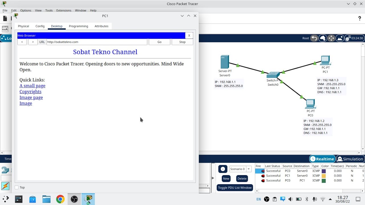
Cara Konfigurasi DNS Server Di Cisco Packet Tracer
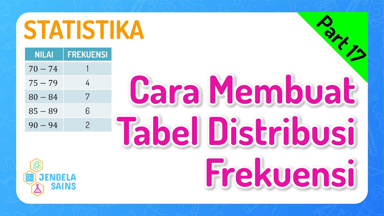
Statistika • Part 17: Cara Membuat Tabel Distribusi Frekuensi
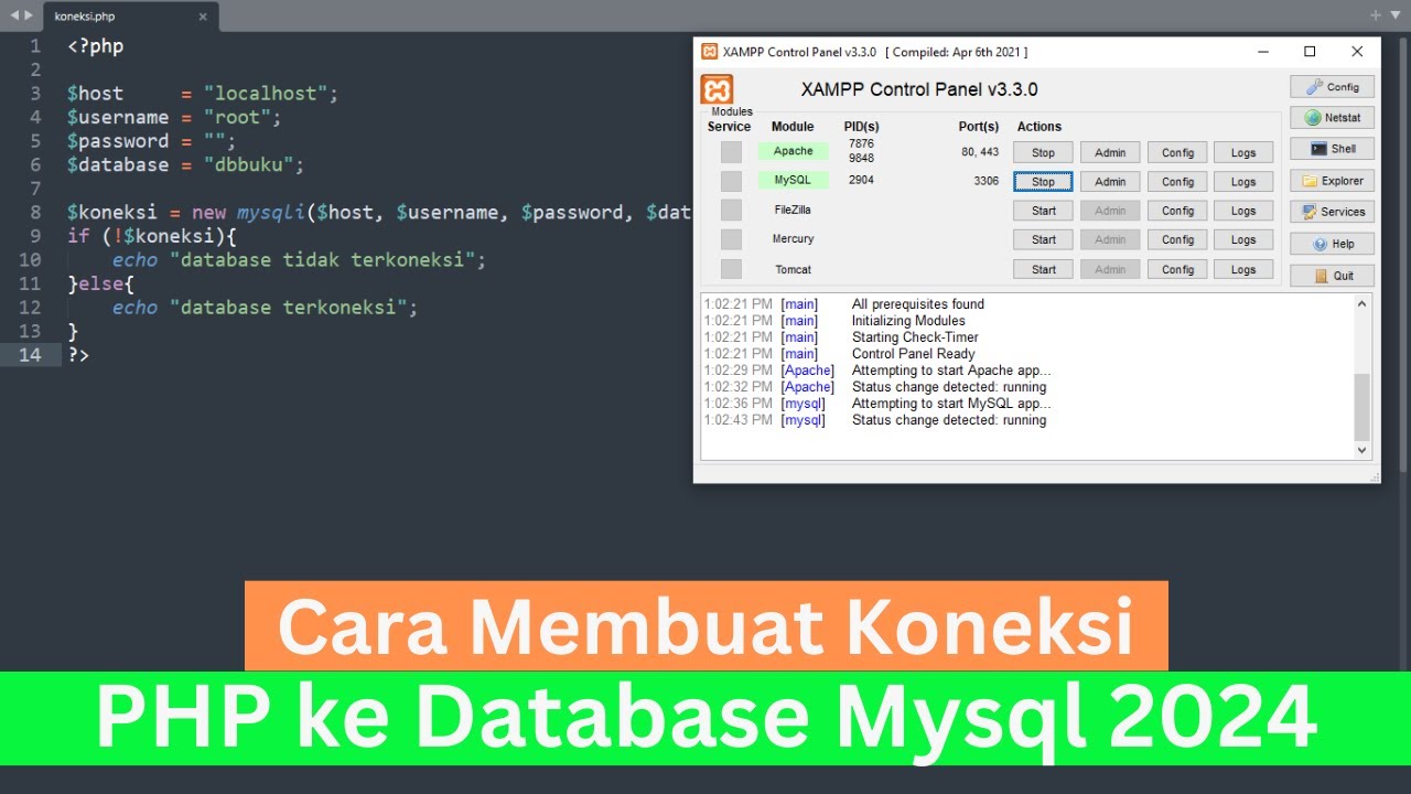
Cara Membuat Koneksi PHP ke Database Mysql 2024 (How To Make PHP Connect To Mysql Database 2024)
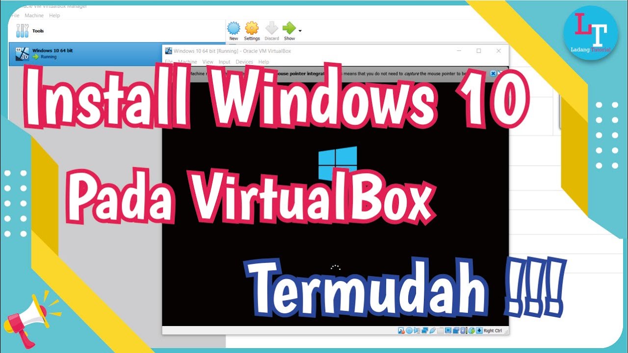
Tutorial on Installing Windows 10 in VirtualBox
7 Diagram IPA Ms Excel (2) | Importance Performance Analysis Ms Excel

Rancang Bangun Jaringan Berbasis Kabel dan Nirkabel dengan VLAN dan Routing (UKK 2023 Paket 2) TKJ
5.0 / 5 (0 votes)