Descubra qual o significado da cor laranja - Psicologia das Cores
Summary
TLDRIn this video, the color orange is explored for its significance in color psychology, design, and its connection to energy, warmth, creativity, and adventure. The presenter explains how orange, a combination of yellow and red, evokes feelings of enthusiasm, comfort, and spontaneity. Commonly associated with warmth and attention, orange is seen in natural elements like sunsets, fire, and certain animals. It's widely used in marketing, food packaging, and safety equipment. The video provides insights into how orange can be used to evoke specific emotions, especially in creative and energetic contexts, making it a popular choice for branding and design.
Takeaways
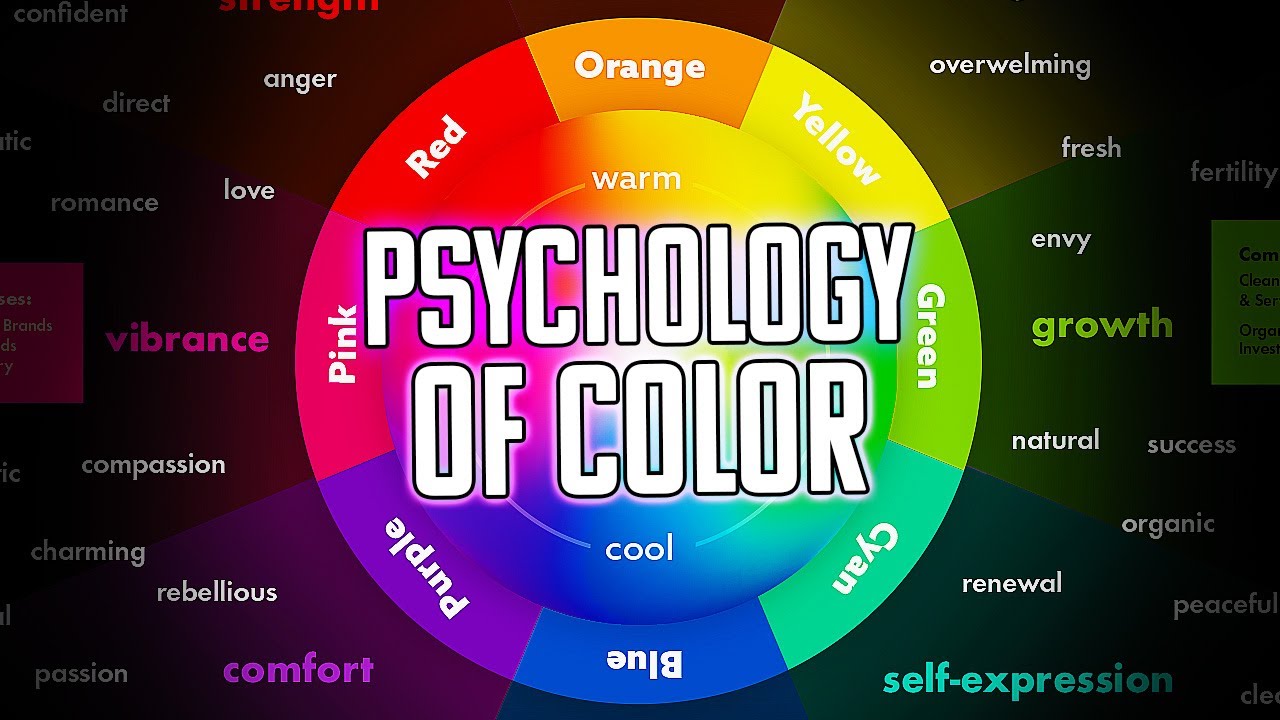
- 😀 The color orange is associated with adventure, energy, and creativity. It's a vibrant color that sits between yellow and red on the color spectrum.
- 😀 Orange is used in design to evoke feelings of warmth, enthusiasm, comfort, and spontaneity. It is also linked to appetite and fun.
- 😀 The color orange can have different emotional meanings depending on its context and how it is applied in design.
- 😀 Natural examples of orange include sunsets, fire, and lava, all of which are warm, vibrant, and energetic elements.
- 😀 Orange is categorized as a 'warm' color because it is linked to things like the sun, fire, and heat.
- 😀 In the natural world, animals like foxes and some fruits (e.g., oranges, pumpkins) are orange, making it a common color in nature.
- 😀 Foods that are orange, like carrots and papayas, indicate ripeness and are often associated with being fresh and healthy.
- 😀 Orange is often used in advertising and marketing to capture attention. It's particularly effective in promotions and sales materials.
- 😀 The color orange is frequently used in safety and warning signs (e.g., construction zones, cones) because it grabs attention.
- 😀 Orange is a good color choice for brands or products related to creativity, food, and energy. It conveys vibrancy, action, and confidence.
Q & A
What emotions and feelings are associated with the color orange?
-The color orange is associated with emotions such as comfort, inspiration, spontaneity, attraction, appetite, energy, warmth, creativity, joy, and fun.
Why is orange considered a 'warm color'?
-Orange is considered a warm color because it is commonly found in natural elements that evoke warmth, such as the sun, fire, and lava. It is also associated with heat and comfort.
How is orange used in nature, and what does it represent?
-In nature, orange is found in elements like sunsets, fire, and certain animals like foxes. It represents warmth, energy, and a sunny, inviting environment.
Why is orange commonly used in food-related branding?
-Orange is often used in food-related branding because it signifies freshness and sweetness. It’s frequently seen in foods rich in vitamin C, like oranges and carrots, and is associated with things that are ripe and good for consumption.
What role does orange play in creativity and design?
-Orange is seen as a stimulating and vibrant color, much like yellow, which is why it’s often associated with creativity. It encourages alertness and inspiration, making it a popular choice in design for creative industries and environments.
How is orange used in safety and attention-grabbing contexts?
-Orange is used in safety and attention-grabbing contexts because of its high visibility. It is used in construction zones, safety vests, and traffic cones to signal caution and alert people to potential hazards.
Why do some companies use orange in their branding?
-Companies use orange in their branding because it represents energy, action, and creativity. It is also an inviting and attention-grabbing color, making it ideal for brands in industries like food, entertainment, and technology.
What are some examples of companies or brands that use orange in their logos?
-Examples of companies using orange in their logos include Firefox, Fanta, and TNT. Each brand uses orange to convey energy, creativity, or association with food or beverages.
What significance does orange have in marketing and promotional materials?
-In marketing and promotions, orange is used to attract attention and create urgency. It’s often seen in sales advertisements, promotional graphics, and product designs to convey excitement and encourage action.
How can orange be effectively applied in graphic design?
-Orange can be effectively applied in graphic design when the goal is to create a sense of warmth, energy, or creativity. It is particularly useful in designs related to food, safety, or vibrant, active brands.
Outlines

This section is available to paid users only. Please upgrade to access this part.
Upgrade NowMindmap

This section is available to paid users only. Please upgrade to access this part.
Upgrade NowKeywords

This section is available to paid users only. Please upgrade to access this part.
Upgrade NowHighlights

This section is available to paid users only. Please upgrade to access this part.
Upgrade NowTranscripts

This section is available to paid users only. Please upgrade to access this part.
Upgrade NowBrowse More Related Video

Descubra qual o significado da cor amarela - Psicologia das Cores

Descubra qual o significado da cor violeta - Psicologia das Cores

Entenda qual o significado da cor marrom - Psicologia das Cores
Teori Warna | #Part7 | Kelas Pengantar Desain Grafis
GOOD vs BAD Character Design: Tips and Tricks!
The Psychology of Color in Design
5.0 / 5 (0 votes)