Love Letter Using Html, CSS | CSS Text Effect In Hindi| @untold_coding
Summary
TLDRThis script provides a detailed guide on creating a CSS-based animated envelope with interactive text and heart animations. The tutorial covers HTML and CSS techniques, including setting up the basic structure, positioning elements, and implementing hover effects to animate the envelope’s opening and reveal its contents. Key concepts include relative and absolute positioning, transitions, and the use of keyframe animations for smooth visual effects. The guide also includes creating a heart shape animation inside the envelope and styling the text with custom animations, making the entire design interactive and visually appealing.
Takeaways
- 😀 Start by creating an HTML file and linking it to a CSS file.
- 😀 Design the envelope by creating a main div, and use nested divs for the back and front sides.
- 😀 Add text to the envelope, using a div inside the letter to position and style it.
- 😀 Apply flexbox to center all elements on the page, and set the body height to 100vh.
- 😀 Set the envelope position as relative and change the cursor to 'pointer' for interactivity.
- 😀 For the back side of the envelope, set its dimensions and background color using CSS.
- 😀 Use transparent borders on the front side of the envelope and apply a smooth transition effect.
- 😀 Apply rotation on hover to open the envelope using the X-axis with a 160-degree rotation.
- 😀 Create heart shapes inside the envelope using CSS properties, and rotate them to create a 3D look.
- 😀 Implement a heartbeat animation on the heart using a keyframe animation with scale and rotation.
- 😀 Add a text animation effect with various timing and rotations for each text element to make it dynamic.
Q & A
What is the first step in creating this animation?
-The first step is to create an HTML file and link it to a CSS file.
How do you design the envelope's back side?
-To design the envelope's back side, create a div with a specific class for the back and set its position as relative. Then define its height, width, and background color.
What CSS properties are used to center elements in the body?
-In the CSS, you can use 'display: flex' and 'justify-content: center' along with 'align-items: center' to center the content both horizontally and vertically. Additionally, set the body's height to 100vh.
Why is the position property important for the envelope's elements?
-The 'position: relative' and 'position: absolute' properties are used to place the elements correctly within the envelope. The relative position allows for precise adjustments of elements inside it, while absolute positioning helps place the letter and other components at specific locations.
How does the envelope's top open when hovered over?
-When the envelope is hovered over, the top rotates by 160 degrees on the X-axis using CSS 'transform' property, revealing the letter inside.
How is the text inside the envelope styled and animated?
-The text inside the envelope is styled using CSS properties like 'font-family', 'color', and positioning techniques. For animations, CSS keyframes are used to animate the text's position, opacity, and scaling effects, with transitions applied for smoothness.
How is the heart inside the letter designed?
-The heart is designed using a div element with a background color, height, and width set to create a shape. The div is then rotated by -45 degrees, and CSS 'before' and 'after' pseudo-elements are used to form the heart's additional parts. Shadows are added for effect.
What is the purpose of the 'before' and 'after' pseudo-elements in the heart design?
-The 'before' and 'after' pseudo-elements are used to create the upper parts of the heart. These elements are positioned absolutely and rotated to form the top lobes of the heart shape.
How is the animation of the heart achieved?
-The heart animation is achieved by defining a CSS keyframe animation. The heart rotates from -4 degrees to its original position and scales in size to create a pulsating effect. The animation runs infinitely with a smooth transition.
What happens when you click the envelope?
-Upon clicking the envelope, the animation shows the text inside, and the letter inside the envelope slides out, triggered by the animation defined in the CSS.
Outlines

This section is available to paid users only. Please upgrade to access this part.
Upgrade NowMindmap

This section is available to paid users only. Please upgrade to access this part.
Upgrade NowKeywords
This section is available to paid users only. Please upgrade to access this part.
Upgrade NowHighlights
This section is available to paid users only. Please upgrade to access this part.
Upgrade NowTranscripts

This section is available to paid users only. Please upgrade to access this part.
Upgrade NowBrowse More Related Video
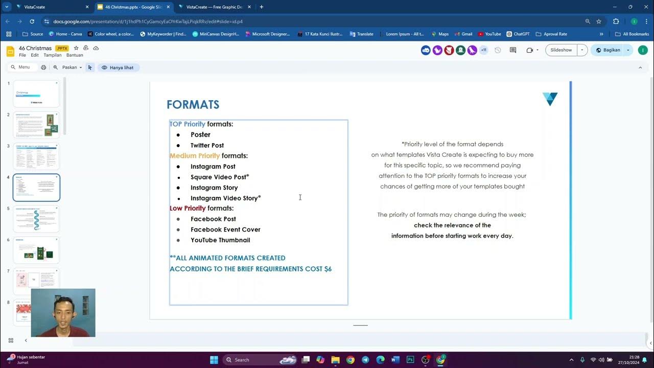
Video 1 | Penjelasan Lengkap Brief Vista Create (Nukleus Studio)
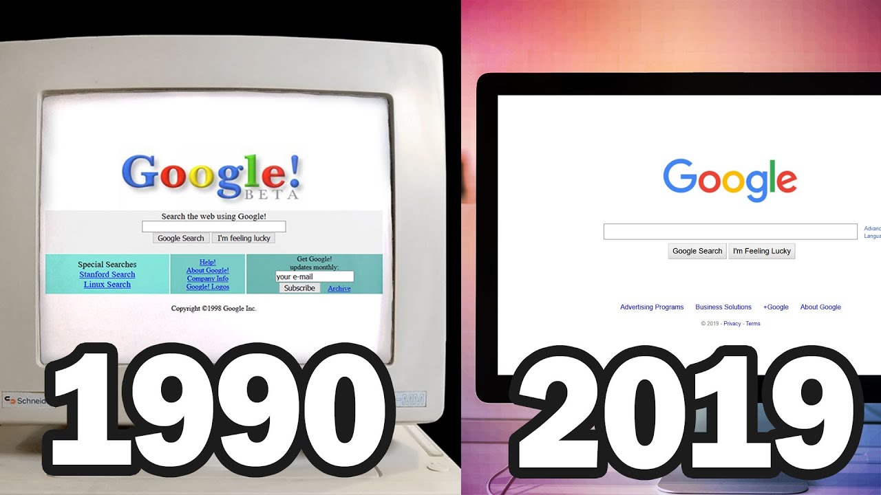
Evolution of Web Design 1990-2019
Website PreLoader Animation | Page Reveal Animation GSAP | HTML, CSS, JavaScript x Greensock
This UI component library is mind-blowing

I Attempted The Wildest SOTD Scroll Animation Just To See If I Could (w/ Three.js and ScrollTrigger)
How to make Viral Monetizable 3D Film using AI ($500/month)
5.0 / 5 (0 votes)