Stem-Leaf Plot: Cara Mudah menyusun DIAGRAM BATANG DAN DAUN. Pahami Penyusunannya dg Mudah!
Summary
TLDRIn this video, the presenter discusses stem-and-leaf diagrams, a data visualization method introduced by John Tukey in 1977. The diagram is divided into two sections: the 'stem' representing the leading digits and the 'leaf' representing the trailing digits. The video provides a step-by-step guide to creating a stem-and-leaf diagram, emphasizing its utility in displaying data distributions and identifying trends. By illustrating how to organize and interpret data effectively, viewers gain valuable insights into data analysis techniques that are both simple and informative.
Takeaways
- 📊 The steam and leaf plot is a data visualization technique introduced by John Tukey in 1977.
- 📝 This plot divides data into two parts: the 'stem' for larger place values and the 'leaf' for smaller units.
- 🔍 The left side (stem) represents tens or hundreds, while the right side (leaf) represents single units.
- 🔢 Organizing the data in a steam and leaf plot allows for a clear view of the data's distribution.
- 📈 Leaves must be sorted in ascending order to provide clarity and enhance readability.
- ⚖️ The steam and leaf plot helps identify the frequency and patterns within the data set.
- 🔑 To create a steam and leaf plot, start by identifying the smallest and largest values in the data.
- ✏️ It is important to maintain the order of leaves to accurately interpret the data.
- 🆙 The mode can easily be identified by observing clusters of leaves in the plot.
- 💡 Practicing with steam and leaf plots improves data analysis skills and enhances understanding of data distribution.
Q & A
What is the main topic of the discussion?
-The main topic is the stem-and-leaf plot, a method for presenting data in an organized way.
Who created the stem-and-leaf plot and when?
-The stem-and-leaf plot was created by John Tukey in 1977, as described in his book 'Exploratory Data Analysis.'
What are the two parts of a stem-and-leaf plot?
-The two parts are the 'stem' on the left side, which represents tens or hundreds, and the 'leaf' on the right side, which represents single units.
How should the leaves in a stem-and-leaf plot be organized?
-The leaves must be arranged in ascending order, allowing for a clear visualization of the data distribution.
What steps are involved in creating a stem-and-leaf plot?
-First, identify and transfer the smallest value to the plot, then transfer the largest value, and finally organize all values systematically in the plot.
What should you do if certain data ranges have no values?
-Even if certain ranges have no data, you should note this by leaving spaces blank in the plot to maintain the integrity of the information.
How can the mode be identified in a stem-and-leaf plot?
-The mode can be identified by looking for the number that appears most frequently in the plot, often indicated by the highest number of leaves in a stem.
What advantages does a stem-and-leaf plot provide?
-A stem-and-leaf plot provides a structured way to visualize data, making it easier to analyze distributions and identify statistical measures.
What does the distribution analysis in a stem-and-leaf plot reveal?
-The distribution analysis reveals patterns, such as how many values fall into each range and any gaps in the data, which aids in understanding the overall dataset.
What is the significance of maintaining consistency in the spacing of numbers in the plot?
-Consistency in spacing helps to accurately represent the data distribution and allows for easier interpretation of how many numbers are present in each range.
Outlines

This section is available to paid users only. Please upgrade to access this part.
Upgrade NowMindmap

This section is available to paid users only. Please upgrade to access this part.
Upgrade NowKeywords

This section is available to paid users only. Please upgrade to access this part.
Upgrade NowHighlights

This section is available to paid users only. Please upgrade to access this part.
Upgrade NowTranscripts

This section is available to paid users only. Please upgrade to access this part.
Upgrade NowBrowse More Related Video
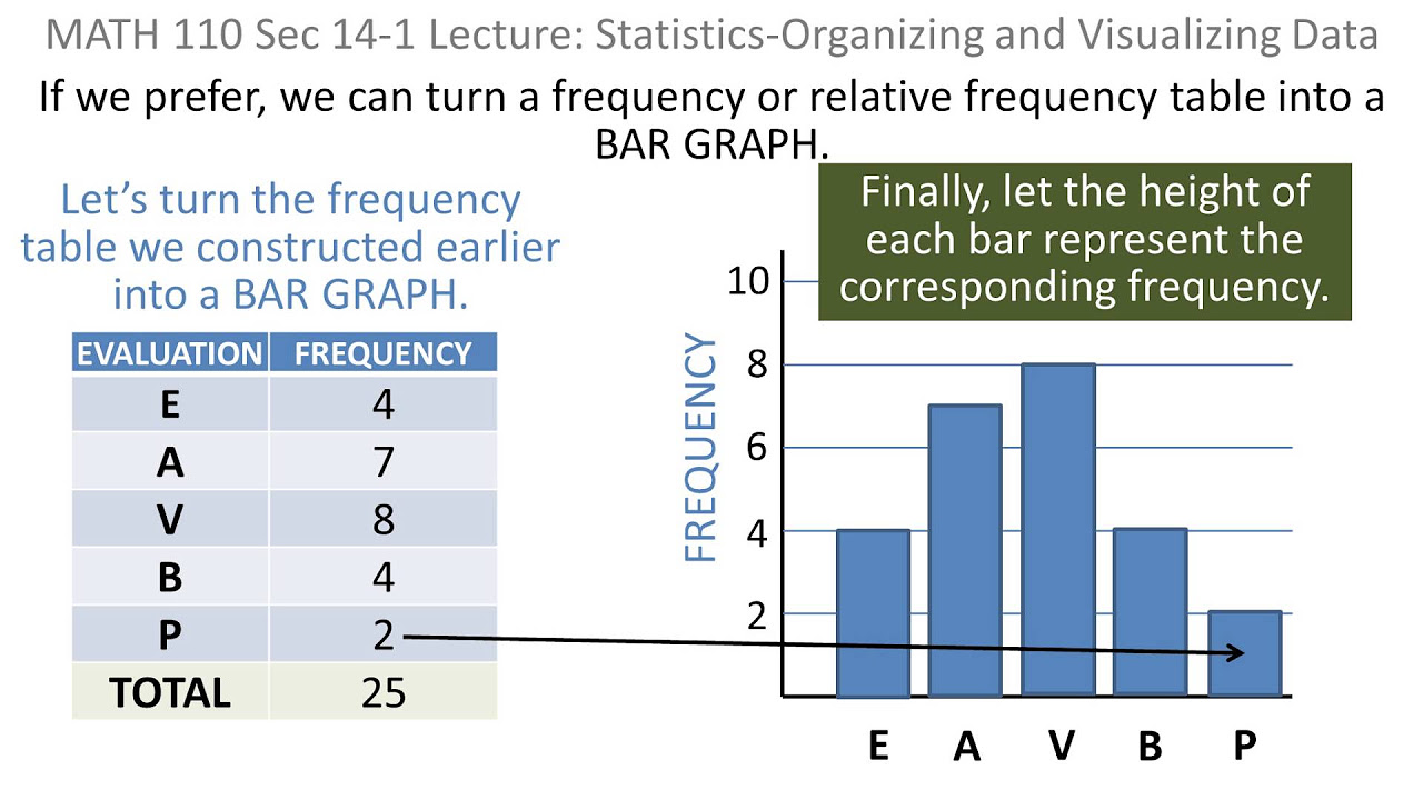
Statistics: 01 Organizing and Visaulizing Data

Statistika 06 | Visualisasi Data dalam Statistika | Data Visualization | Belajar Statistika
Statistika - Penyajian Data Eps.2 l Ruang Belajar #StudyWithDiida
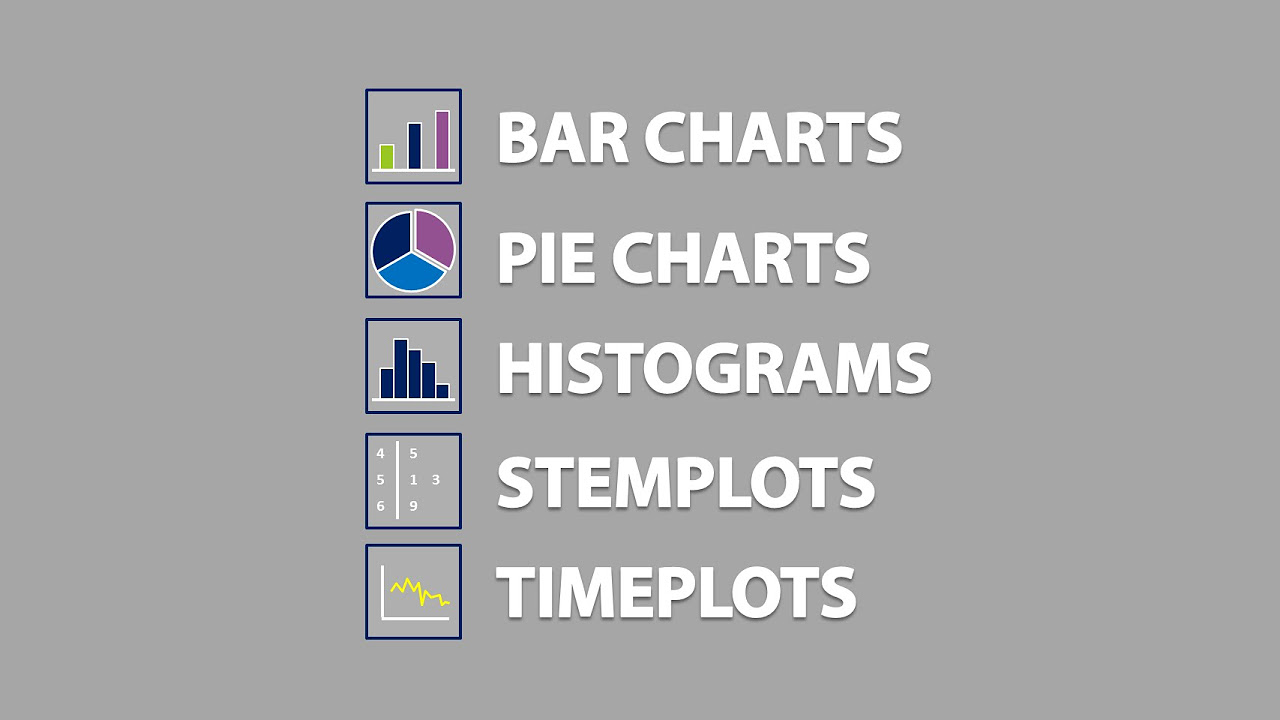
Bar Charts, Pie Charts, Histograms, Stemplots, Timeplots (1.2)
Belajar Statistika - [Scatter Plot] Diagram Pencar (bagian 1)

What is Classification? What is a Classifier?
5.0 / 5 (0 votes)