Master Spacing in UI Design 💪
Summary
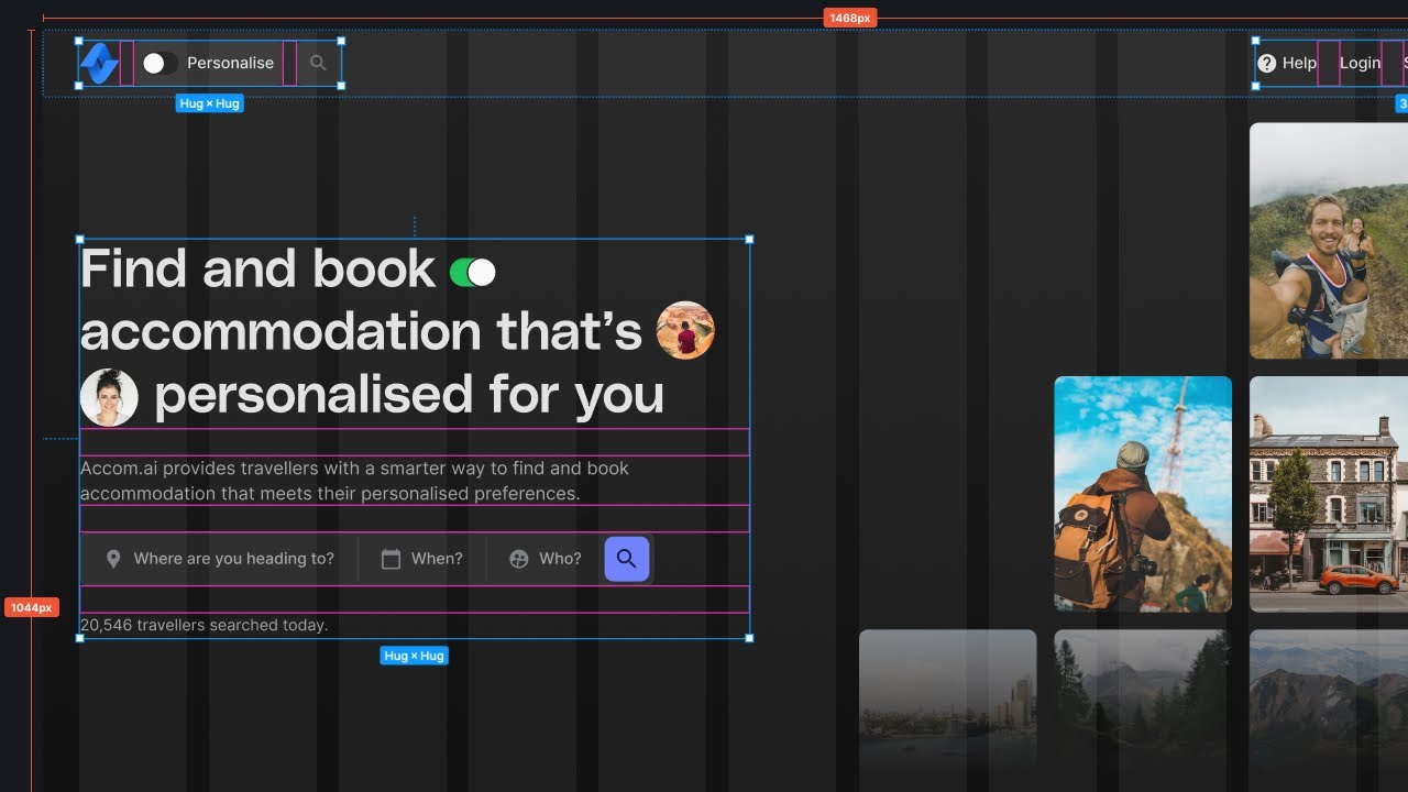
TLDRMastering spacing in mobile UI design is crucial for creating visually appealing and user-friendly applications. This video highlights the importance of adopting a spacing system, such as an 8-pixel grid, to streamline design decisions. Key principles include maintaining at least six pixels between elements and understanding the relationship between different components. The presenter introduces the 'outside in' method for organizing spacing, emphasizing consistency while embracing white space. Tools like Figma and resources from Mobin are recommended to enhance design skills and efficiency, ultimately leading to more polished and effective mobile interfaces.
Takeaways
- 🎨 Spacing is crucial in mobile app design, distinguishing junior designers from senior designers.
- 📏 Choose and adhere to a spacing system, like an 8-pixel grid, to streamline design decisions.
- 🔍 Aim for at least 6 pixels of spacing between elements to improve legibility and overall design quality.
- 📦 Buttons should be spaced 12 to 42 pixels apart, depending on their size, to enhance usability.
- ☁️ Embrace white space in your designs but avoid disconnecting elements that share a relationship.
- 🔄 The 'outside-in' method categorizes spacing into groups: outer wrappers, containers, groups, cards, and individual elements.
- 📐 Outer wrappers should have 24-30 pixels of space, while containers help group related content.
- 💡 Maintain consistent spacing within groups, typically less than the spacing between headings and the group itself.
- 🔒 Internal padding for cards or rows should ideally be less than the spacing between the cards.
- ⚙️ Utilizing tools like Figma’s auto layout can help apply these spacing rules efficiently in your designs.
Q & A
What is the primary focus of the video?
-The video focuses on tips and tricks for mastering spacing in mobile UI design.
Why is spacing considered important in UI design?
-Spacing is crucial because it differentiates junior designers from senior designers and impacts the overall usability and aesthetics of the design.
What spacing system does the speaker prefer?
-The speaker prefers an 8-pixel grid system, which helps in making consistent and quick spacing decisions.
What is a hard and fast rule for spacing between elements?
-There should generally be at least 6 pixels of spacing between elements to avoid clutter and enhance readability.
What are the recommended spacing distances for buttons?
-Buttons should be spaced between 12 and 42 pixels apart, depending on their size.
What is meant by 'white space' in UI design?
-White space refers to the empty spaces in a design that help improve readability and user experience by preventing elements from appearing cramped.
Can you explain the 'outside in' method for spacing?
-The 'outside in' method involves grouping elements into five categories—outer wrapper, containers, groups, cards or rows, and individual elements—to determine appropriate spacing based on their relationships.
What is the recommended spacing for the outer wrapper in a design?
-The outer wrapper should typically have between 24 to 30 pixels of spacing to provide an airy layout.
How should spacing between different groups of items be determined?
-The spacing between groups should generally be larger than the spacing within groups, establishing a clear hierarchy and connection between related items.
Why is Auto Layout emphasized in Figma?
-Auto Layout is crucial in Figma because it allows designers to create responsive designs that automatically adjust spacing based on the defined rules, facilitating more efficient design processes.
Outlines

This section is available to paid users only. Please upgrade to access this part.
Upgrade NowMindmap

This section is available to paid users only. Please upgrade to access this part.
Upgrade NowKeywords

This section is available to paid users only. Please upgrade to access this part.
Upgrade NowHighlights

This section is available to paid users only. Please upgrade to access this part.
Upgrade NowTranscripts

This section is available to paid users only. Please upgrade to access this part.
Upgrade Now5.0 / 5 (0 votes)


