COLOR: Elements of Art Explained in 6 minutes (funny!)

Winged Canvas
6 Nov 202006:01

Summary

TLDRThis video dives into the complexities of color theory in art, explaining different color schemes such as monochromatic, analogous, and complementary. The speaker highlights how colors evoke emotions and set moods, using examples like Picasso’s blue period and Monet’s Water Lilies to illustrate the impact of color choices. The video encourages artists to experiment with new color combinations to enhance their work and offers tips for breaking traditional color theory rules. It concludes with a call to explore more color schemes and engage with the art community.

Takeaways

  • 🎨 Colour theory can be complex, but it's crucial for artists to understand how to use colours effectively.
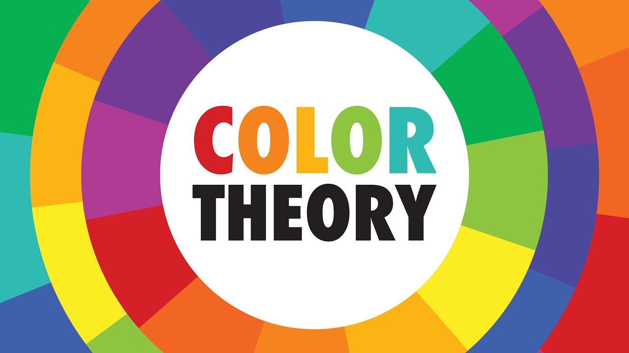
  • 🌈 Colours are categorized to help us understand different kinds of light, and all colours combined make white light.
  • 🖌️ Pigments are used in a subtractive color model, which is taught in art classes and involves mixing colours to create new ones.
  • 🔵 The monochromatic color scheme uses shades and tints of a single hue, which can evoke a specific emotion, like sadness in Picasso's blue period.
  • 🌿 Analogous color schemes use colours next to each other on the color wheel, creating a mood that can vary even with similar color schemes, as shown by comparing Picasso's and Monet's works.
  • 💧 Value, or the lightness and darkness of a color, plays a significant role in creating different moods, as demonstrated by the contrast between dark tones in Picasso's work and bright tones in Monet's.
  • 🔴 Complementary color schemes use colors opposite each other on the color wheel and are often used to create striking contrasts and moody atmospheres.
  • 🎮 In digital art, like in The Legend of Zelda: Breath of the Wild, complementary colors are used to create a mature and serious tone.
  • 🚀 Experimental artists often break the rules of color theory to create unique and striking color schemes that can be harsh on the eyes.
  • 📚 Understanding the basics of color theory is essential before attempting to break the rules and create innovative color schemes.
  • 🌟 Trying new color combinations can lead to discovering new techniques and styles in art.

Q & A

  • What is the speaker's opinion on color in art?

    -The speaker considers color to be a crucial element in art, second only to line, and emphasizes the importance of using colors properly to avoid breaking a piece.

  • What does the speaker suggest about using bright colors in art?

    -The speaker acknowledges that while some artists may prefer bright colors, it's essential to understand color theory to use them effectively without compromising the artwork.

  • How does the speaker describe the relationship between colors and light?

    -The speaker explains that all colors combined make white light, as demonstrated by a rainbow when light passes through a prism, and that physical colors, or pigments, follow a subtractive color model.

  • What are the primary, secondary, and tertiary colors on the color wheel?

    -Primary colors are the base colors that cannot be mixed from others, secondary colors are created by mixing primary colors, and tertiary colors are created by mixing primary and secondary colors.

  • How can colors be used to evoke emotions or create moods?

    -Colors can be used to evoke specific emotions or create moods by the combinations used and the values applied, which are referred to as color schemes or color palettes.

  • What is a monochromatic color scheme and how is it exemplified?

    -A monochromatic color scheme consists of all shades and tints within a single hue. The speaker uses Pablo Picasso's 'Blue Period' as an example, where he used various shades of blue to create his artworks.

  • How does the analogous color scheme differ from the monochromatic scheme?

    -An analogous color scheme uses three or more colors that are next to each other on the color wheel, creating a more evolved version of the monochromatic scheme. The speaker uses Claude Monet's 'Water Lilies' as an example.

  • What is the role of value in creating different moods in art?

    -Value refers to how light or dark a color is and plays a significant role in setting the mood of a piece. The speaker contrasts Picasso's use of dark tones with Monet's use of bright tones to illustrate this point.

  • What is a complementary color scheme and how is it typically used?

    -A complementary color scheme uses colors that are opposite each other on the color wheel. It is often used by concept artists to create moody atmospheres and is a favorite among those looking to create striking visual contrasts.

  • How do traditional and experimental artists differ in their approach to complementary color schemes?

    -Traditional artists typically use complementary colors with one being bright and minorly used, while the other is muted and dominant. Experimental artists often break this rule, creating schemes with both colors at the same saturation and value, resulting in eye strain and striking contrasts.

  • What advice does the speaker give for artists looking to challenge themselves with color?

    -The speaker encourages artists to try color combinations they have not worked with before, suggesting they might explore complementary or monochromatic schemes if they usually use a wide variety of colors.

  • Where can viewers find additional resources on color theory and art principles?

    -The speaker mentions a worksheet on their blog full of art resources for teachers, which includes a quicker rundown of a principle and another bonus color scheme.

Outlines

00:00

🎨 Understanding Colour Theory in Art

This paragraph introduces the complexities of working with color in art. It discusses how color can greatly influence the outcome of a piece and touches on color theory, a concept that becomes more challenging the deeper one delves into it. The speaker emphasizes that color is the second most important element in their artistic process, just after line. They reference how color can create moods and evoke emotions, using examples like Picasso’s Blue Period to explain the concept of a monochromatic color scheme. The speaker hints at more complex color schemes to come, building up the importance of understanding color theory in artistic creation.

05:01

🎨 Exploring Analogous and Complementary Color Schemes

The second part elaborates on two popular color schemes: analogous and complementary. Analogous schemes involve colors next to each other on the color wheel and are described as an evolved form of monochromatic schemes. An example of this is Monet’s 'Water Lilies,' where colors like blue, green, and blue-green are used. Complementary schemes, on the other hand, use colors directly opposite on the color wheel, like red and green or blue and orange. The speaker explains the importance of balancing these colors, giving an example from 'The Legend of Zelda: Breath of the Wild' and their own work to show how contrast and saturation can affect visual impact.

🎨 Challenging Your Artistic Color Choices

The final paragraph encourages artists to experiment with color schemes they haven’t used before, such as trying a complementary scheme if they typically use analogous colors. It emphasizes the value of challenging oneself with new combinations to discover different techniques. The speaker also promotes additional resources, such as a worksheet on their blog, and encourages viewers to engage with the video by commenting, liking, and subscribing to join the art community.

Mindmap

Keywords

💡Color Theory

Color theory is a set of principles that guide how colors are combined and used to create visual art. In the video, color theory is described as a potentially complicated aspect of art that can make or break a piece if not used properly. It's the foundation for understanding how different colors interact and influence the mood and aesthetics of a work of art.

💡Prismatic Colors

Prismatic colors refer to the spectrum of colors that can be seen when light passes through a prism, creating a rainbow effect. The script mentions that all colors combined make white light, which is demonstrated by the dispersion of light into a rainbow through a prism, illustrating the additive nature of colors in light.

💡Subtractive Color Wheel

A subtractive color wheel is a tool used in art to mix pigments, where the primary colors (red, blue, yellow) are used to create secondary and tertiary colors by mixing them in various combinations. The video explains that this is the common color wheel learned in art classes, emphasizing the subtractive nature of mixing pigments.

💡Primaries, Secondaries, Tertiaries

These terms refer to the hierarchical levels of colors on the color wheel. Primary colors are the base colors that cannot be created by mixing other colors. Secondary colors are created by mixing two primary colors, and tertiaries are created by mixing a primary color with a secondary color. The video uses these terms to explain the relationships between colors on the color wheel.

💡Color Schemes

Color schemes are combinations of colors that work well together and are used to create a harmonious or intentional visual effect. The video discusses different types of color schemes, such as monochromatic, analogous, and complementary, and how they can be used to evoke different emotions or create specific moods in art.

💡Monochromatic Color Scheme

A monochromatic color scheme uses various shades and tints of a single color. The video uses Pablo Picasso's 'Blue Period' as an example of a monochromatic color scheme, where the artist used different tones of blue to create a sad and somber mood.

💡Analogous Color Scheme

Analogous color schemes are created by choosing three or more colors that are next to each other on the color wheel. The video contrasts Picasso's monochromatic blue with Monet's 'Water Lilies', which uses analogous colors around blue to create a peaceful and calming mood.

💡Complementary Color Scheme

Complementary color schemes involve colors that are opposite each other on the color wheel, such as red and green or blue and orange. The video discusses how these schemes are often used to create a moody atmosphere and how they can be used traditionally or experimentally, with examples from 'The Legend of Zelda: Breath of the Wild'.

💡Value

In art, value refers to the lightness or darkness of a color. The video explains how value can change the mood of a piece, using Monet's use of bright, soft tones versus Picasso's use of rich dark tones to illustrate the difference in mood despite similar color schemes.

💡Emotion and Mood

The video discusses how colors can be used to evoke specific emotions and create different moods in art. For example, the monochromatic blue in Picasso's work is used to create a sad mood, while the analogous colors in Monet's 'Water Lilies' create a calming mood.

💡Experimental Artists

Experimental artists are mentioned in the context of those who may break traditional color theory rules to create striking and unconventional color schemes. The video suggests that while it's important to understand the rules of color theory, it's also valuable to experiment with them to find new techniques and styles.

Highlights

Working with color is easy until you dive into color theory, which becomes more complicated.

Colors can make or break an artwork; learning how to use them properly is essential.

Primary, secondary, and tertiary colors form the foundation of the subtractive color wheel.

Colors evoke emotions and create moods, with different combinations and values forming color schemes.

Monochromatic color schemes use shades and tints of a single hue, like Picasso's blue period.

Analogous color schemes consist of three or more colors adjacent on the color wheel, such as Monet’s 'Water Lilies.'

Value, or how light or dark a color is, greatly influences the mood of a piece.

Complementary color schemes use colors directly opposite on the color wheel, like blue and orange.

Traditional complementary color schemes maintain contrast by using one bright color and one muted color.

Experimental artists often break traditional complementary rules by using equally bright and saturated colors.

Using highly saturated complementary colors can create 'eye strain,' which some artists embrace.

Understanding the rules of color theory is important before experimenting or breaking them.

Challenging yourself with new color combinations can lead to discovering new techniques.

Exploring different color schemes like complementary or monochrome helps develop artistic skills.

A call to action encourages viewers to engage with the content, experiment with color schemes, and explore related resources.

Transcripts

play00:00

Colour: Sometimes you hate it, sometimes you  don't. Working with color is always easy until  

play00:03

you get further down into the colour theory rabbit  hole and then it starts to get somewhat more  

play00:07

complicated. Colour is probably the element  of art I pay attention to the second most,  

play00:10

where line is the first, even though I dress like  I've waded out of a dark pool of muted colours  

play00:15

but your colours can make or break a piece  in its entirety if you don't want to learn  

play00:18

to use them properly. "Jessie, I don't want to hear about how I can't use super bright  

play00:21

colours in my piece because I really  like ice cream and it is my art style and --"

play00:26

We're literally seconds since the video. Give  me time to elaborate on this. Let's continue.

play00:34

Now I would say what our friend Google says about  colour but uh.. I um.. I'll simplify it a little.

play00:40

Don't worry colour is made up of different kinds of  light that we've put into categories to understand  

play00:45

them better. When it comes to light, all colors  put together make white which is why when you aim  

play00:49

light through certain prisms a rainbow, comes out  the other side. When we use physical colours, also  

play00:53

known as pigments, we're using a subtractive color  wheel which is the common colour wheel we learn in  

play00:58

art class. We can also read our colours on the colour  wheel as primaries, secondaries, and tertiaries.

play01:03

All tertiaries come from secondaries, and all  secondaries come from primaries, but you cannot mix  

play01:08

colours to get primaries. Colours can also be used  to evoke emotion create moods or bring different  

play01:13

aesthetics to certain things depending on the  combinations used and the values applied. These  

play01:17

sets of colours are called colour schemes or colour  palettes and making them look good is when our  

play01:22

dear frenemy colour theory comes into play. Let's  talk about three or more popular combinations.  

play01:26

Arguably the easiest to work with is the  monochromatic color scheme which is defined as  

play01:29

all the shades and tints within a single hue which  means it's a single color that you make lighter  

play01:33

and darker. Don't worry, I'm bad at explaining which in words so I have an example to make up for my  

play01:38

ineptitude. Pablo Picasso had a whole period where  a bunch of his paintings were all just as blue as  

play01:42

that Eiffel 65 song and I think the tragedy is one  of the better examples of pure monochromatic colour  

play01:46

schemes. This whole piece is literally just blue. In fact, my guy had a whole period where he used  

play01:50

nothing but blue for a whole four years. Can you  imagine doing nothing but one thing for that long??  

play01:56

Couldn't -- couldn't be me. But it's that same balloon  made lighter and darker to create an entire piece.  

play02:01

Using the single hue can also make it easier to  pick out a single emotion where the blue in this  

play02:04

case is used to create a more sad and somber  mood though to be fair I don't think I'd call  

play02:08

a happy piece The Tragedy and Dadaism won't be  invented for another decade or so after this piece  

play02:13

but that's an easy one. Let's move on. Arguably the  second easiest to work with is the analogous colour  

play02:17

scheme. That took me half a year to figure out  how to pronounce without hesitating because I'm  

play02:20

a walking buffoon :) Analogous colour schemes are  three or more colours next to each other on the  

play02:23

colour wheel to create a scheme that's kind of like  an evolved monochromatic colour scheme. To push that  

play02:27

point further, here's another blue-ish painting: Water  Lilies from 1906 to be exact by Claude Monet.  

play02:31

In this case, the main colours in this painting revolve  around blue, blue-green, green and hints of blue-

play02:36

purple and pink, but the largest difference of  the colours is the difference in mood. Even though  

play02:39

their colour schemes are fairly similar. Let's do  a side by side on these you see how Picasso's is  

play02:43

super sad and almost depressing while on the  contrary Monet's is actually quite peaceful and  

play02:47

calming. This has to do with added value which is  another element of art that has to do with how  

play02:50

dark and light a colour is. While Picasso uses a lot  more rich dark tones, Monet sticks with more bright  

play02:55

soft tones in this piece which switches up the  moods even though the schemes are very similar.  

play02:59

But we still got a couple more to talk about!  Moving on. My personal favorite colour scheme and  

play03:03

one of the trickier ones to get the hang of, in  my opinion, are complementary colour schemes; the  

play03:07

concept artist's favorite kind of scheme and  the scheme most used to set a moody atmosphere. 

play03:11

In this one, you take colours directly across or  opposite from each other on the colour wheel to  

play03:14

create colour schemes: red and green, orange  blue, and yellow and purple are the baseline  

play03:18

popular ones but you can get creative with  them. However, with complementary, especially  

play03:22

lots of debates happen between more traditional  artists and more experimental artists, where the  

play03:26

very basic rule of complementary colour schemes  is very often broken with experimental artists. 

play03:30

Your complementary colours should not be the  same saturation or value and should instead  

play03:35

be on opposite ends of the spectrum. For instance, let's take a look at one of the main artworks to  

play03:39

come from The Legend of Zelda: Breath of the Wild. Side  note at how often I played this game when I first  

play03:43

got it once when I stayed home sick from school,  I played it for a good 9 hours straight which  

play03:47

didn't help me in the slightest by the way -- A very  popular complementary scheme with more mature or  

play03:50

serious games is orange and blue where blue stays  more dark and desaturated while orange stays more  

play03:55

bright. Orange then tends to be more of a highlight  whereas the blues tend to take up the majority of  

play03:59

the piece as the main colour of focus. With more  traditional artists, this is the only way to do  

play04:03

it where one colour remains bright and minorly used  while the other color takes up the majority of the  

play04:07

piece but stays muted and dark to create points  of contrast, a principle of design not an element.  

play04:12

However, more experimental artists don't like to  follow this rule whatsoever. Let's take a look  

play04:15

at a piece I created solely for this video. This is  more of a split complementary colour scheme but the  

play04:19

same rule would apply regardless of whether it's  complementary, split complementary. Here I've used a  

play04:24

red and a derivative of blue-green-teal which is  another favorite colour combination of mine when  

play04:29

they're the same super bright saturation or value  it creates something called eye strain which just  

play04:33

creates harsh contrasts that aren't easy on the  eyes at all. More experimental artists love to play  

play04:37

around with this and create very striking colour  schemes that are anything but easy on the eyes,  

play04:41

but even though it's applicable to every rule  of art, before you play around with things such  

play04:45

as messing with colour and theory rules, make sure  that you know them before you decide to break them.

play04:51

What I talked about here isn't even half the  amount of the colour schemes you could work  

play04:54

with if I talked about all those, we'd be  here for way longer than just five minutes  

play04:58

but understanding the baseline for what  colours you can work with and how you can  

play05:01

work with them is key to creating great  works of art to stunning works of art.  

play05:05

For your next piece, try a colour combination that  you've never worked with before. Always work with  

play05:08

analogous; try a complimentary piece next time! Used  to using a wide variety of colorus? Try a monochrome  

play05:13

colour scheme. Challenge yourself with the colours  you use and you may just find a technique that you  

play05:17

like more than what you'd normally do. If you want  another quicker run down of a principle and another

play05:21

bonus colour scheme, check out our worksheet on  the topic on our blog full of art resources  

play05:25

for teachers. Link down below. If you liked what  you saw, make sure to leave a like on this video.  

play05:29

Comment down below and to tell me what you'd like  to see me draw next and hit subscribe so that you  

play05:33

never miss an upload and hey, we art nerds  gotta stick together so join our little art  

play05:37

community with the links down below. With that said,  thanks for watching and I'll see you next time.

play05:42

Buh-bye!

Rate This

5.0 / 5 (0 votes)

Related Tags
Color TheoryArt TechniquesComplementary ColorsMonochromaticAnalogous ColorsArt LessonsCreative TipsEmotional DesignPainting StylesArt Community