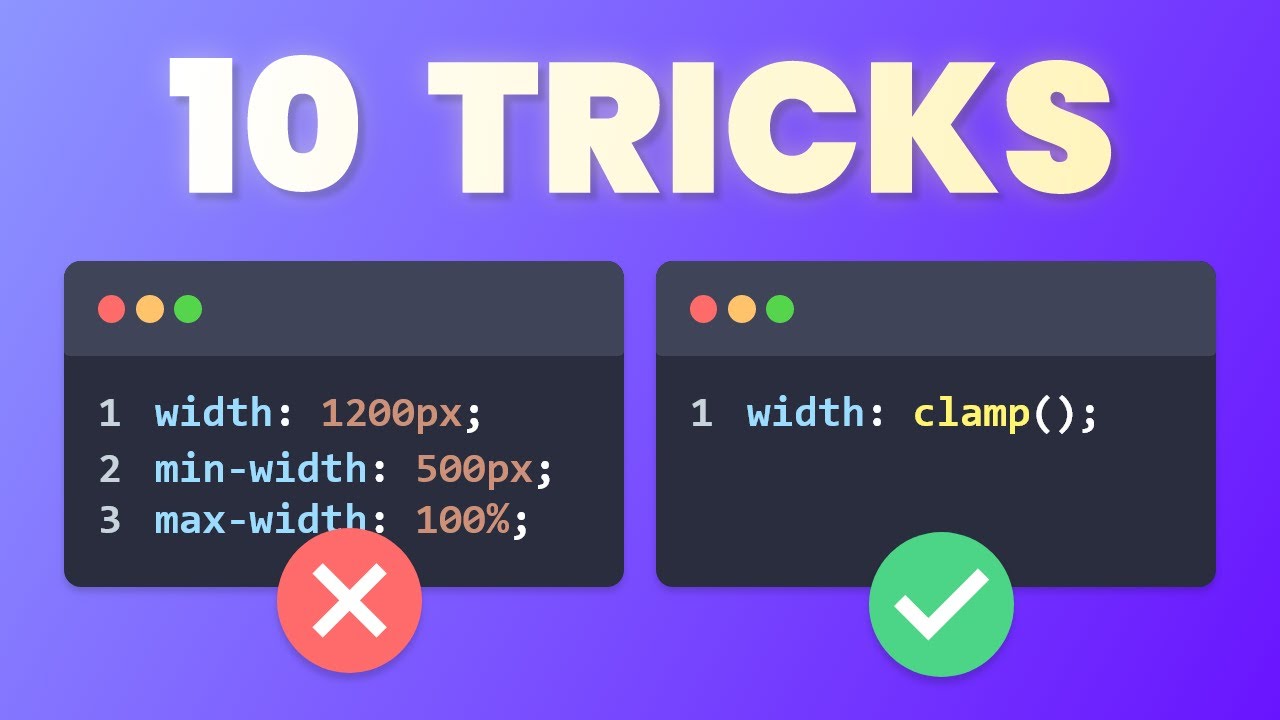
10 Tailwind Tricks You NEED To Know!

Ravi - Perfect Base
24 Jun 202310:45

Summary

TLDRThis video script offers 10 insightful Tailwind CSS tricks that can greatly enhance your development experience, regardless of your skill level. From leveraging peer and group utility classes to dynamically change styles based on element states, to understanding Tailwind's mobile-first approach and leveraging responsive utilities, the script covers a wide range of useful techniques. It also delves into advanced concepts like extending Tailwind with custom utilities and plugins, using colors from JavaScript, and a handy package for overriding component styles. With clear explanations and practical examples, this script promises to unveil valuable Tailwind tips that can streamline your workflow and improve your projects.

Takeaways

  • 😎 Tailwind utilities like group-hover and peer can be used to style elements based on the state of other elements.
  • 🌈 Tailwind provides easy-to-use animation utility classes for smooth transitions and preset animations.
  • 📐 Tailwind is mobile-first, so unprefixed utilities apply to all screen sizes, while prefixed utilities override styles at specific breakpoints and above.
  • 🔍 Tailwind's IntelliSense extension enhances the development experience by providing auto-completion, color previews, and class explanations.
  • 🔑 Tailwind purges unused styles to keep bundle sizes small, so dynamic classes may need to be explicitly used somewhere in the code.
  • ✨ The @apply directive allows you to use Tailwind classes within CSS, and the theme() function lets you access Tailwind theme values.
  • 🛠️ Custom Tailwind utility classes can be created by extending existing utilities in the configuration file.
  • 🎨 Custom Tailwind plugins can be created to generate dynamic utility classes based on theme values or other conditions.
  • 🌈 Tailwind color palettes can be imported as JavaScript objects and used for custom themes or components.
  • 🔀 The tailwind-merge package can be used to merge multiple Tailwind classes without conflicts, enabling style overrides in components.

Q & A

  • What are the 'group' and 'peer' utility classes in Tailwind CSS, and how can they be useful?

    -The 'group' and 'peer' utility classes allow you to style an element based on the state of another element. The 'group' class is used to group elements together, and the 'group-hover' class can be applied to child elements to change their styles when the parent is hovered. The 'peer' class works similarly but for sibling elements.

  • How can you animate property changes in Tailwind CSS?

    -Tailwind CSS provides built-in animation utility classes, such as 'transition' and 'duration', that allow you to animate changes in various CSS properties. You can specify the property to animate, the duration, and even add animation curves and delays.

  • What does the 'mobile-first' approach in Tailwind CSS mean, and how does it affect responsive design?

    -Tailwind CSS follows a 'mobile-first' approach, which means that unprefixed utility classes apply to all screen sizes, while prefixed classes override styles at specific breakpoints and above. This approach requires careful consideration when building responsive designs, as you may need to set the default styles for smaller screens and then override them for larger screen sizes.

  • How can you use Tailwind CSS classes with variables in JavaScript or a framework like React?

    -To use Tailwind CSS classes with variables in JavaScript or a framework like React, you can take advantage of the Intellisense extension or configure your IDE to recognize the variable names you're using. This allows you to get autocompletion and hover previews for Tailwind classes even when using them in variables.

  • What is the purpose of the 'purge' process in Tailwind CSS, and how can you ensure that the classes you need are not purged?

    -The 'purge' process in Tailwind CSS eliminates unused CSS classes to keep the final bundle size small. To ensure that the classes you need are not purged, you need to include them explicitly somewhere in your code, even if they are not directly used in the HTML.

  • How can you use Tailwind CSS styles in combination with regular CSS or third-party component styles?

    -You can use the '@apply' directive in your CSS to apply Tailwind utility classes, or you can access the Tailwind theme object in your CSS to use Tailwind colors and other theme values. Additionally, you can create custom utility classes in your Tailwind configuration file.

  • How can you create custom utility classes in Tailwind CSS?

    -You can create custom utility classes in Tailwind CSS by extending existing utilities or creating new ones in the Tailwind configuration file. This allows you to define your own reusable styles and use them throughout your application.

  • What is a Tailwind CSS plugin, and how can you use it to create dynamic utility classes?

    -A Tailwind CSS plugin is a way to extend Tailwind's functionality. You can create your own custom plugin to generate dynamic utility classes based on certain conditions or values. This can be useful for creating classes that can be parameterized or vary based on user input or other data.

  • How can you import and use Tailwind CSS colors in JavaScript?

    -Tailwind CSS colors can be imported as an object in JavaScript, allowing you to use them programmatically. This can be useful for creating custom color themes or applying colors dynamically based on data or user input.

  • What is the purpose of the 'tailwind-merge' package, and how can it be used?

    -The 'tailwind-merge' package is a utility that helps merge Tailwind CSS class names when there are conflicting utility classes. It allows you to combine base classes with additional overriding classes, making it easier to create reusable and customizable components with Tailwind CSS.

Outlines

00:00

🔥 10 Tailwind Tricks for Improved Development

This paragraph introduces a list of 10 useful tricks and techniques for working with Tailwind CSS, a utility-first CSS framework. It covers various topics, including styling based on element states, adding animations, understanding responsive design principles, using Tailwind with external libraries, creating custom utilities, and more. The goal is to provide tips that can benefit both beginner and advanced Tailwind users, ultimately improving their development experience.

05:02

🎨 More Tailwind Tricks for Enhanced Styling

This paragraph continues the list of Tailwind tricks, starting with importing Tailwind colors as JavaScript objects for easier theme customization. It then explores the `tailwind-merge` package, which allows for overriding styles and creating component variants. The paragraph also encourages viewers to subscribe to the channel and check out the creator's startup series for more content.

10:02

🚀 Closing Remarks and Call to Action

The final paragraph wraps up the video by encouraging viewers to provide feedback and subscribe to the channel if they enjoyed the content. It also mentions the creator's startup series and invites viewers to check out the related video, which has garnered the most subscribers to the channel.

Mindmap

Keywords

💡Tailwind CSS

Tailwind CSS is a utility-first CSS framework that provides a set of pre-defined classes for building user interfaces quickly and efficiently. The video focuses on sharing tricks and techniques for better utilization of Tailwind CSS. It is the central theme around which all the other concepts revolve.

💡Utility Classes

Utility classes are the building blocks of Tailwind CSS. They are low-level CSS classes that apply specific styles to elements. In the video, various utility classes are demonstrated, such as `group-hover`, `transition`, and `animate`. These classes allow developers to style elements based on their state, apply transitions, and animations without writing custom CSS.

💡Responsive Design

Responsive design is the practice of creating websites and applications that adapt their layout and styling to different screen sizes and devices. The video addresses how Tailwind CSS handles responsiveness through its mobile-first approach and the use of breakpoint utilities. It explains how to create responsive layouts by applying different utility classes at different breakpoints.

💡Intellisense

Intellisense, also known as code completion or autocomplete, is a feature of modern code editors that provides suggestions and hints as you type. The video highlights the importance of Intellisense for Tailwind CSS, as it makes writing and discovering utility classes more efficient and user-friendly. It demonstrates how the Tailwind CSS Intellisense extension in Visual Studio Code provides class name suggestions, color previews, and class descriptions.

💡Purge CSS

Purge CSS is a process in Tailwind CSS that removes unused CSS styles from the final production build. This helps keep the bundle size small and optimized for performance. The video explains how Tailwind CSS eliminates unused classes and provides a solution to prevent unintended removal of styles by including all potential class names in the code.

💡Third-Party Component Styling

Third-party components are UI elements or libraries developed by external parties and imported into a project. The video demonstrates how to style third-party components using Tailwind CSS by overriding their existing styles. It introduces the `@apply` directive, which allows developers to use Tailwind utility classes directly in CSS.

💡Custom Utilities

Custom utilities are user-defined utility classes in Tailwind CSS. The video showcases how to create custom utilities by extending existing Tailwind utilities or defining new ones in the Tailwind configuration file. This allows developers to encapsulate complex styles into reusable classes and maintain consistency throughout their projects.

💡Tailwind Plugins

Tailwind plugins are used to extend the functionality of Tailwind CSS. The video demonstrates how to create a custom Tailwind plugin that generates dynamic utility classes based on user input. It explains the process of accessing theme values, looping through colors, and adding new utilities using the `addUtilities` function.

💡Theming

Theming refers to the process of creating a consistent visual style across an application or website. The video explores how to leverage Tailwind CSS for theming by importing its color palettes into JavaScript and using them to create custom themes. This approach allows for easy theme switching and maintains consistency with Tailwind's color system.

💡Class Merging

Class merging is a technique used in Tailwind CSS to combine multiple utility classes without conflicts. The video introduces the `tailwind-merge` package, which allows developers to merge base classes with additional user-provided classes. This is particularly useful when creating reusable components and enabling style overrides.

Highlights

Change the style of an element based on the state of another element using the peer and group utility classes in Tailwind CSS.

Use Tailwind's animation utility classes like transition and animation to easily add animations and transitions to elements.

Understand Tailwind's mobile-first approach and how to use unprefixed and prefixed utilities to target different screen sizes.

Get Tailwind CSS autocompletion and class details in variables and objects by configuring the Intellisense extension in IDEs like VS Code.

Understand how Tailwind purges unused classes and the workaround to prevent it from happening in specific cases.

Use the @apply directive and the theme object to apply Tailwind styles within CSS.

Create custom Tailwind utility classes by extending existing utilities in the Tailwind configuration file.

Build custom Tailwind plugins to generate dynamic utility classes based on specific conditions or user input.

Import Tailwind colors as JavaScript objects to use in custom themes or components.

Use the tailwind-merge package to merge and override Tailwind utility classes without conflicts.

Transcripts

play00:00

today I'll show you 10 Tailwind tricks

play00:02

that I really wish I knew earlier and it

play00:04

doesn't matter if you're a beginner or

play00:05

an advanced Tailwind user there should

play00:07

be something on the list that will

play00:08

improve your development experience so

play00:10

let's get straight into it

play00:12

you probably already know that we can

play00:14

change the style of an element based on

play00:16

its state

play00:17

but what if you want to change the style

play00:19

based on a state of another element this

play00:21

is where the peer and the group utility

play00:23

classes come in handy let's say we have

play00:25

some elements inside this box let me

play00:27

just Center them

play00:29

all right so we want to change the style

play00:31

of the children when the parent is

play00:33

hovered for that let's turn the parent

play00:35

into a group and use the group hover

play00:37

utility to change the Styles in the

play00:39

child elements let's make one red and

play00:41

one blue and there we have it

play00:44

here's the use case shown in the

play00:46

Tailwind website when you hover the

play00:48

parent element the children's Styles

play00:50

changes and if you want to do a similar

play00:52

thing with a sibling element then we

play00:54

just do the same thing with the pure

play00:55

utility class instead

play00:59

and you can also choose a name for them

play01:01

in case you want to use multiple groups

play01:03

and peers but want to treat them

play01:04

separately

play01:07

okay this is a quick one but in case you

play01:10

didn't know Tailwind has some very

play01:12

useful and easy to use animation utility

play01:14

classes from our last example if we just

play01:16

add the transition color class and set a

play01:19

duration of 300 milliseconds the color

play01:21

change on Hover will slowly take effect

play01:23

over the 300 milliseconds and we can

play01:25

also even pass an animation curve in a

play01:27

delay for the animation

play01:31

and we can do the same thing for

play01:32

basically any other animatable property

play01:34

in CSS and there are also some preset

play01:37

animations that we can use out of the

play01:38

box that can be very useful

play01:46

this one is very useful to understand if

play01:49

you're building responsive designs let's

play01:51

say we have a grid layout with three

play01:53

columns we want it to change to a two

play01:55

column layout when the screen becomes

play01:57

small

play01:57

[Music]

play01:59

so let's use the small breakpoint to

play02:01

change it to a two column layout on a

play02:03

small screen well that actually didn't

play02:05

work it's turned into a three column on

play02:07

a small screen we want the opposite of

play02:09

that that's because Tailwind is a mobile

play02:11

first framework which means that

play02:13

unperfixed utility stick effect on all

play02:16

screen sizes while the prefix utilities

play02:18

override the Styles at the specific

play02:20

breakpoint and above so to fix our

play02:23

example we need to write the default

play02:25

style thinking on the smallest screen

play02:27

size which will be the two columns

play02:29

layout and then override it to three

play02:31

columns for bigger screen sizes now it

play02:34

works as expected and if we want we can

play02:36

Target a specific range of breakpoints

play02:38

Now it only turns into a three columns

play02:40

layout on the range between the small

play02:42

and medium

play02:44

you can also use the Max and mean

play02:46

modifiers to generate custom breakpoints

play02:48

on the fly now our layout will change at

play02:51

the breakpoint of 400 pixels and as an

play02:54

additional tip you can also set custom

play02:55

breakpoints for your theme on your

play02:57

Tailwind configuration file

play03:01

using Tailwind you're probably already

play03:02

using the intellisense extension for

play03:04

your IDE I'll be showing these and some

play03:06

other tips using react on vs code but

play03:09

you can probably apply it for your IDE

play03:10

or your framework in my opinion this

play03:12

extension is one of the main reasons why

play03:14

Tailwind is so pleasant to use and why

play03:16

it got so many users when you're writing

play03:19

the style it will auto complete the

play03:20

class names for you

play03:22

it will show you the color being used

play03:24

and it will explain the details of the

play03:26

class when you hover it but you might

play03:28

have noticed that you don't get any of

play03:29

that when you're writing the classes in

play03:31

a variable outside the HTML

play03:33

well did you know you can get all this

play03:35

good stuff here as well by default it

play03:38

already works with some variable names

play03:40

like class or class name and you can

play03:42

even make it an object for all of your

play03:44

variants but if you really want to be

play03:46

able to use it with a specific variable

play03:48

name that it's not accepted by default

play03:49

you can just open your vs code settings

play03:51

with this shortcut search for class

play03:54

attributes and add the variable name you

play03:56

want here

play03:58

and now it will work with that new

play04:00

variable name

play04:04

or this one it's good to understand a

play04:06

little bit of how Tailwind Works behind

play04:08

the scenes let's say we have a select

play04:10

input with some colors red green and

play04:12

blue and we want to change the inputs

play04:14

background to the selected color so

play04:16

let's use a dynamic class name using the

play04:18

color State now when we select green

play04:21

well that doesn't work the thing is that

play04:24

Tailwind eliminates all the classes that

play04:26

are not being used this is how it's able

play04:28

to have so many features and still keep

play04:30

our products bundle size small since

play04:32

classes don't explicitly appear anywhere

play04:35

in the code they will be purged so to

play04:37

make it work we would need to have all

play04:39

the class names we want written

play04:40

somewhere in our code

play04:42

now the background color successfully

play04:44

changes to the selected color even

play04:46

though all we did was to add an unused

play04:49

variable to our code for this specific

play04:51

example we could just use this list for

play04:53

the logic but if we wanted to have a

play04:55

combination of all the colors and

play04:57

intensity numbers it might be a little

play04:59

too much to be honest when I have used

play05:01

cases like this I just decide not to use

play05:04

Tailwind for that part this tip was more

play05:06

to help you understand how Tailwind

play05:07

works so you don't get confused when

play05:10

things aren't working the way you

play05:11

expected and with that you finally made

play05:13

halfway through the list if you already

play05:14

learned something and you're enjoying

play05:16

the content please let me know by liking

play05:18

the video and subscribe if you feel like

play05:20

it alright let's get back to the list

play05:22

okay we all love to write our Styles in

play05:24

Tailwind but there are still times where

play05:26

we are forced to use CSS for our Styles

play05:29

here we have a third-party component

play05:31

from an external library and we want to

play05:33

change the style which we can do by

play05:35

overriding this class but we want to

play05:37

stick with the Tailwind colors for that

play05:39

all we need to do is use the add apply

play05:41

directive and just like that we can

play05:43

basically write the Theo in class just

play05:45

as we would in HTML

play05:48

another alternative is to use the theme

play05:50

object we can grab anything set in the

play05:53

Tailwind theme

play05:56

the nice thing about this is that you

play05:58

can also use it in the Tailwind

play06:00

arbitrary utilities here if you have

play06:02

this box and we want to give it a neon

play06:04

like Shadow we can add a custom Shadow

play06:06

like this this inside the brackets is

play06:08

basically CSS when the spaces are

play06:10

replaced with underscores and if we want

play06:12

to use the tail in colors we can grab

play06:14

them from the theme object

play06:18

thank you

play06:19

what if you want to use this neon Shadow

play06:21

style in other places of our app for

play06:23

that instead of repeating this class

play06:25

everywhere we can use the Tailwind

play06:27

configuration file to create our own

play06:29

custom utility class this style is based

play06:32

on a shadow so let's extend the Box

play06:33

Shadow utility this is just CSS so we

play06:36

can use the theme we talked in the other

play06:38

trick to use the Tailwind colors here

play06:40

and I'll actually add two Shadows a 5

play06:42

pixel one with a brighter color and a 20

play06:45

pixel one with a darker color now we can

play06:47

replace our original Style with this new

play06:49

Shadow neon utility and we can use it

play06:52

anywhere in our app essentially anything

play06:54

in Tailwind can be extended we can add

play06:56

new colors custom breakpoints and many

play06:58

other things

play07:00

okay what if you want to be able to

play07:02

choose the color of the neon Shadow by

play07:04

obtaining the color here right now it is

play07:06

fixed to purple because that's what we

play07:08

put in our configuration to be able to

play07:10

choose it we need to make our own custom

play07:12

Tailwind plug-in so let's go to our

play07:14

Tailwind configuration again and import

play07:16

the plugin helper from the Tailwind CSS

play07:18

package now we add the plugin to our

play07:20

plugins list the plugin helper exposes

play07:23

many Tailwind properties and functions

play07:24

that we can use in our plugin we want to

play07:27

grab the theme so we can access the

play07:28

colors and we want to grab the add

play07:30

utilities function that will allow us to

play07:33

create our own kwin classes so now let's

play07:35

initiate our empty utilities object we

play07:38

want to add the classes here for each

play07:39

color so let's grab the colors from the

play07:41

theme and loop through the colors here's

play07:44

where things get a little bit tricky if

play07:46

we take a look at the colors object

play07:47

we'll see that sometimes the value is a

play07:50

string and sometimes it is an object

play07:52

with a color palette in our case we want

play07:54

to use the colors that are objects

play07:56

because we want to use the 200 for the

play07:58

bright color and the 700 for the darker

play08:01

color so the first thing we need to do

play08:02

in our Loop is to check if the color is

play08:04

an object if it is we'll take the bright

play08:06

color of 200 actually let's make it 500

play08:09

this time and we take the dark color of

play08:11

700 now we can create our neon class

play08:13

inside our utilities object set our 5

play08:16

pixel bright neon shadow in our 20 pixel

play08:19

dark neon Shadow and finally we can use

play08:21

the added till it is function after the

play08:23

loop to add it to Tailwind now if we go

play08:25

back to our code we can change this to

play08:28

our new neon utility with any color we

play08:30

want red green blue and the best part is

play08:34

that autocomplete works and we can see

play08:36

all the colors that we can use here

play08:39

[Music]

play08:41

I think this was the most advanced trick

play08:44

on the list but hopefully I was able to

play08:45

break it down well enough so let's go to

play08:47

the next one

play08:49

did you know that we can import a

play08:51

Tailwind colors as an object inside

play08:53

JavaScript this can be extremely useful

play08:55

if you want to use the Tailwind crawlers

play08:57

to create our own custom theme let's

play08:59

make a primary color which will just be

play09:01

the Tailwind Violet palette now we can

play09:03

go to our code and start using this

play09:05

color just like any other Tailwind color

play09:07

and if we want we can also set it with

play09:10

the spread operator so that we can add a

play09:12

default color here now we can use the

play09:14

primary color without a number and it

play09:16

will use the 600 reset here I actually

play09:19

use this trick in my startups landing

play09:21

page and because of that I can easily

play09:23

change the theme colors of my app while

play09:25

still using the Tailwind colors

play09:28

foreign

play09:30

we finally arrived at the last one and

play09:32

this one is actually a package that I

play09:34

use in all my projects when I use

play09:36

Tailwind let's say we're making our own

play09:38

custom component styled with daywind but

play09:40

we want to be able to override the style

play09:42

if needed so we let the user pass the

play09:45

class name

play09:46

which will be appended to the default

play09:48

classes now let's try to turn the text

play09:50

to White

play09:51

well that doesn't work the thing is that

play09:54

the combination of the class names have

play09:56

conflicting utility classes so only one

play09:58

of them is going to be used to fix that

play10:00

we can use the Tailwind merch package

play10:02

all we need to do is pass the base

play10:04

classes as the first parameter and the

play10:06

class name as the second parameter now

play10:08

our class name works because it's

play10:10

overriding the default class this is

play10:12

also very useful if you want to have

play10:14

multiple variants for a component and

play10:16

change the variant based on some

play10:17

variables like we're doing in this Drop

play10:19

Zone component here by the way sooner I

play10:21

showed you the landing page of my

play10:23

startup and I actually have a series

play10:25

where I am trying to build a startup

play10:26

from scratch as a solo developer and if

play10:29

you're also interested in this type of

play10:30

content make sure to check out this

play10:32

video which as of right now is also the

play10:33

video that gave the most subscribers to

play10:35

the channel I hope you like it and also

play10:37

let me know in the comments down below

play10:39

if you enjoyed the video and if you

play10:40

learned something new and yeah that will

play10:42

be it for today see you in the next one

Rate This

5.0 / 5 (0 votes)

Related Tags
Web DevelopmentCSSTailwind CSSFront-EndProductivity TipsResponsive DesignUI/UXCodingWeb DesignTutorial