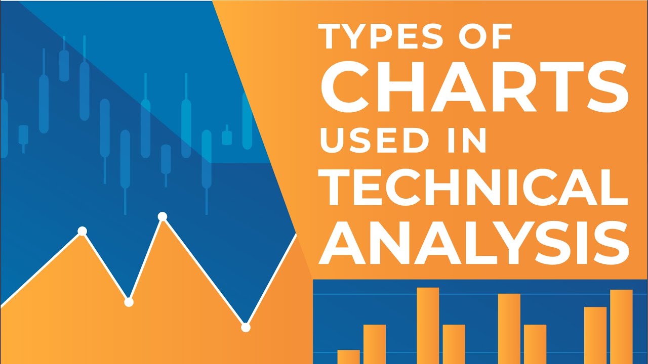
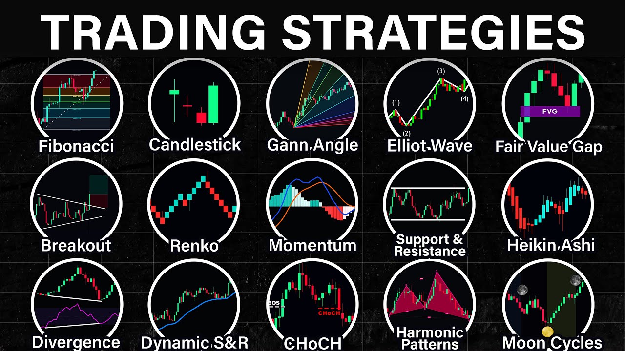
Candlestick Patterns Analysis: What is Candlestick, How to read Candlestick chart | CA Nishant Kumar

Groww
12 Nov 202017:52

Summary

TLDRIn this informative video, CA Nishant Kumar introduces viewers to the world of candlestick charts, a fundamental aspect of stock market technical analysis. He explains the basic components of a candlestick, including the body, wicks, and their colors, which represent bullish and bearish market sentiments. The tutorial covers how to interpret the opening, closing, highest, and lowest prices, and the significance of wicks in understanding market trends. The session aims to empower viewers with the knowledge to analyze stock price patterns effectively.

Takeaways

  • 📈 Candlestick charts are a fundamental aspect of technical analysis in stock trading, providing insights into market trends.
  • 📊 Technical analysis tools on platforms like Groww offer advanced options for reading and interpreting candlestick charts.
  • 🎓 CA Nishant Kumar, an author and tutor, is the featured expert in the video, guiding viewers on how to read and understand candlestick charts.
  • 📚 Candlestick charts offer more information than line diagrams, including opening, closing, highest, and lowest prices for a given day.
  • 🟢 A green candlestick indicates a bullish trend where the closing price is higher than the opening price, suggesting a positive market sentiment.
  • 🔴 A red candlestick signifies a bearish trend where the closing price is lower than the opening price, reflecting a negative market sentiment.
  • 🔑 The body of the candlestick represents the opening and closing prices, while the wicks (or shadows) indicate the highest and lowest prices of the day.
  • 🤔 Market sentiment is crucial in understanding candlestick charts; bullish indicates a general rise in prices, while bearish indicates a fall.
  • 🛍️ Buyers control the market in a bullish trend, as they are willing to purchase stocks at higher prices, driving the market upwards.
  • 🛒 Sellers control the market in a bearish trend, as they may be more inclined to sell, leading to a decrease in stock prices.
  • 🔍 Candlestick charts can sometimes have single wicks, indicating that the opening or closing price was also the highest or lowest price of the day.

Q & A

  • What is the significance of candlestick charts in stock market analysis?

    -Candlestick charts are a fundamental tool in technical analysis of stocks, providing a visual representation of the stock's price movements, including the opening, closing, highest, and lowest prices for a given period.

  • What are the two types of market sentiment mentioned in the script?

    -The two types of market sentiment are bullish and bearish. Bullish sentiment indicates a general rise in stock market prices, while bearish sentiment indicates a general fall.

  • How does a candlestick chart differ from a line diagram?

    -A line diagram connects closing prices of a stock over several days with a line, whereas a candlestick chart provides more detailed information, including the opening, closing, highest, and lowest prices for each day.

  • What is the meaning of a green candlestick in the context of the stock market?

    -A green candlestick represents a bullish trend, indicating that the closing price of the stock is higher than the opening price, suggesting that buyers are in control and prices are tending to rise.

  • What does a red candlestick signify in candlestick charts?

    -A red candlestick signifies a bearish trend, where the closing price is lower than the opening price, indicating that sellers are in control and stock prices are tending to fall.

  • What are the components of a candlestick?

    -The components of a candlestick include the body, which represents the opening and closing prices, and the wicks or shadows, which represent the highest and lowest prices of the day.

  • Why is the absence of a wick at the top of a red candlestick significant?

    -The absence of a wick at the top of a red candlestick indicates that the opening price was the highest price of the day, suggesting a strong downward price movement with no significant highs after the opening.

  • How can the presence of a single wick in a candlestick provide insight into the stock's price movement?

    -A single wick indicates that the opening or closing price was the highest or lowest price of the day, respectively. This can suggest a rapid price movement in one direction with little fluctuation during the trading period.

  • What is the importance of understanding market sentiment in technical analysis?

    -Understanding market sentiment is crucial in technical analysis as it helps investors gauge the overall mood of the market and make informed decisions based on whether the market is bullish or bearish.

  • How can the information provided by candlestick charts be used to make investment decisions?

    -Candlestick charts can be used to identify patterns and trends in stock prices, which can help investors make decisions on when to buy or sell stocks based on the perceived market sentiment and price movements.

  • What is the role of CA Nishant Kumar in the video mentioned in the script?

    -CA Nishant Kumar is a tutor and author who is invited to educate viewers on candlestick charts and technical analysis, providing insights and guidance on how to read and interpret these charts for stock market analysis.

Outlines

00:00

📈 Introduction to Candlestick Charts on Groww

The script introduces the launch of candlestick charts on the Groww platform, highlighting the availability of advanced technical analysis options on the website and the upcoming release of this feature on the app. The video features CA Nishant Kumar, a tutor and author, who will guide viewers on understanding candlestick and technical charts. The importance of market sentiment, categorized as bullish (rising prices) and bearish (falling prices), is also introduced, setting the stage for a deeper dive into technical analysis.

05:09

📊 Understanding Candlestick Chart Components

This paragraph delves into the specifics of reading candlestick charts, contrasting them with traditional line diagrams which only show closing prices. Candlestick charts provide a comprehensive view by including the opening, closing, highest, and lowest prices for a given day. The components of a candlestick are explained, including the body representing the opening and closing prices, and the wicks (or shadows) indicating the highest and lowest prices. The difference between green (bullish) and red (bearish) candlesticks is clarified, with the body color indicating whether the closing price was higher or lower than the opening price.

10:13

🟢 Bullish vs. 🟥 Bearish Market Sentiment

The script explains the significance of bullish and bearish candlesticks in reflecting market sentiment. A green candlestick signifies a bullish trend where the closing price is higher than the opening price, indicating buyer control and a potential for price increase. Conversely, a red candlestick represents a bearish trend with the closing price lower than the opening price, suggesting seller control and falling prices. The paragraph also discusses the concept of market control, where continuous buying at higher prices by buyers indicates a growing market, whereas the absence of a top wick can imply that the opening price was the highest for the day.

15:25

📚 Conclusion on Candlestick Chart Analysis

The final paragraph wraps up the discussion on candlestick charts, summarizing the key points covered in the video. It reiterates the importance of understanding the opening, closing, highest, and lowest prices depicted by the candlestick's body and wicks. The video encourages viewers to like and comment for more topics and reminds them to subscribe for future informative content aimed at fostering intelligent investing.

Mindmap

Keywords

💡Candlestick Charts

Candlestick Charts are a method of displaying price movements of a security, derivative, or currency over time, typically used in stock trading. Each 'candle' represents a specific time period, such as a day or an hour, and shows the open, high, low, and close prices. In the video, candlestick charts are introduced as a fundamental tool for technical analysis of stocks, with the script explaining their components and how they provide more information than line diagrams by including the opening, closing, highest, and lowest prices.

💡Technical Analysis

Technical Analysis is the study of past market data, primarily price and volume, to predict future market trends. It is a method used by traders and investors to make informed decisions by analyzing charts and patterns. In the context of the video, technical analysis is the overarching theme, with candlestick charts being a key component for understanding market sentiment and predicting price movements.

💡Market Sentiment

Market Sentiment refers to the overall attitude or feeling of investors toward the market or a particular security. It can be classified as 'bullish' when there is a general expectation of rising prices, or 'bearish' when there is an expectation of falling prices. The script uses market sentiment to explain the significance of green (bullish) and red (bearish) candlesticks, indicating whether buyers or sellers are in control of the market.

💡Bullish

Bullish is a term used to describe a market sentiment where there is a belief that prices will rise. In the video, a bullish trend is indicated by a green candlestick, where the closing price is higher than the opening price, suggesting that buyers are driving the market upwards.

💡Bearish

Bearish is the opposite of bullish and refers to a market sentiment where there is a belief that prices will fall. The script describes a bearish trend by the red candlestick, where the closing price is lower than the opening price, indicating that sellers are influencing the market downwards.

💡Line Diagram

A Line Diagram is a basic chart type that connects data points with lines, often used to represent stock prices over time. However, as mentioned in the script, line diagrams have limitations as they only show closing prices and do not provide information about the opening, highest, or lowest prices within the period.

💡Opening Price

The Opening Price is the price at which a security first trades upon the opening of an exchange. In the context of candlestick charts, the opening price is depicted at the bottom of the candlestick body for a green candle (bullish) and at the top for a red candle (bearish), indicating the starting point of trading activity for the period.

💡Closing Price

The Closing Price is the price at which a security is traded at the end of the trading day. In candlestick charts, the closing price is shown at the top of the green candlestick body (indicating a bullish trend) and at the bottom for a red candlestick (indicating a bearish trend), representing the final trading price for the period.

💡Highest Price

The Highest Price is the peak price level that a security reaches during a given trading period. In the script, the highest price is represented by the top wick of the candlestick, providing insight into the maximum value the security achieved within the time frame.

💡Lowest Price

The Lowest Price is the lowest level that a security's price falls to during a trading period. According to the script, the lowest price is indicated by the bottom wick of the candlestick, showing the minimum value the security reached within the time frame.

💡Wick or Shadow

The Wick, also known as the Shadow, is the thin line extending from the top and bottom of the candlestick body. It represents the range between the high and low prices of the security during the period. The script explains that wicks provide additional information about volatility within the trading period, with longer wicks indicating greater price fluctuations.

Highlights

Candlestick charts have been launched on Groww, providing advanced options for technical analysis and chart reading.

The functionality of candlestick charts will soon be available on the Groww app.

CA Nishant Kumar, a tutor and author, will guide on candlestick and technical charts.

Candlestick charts are a fundamental aspect of stock technical analysis.

Market sentiment can be categorized as Bullish (rising prices) or Bearish (falling prices).

Line diagrams are an older method of stock price representation, lacking certain details.

Candlestick charts provide comprehensive daily information including opening, closing, highest, and lowest prices.

The body of a candlestick represents the opening and closing prices, while the wicks represent the highest and lowest prices.

A green candlestick indicates a Bullish trend with the closing price higher than the opening price.

A red candlestick signifies a Bearish trend where the closing price is lower than the opening price.

Bullish candlesticks imply that buyers are in control of the market, driving prices up.

Bearish candlesticks indicate that sellers are in control, leading to a fall in stock prices.

Candlestick charts can have single wicks, indicating the highest or lowest price coincides with the opening or closing price.

Understanding candlestick charts helps in analyzing stock price patterns and market trends.

The video encourages viewers to subscribe for more insightful content on becoming an intelligent investor.

The session concludes with an invitation for feedback on topics for future video content.

Transcripts

play00:06

Hey friends!

play00:08

As you know that a short time ago, candlestick charts were launched on Groww If you visit the Groww website, some advanced options also are available

play00:17

By using those options, you can do technical analysis and read charts Shortly this functionality will be available on the app as well

play00:33

Following this, we have brought a new Groww originals session where we have invited CA Nishant Kumar. He will tutor you on candlestick charts and technical charts.

play00:44

Nishant Kumar is a tutor as well as an author of books. Let's move to Nishant Kumar, who will talk about candlestick charts and the ways of doing technical analysis

play00:57

But before starting this video, if you have not subscribed to our channel, then surely do it.

play01:05

Hey Guys What's up? This is CA Nishant Kumar Today we are going to talk about candlestick charts

play01:11

Reading candlestick charts is a basic area of technical analysis of stocks It is the first step of technical analysis

play01:24

The meaning, usage, readability, and information available through candlestick charts is the topic for today We will talk about all these things

play01:35

Now, what is a candlestick? Everybody knows this is a normal candle(on the left side) On the right side is a stock market candlestick with a wick on both the sides

play01:55

Today we will learn the actual meaning of candlestick in the stock market Also, I will guide you on 'how to read candlestick fort stock market analysis'

play02:12

Before learning about the stock market we will first discuss an important concept which is, market sentiment There are two types of market sentiment namely, bullish and bearish

play02:35

Market sentiment is termed as Bullish when there is a general rise in stock market prices. While whenever there is a general fall in stock market prices, market sentiment is termed as Bearish.

play03:04

I will slowly and gradually explain its usage. Now let's talk of Candlestick charts.

play03:10

You might be aware of what are Line diagrams Candlestick chart is an improved version of the Line diagram.

play03:25

Now, what are the Line diagrams? Suppose you have closing prices of a particular stock for 5 trading days.

play03:43

Suppose you have closing prices of a particular stock for 5 trading days. As follows, on the first day, Rs.120, then Rs.150, Rs.170, Rs.160, and Rs.190 on the fifth day

play03:54

If you plot these points on a normal graph paper and then draw a line, then it will look like a Line diagram

play04:07

The Closing prices for 5 days which are- Rs.120, Rs. Rs150, Rs170, Rs160, and Rs190 are plotted on a graph paper and then joined through a line

play04:25

This is called a Line diagram. So what is the problem over here? The problem is that this overlooks 3 major aspects

play04:34

It does not depict stock's opening and closing prices on a day. Also, the information on the highest and lowest rates is not available.

play04:49

All these things are told by a candlestick chart We can see that this chart only gives information regarding the closing prices of the stock

play04:51

On the other hand, the Candlestick chart gives four types of information for every day, namely, Opening, Closing, Highest and Lowest price.

play05:09

It looks like this (watch video) Now let's talk about its component and way of reading it.

play05:25

Now let's come to this discussion, i.e., the way of reading the details of the chart Come let's look into this

play05:44

We have two types of candlesticks, namely- red and green. First, we will talk about the Green colored candlestick, which is exhibits positivity.

play06:00

First, we will talk about the Green colored candlestick

play06:05

So this is a Green colored candlestick which has a wick at both top and bottom The line should not be crooked

play06:34

Now not building more suspense, I will explain this candlestick The bottom point denotes the opening price on a particular day While the top point denotes the closing price

play07:03

And the wick at the bottom this denotes the lowest price of the day While the wick at the top denotes the highest price

play07:22

Now, look at this diagram again. Let's take any candlestick.

play07:35

Let's talk about this one(watch video) Over here on the left side, the prices are mentioned. I have zoomed out the chart to make it easy for you to understand it.

play07:45

Over here on the left side, the prices are mentioned

play07:49

This(watch video) denotes the opening price of the stock This(watch video) denotes the closing price of the stock

play08:00

The wick at the bottom denotes the lowest price of the stock on that particular day While the wick at the top denotes the highest price of the stock

play08:12

Coming back to the diagram The middle part is known as the body of the candle And these lines(watch video) are known as wick or shadow

play08:36

Hence we have two things one this body and the other is wick/shadow

play08:38

The lowest portion of a candlestick is the opening price, and the highest portion is the closing price of the day

play08:50

The highest portion of the wick is the highest price, and the lowest portion is the lowest price of the day

play08:59

Now lets talk of the red-colored candlestick Here is the red-colored candlestick with a wick at both the ends

play09:17

Now, let's look into the difference between the two. The red-colored candlestick has the bottom portion as the closing price and the top-most as the opening price.

play09:40

There is no problem with the highest and lowest price as they are exactly the same green-colored candlestick

play09:50

This(watch video) is the lowest price on a particular day While this(watch video) is the highest price

play10:01

This way, you can understand Let's come back to the diagram; here (watch video) is your red-colored candlestick

play10:13

Over here, this(watch video) portion denotes the opening price While this portion(watch video) denotes the closing price

play10:23

Also, these are the highest and lowest price I hope that this thing is clear to you

play10:28

Now we understand one more thing with this. The green candle represents the bullish trend in the market. This is a bullish candlestick.

play10:52

While the red colored one is a bearish candlestick Try to recall what I told you at the starting of the video

play11:05

The Bullish market has a tendency to raise the prices, while this is the opposite in the case of the Bearish market, i.e., fall in prices.

play11:15

So if your opening price is more than the closing price, then the market sentiment is Bearish. Hence the red colored candlestick is called a bearish candlestick

play11:27

On the other hand, if your opening price is less than the closing price, then the market sentiment is Bullish. It means that the prices have a tendency to rise.

play11:43

Let me tell you about one more interesting concept Bullish candlestick means that the buyer is in control

play12:10

If the price is rising, how can you say that buyer is in control?

play12:15

This thing is viewed differently in the stock market I will explain this

play12:22

Whenever a stock's price is rising it means that buyer is willing to purchase it However, when the buyer stops buying the stock, the price will fall

play12:48

If the stock prices are rising and the buyer is still willing to purchase at a higher price, it depicts growth in the stock market

play13:16

If the stock is brought even at higher prices, only then the stock market will grow further.

play13:23

This means that buyers are oblivious to the high stock prices and continue to buy stocks, leading to the market's growth. The buyer is in control of the stock market.

play13:35

Hence the Bullish candlestick means that buyer is in control of the stock market

play13:50

If the closing price is higher than the opening price, it means that the market sentiment is Bullish with the buyer in its control

play13:57

The exact opposite of this case is in the Bearish candlestick as here the seller is in control of the market I hope you have understood this thing

play14:15

This was a concept of candlestick charts, which are of two types, namely Green( bullish) and Red( bearish ) candlestick

play14:29

Green candlestick denotes that the closing price is higher than the opening price. While Red candlestick denotes that the closing price is lower than the opening price

play14:35

Every candle has two wicks. The tip of the top-most wick depicts the highest price, while the tip of the bottom-most depicts the lowest price on any particular day.

play14:50

There is one more thing to be noticed Over here(watch video), a lot of candlesticks have only one wick

play14:59

This(watch video) Red-colored candlestick does not have a wick at the top. This means that the opening price is itself the highest price of the stock.

play15:25

So there is no point for the wick to be at the top.

play15:29

So if there is no wick at the top in this Red-colored candlestick, it means that the opening price is itself the stock's highest price.

play15:40

Similarly, you can take an example of another candlestick, i.e., the one which does not have a wick at the bottom. This means that the closing price is the lowest price for the day of that stock.

play16:02

The exact opposite for this in the case of a Green-colored candlestick

play16:14

Suppose a case where there is no wick at the bottom; this means that the lowest price is the opening price of the stock on that day.

play16:36

The exact opposite of this is the case where there is no wick at the top. This means that the highest price is the closing price of the stock on that day. The lowest and opening price remains at the bottom of the candle.

play16:53

So this was all about the candlestick charts. This is how you read, understand and analyze the patterns of a stock price with the help of a candlestick chart

play17:01

Candlestick chart gives four types of information for every day, namely, Opening, Closing, Highest and Lowest price of a stock

play17:10

The middle part is called the body, while the top and bottom lines are known as wicks. Thank you so much. I will see you in the next session.

play17:20

Hey friends, I hope you liked today's video. If you liked today's video, then press the like button and comment about the other topics on which you want us to make a video.

play17:31

But, if you have not subscribed to our channel, then surely do it.

play17:35

In the upcoming days, we will bring more insightful videos to become an intelligent investor. Happy investing!

Rate This

5.0 / 5 (0 votes)

Связанные теги
Candlestick ChartsTechnical AnalysisStock MarketMarket SentimentBullish TrendBearish TrendInvestment TipsFinancial EducationTrading StrategiesGroww AppCA Nishant
Вам нужно краткое изложение на английском?