The Psychology of Color in Design
Summary
TLDRThis script delves into the emotional impact of color in design, highlighting how different hues can evoke various feelings, from calmness to excitement. It introduces a 'Psychology of Color Chart' as a guide for designers to select colors that elicit desired emotions. The video discusses the strategic use of warm colors like red, orange, and yellow for energy and attention, and cooler colors like green, blue, and purple for stability and calmness. It also touches on the resurgence of purple and the evolving use of pink beyond traditional gender associations, emphasizing the importance of intentional color choices in design.
Takeaways
- 🎨 Color has a profound psychological impact on viewers, influencing emotions and perceptions.
- 🔥 Warm colors like red, yellow, and orange evoke energy and vibrancy, with red being particularly powerful for drawing attention.
- 🚨 Red is often used in call-to-action buttons and fast food logos due to its association with appetite and alertness, but it should be used intentionally to avoid overuse.
- 🍊 Orange combines the enthusiasm of red with the energy of yellow, offering a versatile option for design that complements cooler colors like blue.
- 🌟 Yellow is bright and can evoke happiness, but it's also the least used color in design due to its tendency to be overused and visibility issues when printed with red.
- 💚 Green is associated with cleanliness, nature, and growth, making it a popular choice for cleaning and financial industries.
- 💰 Green's positive connotations also make it a common choice in banking and stock market representations, symbolizing wealth and status.
- 🔵 Blue is a versatile and commonly used color in branding worldwide, evoking stability, trust, and calmness, particularly favored by banks and healthcare.
- 💜 Purple combines the stability of blue with the vibrance of pink, associated with royalty, sophistication, and a sense of passion, making it suitable for hospitality and healthcare.
- 🌈 Pink, traditionally associated with femininity, is evolving in its use and can remind viewers of romance, love, and simpler times, working best when paired with calming counter colors.
- 📈 The script encourages designers to use colors wisely and intentionally, experimenting with different color combinations to evoke desired emotions and enhance design impact.
Q & A
What is the significance of color in design according to the script?
-Color in design is significant as it can evoke emotions, provide a sense of calmness, and even influence behaviors such as increasing appetite or drawing attention to certain areas of a design.
What is the 'psychology of color chart' mentioned in the script?
-The 'psychology of color chart' is a downloadable resource that lists common emotions associated with different colors, intended to guide designers in selecting colors that elicit the desired emotional responses from viewers.
Why are warm colors like reds, yellows, and oranges considered to bring energy and vibrance to a design?
-Warm colors are associated with energy and vibrance because they can spark emotions of happiness and joy, and are often used to draw attention or increase alertness in a design.
Why is red particularly powerful in design?
-Red is especially powerful in design due to its ability to draw attention and increase alertness, making it a common choice for buttons and call-to-action elements. However, it should be used intentionally to avoid overwhelming a design.
How does the color orange balance the design when used with cooler colors?
-Orange balances the design with cooler colors by maintaining the bright energy of red while also incorporating the enthusiasm of yellow, creating a sense of contrast that works well in design.
What are the challenges associated with using the color yellow in design?
-Yellow can be challenging in design because it can easily be overused and is the least used color due to its brightness. Additionally, it can be hard to see when printed with red, so it should be used carefully and sparingly.
Why is green often the color of choice for cleaning industries and financial industry?
-Green is associated with cleanliness, freshness, and nature, making it a suitable choice for cleaning industries. In the financial industry, green signifies positive gains and wealth, which is why it is commonly used to represent a good day in the stock market.
What unique blend of emotions does cyan evoke, and where might it be commonly seen?
-Cyan combines green's organic, clean feeling with blue's calm feeling, creating a unique blend. It may be commonly seen in biotech startups to convey optimism.
Why is blue the most commonly used color for brands worldwide?
-Blue is widely used because it evokes emotions like stability and calmness, making it a favorite for banks, industries, and healthcare to convey trust and reliability.
How does the color purple combine different emotions to create a unique effect in design?
-Purple combines the stability and calmness of blue with the compassion and vibrance of pink, adding warm tones that give it a sense of royalty, sophistication, and passion, making it suitable for hospitality and healthcare industries.
What are some considerations for using pink in design, and how can it be effectively paired with other colors?
-Pink should be used considering its past association with femininity, but it can evoke romance and love. It works best in tandem with calming counter colors to balance its strong presence and highlight certain areas of the design.
Outlines

Этот раздел доступен только подписчикам платных тарифов. Пожалуйста, перейдите на платный тариф для доступа.
Перейти на платный тарифMindmap

Этот раздел доступен только подписчикам платных тарифов. Пожалуйста, перейдите на платный тариф для доступа.
Перейти на платный тарифKeywords

Этот раздел доступен только подписчикам платных тарифов. Пожалуйста, перейдите на платный тариф для доступа.
Перейти на платный тарифHighlights

Этот раздел доступен только подписчикам платных тарифов. Пожалуйста, перейдите на платный тариф для доступа.
Перейти на платный тарифTranscripts

Этот раздел доступен только подписчикам платных тарифов. Пожалуйста, перейдите на платный тариф для доступа.
Перейти на платный тариф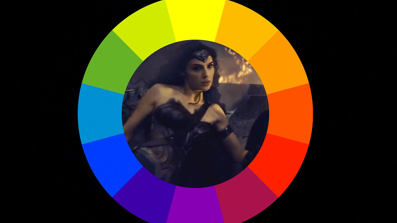


5.0 / 5 (0 votes)
