How to Make a Graph in Excel | Learn Microsoft Excel
Summary
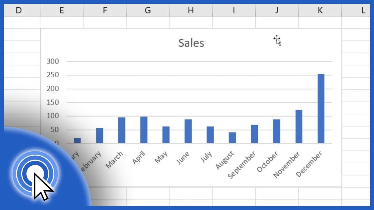
TLDRIn this tutorial on the Jurus Digital channel, the host demonstrates how to create a simple graph in Excel. Starting with test scores for good students, the tutorial guides viewers step by step on how to insert a line graph, edit data ranges, and label the axes. The process involves selecting the correct chart type, inputting student scores, and adjusting both horizontal and vertical axis values. By the end of the tutorial, viewers will have learned how to make a basic graph showcasing good student scores from the first test to the tenth.
Takeaways
- 😀 The video is a tutorial on how to create graphs in Excel.
- 😀 The graph being demonstrated is a simple one representing student grades from test scores.
- 😀 The first step is to input the data for the graph, which consists of test scores from 1 to 10.
- 😀 The user selects the line graph type in Excel to create the initial blank graph.
- 😀 Right-clicking and selecting 'Select Data' is a key step in setting up the graph's data.
- 😀 The series name for the graph is given the label 'Good Student Grade'.
- 😀 The unnecessary series is deleted after selecting the data, leaving only the relevant data for the graph.
- 😀 The user can edit the horizontal axis by right-clicking again and selecting 'Edit' for the axis range.
- 😀 The graph is enhanced by adding horizontal and vertical axis titles to clarify the data represented.
- 😀 The process concludes with a simple line graph showing the test scores from 1 to 10, representing good student grades.
Q & A
What is the main topic of the video?
-The main topic of the video is a tutorial on how to create a simple graph in Excel, specifically focusing on graphing good student scores.
What type of graph does the tutorial recommend using?
-The tutorial recommends using a line graph to display the data.
How do you start creating a graph in Excel according to the tutorial?
-To start creating a graph, you need to place the cursor where you want the data to appear, then insert a line graph from the 'Insert' tab.
What should you do if the graph appears blank after inserting the line graph?
-If the graph appears blank, you need to right-click and select 'Select Data' to add the required data for the graph.
What is the first step after clicking 'Select Data' in Excel?
-The first step after clicking 'Select Data' is to name the series, which in this case is 'good student grades.'
How do you add horizontal axis values to the graph?
-To add horizontal axis values, right-click, select 'Select Data,' and then edit the range for the axis. You can also specify the horizontal and vertical axis values.
What are the axis titles that the tutorial suggests adding to the graph?
-The tutorial suggests adding titles for both the horizontal and vertical axes. The horizontal axis title could be the test number, and the vertical axis title would represent the good student scores.
What does the tutorial suggest after editing the axis values?
-After editing the axis values, the tutorial suggests finishing the graph by ensuring all the necessary chart elements, such as the axis titles, are added.
What kind of data does the tutorial use for the graph example?
-The tutorial uses a set of test scores ranging from 1 to 10, and it focuses on the scores of good students.
What does the tutorial imply about customizing the range for the graph?
-The tutorial implies that the range for the graph can be customized based on the data being presented, and in this case, the range remains the same for the test scores of good students.
Outlines

Этот раздел доступен только подписчикам платных тарифов. Пожалуйста, перейдите на платный тариф для доступа.
Перейти на платный тарифMindmap

Этот раздел доступен только подписчикам платных тарифов. Пожалуйста, перейдите на платный тариф для доступа.
Перейти на платный тарифKeywords

Этот раздел доступен только подписчикам платных тарифов. Пожалуйста, перейдите на платный тариф для доступа.
Перейти на платный тарифHighlights

Этот раздел доступен только подписчикам платных тарифов. Пожалуйста, перейдите на платный тариф для доступа.
Перейти на платный тарифTranscripts

Этот раздел доступен только подписчикам платных тарифов. Пожалуйста, перейдите на платный тариф для доступа.
Перейти на платный тарифПосмотреть больше похожих видео
How to Make a Bar Graph in Excel

Balloon Shooting Game with Python
Penting! Cara Membuat Laporan Kas Masuk dan Keluar│ Belajar membuat laporan kas sederhana di excel

TUTORIAL BELAJAR MUDAH DAN SEDERHANA MEMBUAT TYPOGRAPHY DENGAN CORELDRAW

Create Unique Thumbnails with PixelLab | Stand Out on YouTube in 2024!

Excel Conditional Formatting based on Another Cell | Highlight Cells
5.0 / 5 (0 votes)
