A Warning from the Past...

Figuring Out Money
16 Sept 202416:46

Summary

TLDRIn this stock market analysis, the presenter discusses the steepening of the university yield curve and its historical correlation with market volatility and recessions. They highlight the inverted 10-year, 3-month yield curve, which has historically preceded economic downturns. The video also reviews the performance of the S&P 500 sectors, suggesting early signs of economic contraction. The presenter examines historical instances of the 3-month yield surpassing long-term yields and their impact on commodities like oil and copper, noting similar patterns emerging. They conclude with trading insights, focusing on key support levels and the importance of monitoring market indicators for potential shifts.

Takeaways

  • 📈 The stock market has been experiencing volatility, with the yield curve steepening and potentially signaling economic shifts.
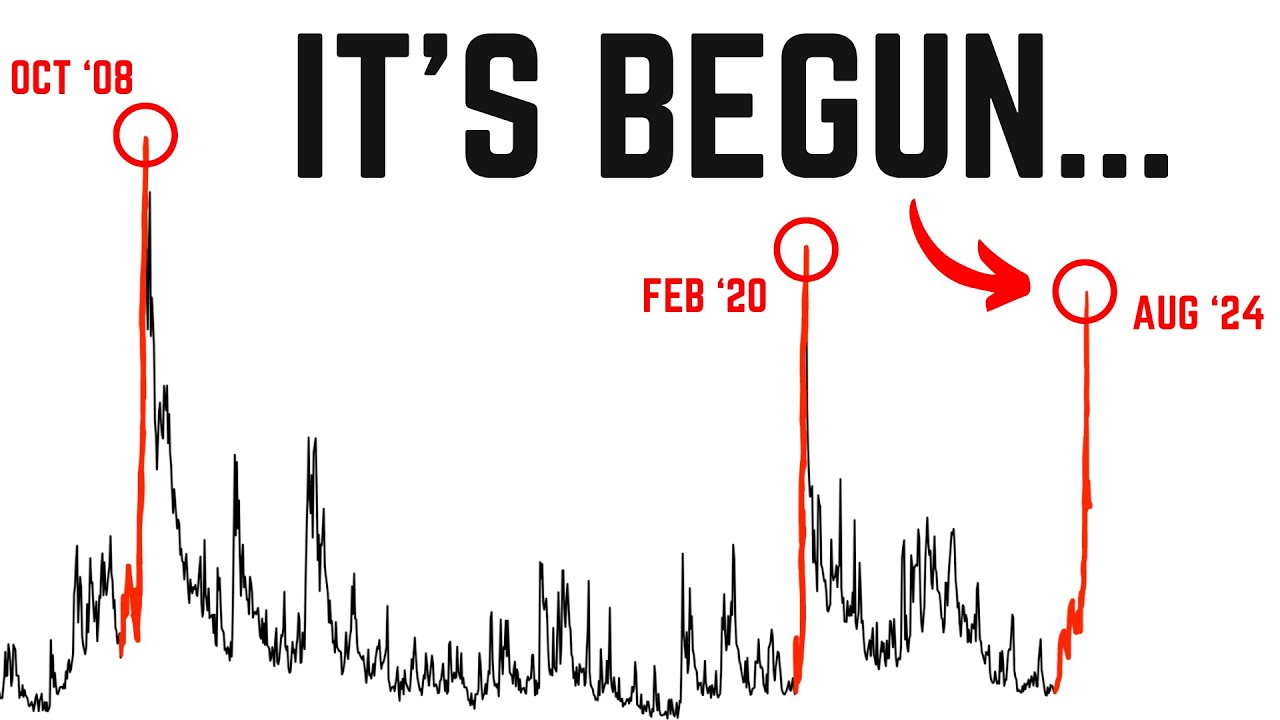
  • 📉 The 10-year and 3-month yield curve remains inverted, which historically has been associated with economic recessions.
  • 🔍 The presenter highlights the importance of monitoring the 3-month yield, which closely tracks the federal funds rate, for economic indicators.
  • 🏢 Sector performance in the S&P 500 shows strength in real estate, utilities, and consumer staples, suggesting a potential early sign of economic contraction.
  • 📊 The presenter reviews historical data, noting that when the 3-month yield was above the 10, 20, and 30-year yields for extended periods, it preceded market turbulence and recessions.
  • ⏳ The script discusses the upcoming Federal Reserve rate decision, with market expectations shifting towards a 50 basis point cut rather than a 25 basis point cut.
  • 📉 Commodity prices, particularly oil and copper, have shown significant drops recently, which historically have coincided with economic downturns.
  • 📊 The presenter analyzes various market indices, noting that they are currently above their short-term moving averages, indicating a positive short-term trend.
  • 📍 Key support and resistance levels are identified for the S&P 500 and other indices, which will be crucial for market direction in the coming sessions.
  • 🔎 The presenter emphasizes the importance of monitoring economic commodities and yield curves for signs of potential market movements and economic shifts.

Q & A

  • What is the significance of the university yield curve in the stock market?

    -The university yield curve is significant in the stock market as it has historically been an indicator of economic conditions. Its steepening and inversion have been linked to increased market volatility and have sometimes preceded recessions.

  • What does the 10-year 3-month yield curve indicate about the economy?

    -The 10-year 3-month yield curve, also known as the fed staple yield curve, is an economic indicator that reflects the difference in yields between 10-year and 3-month U.S. Treasury securities. An inversion of this curve can signal potential economic slowdowns or recessions.

  • How does the speaker analyze the stock market sectors' performance in relation to the S&P 500?

    -The speaker analyzes the performance of the 11 sectors that make up the S&P 500, noting which sectors are in the green and how they align with the stock market cycle and economic cycle. This analysis helps to identify potential shifts in market trends and economic conditions.

  • What does the speaker find interesting about the longer-term chart of the 10-year 3-month yield curve?

    -The speaker finds it interesting that the 10-year 3-month yield curve is still inverted despite the overall market being at highs. This observation is significant because historical data shows that such inversions have often preceded economic downturns.

  • What historical patterns does the speaker observe regarding the 3-month yield and its relation to economic recessions?

    -The speaker observes that during periods of economic recessions, such as in 2000-2001 and 2007-2008, the 3-month yield has been above the 10-year, 20-year, and 30-year yields for several months. This pattern suggests that prolonged inversions of the 3-month yield relative to longer-term yields may precede economic downturns.

  • How does the speaker use economic commodities like oil and copper to support their analysis?

    -The speaker uses the performance of economic commodities like oil and copper to support their analysis by noting significant price drops in these commodities prior to rate cuts and economic downturns. These drops are seen as potential indicators of economic stress.

  • What is the speaker's stance on trading during periods of market uncertainty?

    -The speaker suggests a cautious approach to trading during periods of market uncertainty, focusing on key support and resistance levels, and being prepared for potential market movements based on historical patterns and current economic indicators.

  • What technical analysis tools does the speaker use to evaluate the market's short-term trends?

    -The speaker uses technical analysis tools such as the 5-day moving average on an intraday time frame and the month-to-date anchored volume-weighted average price to evaluate the market's short-term trends and to identify potential entry and exit points for trades.

  • How does the speaker interpret the gamma structure in the context of market volatility?

    -The speaker interprets the gamma structure as an indicator of market volatility. Being in positive gamma territory suggests that dealers are more likely to buy the dip and sell the rip, which can suppress volatility. Key levels identified from the gamma structure are used to gauge market sentiment and potential price movements.

  • What are the key levels the speaker suggests to monitor for potential market movements?

    -The speaker suggests monitoring key levels such as 5600 and 5650 for the S&P 500 index, as these levels have been significant in past market movements and can provide insight into potential future trends.

Outlines

00:00

📈 Stock Market Brief: Yield Curve Analysis

The speaker begins by sharing an observation on the stock market, focusing on the university year yield curve which has been steepening and historically associated with market volatility and recessions. They highlight the inverted 10-year 3-month yield curve, which is a significant indicator. The discussion transitions to the broader market, noting that most sectors of the S&P 500 are in the green, except for consumer discretionary. The speaker also delves into the stock market cycle, economic cycle, and sector performance, suggesting early signs of an economic contraction period. They conclude by reiterating the importance of the 3-month yield and its historical impact on market volatility and recessions.

05:01

📉 Historical Yield Curve Trends and Market Reactions

This paragraph delves into the historical behavior of the 3-month yield curve in relation to economic recessions. The speaker examines past instances where the 3-month yield was above the 10-year, 20-year, and 30-year yields, notably in 2006-2007 and 2000-2001. They correlate these periods with significant market volatility and economic downturns, including the financial crisis. The discussion also includes the performance of economic commodities like oil and copper during these times, showing significant drops that coincided with market instability. The speaker emphasizes the potential implications of these historical patterns for current market conditions, suggesting that similar trends might be emerging.

10:03

🔍 Analyzing Market Indicators and Potential Outcomes

The speaker continues to analyze market indicators, focusing on the current status of the 3-month yield and its proximity to the federal funds rate. They note the recent drop in yields and the market's reaction, which includes a potential rate cut. The discussion also includes the performance of economic commodities like oil and copper, which have seen significant drops similar to past market stress periods. The speaker speculates on the market's potential response to these indicators, considering both bullish and bearish scenarios. They also discuss the market's pricing in of rate cuts and the impact of political pressures on the Federal Reserve's decisions. The paragraph concludes with a focus on trading strategies and the importance of monitoring key market levels.

15:04

📊 Technical Analysis and Market Sentiment

In this final paragraph, the speaker shifts to a more technical analysis of the market, discussing specific levels and patterns that could influence trading decisions. They mention the importance of being above certain levels for a bullish outlook and caution below these levels. The discussion includes the gamma structure of the market, which influences volatility and trading behavior. The speaker also provides specific price levels for the S&P 500 (Spy) and other indices, suggesting how market participants might react to these levels. The summary concludes with a focus on the importance of monitoring short-term price movements and adjusting trading strategies accordingly.

Mindmap

Keywords

💡Yield Curve

The yield curve is a graphical representation of the interest rates, or yields, on debt for a range of maturities. In the video, the presenter discusses the 'university year yield curve' and its steepening, which historically has been associated with market volatility and recessions. The presenter also focuses on the 'fed staple yield curve', specifically the 10-year and 3-month yield curve, which is still inverted. This inversion is seen as a potential indicator of future economic conditions.

💡Inversion

Inversion in the context of the yield curve refers to a situation where short-term interest rates are higher than long-term rates. This is typically considered unusual as investors usually expect higher returns for tying up their money for longer periods. The video discusses the inversion of the 10-year and 3-month yield curve, which has historically preceded economic downturns.

💡Volatility

Volatility in financial markets refers to the degree of variation in the prices of securities over time. The video script mentions that the steepening yield curve has historically led to increased volatility, which can result in significant price swings and potential market instability.

💡Recession

A recession is a significant decline in economic activity that lasts more than a few months, typically visible in real GDP, income, employment, and industrial production. The video discusses the historical correlation between the yield curve inversion and the onset of recessions.

💡S&P 500

The S&P 500, or Standard & Poor's 500, is a stock market index that tracks the performance of 500 large companies listed on stock exchanges in the United States. It is often used as a gauge of the U.S. equities market. The video mentions the 11 sectors that make up the S&P 500 and their performance, which is indicative of market sentiment.

💡Consumer Discretionary

Consumer discretionary refers to a sector of the economy that consists of non-essential goods and services. In the video, the presenter notes that the consumer discretionary sector (XLK) was not in the green, meaning it did not perform as well as other sectors on that day.

💡Stock Market Cycle

The stock market cycle refers to the recurring pattern of economic activity in the stock market, which includes periods of expansion and contraction. The video discusses the stock market cycle in relation to economic cycles and sector performance, suggesting that the market may be moving into a period of potential economic contraction.

💡Federal Funds Rate

The federal funds rate is the interest rate at which depository institutions lend balances to other banks overnight. It is the primary tool used by the Federal Reserve to manage monetary policy. The video script discusses the three-month yield, which tracks the federal funds rate, and its inversion from the 10-year, 20-year, and 30-year yields.

💡Commodity

In the financial context, commodities refer to basic goods used in commerce that are interchangeable with other goods of the same type. The video mentions economic commodities like oil and copper, which are often used as indicators of economic health. The presenter notes significant price drops in these commodities prior to past rate cuts, suggesting potential economic concerns.

💡Rate Cut

A rate cut refers to a reduction in the interest rates set by a country's central bank. The video discusses the timing of past rate cuts and their correlation with economic indicators, such as the movement of the three-month yield and the performance of economic commodities.

💡Gamma

In finance, gamma is a measure of the rate of change in an option's delta with respect to changes in the price of the underlying asset. The video mentions gamma in the context of options trading, discussing how the gamma structure can influence market volatility and trading strategies.

Highlights

The university yield curve has been steepening, historically associated with market volatility and recessions.

The 10-year 3-month yield curve is still inverted, which is an interesting observation for market analysts.

The S&P 500 sectors show a mixed performance with most in the green, indicating a risk-on market sentiment.

Real estate, utilities, and consumer staples sectors hit new year-to-date highs, suggesting a potential economic contraction phase.

The 10-year 2-year yield curve has un-inverted and is steepening, which historically has led to market volatility.

The three-month yield, which tracks the federal funds rate, has been inverted from the 10-year, 20-year, and 30-year for an extended period.

Historical analysis shows that when the three-month yield was above the long-term yields for multiple months, it preceded economic downturns.

In 2007, the three-month yield was above the 10-year, 20-year, and 30-year for about eight months before the financial crisis.

Economic commodities like oil and copper showed significant drops leading up to rate cuts, indicating potential market stress.

The market's reaction to the yield curve inversion and rate cuts has varied, with periods of sideways movement observed.

The speaker emphasizes the importance of looking for bullish cases even in potentially bearish scenarios.

The S&P 500 (SPY) and the NASDAQ (Q's) are in different technical patterns, with the SPY showing a potential cup and handle formation.

The semiconductor index (XBI) and the Dow Jones Industrial Average are above their short-term moving averages, indicating a bullish short-term trend.

Key support levels for the SPY and other indices are identified, which could be crucial for market direction in the short term.

Gamma analysis shows a big contract roll is taking place, which could influence market volatility and price action.

The speaker discusses the potential for a measured move in the Q's index, suggesting a break out could lead to new highs.

The market's reaction to the yield curve and rate cuts is complex, and the speaker advises caution and careful analysis of economic commodities.

Transcripts

play00:00

so I noticed something pretty

play00:01

interesting today that I want to share

play00:03

with everyone on today's stock market

play00:04

brief show a lot of people have been

play00:06

talking about the

play00:08

uninversity year yield curve and they're

play00:10

absolutely right it has been steepening

play00:12

and going up and looking back through

play00:14

history it has cost some volatility and

play00:16

even led into some recessions but more

play00:18

importantly I want to talk about

play00:19

something that I found interesting about

play00:21

that fed staple yield curve which is the

play00:23

10year 3 month as you can see currently

play00:25

the 10year 3mon is still well inverted

play00:28

but I did notice something very

play00:30

interesting on this longer term chart

play00:32

and that's what I want to talk about on

play00:34

today's stock market brief show so we're

play00:35

going to go ahead and get right into

play00:37

[Music]

play00:41

that all right everybody welcome back to

play00:43

the show before we hop right into that

play00:45

specific chart and then dig into the

play00:48

history of that chart and then we'll

play00:50

also obviously walk through what it is

play00:52

that I'm doing what I'm looking at from

play00:53

a shorter term perspective let's take a

play00:56

look at the 11 sectors that make up the

play00:57

S&P 500 almost everything was in the grp

play00:59

green today other than consumer

play01:01

discretionary in xlk so these are the

play01:03

risk on assets these were the sectors

play01:05

towards the bottom it's just one day

play01:07

right we have a contract rooll going on

play01:09

we got macro data coming out so it is

play01:11

what it is there but I did find

play01:12

something interesting once again looking

play01:14

at this cycle chart where we're looking

play01:17

at the orange which is the stock market

play01:19

cycle the blue is the economic cycle and

play01:21

then you have the 11 sectors that

play01:23

typically perform and let you where we

play01:24

stand well today we hit another

play01:26

year-to-date high in real estate

play01:28

utilities consumer staples even out

play01:30

there in Industrials uh I think that

play01:32

that was it but yeah we're starting to

play01:34

see continu just strength Within These

play01:37

sectors that are kind of telling us that

play01:39

yeah yeah we're kind of coming from the

play01:41

stock market top area but we're now kind

play01:43

of moving into the potential the early

play01:46

signs right of of the economic

play01:49

contraction period or starts to turn

play01:51

down where we go into early recession

play01:53

and if you just look at the last three

play01:55

months performance right you have xlre

play01:58

right here you have utilities financials

play02:00

Consumer Staples right right over here

play02:02

you have Consumer Staples utilities

play02:04

financials real estate so we're we are

play02:07

seeing this cycle thing progress out and

play02:09

on a prior video we talked about what to

play02:11

look for as far as strength if we do go

play02:13

in through an economic recession well

play02:15

typically you start getting strength

play02:16

later down the road there in technology

play02:18

consumer discretionary and so forth so

play02:19

we got to be prepared for that type of

play02:22

situation to potentially play out now

play02:24

back to what I was talking about here on

play02:26

the yield curve stuff so the 10-year

play02:28

2-year did un invert we're current ly

play02:54

unadvertised and steepening un inverting

play02:56

steepening and you can see it led to

play02:58

volatility in the markets pandemic

play03:00

actually went higher and then the

play03:01

pandemic came so who knows what would

play03:03

have happened there after they used QE

play03:06

Infinity uh but now what I want to kind

play03:09

of focus attention on is something that

play03:11

I found interesting and that was that

play03:13

three-month yield right the three-month

play03:15

yield for those that don't know this one

play03:17

tracks the federal funds rate so the in

play03:19

the shade shaded black that is the

play03:21

federal funds rate and the pink line is

play03:23

the three month uh and a lot of people

play03:25

look at the 2-year and the federal funds

play03:27

rate that's totally fine too I just

play03:28

wanted to call this out because looking

play03:30

back through history I was like thinking

play03:31

to myself I'm like wow the it's way up

play03:33

here it's been up here basically

play03:36

inverting from the the 10 year the 20

play03:39

year and the 30-year for quite some time

play03:40

and I looked back at 2020 I was like did

play03:42

it did it invert did it invert all these

play03:44

curves here too as well and the answer

play03:46

is is no actually maybe maybe very

play03:49

quickly over here I'd have to check in a

play03:51

little bit it doesn't look like it did

play03:52

though okay but where was the areas that

play03:56

it did completely overtake the 10 the 20

play04:00

year and the 30-y year the 3 Monon well

play04:01

you can see over here in 2006 and 2007

play04:05

and then right over here too as well in

play04:07

2000 and then a couple of times back

play04:09

further which I'll get into but let's

play04:11

zoom in more specifically to this area

play04:14

right over here so if I zoom in right

play04:16

here this is pretty cool this is back to

play04:19

2007 going into 2008 you can see right

play04:21

here is that time that we highlighted

play04:22

where the pink line which is the 3mon

play04:24

was above the 10 year the 20 year and

play04:26

the 30-year and it happened to be above

play04:28

it for roughly from

play04:31

one 2 3 4 5 6 7 8 eight eight months or

play04:36

so the black line is when they all

play04:38

uninverted which is roughly about June

play04:40

of 2007 and then our first rate cut from

play04:43

the cycle of rate Cuts happened to be

play04:45

September 18th too as well isn't that

play04:47

kind of funny so we're going into our

play04:48

first rate cut this cycle at September

play04:50

18th and in 20072 2008 happened to be

play04:52

that same way but what what was the

play04:54

market doing in that time well when it

play04:55

first when they all uninverted the 3mon

play04:57

uninverted from all the the 10 20 to 30

play05:01

what you'll see here is that the market

play05:03

saw some volatility it went up and then

play05:05

it went through the financial crisis

play05:07

during that same time there was a couple

play05:09

economic assets so we like to talk about

play05:11

intermarket analysis and look at various

play05:14

economic Commodities that weigh not only

play05:16

on the US but also the global

play05:18

perspective as well and here during that

play05:21

same period of time when we went through

play05:23

the rate cut so the First Rate cut was

play05:26

September 18th is I'm remember right

play05:29

around there okay um which is labeled on

play05:32

the chart right now I think I just put

play05:33

it at September but what was oil doing

play05:35

in that time leading up to the First

play05:37

Rate cut well it dropped 20% okay what

play05:40

was copper doing which is pretty intense

play05:42

volatility in a period of two short

play05:44

months and yeah it's been on a monster

play05:46

run up over here but that big snap right

play05:48

that that these type of things these

play05:51

type of moves can cause concerns and

play05:53

then copper was also kind of just going

play05:56

sideways chopping around but from its

play05:57

most recent Peak to when we we started

play05:59

cutting rates it was down maybe maybe a

play06:02

little bit more than 18% if I went to

play06:04

September 18th specifically but it was

play06:06

about

play06:07

18% okay so let's go a little bit

play06:09

further back and go to 2000 2001 2002

play06:12

which is the do bubble bursting well

play06:14

over here you can see that the yield

play06:16

curve or the yield the three-month yield

play06:18

was above it for one two three months

play06:20

maybe a little bit more if you count

play06:22

this but it's kind of in and out so four

play06:24

or five months right around there and

play06:25

then we went through a rate cut at the

play06:27

beginning of 2001 and at the black line

play06:31

resembles when the 3month fell

play06:33

underneath back underneath so these all

play06:35

these yield curves uninverted which is

play06:37

the the 10

play06:39

2030 and what happened to the market

play06:41

well the market started seeing much more

play06:43

volatility and so forth what was those

play06:46

econ Eon e economic commodities doing so

play06:49

crude oil and copper well leading up to

play06:52

that rate cut oil fell 26.9% in a very

play06:55

short period of time copper in the same

play06:57

short period of time from its recent

play06:59

Peak over here fell about roughly

play07:02

133% now we can go back a little bit

play07:04

further so I looked at the 8990 this is

play07:07

when I kind of quickly saw that hey it

play07:08

was above them it was that the 3mon was

play07:10

above the now I don't have data for the

play07:12

20 year for whatever reason it's not

play07:14

loading here but it was above the 10 and

play07:16

the 30 but it was only like a day and so

play07:19

can I really come to a conclusion about

play07:21

that not really in my opinion but if we

play07:24

were to use that what did the market do

play07:25

the market kind of went sideways when it

play07:27

began getting under all these yields

play07:29

okay and then over here if you go back a

play07:32

little bit further talking 1982 this was

play07:35

up there for maybe uh not even a half of

play07:38

a month and you could see it inverted

play07:40

and uninverted and uninverted and you

play07:42

could see what was the market doing

play07:43

during that time well it was going

play07:44

through some turbulence definitely uh at

play07:47

that given time and this is when the SPX

play07:49

was at 120 and dropped it like 102 maybe

play07:51

a little bit more further but I just

play07:53

wanted to zoom in specifically on there

play07:54

so the the the main times that I'm

play07:56

looking really are when I zoom out is

play07:59

the times where it lasted for multiple

play08:01

months and that happened to be 2000 and

play08:04

2007 and the reason why I'm kind of lean

play08:07

on the fence like nobody really knows

play08:08

what's going to be happening here is

play08:10

because we actually haven't began un

play08:13

inverting this yet now if I zoom in more

play08:17

specifically to the thre Monon right

play08:20

here which is the pink line we did fall

play08:23

about 1.73% today and it's like I said

play08:26

tracking the federal funds rate pretty

play08:27

closely it's pretty much front running

play08:29

what the FED will do we closed at

play08:33

4.89 and this is at a time when the

play08:36

Market's basically at all-time highs I

play08:38

mean we're pressing really we like right

play08:41

about to hit a brand new high in the

play08:43

market and as we're about to hit a brand

play08:44

new high and go through the rate cut

play08:46

cycle oil just recently from its recent

play08:48

Peak just fell 18% and while copper just

play08:51

fell 177% from its recent Peak too so

play08:55

there are some common things going on

play08:57

here from a commodity standpoint point

play09:00

from yield curve potentially un

play09:02

inverting from a rate cut cycle and it

play09:04

is it's it's just how do you trade this

play09:07

right how do you how do you set up a

play09:09

trade and this is where it's going to

play09:10

get a little bit more interesting but we

play09:12

we'll talk more specifically what is

play09:13

that I'm doing because this doesn't mean

play09:15

go short the market or anything like

play09:17

that but while this is happening too in

play09:20

recent trade the TLT has been kind of on

play09:22

a monster terar and the TLT right can be

play09:25

more of a flight to safety these are

play09:27

bonds typically people fly fly bonds for

play09:29

safety that's been the case throughout

play09:32

history 2022 was definitely an anom an

play09:36

anomaly during that specific time now as

play09:39

I stated we have the FED coming into cut

play09:41

rates here in September at least that's

play09:43

what the Market's pricing in in fact it

play09:45

was a 25 basis point cut okay where from

play09:48

where we currently stand but the odds of

play09:50

a 25 basis point cut have been falling

play09:53

while the odds of a 50 basis point cut

play09:56

have actually been increasing in recent

play09:59

trade this is looking back from the

play10:01

current to one day to one week and to

play10:03

one month ago you can see that that the

play10:06

Market's trying to price in a 50 basis

play10:08

point cut and you have senators or

play10:10

politicians asking now for a 75 basis

play10:13

point cut reaching out to Jerome Powell

play10:16

so we'll see if that's going to play out

play10:18

now does this mean that the Market's

play10:20

going to fall apart no not necessarily

play10:22

but I think it's enough evidence to

play10:24

state that what has happened in the past

play10:27

when we had the 3mon well above the 10

play10:29

2030 for multiple months well it

play10:32

happened to be in 2006 2007 and also

play10:34

here and then what happened shortly

play10:35

thereafter and what was economic

play10:37

commodities doing during these same

play10:38

times and well the Commodities right now

play10:41

like I said they're doing very similar

play10:42

things and well we have't began to

play10:44

unvert but you you it begs a question

play10:47

like is there something really around

play10:49

the corner that is going to just take

play10:51

Everyone by storm is it going to be some

play10:53

sort of catalyst where everyone looks

play10:55

back and says well it's actually because

play10:57

this specific thing happened or is it

play10:59

all going to look very obvious and

play11:01

hindsight if something were to take

play11:02

place in these financial markets and

play11:04

everyone's like

play11:06

like it passes fast because of just how

play11:09

fast things move these days I it's too

play11:11

hard to say so what do I specifically

play11:14

look for well first and foremost I

play11:16

looked for still the bullish case in in

play11:18

in these scenarios right and there's a

play11:20

couple things that I looked for as far

play11:21

as getting potentially more bearish but

play11:23

the majority of times I want to trade to

play11:25

the upside and why is because it's a lot

play11:28

easier to trade to the up to the upside

play11:30

when the trend is up uh versus shorting

play11:33

the market while the market's at highs

play11:35

okay so if I'm just looking at the spy

play11:38

on The Daily time frame you might look

play11:40

at this as a potential cup with handle

play11:41

or a cup with handle here and a measured

play11:43

move of a cup and handle would just take

play11:45

the low of this prior pullback to its

play11:48

pivot point which would be the all-time

play11:49

high and you'd measure that up to around

play11:51

620 on the Spy can that happen sure yeah

play11:54

why not what will make it happen is if

play11:57

we stay above some uh a couple of a

play12:00

couple of levels which I'll go into

play12:01

momentarily but I want to go to the q's

play12:04

now and the q's is also in this

play12:05

compression pattern and these can break

play12:07

either direction but a measured move to

play12:09

the upside in the q's in this specific

play12:11

pattern would bring us up to roughly

play12:12

around 550 I mean if it breaks out

play12:14

earlier we can measure from the breakout

play12:15

area but I just measured it from kind of

play12:17

the Apex of this compression pattern

play12:20

where you have a a high a lower high a

play12:22

lower high currently you have a low and

play12:24

a higher low here you can see price is

play12:26

coiling up it doesn't necessarily mean

play12:28

it's going to break out to the up side

play12:29

but it doesn't necessarily mean it's not

play12:31

going to break out to the upside so I do

play12:34

find it interesting that Q's right is

play12:36

heavily Tech and Tech is not nearly as

play12:38

high as the spy and there's been many

play12:40

cases where the qes have led the S&P 500

play12:43

both from finding a bottom to finding a

play12:46

top so if this were to break down I I

play12:48

would think that spy if it even broks

play12:50

out it would be end up being a some sort

play12:52

of a bull trap but we'll we got to have

play12:55

more data now in the short term we can

play12:58

look at the 30-minute charts of all

play12:59

these index products we got the spies

play13:01

The Q's the iwm semiconductors xbi Dow

play13:04

Jones Industrial they're all green what

play13:06

does that mean it means that it's above

play13:07

its short-term moving average we're

play13:09

using the 5-day moving average on an

play13:10

intraday time frame and on top of that

play13:12

even shorter time frame we have that

play13:15

month-to date anchored volume weighted

play13:16

average price we got all above that

play13:17

remember just a few episodes ago these

play13:20

were all red and we said when do we get

play13:21

more bullish well we can get more

play13:23

bullish when this starts to turn back up

play13:25

well it started turning back up and then

play13:27

we said about the month to-day anchored

play13:28

volume weight average price and it got

play13:29

started getting above that too okay and

play13:32

now price action is seeing a nice little

play13:33

move so hopefully you got to catch some

play13:36

of that trade or maybe add some exposure

play13:38

during that now if the market pulls back

play13:40

what are the key levels I would say from

play13:42

the swing low like for the Spy over here

play13:45

I would be looking to see how price

play13:47

responds in and around those areas even

play13:49

when it comes to like semiconductors

play13:50

right where the month to date is by its

play13:52

swing low and then also the xbi its

play13:55

swing low is in Confluence with its

play13:57

month- to-day anchored volume weight at

play13:58

average price and then you have the qes

play14:00

over here which didn't look nearly as

play14:03

good as the Spy today is that telling us

play14:05

something might be around the corner I

play14:06

don't know and then the iw2 as well it's

play14:09

kind of just right in this area where

play14:10

you see this prior swing low anchored

play14:12

volume weighted average price and the

play14:13

month to date so if we pull back and we

play14:15

can hold that could be just a pullback

play14:17

and a shorter term uptrend which would

play14:18

be a more positive look now when we take

play14:21

a look at Gamma we do have a big

play14:22

contract roll like I said already taking

play14:24

place this week we'll see how this

play14:26

changes over time but right now we got

play14:28

50 600 right here and then 5650 we're

play14:31

more near 5650 so I can see us getting

play14:34

stuck in this area for a bit but if we

play14:36

start cracking down through 5600 there's

play14:39

nothing really going on uh up until 5500

play14:44

so I'd be cautious for sure under 5600

play14:48

and more bullish above it given the

play14:50

context of what the gamma structure

play14:52

looks like right now if I pull that up

play14:56

on a specific chart you can see the 50

play14:59

650 level and the 5600 level here and

play15:02

we've been kind of just pinning in

play15:04

between these the gamma flip line is

play15:06

currently at

play15:07

5570 this will change come tomorrow but

play15:10

being that we're in positive gamma

play15:12

territory this is where volatility

play15:14

typically gets suppress dealers look to

play15:15

buy the dip sell the rip buy the dip

play15:17

sell the rip and that is the kind of

play15:19

environment that I like to add exposure

play15:21

into paired with being above an

play15:23

inclining 5-day moving average so all

play15:25

signs of go right now I would say if you

play15:27

want specific levels yeah 5 00 below

play15:29

that proceed with caution above that

play15:31

that 5650 and even higher depending on

play15:34

where Traders reach I'd only have more

play15:36

concern per usual and start reducing

play15:39

positions or at least at minimum keep my

play15:41

winners and the ones that get stopped

play15:44

out I would just remove from I would be

play15:46

doing that if the case was we started

play15:49

turning red on this screen and we

play15:50

started getting back below the flip line

play15:52

where you get dealers to sell into

play15:54

selling buy into buying you get much

play15:56

more volatile moves and volatility

play15:59

typically increases if we take a look at

play16:01

the spy on the 15minute time frame the

play16:03

weekly expected move this week can take

play16:05

us down to an around

play16:07

551 and some change 55160 and then above

play16:10

us at 572 43 so far the start of the

play16:13

week is not a bad look for the Spy but

play16:17

the cues obviously was down slightly on

play16:19

the trading session going into

play16:20

tomorrow's day we have a daily expected

play16:22

move at 56560 and a lower at

play16:25

55842 hope today's episode gave you some

play16:27

insight to a bigger picture thing that

play16:29

was going on from more of a bearish

play16:31

standpoint or more of like hey we we

play16:34

don't act like exactly what's going to

play16:35

be taking place here cuz we don't and

play16:37

then two like we drill down on the very

play16:40

small time frames went to be bullish

play16:42

went to be more bearish went to add more

play16:43

exposure so hope it helped out I'll see

play16:45

you later

Rate This

5.0 / 5 (0 votes)

Связанные теги
Yield CurveEconomic TrendsMarket AnalysisInterest RatesStock MarketRecession IndicatorsInvestment InsightsFinancial StrategyHistorical DataEconomic Volatility
Вам нужно краткое изложение на английском?